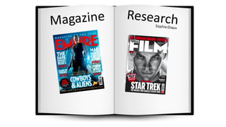
SlideShare a Scribd company logo
1 of 19
Magazines
A magazine is "a publicationthat is issued periodically, usually bound in a
paper cover, and typically contains essays, stories, poems, etc."
(http://www.dictionary.com/browse/magazine)
Even though magazine advertisingis expensive for even large film
conglomeratesthere are many benefits including:
• The idea that are seen by a large audience (and even if you target e.g. 15-
24 year old's you need to reach a wider audience because they are less
likely to to have income to go to the cinema so coveringall areas of an
audience is essential)
• Magazines are usually kept for a longer period of time compared to
newspapers where today's news is old after tomorrow.
• This is a more mainstream magazine that targets a more mass audience (in the whole
scheme of film/ entertainment magazines). It is owned by a big company, Bauer Media.
• Empire is a "EMPIRE IS, WITHOUT question, the world’s most influential film and
entertainment brand. Encompassing a print magazine, podcast, website, digital edition and
live events strand" (http://www.bauermedia.co.uk/brands/empire) This idea could be
biased though because Bauer Media is the company that produces this magazine but the
idea that this magazine influences audiences opinions exaggerates it power.
• It can be assessed online or via print.
• Empire is a British magazine being very influential regarding films. The content of the
magazine is made up of reviews on the films and articles about the cast members as well as
interviews with directors.
• This film magazine provides authentic information to an audience.
SocialDemographic
Model
•The target audience of this magazine is film lovers, as well as TV lovers of both gendersbut I found that the
majority were male. The age of the audience is predominantly older, 18-50 yearsold. The information is factual,
focusing on the film rather than e.g. just the cast (for marketing purposes) so appeals to the older audience.
• In regards to the social demographic transition model, the audience for empire would be grade B/A, having
more money and possibly experience which could translate to their creative ideas (linking to the complicated
narratives of the films). In addition the magazine is quite expensiveto purchase,being £4.50, so only this
older higher class audience can afford it comfortably.
•I can identify the audience as male through the use of darker colour's on the frontcoverof the
magazine, aswell as the focus on the action side of the film narrative. I previously researched that action is what
appeals to the male audience compared to females who enjoy 'happy'films, stereotypically.
• Entertainment Weekly is an American run magazine that focuses on all
mediums of entertainment; music, TV, Film etc. The idea that film isn't there
main focus can suggest the less importance of it to their audience. There are
significant culture differences from this magazine and empire due to them
being created in different countries.
• The audience for this magazine are more likely to be interested in the idea of
films, getting caught up in 'gossip' rather than focusing on the film itself (like
the audience of e.g. EMPIRE). This is a huge generalization and based on
American stereotypes. However, saying that the content is very similar to
that of empire, including interviews, reviews etc. but focus not only on film
but gaming, television, music and books.
• The content of the magazine is a lot more varied and explores more than
just a normal film magazine, so the price of $3.50 reflects the information in
it.
• I feel as though I wouldn’t use the title of this magazine because it
is too generic and doesn’t stand out to me as a film brand. The
firstreason is because it is called 'entertainment' which doesn’t
show film very strongly however 'weekly' suggests the information
is up to date and current which is a positive. The colour of the logo
is black, which would be shown visually on our piece if we used it.
I feel as though black has connotations of being dull and generic
though and doesn’t make it stand out compared to the colour of
red in Empire however it follows stereotypical conventions of
magazine titles.
• I understand it is not solely based on the visuals and I have to take
into consideration the branding and audience of this magazine;
there style as an institution. This magazine follows a consistent
house style being made up of the same font in the masthead,
central image and three colour's including white, black and then
the other linking to the film advertised on the front.
The majority of the audience are female, as shown
in the information above sourced from
(http://microsites.ew.com/microsite/media-
kit/2017/index.html#audience). The majority of the
audience is aged 18-49,with a relatively high
income. The magazine itself is $3.50 which is quite
expensive. However the content of the magazine is a
lot more varied and explores more than just a
normal film magazine.
• This film magazine is run by the BFI, which is a British film company that helps to create
independently produced films. This magazine advertises these.
• The colour scheme of the masthead, light red and yellow subverts conventions as it isn't as dynamic
and standout as others. Especially also because the text isn't in capital letters and being written in
sans serif font going against stereotypical representations.
• The content is of the film itself and the locations filmed it at etc. This magazine focuses more on the
technical elements and the abstract ideas behind the narratives which attracts the niche audience.
However they do advertise bug blockbusters aswell just explore them in a more technical way.
• I am not going to use this as my final piece as we need a more 'generic' colour scheme to match with
our planned photography. In addition we need to look at a magazine that looks at action and thriller
films (as the colour scheme and type of photography e.g. serious facial expression focused on one
actor etc.) and has a more mainstream audience. However it is good to explore different types of film
magazines.
I have found this information from (https://www.slideshare.net/Lloyder/sight-sound-
magazine-readership-profile).When analyzing this information I can configure that most of
the people that read the magazine are male, a bit less that 75%. The audience is majority
older, which is a similar idea to all of the other magazines I have researched. This could be
because of the huge impact of technology and social media. There is less of a need for
physical copies of media to find out information if you can source it for free online, especially
for the younger audience.
The BFI produce this magazine to
appeal to the niche audience who
watch arthouse films that are
independently produced rather than for
the mainstream Hollywood
blockbusters. It is noticeably different to
all of the other magazine I have
explored.
The front covers don’t focus on one
character in the film but a background,
a setting from the film to set the scene.
This gives the audience a sense of what
the film will entail
(http://www.prweek.com/article/1015779/editors-desk-aubrey-day-total-film)
Having an audience of 17-35 year old's means that they can 1, afford the £3.90 price tag and 2 understand all of the complex
information in the magazine. This is similar to Empire but gives more information into the film rather than focusing on
marketing and making money. This is a good identity to have.
They look at horror/
action genres and use
dark colour schemes
to express their ideas.
This is something that
I want to achieve with
my magazine front
cover.
They have a central image
with a lot of cover lines and
headlines surrounding it.
The central image is a
significantcharacter to the
narrative. This is
stereotypical and something
we will use in our piece.
Aubrey Day: Editor of Total Film
(http://www.prweek.com/article/1015779/editors-desk-aubrey-day-
total-film)​
This information suggest that the total
film include all information about a film
and this British company doesn’t always
focus on the mainstream Hollywood films
but rather gives a rounded view. This is
branding that I would want to have for my
piece
• This magazine mainly focused on television crime dramas. This means that it has a narrow
audience in regards to film and the information has no reference to the film industry
directly.
• The masthead font and style I will take for inspiration as it links to crime which is a
fundamental theme for our crime thriller piece. The crime 'scene' ideologies will match my
narrative of my film, so it is a good magazine to explore.
• I can identify a distinct similarity to total film, empire and this one as it uses a central
character on the front cover and capital letters for the masthead (very stereotypical).
• If I were to use this piece I would take inspiration from the layout of the magazine and the
masthead style but create my own piece. I feel as though this would be more efficient
because otherwise we will be using a magazine that goes against the brief, of creating a
film magazine.
• I feel as though the information on films is too limited though
Comparing Total Film and Empire' Front covers
I am going to compare total film and empires front covers as I find a lot of similarityin regards to the front cover layouts but the
ideologies of the brands are significantlydifferent in the sense of content and whether they market or just give information:
They both have the in extra information abovethe mast head to grab
attention of the audience, that relate to other information in the
magazine.
The masthead on both is the colour white with darker coloured
background. The total film magazineis advertising a more intense
narrative, a film that upholds the genre of action/ fantasy.
This empire magazine is a new cover. It subverts a stereotypical
layout of an empire magazine as it shows multiple protagonists on
the front cover of the magazine. There is a lot of secondary images
surroundingthe main central image. This expresses a sense of
community within the films narrative. The masthead is white (on
both magazines) which goes against the main brandingof both
(usuallyred) but works well in respect of the darker backgrounds.
VS
Total film cover uses a lot of 'articles trailed' for extra advertising on the front of this magazine, as well as puffs (sticker, right of the image in
this case). There is evidence of a kicker as well. The main headline stands out a lot and I can makes a clear correlation from the main
photograph and the headline because of the use of colour. The blue used for "blockbuster" is the same as the colour of not only the
background but her costume. The colour scheme is made up of 3, yellow, blue and white. This is similar to the empire one, using red, white
and orange.
• The main difference that I can see between both magazine covers that Total
Film is filled with more information.
• When reading the cover lines of Total Film there is more reference to different
films such as "Godzilla" as well as the central image referring to "Maleficent".
This expresses the versatility of this magazine as they are completely different
genres. Godzilla has a genre of a thriller/ horror compared to Maleficent being a
fantasy/action film. This could be good our film "Suspect" because it is a Crime
thriller Genre.
• However I feel as though empire really expresses the action of the film (In this
case Wonder women) to engage the audience aided by an unconventional
colour scheme (in this example). We need the audience to fully engage so it
possible Empire would be better at advertising our film.
• However there layouts and branding in the sense of being British Magazine
companies are similar. They both include; masthead, cover lines, kicker, pugs,
puffs, and following the 'third' ideas. Each bit of information is put in the right
section of the third. (e.g. left, right or central).
Empire- Comparing Different Covers I havecollected a lot of different magazinecovers
from the same company. I have found that the
majority of them have the iconic red masthead
however dependent on the type of film meant that
there were changes. For the cover that is
promoting the film "Wonder Women" it uses a
white masthead
A common colour I see through the brandingof
empire is the combination of blue and red. Blue is
a conventionalcolour for action and thriller films
as it gives a sense of the unknown and these are
the common films that Empire promotes.
The magazinein the right top corner is recently released, and uses the colour's of blue and oranges as the background, the colour white
dominating the cover lines and masthead. It is promoting 'WonderWomen' which is a film that promotes gender equality targeting women so
the central image has strong armour costume to represent this. Similarly the magazine cover in the left top corner has a costume of armour,
connoting a superhero film. This brand, "Empire" promotes a lot of action and supernatural films. However this magazine uses the colour
purple connoting aspiration and the red masthead (red connoting death and fear) blends in more with the background as well as reflecting the
narrativeof Appocalypse. The connotation of this films is based on danger but love. The colour's shows there contrasting ideas. In all magazines
there is always a main central image surrounded by pugs (promotingsomething else within the magazines or exaggeratingstatistics) and
headlines (stereotypical of a magazinefront cover).
There are less cover lines than in e.g. total film as it
focusses mainly on the image. There is anchorage text
on each front cover that catches the audience's
attention, reading e.g. "This means war"
FrontCoverAnalysis- Inceptionby TotalFilm
From watching the film trailer, the teaser as well as the
full film myself I can identify the main protagonist as
loving and although his actions are criminal they are for
the greater good (even if they aren't exactly moral all of
the time). The film puts the audience in a perspective
that makes us feel sympathy for the criminals. On the
front of the magazine the main character is presentedas
evil and a criminal, holding what looks like a gun. There
is no consideration to the warm and loving side to this
character, no sign of the love story that revolves the
whole narrative, between Cobb and Mal. This is because
Total film needs to uphold there brand identity. They
have control to pick and choose parts of the film to
exaggerate to keep their male target audience.
The use of a pug is effective as it alerts an
important piece of information to an audience.
"Everything you need to know". This phrase is
putting an idea into the audience head, a
forceful statement which can fulfil there needs
to know everything. This is very exaggerated to
give the sense of urgency; that they NEED to
purchase this magazine.
The masthead 'Total Film' is usually written in red and white writing however here the themes of the film
have been incorporated into the magazines identity. The idea that this film had the power to change the
magazine brand can shock a regular customer, leading to them going to watch it.
The main headline, relating to the central photograph reads "Inception' followed by the strapline 'Inside the ultimate head trip" which exaggerates the idea that
the narrative is confusing and messes with your mind. The typography is made up of a sans serif bold font, written in capital letters to stand out to an audience as
an important piece of information (acts as anchorage text). In addition the colour of the writing is grey showing some shadows. The tone of grey is light so the
shadows are fairly obvious. This connotes the idea of darkness in the narrative as well as visually standing out to an audience more.
The photograph placed centrally of the magazine is
the main male protagonist In the film. His facial
expressions are serious, looking at something off the
page, using indirect mode of address. This is
unconventional of front covers of magazine as the
character usually looks directly in the camera so the
audience can become emotionally involved with them
before they watch the film. The prop he is holding
seems to be a gun/ torch of some sort connoting a
sense of mystery; the fear of the unknown within not
only the audience but the character as well as
portraying a negative view of him.
The website of total film is presented just under the
masthead so it is easy assessable for an audience.
On the cover line here, there is the use of the same
typographyas the in the main headline. The use of
this font again creates consistency. There is use of 3
different fonts on the frontof the cover. This makes
the magazine look more presentableand the fonts
don’t become muddled up with each other.
Overall I would say that this magazine front cover subverts Total Films usual
branding as instead of using a red masthead they are adapting based on this sci-fi
action film. However the layout is similar to what they usually do.
The date and the issue number
The colour scheme of the background follows the stereotypical conventions of a sci-
fi genre film. The blue tinge to the background has connotations of depth and the
mind. This has a direct correlation with Inceptions Narrative. Stereotypically this
attracts a female audience as it involves exploringreasons for things happening.
However through the props held by the protagonist, as well as the colour scheme
suggest an action aspect of the film, which stereotypically attracts the male
audience. This colour scheme however is also very common in the thriller/ horror
genre so there could be a lot of elements of mystery which are key themes of the
thriller genre. (which my film will be so it is imperative that I choose a magazinefront
cover that can correctly identify with my audience)
Graphics-plus to show the extra information given.
It is in red to suggest its urgency as well as the
possible danger of the information in the cover line
below.
The micro features, mise en
scene is made up of a
torch/gun prop and a smart
attire as the costume. These
both promotea professional
character. This reflects the
important and complicated
narrativeof Inception. This
action part of the narrative is
what needs to be represented
to an audience.
The films target audience is predominantlymale so
the imagery on the film magazine that
predominantlytargets male makes sense
Howhas analyzingthisFront Cover helpedme
developmy piece?
• By analyzing this Magazine Front Cover I have depicted the kind of magazine
that I want to use, something similar to the one on the previous slide.
• I am going to use Total Film or Empire (they have similar ideologies but
Empire is more strong on male dominance and both being British). As our
film is going to be for the male audience predominantly we need to use mise
en scene; lighting, props, costume and facial expressions being the major
focus for us to express our ideas of 'Suspect' to our audience effectively. I feel
as though analyzing this Total Film front cover it has given me a lot of ideas.
• In this front cover the image has serious facial expressions, smart attire and
the use of relevant props which is something we aspire for in ours. However
we are going to use a female character so will have to dress her in something
other than a suit as stereotypically they have connotations of male.
Imagesfrom google images
• It will be difficult for me to bring in a male audience without a male protagonistfor
our film but we are going to subvert stereotypes in certain areas to do so, such as
the facial expressions being very strong and serious with direct mode of address.
The audience will be able to feel strong emotion, similar to Cobb in this front cover,
then interesting them in the film.
• The layout of the whole magazine is something that I like very much and will use. It
is rare to find magazine front covers with dark backgroundsso finding this is
importantfor me. I want our piece to have a dark background,with the masthead
being white and the cover lines too being either white or a light colour. This is to
connote the darkness behind the films narratives and the characters life's. The
white cover lines, white having connotation of purity will show that the contents of
the magazine will give a lot of good information on the film as well as
the colour contrasting well to the blue/black background. Both factually and visually
having white cover lines will work for our film; "Suspect".
• In this piece they have used silver and red and blue. This use of three colour's keeps
it consistent, which again is something I have taken inspiration from. At this present
moment I am going to use blue black and white. This could change depending on
new ideas I develop, considering stereotypes.
Imagesfrom google images

More Related Content

What's hot

Evaluation of my horror poster
Evaluation of my horror posterEvaluation of my horror poster
Evaluation of my horror poster
rebecca-paterson
 
Front cover magazine evaluation new
Front cover magazine evaluation newFront cover magazine evaluation new
Front cover magazine evaluation new
rebecca-paterson
 
Research planning presentation 2011 12
Research planning presentation 2011 12Research planning presentation 2011 12
Research planning presentation 2011 12
barnorb9064
 
Film poster analysis (A2 media studies)
Film poster analysis (A2 media studies) Film poster analysis (A2 media studies)
Film poster analysis (A2 media studies)
Pablo Ortiz
 

What's hot (20)

Poster analysis
Poster analysisPoster analysis
Poster analysis
 
Magazine front cover analysis one
Magazine front cover analysis oneMagazine front cover analysis one
Magazine front cover analysis one
 
Evaluation of my horror poster
Evaluation of my horror posterEvaluation of my horror poster
Evaluation of my horror poster
 
Front cover magazine evaluation new
Front cover magazine evaluation newFront cover magazine evaluation new
Front cover magazine evaluation new
 
Film poster overview
Film poster overviewFilm poster overview
Film poster overview
 
Ancillary research 2.1
Ancillary research 2.1Ancillary research 2.1
Ancillary research 2.1
 
Poster analysis three
Poster analysis threePoster analysis three
Poster analysis three
 
Research planning presentation 2011 12
Research planning presentation 2011 12Research planning presentation 2011 12
Research planning presentation 2011 12
 
MOVIE
MOVIEMOVIE
MOVIE
 
FMP Research Refined
FMP Research RefinedFMP Research Refined
FMP Research Refined
 
Changed Fmp research
Changed Fmp researchChanged Fmp research
Changed Fmp research
 
Fmp research improved
Fmp research improvedFmp research improved
Fmp research improved
 
Film poster analysis (A2 media studies)
Film poster analysis (A2 media studies) Film poster analysis (A2 media studies)
Film poster analysis (A2 media studies)
 
Film Poster Analysis
Film Poster Analysis Film Poster Analysis
Film Poster Analysis
 
Evaluation Question 2: Ancillary Products
Evaluation Question 2: Ancillary ProductsEvaluation Question 2: Ancillary Products
Evaluation Question 2: Ancillary Products
 
Film Poster Evaluation
Film Poster EvaluationFilm Poster Evaluation
Film Poster Evaluation
 
Magazine Front Cover Analysis One
Magazine Front Cover Analysis OneMagazine Front Cover Analysis One
Magazine Front Cover Analysis One
 
Question 1
Question 1Question 1
Question 1
 
FMP- Research
FMP- Research FMP- Research
FMP- Research
 
Fmp research
Fmp  researchFmp  research
Fmp research
 

Viewers also liked (13)

Magazine research and planning
Magazine research and planningMagazine research and planning
Magazine research and planning
 
Magazine Genre Research
Magazine Genre ResearchMagazine Genre Research
Magazine Genre Research
 
Task 4 magazine genres
Task 4 magazine genresTask 4 magazine genres
Task 4 magazine genres
 
Photography Tips
Photography TipsPhotography Tips
Photography Tips
 
Seven- Sophie
Seven- SophieSeven- Sophie
Seven- Sophie
 
Script
ScriptScript
Script
 
Storyboards
StoryboardsStoryboards
Storyboards
 
Test shots
Test shotsTest shots
Test shots
 
Pitch Presentation- Media Studies
Pitch Presentation- Media StudiesPitch Presentation- Media Studies
Pitch Presentation- Media Studies
 
A2 media course details
A2 media course detailsA2 media course details
A2 media course details
 
A2 Media course details
A2 Media course detailsA2 Media course details
A2 Media course details
 
Magazine Research and Planning
Magazine Research and PlanningMagazine Research and Planning
Magazine Research and Planning
 
Photography tips
Photography tipsPhotography tips
Photography tips
 

Similar to Magazine research sophie dixon

Film magazine planning powerpoint
Film magazine planning powerpointFilm magazine planning powerpoint
Film magazine planning powerpoint
ramsz001
 
Kat film magazines
Kat film magazinesKat film magazines
Kat film magazines
katt1234
 
Evaluation, Question one - Magazine cover
Evaluation, Question one - Magazine coverEvaluation, Question one - Magazine cover
Evaluation, Question one - Magazine cover
rachie1234
 
Katherine film magazines
Katherine film magazinesKatherine film magazines
Katherine film magazines
bir
 
Secondary Research for Ancillary Task
Secondary Research for Ancillary TaskSecondary Research for Ancillary Task
Secondary Research for Ancillary Task
alicesoph96
 
Analysing Magazine Covers.. Afreen Shahid
Analysing Magazine Covers.. Afreen Shahid Analysing Magazine Covers.. Afreen Shahid
Analysing Magazine Covers.. Afreen Shahid
afreens10
 

Similar to Magazine research sophie dixon (20)

Film magazine planning powerpoint
Film magazine planning powerpointFilm magazine planning powerpoint
Film magazine planning powerpoint
 
Learning Aim A
Learning Aim ALearning Aim A
Learning Aim A
 
Magazine
MagazineMagazine
Magazine
 
Magazine research and planning 3
Magazine research and planning 3Magazine research and planning 3
Magazine research and planning 3
 
Magazine research and planning 2
Magazine research and planning 2Magazine research and planning 2
Magazine research and planning 2
 
Magazine research and planning
Magazine research and planningMagazine research and planning
Magazine research and planning
 
Magazine research and planning
Magazine research and planningMagazine research and planning
Magazine research and planning
 
Magazine research
Magazine researchMagazine research
Magazine research
 
Magazine research
Magazine researchMagazine research
Magazine research
 
Film magazines
Film magazinesFilm magazines
Film magazines
 
Magazine Front Cover Analysis One
Magazine Front Cover Analysis OneMagazine Front Cover Analysis One
Magazine Front Cover Analysis One
 
Kat film magazines
Kat film magazinesKat film magazines
Kat film magazines
 
Evaluation, Question one - Magazine cover
Evaluation, Question one - Magazine coverEvaluation, Question one - Magazine cover
Evaluation, Question one - Magazine cover
 
Katherine film magazines
Katherine film magazinesKatherine film magazines
Katherine film magazines
 
Secondary Research for Ancillary Task
Secondary Research for Ancillary TaskSecondary Research for Ancillary Task
Secondary Research for Ancillary Task
 
Analysing Magazine Covers.. Afreen Shahid
Analysing Magazine Covers.. Afreen Shahid Analysing Magazine Covers.. Afreen Shahid
Analysing Magazine Covers.. Afreen Shahid
 
Assignment 9 part 2
Assignment 9 part 2Assignment 9 part 2
Assignment 9 part 2
 
Learning Aim A
Learning Aim ALearning Aim A
Learning Aim A
 
Film magazine
Film magazineFilm magazine
Film magazine
 
Magazine research
Magazine researchMagazine research
Magazine research
 

More from sophiedixon44

A Girl with a Dragon Tattoo Teaser and Poster Analysis
A Girl with a Dragon Tattoo Teaser and Poster AnalysisA Girl with a Dragon Tattoo Teaser and Poster Analysis
A Girl with a Dragon Tattoo Teaser and Poster Analysis
sophiedixon44
 
The Girl On the Train- Teaser Trailer and Poster Analysis
The Girl On the Train- Teaser Trailer and Poster AnalysisThe Girl On the Train- Teaser Trailer and Poster Analysis
The Girl On the Train- Teaser Trailer and Poster Analysis
sophiedixon44
 

More from sophiedixon44 (14)

Question 4- How did you use new media technologies in the construction and re...
Question 4- How did you use new media technologies in the construction and re...Question 4- How did you use new media technologies in the construction and re...
Question 4- How did you use new media technologies in the construction and re...
 
Question 4- How did you use new media technologies in the construction and re...
Question 4- How did you use new media technologies in the construction and re...Question 4- How did you use new media technologies in the construction and re...
Question 4- How did you use new media technologies in the construction and re...
 
Question 4- half way done
Question 4- half way doneQuestion 4- half way done
Question 4- half way done
 
Company ident research by Lucy Napper.
Company ident research by Lucy Napper. Company ident research by Lucy Napper.
Company ident research by Lucy Napper.
 
Target audience research by Lucy Napper
Target audience research by Lucy NapperTarget audience research by Lucy Napper
Target audience research by Lucy Napper
 
Title Research/Collage
Title Research/CollageTitle Research/Collage
Title Research/Collage
 
Lighting Techniques
Lighting TechniquesLighting Techniques
Lighting Techniques
 
Sound Research- Timelines of films sound
Sound Research- Timelines of films soundSound Research- Timelines of films sound
Sound Research- Timelines of films sound
 
A Girl with a Dragon Tattoo Teaser and Poster Analysis
A Girl with a Dragon Tattoo Teaser and Poster AnalysisA Girl with a Dragon Tattoo Teaser and Poster Analysis
A Girl with a Dragon Tattoo Teaser and Poster Analysis
 
The Girl On the Train- Teaser Trailer and Poster Analysis
The Girl On the Train- Teaser Trailer and Poster AnalysisThe Girl On the Train- Teaser Trailer and Poster Analysis
The Girl On the Train- Teaser Trailer and Poster Analysis
 
Images form filming day
Images form filming dayImages form filming day
Images form filming day
 
Group genre task
Group genre taskGroup genre task
Group genre task
 
Media- Technology
Media- TechnologyMedia- Technology
Media- Technology
 
Media- Distribution of Film
Media- Distribution of FilmMedia- Distribution of Film
Media- Distribution of Film
 

Recently uploaded

QUATER-1-PE-HEALTH-LC2- this is just a sample of unpacked lesson
QUATER-1-PE-HEALTH-LC2- this is just a sample of unpacked lessonQUATER-1-PE-HEALTH-LC2- this is just a sample of unpacked lesson
QUATER-1-PE-HEALTH-LC2- this is just a sample of unpacked lesson
httgc7rh9c
 
Transparency, Recognition and the role of eSealing - Ildiko Mazar and Koen No...
Transparency, Recognition and the role of eSealing - Ildiko Mazar and Koen No...Transparency, Recognition and the role of eSealing - Ildiko Mazar and Koen No...
Transparency, Recognition and the role of eSealing - Ildiko Mazar and Koen No...
EADTU
 

Recently uploaded (20)

80 ĐỀ THI THỬ TUYỂN SINH TIẾNG ANH VÀO 10 SỞ GD – ĐT THÀNH PHỐ HỒ CHÍ MINH NĂ...
80 ĐỀ THI THỬ TUYỂN SINH TIẾNG ANH VÀO 10 SỞ GD – ĐT THÀNH PHỐ HỒ CHÍ MINH NĂ...80 ĐỀ THI THỬ TUYỂN SINH TIẾNG ANH VÀO 10 SỞ GD – ĐT THÀNH PHỐ HỒ CHÍ MINH NĂ...
80 ĐỀ THI THỬ TUYỂN SINH TIẾNG ANH VÀO 10 SỞ GD – ĐT THÀNH PHỐ HỒ CHÍ MINH NĂ...
 
How to Manage Global Discount in Odoo 17 POS
How to Manage Global Discount in Odoo 17 POSHow to Manage Global Discount in Odoo 17 POS
How to Manage Global Discount in Odoo 17 POS
 
AIM of Education-Teachers Training-2024.ppt
AIM of Education-Teachers Training-2024.pptAIM of Education-Teachers Training-2024.ppt
AIM of Education-Teachers Training-2024.ppt
 
How to Manage Call for Tendor in Odoo 17
How to Manage Call for Tendor in Odoo 17How to Manage Call for Tendor in Odoo 17
How to Manage Call for Tendor in Odoo 17
 
Details on CBSE Compartment Exam.pptx1111
Details on CBSE Compartment Exam.pptx1111Details on CBSE Compartment Exam.pptx1111
Details on CBSE Compartment Exam.pptx1111
 
HMCS Vancouver Pre-Deployment Brief - May 2024 (Web Version).pptx
HMCS Vancouver Pre-Deployment Brief - May 2024 (Web Version).pptxHMCS Vancouver Pre-Deployment Brief - May 2024 (Web Version).pptx
HMCS Vancouver Pre-Deployment Brief - May 2024 (Web Version).pptx
 
21st_Century_Skills_Framework_Final_Presentation_2.pptx
21st_Century_Skills_Framework_Final_Presentation_2.pptx21st_Century_Skills_Framework_Final_Presentation_2.pptx
21st_Century_Skills_Framework_Final_Presentation_2.pptx
 
Interdisciplinary_Insights_Data_Collection_Methods.pptx
Interdisciplinary_Insights_Data_Collection_Methods.pptxInterdisciplinary_Insights_Data_Collection_Methods.pptx
Interdisciplinary_Insights_Data_Collection_Methods.pptx
 
VAMOS CUIDAR DO NOSSO PLANETA! .
VAMOS CUIDAR DO NOSSO PLANETA!                    .VAMOS CUIDAR DO NOSSO PLANETA!                    .
VAMOS CUIDAR DO NOSSO PLANETA! .
 
How to setup Pycharm environment for Odoo 17.pptx
How to setup Pycharm environment for Odoo 17.pptxHow to setup Pycharm environment for Odoo 17.pptx
How to setup Pycharm environment for Odoo 17.pptx
 
Exploring_the_Narrative_Style_of_Amitav_Ghoshs_Gun_Island.pptx
Exploring_the_Narrative_Style_of_Amitav_Ghoshs_Gun_Island.pptxExploring_the_Narrative_Style_of_Amitav_Ghoshs_Gun_Island.pptx
Exploring_the_Narrative_Style_of_Amitav_Ghoshs_Gun_Island.pptx
 
QUATER-1-PE-HEALTH-LC2- this is just a sample of unpacked lesson
QUATER-1-PE-HEALTH-LC2- this is just a sample of unpacked lessonQUATER-1-PE-HEALTH-LC2- this is just a sample of unpacked lesson
QUATER-1-PE-HEALTH-LC2- this is just a sample of unpacked lesson
 
HMCS Max Bernays Pre-Deployment Brief (May 2024).pptx
HMCS Max Bernays Pre-Deployment Brief (May 2024).pptxHMCS Max Bernays Pre-Deployment Brief (May 2024).pptx
HMCS Max Bernays Pre-Deployment Brief (May 2024).pptx
 
Wellbeing inclusion and digital dystopias.pptx
Wellbeing inclusion and digital dystopias.pptxWellbeing inclusion and digital dystopias.pptx
Wellbeing inclusion and digital dystopias.pptx
 
PANDITA RAMABAI- Indian political thought GENDER.pptx
PANDITA RAMABAI- Indian political thought GENDER.pptxPANDITA RAMABAI- Indian political thought GENDER.pptx
PANDITA RAMABAI- Indian political thought GENDER.pptx
 
Transparency, Recognition and the role of eSealing - Ildiko Mazar and Koen No...
Transparency, Recognition and the role of eSealing - Ildiko Mazar and Koen No...Transparency, Recognition and the role of eSealing - Ildiko Mazar and Koen No...
Transparency, Recognition and the role of eSealing - Ildiko Mazar and Koen No...
 
FSB Advising Checklist - Orientation 2024
FSB Advising Checklist - Orientation 2024FSB Advising Checklist - Orientation 2024
FSB Advising Checklist - Orientation 2024
 
OS-operating systems- ch05 (CPU Scheduling) ...
OS-operating systems- ch05 (CPU Scheduling) ...OS-operating systems- ch05 (CPU Scheduling) ...
OS-operating systems- ch05 (CPU Scheduling) ...
 
What is 3 Way Matching Process in Odoo 17.pptx
What is 3 Way Matching Process in Odoo 17.pptxWhat is 3 Way Matching Process in Odoo 17.pptx
What is 3 Way Matching Process in Odoo 17.pptx
 
On_Translating_a_Tamil_Poem_by_A_K_Ramanujan.pptx
On_Translating_a_Tamil_Poem_by_A_K_Ramanujan.pptxOn_Translating_a_Tamil_Poem_by_A_K_Ramanujan.pptx
On_Translating_a_Tamil_Poem_by_A_K_Ramanujan.pptx
 

Magazine research sophie dixon

  • 1.
  • 2. Magazines A magazine is "a publicationthat is issued periodically, usually bound in a paper cover, and typically contains essays, stories, poems, etc." (http://www.dictionary.com/browse/magazine) Even though magazine advertisingis expensive for even large film conglomeratesthere are many benefits including: • The idea that are seen by a large audience (and even if you target e.g. 15- 24 year old's you need to reach a wider audience because they are less likely to to have income to go to the cinema so coveringall areas of an audience is essential) • Magazines are usually kept for a longer period of time compared to newspapers where today's news is old after tomorrow.
  • 3.
  • 4. • This is a more mainstream magazine that targets a more mass audience (in the whole scheme of film/ entertainment magazines). It is owned by a big company, Bauer Media. • Empire is a "EMPIRE IS, WITHOUT question, the world’s most influential film and entertainment brand. Encompassing a print magazine, podcast, website, digital edition and live events strand" (http://www.bauermedia.co.uk/brands/empire) This idea could be biased though because Bauer Media is the company that produces this magazine but the idea that this magazine influences audiences opinions exaggerates it power. • It can be assessed online or via print. • Empire is a British magazine being very influential regarding films. The content of the magazine is made up of reviews on the films and articles about the cast members as well as interviews with directors. • This film magazine provides authentic information to an audience.
  • 5. SocialDemographic Model •The target audience of this magazine is film lovers, as well as TV lovers of both gendersbut I found that the majority were male. The age of the audience is predominantly older, 18-50 yearsold. The information is factual, focusing on the film rather than e.g. just the cast (for marketing purposes) so appeals to the older audience. • In regards to the social demographic transition model, the audience for empire would be grade B/A, having more money and possibly experience which could translate to their creative ideas (linking to the complicated narratives of the films). In addition the magazine is quite expensiveto purchase,being £4.50, so only this older higher class audience can afford it comfortably. •I can identify the audience as male through the use of darker colour's on the frontcoverof the magazine, aswell as the focus on the action side of the film narrative. I previously researched that action is what appeals to the male audience compared to females who enjoy 'happy'films, stereotypically.
  • 6. • Entertainment Weekly is an American run magazine that focuses on all mediums of entertainment; music, TV, Film etc. The idea that film isn't there main focus can suggest the less importance of it to their audience. There are significant culture differences from this magazine and empire due to them being created in different countries. • The audience for this magazine are more likely to be interested in the idea of films, getting caught up in 'gossip' rather than focusing on the film itself (like the audience of e.g. EMPIRE). This is a huge generalization and based on American stereotypes. However, saying that the content is very similar to that of empire, including interviews, reviews etc. but focus not only on film but gaming, television, music and books. • The content of the magazine is a lot more varied and explores more than just a normal film magazine, so the price of $3.50 reflects the information in it.
  • 7. • I feel as though I wouldn’t use the title of this magazine because it is too generic and doesn’t stand out to me as a film brand. The firstreason is because it is called 'entertainment' which doesn’t show film very strongly however 'weekly' suggests the information is up to date and current which is a positive. The colour of the logo is black, which would be shown visually on our piece if we used it. I feel as though black has connotations of being dull and generic though and doesn’t make it stand out compared to the colour of red in Empire however it follows stereotypical conventions of magazine titles. • I understand it is not solely based on the visuals and I have to take into consideration the branding and audience of this magazine; there style as an institution. This magazine follows a consistent house style being made up of the same font in the masthead, central image and three colour's including white, black and then the other linking to the film advertised on the front. The majority of the audience are female, as shown in the information above sourced from (http://microsites.ew.com/microsite/media- kit/2017/index.html#audience). The majority of the audience is aged 18-49,with a relatively high income. The magazine itself is $3.50 which is quite expensive. However the content of the magazine is a lot more varied and explores more than just a normal film magazine.
  • 8. • This film magazine is run by the BFI, which is a British film company that helps to create independently produced films. This magazine advertises these. • The colour scheme of the masthead, light red and yellow subverts conventions as it isn't as dynamic and standout as others. Especially also because the text isn't in capital letters and being written in sans serif font going against stereotypical representations. • The content is of the film itself and the locations filmed it at etc. This magazine focuses more on the technical elements and the abstract ideas behind the narratives which attracts the niche audience. However they do advertise bug blockbusters aswell just explore them in a more technical way. • I am not going to use this as my final piece as we need a more 'generic' colour scheme to match with our planned photography. In addition we need to look at a magazine that looks at action and thriller films (as the colour scheme and type of photography e.g. serious facial expression focused on one actor etc.) and has a more mainstream audience. However it is good to explore different types of film magazines.
  • 9. I have found this information from (https://www.slideshare.net/Lloyder/sight-sound- magazine-readership-profile).When analyzing this information I can configure that most of the people that read the magazine are male, a bit less that 75%. The audience is majority older, which is a similar idea to all of the other magazines I have researched. This could be because of the huge impact of technology and social media. There is less of a need for physical copies of media to find out information if you can source it for free online, especially for the younger audience. The BFI produce this magazine to appeal to the niche audience who watch arthouse films that are independently produced rather than for the mainstream Hollywood blockbusters. It is noticeably different to all of the other magazine I have explored. The front covers don’t focus on one character in the film but a background, a setting from the film to set the scene. This gives the audience a sense of what the film will entail
  • 10. (http://www.prweek.com/article/1015779/editors-desk-aubrey-day-total-film) Having an audience of 17-35 year old's means that they can 1, afford the £3.90 price tag and 2 understand all of the complex information in the magazine. This is similar to Empire but gives more information into the film rather than focusing on marketing and making money. This is a good identity to have. They look at horror/ action genres and use dark colour schemes to express their ideas. This is something that I want to achieve with my magazine front cover. They have a central image with a lot of cover lines and headlines surrounding it. The central image is a significantcharacter to the narrative. This is stereotypical and something we will use in our piece.
  • 11. Aubrey Day: Editor of Total Film (http://www.prweek.com/article/1015779/editors-desk-aubrey-day- total-film)​ This information suggest that the total film include all information about a film and this British company doesn’t always focus on the mainstream Hollywood films but rather gives a rounded view. This is branding that I would want to have for my piece
  • 12. • This magazine mainly focused on television crime dramas. This means that it has a narrow audience in regards to film and the information has no reference to the film industry directly. • The masthead font and style I will take for inspiration as it links to crime which is a fundamental theme for our crime thriller piece. The crime 'scene' ideologies will match my narrative of my film, so it is a good magazine to explore. • I can identify a distinct similarity to total film, empire and this one as it uses a central character on the front cover and capital letters for the masthead (very stereotypical). • If I were to use this piece I would take inspiration from the layout of the magazine and the masthead style but create my own piece. I feel as though this would be more efficient because otherwise we will be using a magazine that goes against the brief, of creating a film magazine. • I feel as though the information on films is too limited though
  • 13. Comparing Total Film and Empire' Front covers I am going to compare total film and empires front covers as I find a lot of similarityin regards to the front cover layouts but the ideologies of the brands are significantlydifferent in the sense of content and whether they market or just give information: They both have the in extra information abovethe mast head to grab attention of the audience, that relate to other information in the magazine. The masthead on both is the colour white with darker coloured background. The total film magazineis advertising a more intense narrative, a film that upholds the genre of action/ fantasy. This empire magazine is a new cover. It subverts a stereotypical layout of an empire magazine as it shows multiple protagonists on the front cover of the magazine. There is a lot of secondary images surroundingthe main central image. This expresses a sense of community within the films narrative. The masthead is white (on both magazines) which goes against the main brandingof both (usuallyred) but works well in respect of the darker backgrounds. VS Total film cover uses a lot of 'articles trailed' for extra advertising on the front of this magazine, as well as puffs (sticker, right of the image in this case). There is evidence of a kicker as well. The main headline stands out a lot and I can makes a clear correlation from the main photograph and the headline because of the use of colour. The blue used for "blockbuster" is the same as the colour of not only the background but her costume. The colour scheme is made up of 3, yellow, blue and white. This is similar to the empire one, using red, white and orange.
  • 14. • The main difference that I can see between both magazine covers that Total Film is filled with more information. • When reading the cover lines of Total Film there is more reference to different films such as "Godzilla" as well as the central image referring to "Maleficent". This expresses the versatility of this magazine as they are completely different genres. Godzilla has a genre of a thriller/ horror compared to Maleficent being a fantasy/action film. This could be good our film "Suspect" because it is a Crime thriller Genre. • However I feel as though empire really expresses the action of the film (In this case Wonder women) to engage the audience aided by an unconventional colour scheme (in this example). We need the audience to fully engage so it possible Empire would be better at advertising our film. • However there layouts and branding in the sense of being British Magazine companies are similar. They both include; masthead, cover lines, kicker, pugs, puffs, and following the 'third' ideas. Each bit of information is put in the right section of the third. (e.g. left, right or central).
  • 15. Empire- Comparing Different Covers I havecollected a lot of different magazinecovers from the same company. I have found that the majority of them have the iconic red masthead however dependent on the type of film meant that there were changes. For the cover that is promoting the film "Wonder Women" it uses a white masthead A common colour I see through the brandingof empire is the combination of blue and red. Blue is a conventionalcolour for action and thriller films as it gives a sense of the unknown and these are the common films that Empire promotes. The magazinein the right top corner is recently released, and uses the colour's of blue and oranges as the background, the colour white dominating the cover lines and masthead. It is promoting 'WonderWomen' which is a film that promotes gender equality targeting women so the central image has strong armour costume to represent this. Similarly the magazine cover in the left top corner has a costume of armour, connoting a superhero film. This brand, "Empire" promotes a lot of action and supernatural films. However this magazine uses the colour purple connoting aspiration and the red masthead (red connoting death and fear) blends in more with the background as well as reflecting the narrativeof Appocalypse. The connotation of this films is based on danger but love. The colour's shows there contrasting ideas. In all magazines there is always a main central image surrounded by pugs (promotingsomething else within the magazines or exaggeratingstatistics) and headlines (stereotypical of a magazinefront cover). There are less cover lines than in e.g. total film as it focusses mainly on the image. There is anchorage text on each front cover that catches the audience's attention, reading e.g. "This means war"
  • 16. FrontCoverAnalysis- Inceptionby TotalFilm From watching the film trailer, the teaser as well as the full film myself I can identify the main protagonist as loving and although his actions are criminal they are for the greater good (even if they aren't exactly moral all of the time). The film puts the audience in a perspective that makes us feel sympathy for the criminals. On the front of the magazine the main character is presentedas evil and a criminal, holding what looks like a gun. There is no consideration to the warm and loving side to this character, no sign of the love story that revolves the whole narrative, between Cobb and Mal. This is because Total film needs to uphold there brand identity. They have control to pick and choose parts of the film to exaggerate to keep their male target audience. The use of a pug is effective as it alerts an important piece of information to an audience. "Everything you need to know". This phrase is putting an idea into the audience head, a forceful statement which can fulfil there needs to know everything. This is very exaggerated to give the sense of urgency; that they NEED to purchase this magazine. The masthead 'Total Film' is usually written in red and white writing however here the themes of the film have been incorporated into the magazines identity. The idea that this film had the power to change the magazine brand can shock a regular customer, leading to them going to watch it. The main headline, relating to the central photograph reads "Inception' followed by the strapline 'Inside the ultimate head trip" which exaggerates the idea that the narrative is confusing and messes with your mind. The typography is made up of a sans serif bold font, written in capital letters to stand out to an audience as an important piece of information (acts as anchorage text). In addition the colour of the writing is grey showing some shadows. The tone of grey is light so the shadows are fairly obvious. This connotes the idea of darkness in the narrative as well as visually standing out to an audience more. The photograph placed centrally of the magazine is the main male protagonist In the film. His facial expressions are serious, looking at something off the page, using indirect mode of address. This is unconventional of front covers of magazine as the character usually looks directly in the camera so the audience can become emotionally involved with them before they watch the film. The prop he is holding seems to be a gun/ torch of some sort connoting a sense of mystery; the fear of the unknown within not only the audience but the character as well as portraying a negative view of him. The website of total film is presented just under the masthead so it is easy assessable for an audience.
  • 17. On the cover line here, there is the use of the same typographyas the in the main headline. The use of this font again creates consistency. There is use of 3 different fonts on the frontof the cover. This makes the magazine look more presentableand the fonts don’t become muddled up with each other. Overall I would say that this magazine front cover subverts Total Films usual branding as instead of using a red masthead they are adapting based on this sci-fi action film. However the layout is similar to what they usually do. The date and the issue number The colour scheme of the background follows the stereotypical conventions of a sci- fi genre film. The blue tinge to the background has connotations of depth and the mind. This has a direct correlation with Inceptions Narrative. Stereotypically this attracts a female audience as it involves exploringreasons for things happening. However through the props held by the protagonist, as well as the colour scheme suggest an action aspect of the film, which stereotypically attracts the male audience. This colour scheme however is also very common in the thriller/ horror genre so there could be a lot of elements of mystery which are key themes of the thriller genre. (which my film will be so it is imperative that I choose a magazinefront cover that can correctly identify with my audience) Graphics-plus to show the extra information given. It is in red to suggest its urgency as well as the possible danger of the information in the cover line below. The micro features, mise en scene is made up of a torch/gun prop and a smart attire as the costume. These both promotea professional character. This reflects the important and complicated narrativeof Inception. This action part of the narrative is what needs to be represented to an audience. The films target audience is predominantlymale so the imagery on the film magazine that predominantlytargets male makes sense
  • 18. Howhas analyzingthisFront Cover helpedme developmy piece? • By analyzing this Magazine Front Cover I have depicted the kind of magazine that I want to use, something similar to the one on the previous slide. • I am going to use Total Film or Empire (they have similar ideologies but Empire is more strong on male dominance and both being British). As our film is going to be for the male audience predominantly we need to use mise en scene; lighting, props, costume and facial expressions being the major focus for us to express our ideas of 'Suspect' to our audience effectively. I feel as though analyzing this Total Film front cover it has given me a lot of ideas. • In this front cover the image has serious facial expressions, smart attire and the use of relevant props which is something we aspire for in ours. However we are going to use a female character so will have to dress her in something other than a suit as stereotypically they have connotations of male. Imagesfrom google images
  • 19. • It will be difficult for me to bring in a male audience without a male protagonistfor our film but we are going to subvert stereotypes in certain areas to do so, such as the facial expressions being very strong and serious with direct mode of address. The audience will be able to feel strong emotion, similar to Cobb in this front cover, then interesting them in the film. • The layout of the whole magazine is something that I like very much and will use. It is rare to find magazine front covers with dark backgroundsso finding this is importantfor me. I want our piece to have a dark background,with the masthead being white and the cover lines too being either white or a light colour. This is to connote the darkness behind the films narratives and the characters life's. The white cover lines, white having connotation of purity will show that the contents of the magazine will give a lot of good information on the film as well as the colour contrasting well to the blue/black background. Both factually and visually having white cover lines will work for our film; "Suspect". • In this piece they have used silver and red and blue. This use of three colour's keeps it consistent, which again is something I have taken inspiration from. At this present moment I am going to use blue black and white. This could change depending on new ideas I develop, considering stereotypes. Imagesfrom google images