The magazine cover features the band Kasabian. The main image shows two band members in plain black and white costumes, suggesting a male target audience. The large central headline "The band of 2014 plot world domination" promotes Kasabian taking over globally. Secondary articles profile popular bands Catfish & The Bottlemen and up-and-coming band White Lung to attract different readers. Key details like the masthead, date, and barcode are conventionally placed. The plain grey background allows the image to stand out clearly. Overall the cover aims to appeal to indie rock fans, particularly males, by profiling a successful band and teasing additional content inside.
Unit 8 - Information and Communication Technology (Paper I).pdfThiyagu K
This slides describes the basic concepts of ICT, basics of Email, Emerging Technology and Digital Initiatives in Education. This presentations aligns with the UGC Paper I syllabus.
The Roman Empire A Historical Colossus.pdfkaushalkr1407
The Roman Empire, a vast and enduring power, stands as one of history's most remarkable civilizations, leaving an indelible imprint on the world. It emerged from the Roman Republic, transitioning into an imperial powerhouse under the leadership of Augustus Caesar in 27 BCE. This transformation marked the beginning of an era defined by unprecedented territorial expansion, architectural marvels, and profound cultural influence.
The empire's roots lie in the city of Rome, founded, according to legend, by Romulus in 753 BCE. Over centuries, Rome evolved from a small settlement to a formidable republic, characterized by a complex political system with elected officials and checks on power. However, internal strife, class conflicts, and military ambitions paved the way for the end of the Republic. Julius Caesar’s dictatorship and subsequent assassination in 44 BCE created a power vacuum, leading to a civil war. Octavian, later Augustus, emerged victorious, heralding the Roman Empire’s birth.
Under Augustus, the empire experienced the Pax Romana, a 200-year period of relative peace and stability. Augustus reformed the military, established efficient administrative systems, and initiated grand construction projects. The empire's borders expanded, encompassing territories from Britain to Egypt and from Spain to the Euphrates. Roman legions, renowned for their discipline and engineering prowess, secured and maintained these vast territories, building roads, fortifications, and cities that facilitated control and integration.
The Roman Empire’s society was hierarchical, with a rigid class system. At the top were the patricians, wealthy elites who held significant political power. Below them were the plebeians, free citizens with limited political influence, and the vast numbers of slaves who formed the backbone of the economy. The family unit was central, governed by the paterfamilias, the male head who held absolute authority.
Culturally, the Romans were eclectic, absorbing and adapting elements from the civilizations they encountered, particularly the Greeks. Roman art, literature, and philosophy reflected this synthesis, creating a rich cultural tapestry. Latin, the Roman language, became the lingua franca of the Western world, influencing numerous modern languages.
Roman architecture and engineering achievements were monumental. They perfected the arch, vault, and dome, constructing enduring structures like the Colosseum, Pantheon, and aqueducts. These engineering marvels not only showcased Roman ingenuity but also served practical purposes, from public entertainment to water supply.
2024.06.01 Introducing a competency framework for languag learning materials ...Sandy Millin
http://sandymillin.wordpress.com/iateflwebinar2024
Published classroom materials form the basis of syllabuses, drive teacher professional development, and have a potentially huge influence on learners, teachers and education systems. All teachers also create their own materials, whether a few sentences on a blackboard, a highly-structured fully-realised online course, or anything in between. Despite this, the knowledge and skills needed to create effective language learning materials are rarely part of teacher training, and are mostly learnt by trial and error.
Knowledge and skills frameworks, generally called competency frameworks, for ELT teachers, trainers and managers have existed for a few years now. However, until I created one for my MA dissertation, there wasn’t one drawing together what we need to know and do to be able to effectively produce language learning materials.
This webinar will introduce you to my framework, highlighting the key competencies I identified from my research. It will also show how anybody involved in language teaching (any language, not just English!), teacher training, managing schools or developing language learning materials can benefit from using the framework.
We all have good and bad thoughts from time to time and situation to situation. We are bombarded daily with spiraling thoughts(both negative and positive) creating all-consuming feel , making us difficult to manage with associated suffering. Good thoughts are like our Mob Signal (Positive thought) amidst noise(negative thought) in the atmosphere. Negative thoughts like noise outweigh positive thoughts. These thoughts often create unwanted confusion, trouble, stress and frustration in our mind as well as chaos in our physical world. Negative thoughts are also known as “distorted thinking”.
The French Revolution, which began in 1789, was a period of radical social and political upheaval in France. It marked the decline of absolute monarchies, the rise of secular and democratic republics, and the eventual rise of Napoleon Bonaparte. This revolutionary period is crucial in understanding the transition from feudalism to modernity in Europe.
For more information, visit-www.vavaclasses.com
Read| The latest issue of The Challenger is here! We are thrilled to announce that our school paper has qualified for the NATIONAL SCHOOLS PRESS CONFERENCE (NSPC) 2024. Thank you for your unwavering support and trust. Dive into the stories that made us stand out!
This is a presentation by Dada Robert in a Your Skill Boost masterclass organised by the Excellence Foundation for South Sudan (EFSS) on Saturday, the 25th and Sunday, the 26th of May 2024.
He discussed the concept of quality improvement, emphasizing its applicability to various aspects of life, including personal, project, and program improvements. He defined quality as doing the right thing at the right time in the right way to achieve the best possible results and discussed the concept of the "gap" between what we know and what we do, and how this gap represents the areas we need to improve. He explained the scientific approach to quality improvement, which involves systematic performance analysis, testing and learning, and implementing change ideas. He also highlighted the importance of client focus and a team approach to quality improvement.
How to Make a Field invisible in Odoo 17Celine George
It is possible to hide or invisible some fields in odoo. Commonly using “invisible” attribute in the field definition to invisible the fields. This slide will show how to make a field invisible in odoo 17.
Ethnobotany and Ethnopharmacology:
Ethnobotany in herbal drug evaluation,
Impact of Ethnobotany in traditional medicine,
New development in herbals,
Bio-prospecting tools for drug discovery,
Role of Ethnopharmacology in drug evaluation,
Reverse Pharmacology.
Thesis Statement for students diagnonsed withADHD.ppt
Front Cover Analysis
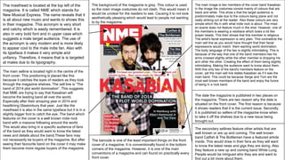
1. The masthead is located at the top left of the
magazine. It is called NME which stands for
New Musical Express. The name reveals that it
is all about new music and wants to shows this
in their magazine. This acronym is very short
and catchy which is easily remembered. It is
also in very bold font and in upper case which
suggests a male target audience. The use of
the acronym is very modern and is more likely
to appear cool to the male indie fan. Also with
its typeface it makes it very simple and
unfancy. Therefore, it means that is is targeted
at males due to its typography.
The main image is two members of the cover band Kasabian.
In the image the costumes consist mainly of colours that are
black and white. This show s that the target audience is
predominately male due to the colours being plane and not
really striking out at the reader. Also these colours are very
simple which fits in with what indie rock is about. The mise-
en-scene does not feature much in the shot. However, one of
the members is wearing a necklace which looks a lot like
prayer beads. This then shows that this member is religious.
The artist's facial expression is very plain. This contradicts the
main sell line as you would have thought that their facial
expressions would match them wanting world domination.
The body language of the two is slightly intimidating. This is
because of the way that one of the band members has his
arms crossed slightly while the other member is dropping his
arm other the other. Creating the effect of them being slightly
intimidating. Making the audience want to know about them.
With this only two of the band's members feature on the
cover, yet the main sell line states Kasabian as if it was the
main band. This could be because Serge and Tom are the
most well known members of the band and enjoy the furore
of being in a rock band.
The secondary sellines feature other artists that are
well known or are up and coming. The well known
band Catfish & The Bottlemen have a featured article
inside. This would draw in their fans as they will want
to know the latest news and gigs they are doing. Also
they feature a new up and coming band White Lung.
People would be intrigued who they are and want to
find out a bit more about them.
The main selline is located right in the centre of the
front cover. This positioning is placed like this
because it catches the eyes of readers as they look
through the magazine shelves. The sell line is “The
band of 2014 plot world domination”. This suggests
that NME are trying to say that Kasabian will
become the leading band all over the world.
Especially after their amazing year in 2014 and
headlining Glastonbury that year. Just like the
masthead it is also in the same typeface but it is in a
slightly bigger font to catch the eye. The band which
features on the cover is a well known indie rock
band with a massive following around the world.
This would also bring in a specific audience of fans
of the band as they would want to know the latest
news and details about the band.These fans may
not necessarily be buyers of the magazine. But after
seeing their favourite band on the cover it may make
them become more regular buyers of the magazine.
The barcode is one of the least important things on the front
cover of a magazine. It is conventionally found in the bottom
corners of the magazine. However, it is one of the main
conventions of a magazine and can found on practically every
front cover.
The date the magazine is published in two places on
the magazine. There are two reason why the date is
situated on the front cover. The first reason is because
it shows readers that it is the current issue. Secondly,
it is published so sellers of the magazine know when
to take it off the shelves due to a new issue being
brought out.
The background of the magazine is grey. This colour is used
so the main image costumes do not clash. This would mean it
would be unclear for the readers to see. Causing it to not look
aesthetically pleasing which would lead to people not wanting
to by the magazine.
2. The masthead is located at the top left of the
magazine. It is called Q. This name is very short
which is easily remembered. Q is a unique title as it
is just one letter. This causes an enigma code
because people do not know what the Q stands for. I
think it has be titled like this to make the readers ask
questions about the magazine and what they are
reading. It is also in very bold font and in upper case
which suggests a male target audience. Also the
typeface is not just simple and unfancy but has
some elegance. The font that has been used is from
the serif family, rather than the sans serif family.
This shows that they are targeting an older target
audience due to them appealing to a more mature
rock fan base.
The main selline is located on the left hand side of
the front cover. This positioning is placed like this
because it catches the eyes of readers as they look
through the magazine shelves. The choice of not
covering up part of the main image indicates that
they want to focus on the artist which is featured.
Just like the masthead it is also in the same typeface
but it is in a slightly bigger font to catch the eye.The
band which features on the cover is a iconic indie
rock band. With a massive following around the
world. This would also bring in a specific audience of
fans of the band as they would want to know the
latest news and details about the band. The sell line
would make readers interested in what Noel has to
say about Oasis and the trauma endured. This
intrigues fans as it lingers with the idea of that one
day the brothers will resolve their problems, allowing
the band to reform which would be some of the
biggest news in the indie rock genre.
The barcode is one of the least important things on the front
cover of a magazine. It is conventionally found in the bottom
corners of the magazine. However, it is one of the main
conventions of a magazine and can found on practically every
front cover.
The main image features a medium close-up. This
camera angle lets the target audience see the cover
stars facial expressions. The expression makes the
readers want to know what he is thinking about as he
looks like he is in deep thought. Noel Gallagher is
probably one of the most iconic indie rock artists of all
time. The shot also shows part of Noel's costume
which includes a denham jacket. This costume is
conventional for the genre and is something of which
fans would wear. Causing the magazine to attract a big
crowd of readers as they would want to know a lot
more about what is happening with himself as a solo
artist and that they can self actualize themselves as he
wears similar clothes.
The secondary sellines are placed the right hand side
of the magazine cover. This placement is because it
shows clear separation from the main selline. It means
that there is no confusion with the main feature article
inside. The typography used is a smaller font than the
main selline because they are not the main articles but
need to be told to the readers as it may be something
they want to read. These sell lines feature some iconic
and unknown artists. This suggests that they want to
show that they cover all areas of the genre from icon
The puff has is located on the left hand side of the
magazine in the bottom corner. This puff stands out on
the front cover because it uses a different colour to any
that is on the cover. This means the target audience is
directed straight to it which makes them want to buy
the magazine. The puff looks like iconography from the
indie rock cult classic ‘Quadrophenia’. True fans of the
genre would recognise this causing the front cover to
appeal to them.
3. The masthead is located at the top left of the
magazine. It is called NME which stands for New
Musical Express. The name reveals that it is all about
new music and wants to shows this in their magazine.
This acronym is very short and catchy which is easily
remembered which suggests that they are attracting a
male target audience due to its simplicity. It is also in
very bold font and in upper case which suggests a
male target audience. Also with its typeface it makes it
very simple and unfancy. Therefore, it means that is is
targeted at males due to its typography. The colour is
bright red and bold easily to see. Meaning that people
will be able to see the magazine on the packed
shelves.
The secondary sellines are placed the right hand
side of the magazine cover. This placement is
because it shows clear separation from the main
selline. It means that there is no confusion with the
main feature article inside. The typography used is a
smaller font than the main selline because they are
not the main articles but need to be told to the
readers as it may be something they want to read.
Also it is in a different colour to the main selline
which means it is clearly distinguishable. These sell
lines feature a controversial sell line. This sell line
features one of the lead indie bands the Arctic
monkeys. The sell line would cause readers to buy
the magazine to find out more about the band's
controversial sex tape.
This front cover has used a secondary image. The
image is used to show the readers who else is in the
magazine. In this image, like the main image, the
artists are wearing very plain costumes which
reflects the genre. This image enhances the front
cover because it provides another pull for impulse
buyers. Due to the image being of the well known
band R.E.M. This image can catch the eye of fans
making them buy the magazine to find out why they
are on the front cover.
The main selline is located on the left hand side of the
front cover. This positioning is placed like this because
it catches the eyes of readers as they look through the
magazine shelves. The choice of not covering up part
of the main image indicates that they want to focus on
the artist which is featured. Just like the masthead it is
also in the same typeface but it is in a much bigger font
size to catch the eye. The artist which features on the
cover is from one of the most iconic indie rock bands
who have a massive following around the world. This
sell line would intrigue fans of the artist. First of all is
does not mention Noel’s surname which suggests that
he does not want to be associated with his brother
liam. The second thing is the “starts over” part which
suggests that he wants to completely restart. However,
it may be read into that he wants to resolve the
problems with his brother, reforming the band causing
an enigma code to be formed with his surname not
being on the cover. This would also bring in a specific
audience of fans of the band and the artist as they
would want to know the latest news and details about
himself.
The main image is of the artist that features in the main
selline. This camera shot is a medium close up. It shows the
artist's facial expressions which you can see him using direct
address. This draws in readers as it makes it much more
personal to them as they theoretically are making eye
contact. This image Noel’s costume is very simple and plain.
The simplistic costume of the image signifies the genre of
music and is relatable for the readers.
“It’s like when Definitely Maybe came out, everything
feels out of control” is a pull quote from Noel. This
quote would entice readers because it is suggesting
about when he knew the band Oasis was going to
split up. This would make readers want to know more
as the band is one of the most iconic for the genre.
The font used is completely different to any of the
others. This could be due to the publishers wanting
the quote to stand out amongst the other content on
the page.