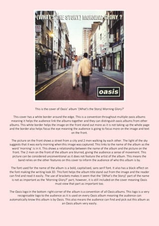
This is the cover of Oasis’ album ‘(What’s the Story) Morning Glory?’
This cover has a white border around the edge. This is a convention throughout multiple oasis albums
meaning it helps the audience link the albums together and they can distinguish oasis albums from other
albums. This white border helps the image on the front stand out more as it is not taking up the whole page
and the border also helps focus the eye meaning the audience is going to focus more on the image and text
on the front.
The picture on the front shows a street from a city and 2 men walking by each other. The light of the sky
suggests that it was early morning when this image was captured. This links to the name of the album as the
word ‘morning’ is in it. This shows a relationship between the name of the album and the picture on the
front. The 2 men on the front of the album are blurred, giving the audience a sense of movement. This
picture can be considered unconventional as it does not feature the artist of the album. This means the
band relies on the other features on this cover to inform the audience of who this album is by.
The font used for the name of the album is a bold, capitalised, sans serif font. It also has a black effect on
the font making the writing look 3D. This font helps the album title stand out from the image and the reader
can find and read it easily. The use of brackets makes it seem that the ‘(What’s the Story)’ part of the name
is not as important as the ‘Morning Glory?’ part; however, it is still included on the cover meaning Oasis
must view that part as important too.
The Oasis logo in the bottom right corner of the album is a convention of all Oasis albums. This logo is a very
recognisable logo to the audience as it is used on every Oasis album meaning the audience can
automatically know this album is by Oasis. This also means the audience can find and pick out this album as
an Oasis album very easily.

Oasis album analysis

  • 1.
    This is thecover of Oasis’ album ‘(What’s the Story) Morning Glory?’ This cover has a white border around the edge. This is a convention throughout multiple oasis albums meaning it helps the audience link the albums together and they can distinguish oasis albums from other albums. This white border helps the image on the front stand out more as it is not taking up the whole page and the border also helps focus the eye meaning the audience is going to focus more on the image and text on the front. The picture on the front shows a street from a city and 2 men walking by each other. The light of the sky suggests that it was early morning when this image was captured. This links to the name of the album as the word ‘morning’ is in it. This shows a relationship between the name of the album and the picture on the front. The 2 men on the front of the album are blurred, giving the audience a sense of movement. This picture can be considered unconventional as it does not feature the artist of the album. This means the band relies on the other features on this cover to inform the audience of who this album is by. The font used for the name of the album is a bold, capitalised, sans serif font. It also has a black effect on the font making the writing look 3D. This font helps the album title stand out from the image and the reader can find and read it easily. The use of brackets makes it seem that the ‘(What’s the Story)’ part of the name is not as important as the ‘Morning Glory?’ part; however, it is still included on the cover meaning Oasis must view that part as important too. The Oasis logo in the bottom right corner of the album is a convention of all Oasis albums. This logo is a very recognisable logo to the audience as it is used on every Oasis album meaning the audience can automatically know this album is by Oasis. This also means the audience can find and pick out this album as an Oasis album very easily.