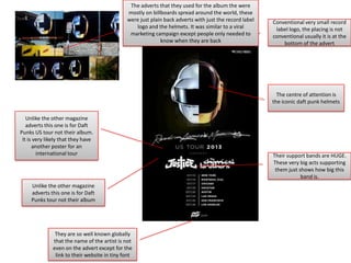
Magazine Analysis
By Ed Dean
The bands name is at the top.
They do not have a generic font
for the band, but have a font
for each album

The album name is
smaller and not in the
main focus

Link to their website offers the
people reading the advert more
information about the band
and album

The red lion on the duller
marble/stone background
stands out clearly and grabs the
consumers attention

Having a quote from one of
their songs in unconventional
to have on the magazine
cover. But it may be a signal to
their fanbase and have a
deeper meaning.

Record label logo in the
corner, conventional place for it
to be put. It also has a
conventional size which is small
and out of main focus
Advert is using thirds technique in
the top third there is the album
art which is used for the front
over of the album. Middle third is
the name of artist and the name
of the album. Bottom third is
extra information
Unconventionally the album
name is larger than the bands
name, this may be because
the Gorillaz are a big band and
that they do not need there
name to be seen

The record labels logo is
very small and hard to
read/see this is
conventional as the
company is not the
important information on
the poster
Link to their website where
there is a role playing game
online which promotes their
album and creates a alternate
reality for people to
explore/play games
The lack of colours in the cover
draws the attention to the pink
lips of the characters

The black background is in the
shape of a crack through the
middle of the advert, this to me
represents the people splitting
up, which contrasts the kissing
and the title of ‘Intimacy’

The very basic font for the
name of the band and album
name are also minimalistic, the
band is quite popular so the
minimalism is probably due to
the fact that their name will sell
the album
Minimalistic cover is very basic,
is just an extreme close up of
kissing. The cover is a link to
the name of the album
“Intimacy”

Basic information added on is
conventional for example the
release date. But it is different
as it has song titles as well.
Artist name in big and their
conventional font

The cover is like some of the
other examples using thirds
technique

The wave style is the waves of
amplitude modulation known
for short as AM
Other information such as the release
date and the name of album added.
Unlike the others it has no link to a
website or anything extra added

AM could stand for either the
initials of the band or the
amplitude modulation waves
that they are using as
minimalistic art

Very basic advert, black and
white cover gives a retro look
Small record label logo,
conventional placing and size
The adverts that they used for the album the were
mostly on billboards spread around the world, these
were just plain back adverts with just the record label
logo and the helmets. It was similar to a viral
marketing campaign except people only needed to
know when they are back

Conventional very small record
label logo, the placing is not
conventional usually it is at the
bottom of the advert

The centre of attention is
the iconic daft punk helmets
Unlike the other magazine
adverts this one is for Daft
Punks US tour not their album.
It is very likely that they have
another poster for an
international tour

Unlike the other magazine
adverts this one is for Daft
Punks tour not their album

They are so well known globally
that the name of the artist is not
even on the advert except for the
link to their website in tiny font

Their support bands are HUGE.
These very big acts supporting
them just shows how big this
band is.

Magazine Analysis

  • 1.
  • 2.
    The bands nameis at the top. They do not have a generic font for the band, but have a font for each album The album name is smaller and not in the main focus Link to their website offers the people reading the advert more information about the band and album The red lion on the duller marble/stone background stands out clearly and grabs the consumers attention Having a quote from one of their songs in unconventional to have on the magazine cover. But it may be a signal to their fanbase and have a deeper meaning. Record label logo in the corner, conventional place for it to be put. It also has a conventional size which is small and out of main focus
  • 3.
    Advert is usingthirds technique in the top third there is the album art which is used for the front over of the album. Middle third is the name of artist and the name of the album. Bottom third is extra information Unconventionally the album name is larger than the bands name, this may be because the Gorillaz are a big band and that they do not need there name to be seen The record labels logo is very small and hard to read/see this is conventional as the company is not the important information on the poster Link to their website where there is a role playing game online which promotes their album and creates a alternate reality for people to explore/play games
  • 4.
    The lack ofcolours in the cover draws the attention to the pink lips of the characters The black background is in the shape of a crack through the middle of the advert, this to me represents the people splitting up, which contrasts the kissing and the title of ‘Intimacy’ The very basic font for the name of the band and album name are also minimalistic, the band is quite popular so the minimalism is probably due to the fact that their name will sell the album Minimalistic cover is very basic, is just an extreme close up of kissing. The cover is a link to the name of the album “Intimacy” Basic information added on is conventional for example the release date. But it is different as it has song titles as well.
  • 5.
    Artist name inbig and their conventional font The cover is like some of the other examples using thirds technique The wave style is the waves of amplitude modulation known for short as AM Other information such as the release date and the name of album added. Unlike the others it has no link to a website or anything extra added AM could stand for either the initials of the band or the amplitude modulation waves that they are using as minimalistic art Very basic advert, black and white cover gives a retro look Small record label logo, conventional placing and size
  • 6.
    The adverts thatthey used for the album the were mostly on billboards spread around the world, these were just plain back adverts with just the record label logo and the helmets. It was similar to a viral marketing campaign except people only needed to know when they are back Conventional very small record label logo, the placing is not conventional usually it is at the bottom of the advert The centre of attention is the iconic daft punk helmets Unlike the other magazine adverts this one is for Daft Punks US tour not their album. It is very likely that they have another poster for an international tour Unlike the other magazine adverts this one is for Daft Punks tour not their album They are so well known globally that the name of the artist is not even on the advert except for the link to their website in tiny font Their support bands are HUGE. These very big acts supporting them just shows how big this band is.