Deconstructions of 3 CD Covers
By Jessica Gough
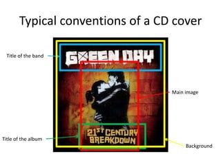
Typical conventions of a CD cover
Title of the band

Main image

Title of the album
Background
Band Name: Tegan and Sara
Album Name: Sainthood
Release date: 27th October 2009
Album Sales: 115,000+
Target Audience: Females 15-25

Sainthood is the 6th studio album of the band Tegan and
Sara. It was released on 27th October 2009 and has sold
115,000 copies in the US as of December 2013. It reached
number 22 on the billboard charts despite being well
received by critics.
On the cover, there is a lack of CD conventions as there is
only a main image and background, with no information
about the band or title. The background appears to be a
gradient, however, it is the background of the cut out which
one of the singers is positioned behind. This might have
been done as they already have a large following outside
the mainstream and because of their 10 years in the music
industry, they would not need to say who they were.
The main image shows the musicians face up, both looking
away from the camera, with one being behind a cut out of a
similar image from a previous photo shoot. The cut-out is a
theme throughout this record as it is used in their music
video for hell in which they describe the concept of it as a
juxtaposition between reality which can change, and the
still perfection which is very flat and stays the same. This
can be related to the album cover as they could be saying
that they have stayed the same (by using the old photo) but
some parts have changed (the up to date face).
They are looking away from the camera, to the point where
one of the musicians whole head is looking to the side. This
adds a sense of mystery to them, as well as tension as they
have a clearly different focal point than the audience.
By using the rule of thirds, they are positioned within the
top two so they are composed in way which the audiences’
eyes will be immediately drawn to them.
Band Name: Panic! At The Disco
Album Name: Vices & Virtues
Release date: 22nd March 2011
Album Sales: 192,000+
Target Audience: Females 13-21

Vices & Virtues is the 3rd studio album of the band Panic! At
The Disco. It was released on 22nd March 2011 and sold
56,000 copies within it’s first week in the US and debuted
at number 7 on the billboard charts. Since then it has sold
over 192,000 copies and it was received mixed reviews
among critics due to the change in band line up.
The typical CD conventions are all used on the CD with a
background and main image being present, as well the band
logo at the top left and the album title at the bottom. The
general theme for the album appears to be similar to steam
punk, which blends fashion and props from an old time
period with new technology.
The band logo appears in the top left hand corner which
immediately attracts the audience as it is large and eye
catching as well as it being in the place where many people
first look to read. The album title is in a much smaller font
at the bottom centre of the album between two of the band
members legs. The text appears small to mark its
insignificant nature in comparison to the logo and the main
image.
The main image is in the foreground of the background, and
has the two band members sitting side by side with their
legs crossed opposite ways. By mirroring each other, they
are implying that they are the same thing, and act as one
person rather than two. In the background it features many
props from the lead single music video which then fades to
black around the border. The fade around the edges of the
cover allows the audience to focus in on the main image
and emphasises it’s importance in the cover.
Band Name: Haim
Album Name: Days Are Gone
Release date: 27th September
2013
Album Sales: 100,000+
Target Audience: Females and
Males 15-25

Days Are Gone is the 1st studio album of the band Haim. It
was released on 27th September 2013 and has sold over
100,00 copies in the UK since it’s release. It reached number
1 on the UK charts, and 6 on the billboard charts and was
well received by critics, but was criticised by some for being
repetitive.
The CD cover contains all the conventions of an album cover
with band’s name and the album title in the top corners and
the main image centred in the middle.
The text is bold and simple in a sans-serif font so it is easy to
read from the distance. The name is the first thing that most
people are drawn to as it is in the top left corner which
most people look at when they read something. This would
automatically lead them to the album name as it is on the
same line, just at the end.
The main image shows the three members of the band all
cross legged and positioned away from the camera,
seemingly looking at something else with sunglasses on.
Their body language makes them appear emotionally
withdrawn from the audience as their legs are crossed, and
because they are looking away they seem mysterious. The
mysteriousness is added to with the sunglasses which hides
their identity. All these aspects make it seem like the band
members want to private and are only comfortable around
each other, hence the closeness of their sitting.
The background is grass, which matches the props used, and
takes up more of the background apart from the top right
corner where there is sand. This could be a tribute to Los
Angeles, where the band primarily are based, and also
contrasts between two different nature aspects.

Deconstructions of 3 cd covers

  • 1.
    Deconstructions of 3CD Covers By Jessica Gough
  • 2.
    Typical conventions ofa CD cover Title of the band Main image Title of the album Background
  • 3.
    Band Name: Teganand Sara Album Name: Sainthood Release date: 27th October 2009 Album Sales: 115,000+ Target Audience: Females 15-25 Sainthood is the 6th studio album of the band Tegan and Sara. It was released on 27th October 2009 and has sold 115,000 copies in the US as of December 2013. It reached number 22 on the billboard charts despite being well received by critics. On the cover, there is a lack of CD conventions as there is only a main image and background, with no information about the band or title. The background appears to be a gradient, however, it is the background of the cut out which one of the singers is positioned behind. This might have been done as they already have a large following outside the mainstream and because of their 10 years in the music industry, they would not need to say who they were. The main image shows the musicians face up, both looking away from the camera, with one being behind a cut out of a similar image from a previous photo shoot. The cut-out is a theme throughout this record as it is used in their music video for hell in which they describe the concept of it as a juxtaposition between reality which can change, and the still perfection which is very flat and stays the same. This can be related to the album cover as they could be saying that they have stayed the same (by using the old photo) but some parts have changed (the up to date face). They are looking away from the camera, to the point where one of the musicians whole head is looking to the side. This adds a sense of mystery to them, as well as tension as they have a clearly different focal point than the audience. By using the rule of thirds, they are positioned within the top two so they are composed in way which the audiences’ eyes will be immediately drawn to them.
  • 4.
    Band Name: Panic!At The Disco Album Name: Vices & Virtues Release date: 22nd March 2011 Album Sales: 192,000+ Target Audience: Females 13-21 Vices & Virtues is the 3rd studio album of the band Panic! At The Disco. It was released on 22nd March 2011 and sold 56,000 copies within it’s first week in the US and debuted at number 7 on the billboard charts. Since then it has sold over 192,000 copies and it was received mixed reviews among critics due to the change in band line up. The typical CD conventions are all used on the CD with a background and main image being present, as well the band logo at the top left and the album title at the bottom. The general theme for the album appears to be similar to steam punk, which blends fashion and props from an old time period with new technology. The band logo appears in the top left hand corner which immediately attracts the audience as it is large and eye catching as well as it being in the place where many people first look to read. The album title is in a much smaller font at the bottom centre of the album between two of the band members legs. The text appears small to mark its insignificant nature in comparison to the logo and the main image. The main image is in the foreground of the background, and has the two band members sitting side by side with their legs crossed opposite ways. By mirroring each other, they are implying that they are the same thing, and act as one person rather than two. In the background it features many props from the lead single music video which then fades to black around the border. The fade around the edges of the cover allows the audience to focus in on the main image and emphasises it’s importance in the cover.
  • 5.
    Band Name: Haim AlbumName: Days Are Gone Release date: 27th September 2013 Album Sales: 100,000+ Target Audience: Females and Males 15-25 Days Are Gone is the 1st studio album of the band Haim. It was released on 27th September 2013 and has sold over 100,00 copies in the UK since it’s release. It reached number 1 on the UK charts, and 6 on the billboard charts and was well received by critics, but was criticised by some for being repetitive. The CD cover contains all the conventions of an album cover with band’s name and the album title in the top corners and the main image centred in the middle. The text is bold and simple in a sans-serif font so it is easy to read from the distance. The name is the first thing that most people are drawn to as it is in the top left corner which most people look at when they read something. This would automatically lead them to the album name as it is on the same line, just at the end. The main image shows the three members of the band all cross legged and positioned away from the camera, seemingly looking at something else with sunglasses on. Their body language makes them appear emotionally withdrawn from the audience as their legs are crossed, and because they are looking away they seem mysterious. The mysteriousness is added to with the sunglasses which hides their identity. All these aspects make it seem like the band members want to private and are only comfortable around each other, hence the closeness of their sitting. The background is grass, which matches the props used, and takes up more of the background apart from the top right corner where there is sand. This could be a tribute to Los Angeles, where the band primarily are based, and also contrasts between two different nature aspects.