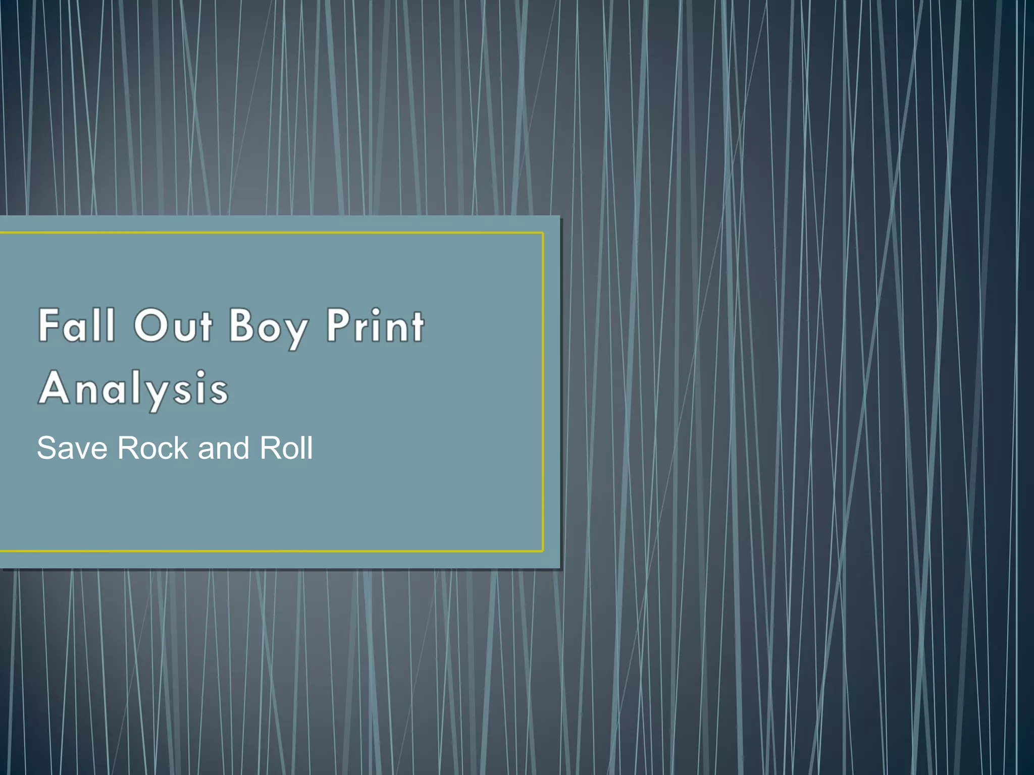
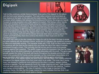
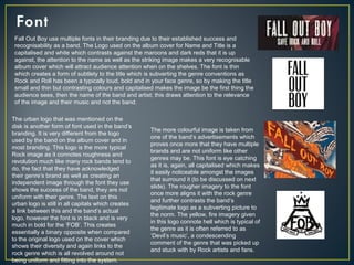
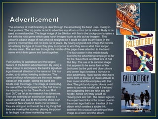
Save Rock and Roll
Fall Out Boy continue a similar theme between three parts of the digipak for this album
with the front cover being the exception. The main colour scheme is red and black as
they feature on the back, on the disk and the inside covers. These colour red connotes
revolution which creates a link between the branding and the lyrics, the songs are heavily
focused on young revolution and a fight against the system. Red being a colour heavily
linked with revolution (France and Russia being two notable examples) connotes the
revolt that their music is focused on, the black running down like liquid could therefore
indicate the blood of the oppressor. Black connotes the darkness that is forced upon the
oppressed population, in this case the band, genre and fans, which would justify the
black in the blood running down the digipak inside cover. The idea of revolution in the
genre is very strong, rock and roll has always famously been about revolting against the
system and Fall Out Boy there fore continue this theme in their music and are now
branding around it.
The urban logo used on the disc creates the image of a cult for the band; the logo is simple
and when keeping with the revolution theme, would give it’s followers (the audience) something
to follow and essentially worship. The triangular shape with ‘FOB’ (Fall Out Boy) inside bands
the audience with the band as the majority who are under the rule of the rulers of society,
symbolised through a crown. This connotes that fall out boy are the voice of the people,
speaking against their superiors. The graffiti imagery gives the impression that their fan base
is younger due to the street implications, something associates with the youth. The genre again
typically speaks the voice of the youth with bands throughout the decades aiming their rock
music at the young (AC-DC being a prime example), so this modernised interpretation of a
young population which need a voice is continued which follows genre conventions.
The back cover of the digipak follows the same theme, Red with Black, this creates uniformity
throughout the digipak except of the front cover which is an outlier. The cover has 2 young
boys, one dressed in traditional monk clothing and the other in modern, western clothes
smoking a cigarette. The ban apparently found this image inspiring and said "really solidified
what we were trying to get across on the record: The idea of old and new clashing. Tradition
and change coming together“. The idea of inspiration in the image is important for the
revolution theme, the idea that this image inspired the band indicates that they think it can
inspire the audience too which would spark a change.
Fall Out Boy use multiple fonts in their branding due to their established success and
recognisability as a band. The Logo used on the album cover for Name and Title is a
capitalised and white which contrasts against the maroons and dark reds that it is up
against, the attention to the name as well as the striking image makes a very recognisable
album cover which will attract audience attention when on the shelves. The font is thin
which creates a form of subtlety to the title which is subverting the genre conventions as
Rock and Roll has been a typically loud, bold and in your face genre, so by making the title
small and thin but contrasting colours and capitalised makes the image be the first thing the
audience sees, then the name of the band and artist; this draws attention to the relevance
of the image and their music and not the band.
The urban logo that was mentioned on the
disk is another form of font used in the band’s
branding. It is very different from the logo
used by the band on the album cover and in
most branding. This logo is the more typical
Rock image as it connotes roughness and
revolution much like many rock bands tend to
do, the fact that they have acknowledged
their genre’s brand as well as creating an
independent image through the font they use
shows the success of the band, they are not
uniform with their genre. The text on this
urban logo is still in all capitals which creates
a link between this and the band’s actual
logo, however the font is in black and is very
much in bold for the ‘FOB’. This creates
essentially a binary opposite when compared
to the original logo used on the cover which
shows their diversity and again links to the
rock genre which is all revolved around not
being uniform and fitting into the system.
The more colourful image is taken from
one of the band’s advertisements which
proves once more that they have multiple
brands and are not uniform like other
genres may be. This font is eye catching
as it is, again, all capitalised which makes
it easily noticeable amongst the images
that surround it (to be discussed on next
slide). The rougher imagery to the font
once more aligns it with the rock genre
and further contrasts the band’s
legitimate logo as a subverting picture to
the norm. The yellow, fire imagery given
in this logo connote hell which is typical of
the genre as it is often referred to as
‘Devil’s music’, a condescending
comment of the genre that was picked up
and stuck with by Rock artists and fans.
The evidence of multi branding is clear through the advertising the band uses, mainly in
their posters. The top poster is not to advertise any album or tour but is instead likely to be
used as merchandise. The large image of the Skelton with fire in the background creates a
link with the rock genre which uses harsh imagery such as this as key imagery. This
poster is a base image of rock and roll designed so it could be used as any band in the
genre’s merchandise and not look out of place. By having a typical rock image the band is
advertising the type of music they play as oppose to who they are or what their songs/
albums mean. The red tear through the middle of the page draws attention to the band
name which links genre and band together.
‘Fall Out Boy’ is capitalised and the largest
feature of the bottom advertisement. By using a
black colour to accompany the band’s signature
logo draws all attention to the name on this tour
poster, so to attract existing audiences. The
name and tour information are the most notable
pieces on this poster, selling the band and
tickets over the image. The image is interesting,
the use of the band appears for the first time in
the advertising for the ‘Save Rock and Roll;
tour/ DVD as far as my research has taken me.
They are selling to an existing fan base so it
would seem and due to the fact the show is an
Auckland, New Zealand, leads me to believe
they are doing so as it would be a big thing that
they are making the journey; playing the poster
to fan hype is a clever marketing move.
The tour poster in the middle totally
subverts the advertising campaign so far
for the ‘Save Rock and Roll’ era of Fall
Out Boy. The use of ta cartoon image
that appears to be some form of Her
(indicated by the gold and blue colours
and crown logo) creates a humour to
their advertising. Rock bands often have
some form of tongue in cheek attitude to
their music and this complies with that
idea. The gold and purple colours used
seem to connote royalty, as if the band
are suggesting they are rock and roll
royalty, hence why they would be
‘Saving rock and roll’. The crown logo on
the super hero links to the crown used in
the urban logo that is on the disk of the
album which creates a subtle link
between this unusual subverting of their
image as a band and the album.

Fall out boy print analysis

  • 1.
  • 2.
    Fall Out Boycontinue a similar theme between three parts of the digipak for this album with the front cover being the exception. The main colour scheme is red and black as they feature on the back, on the disk and the inside covers. These colour red connotes revolution which creates a link between the branding and the lyrics, the songs are heavily focused on young revolution and a fight against the system. Red being a colour heavily linked with revolution (France and Russia being two notable examples) connotes the revolt that their music is focused on, the black running down like liquid could therefore indicate the blood of the oppressor. Black connotes the darkness that is forced upon the oppressed population, in this case the band, genre and fans, which would justify the black in the blood running down the digipak inside cover. The idea of revolution in the genre is very strong, rock and roll has always famously been about revolting against the system and Fall Out Boy there fore continue this theme in their music and are now branding around it. The urban logo used on the disc creates the image of a cult for the band; the logo is simple and when keeping with the revolution theme, would give it’s followers (the audience) something to follow and essentially worship. The triangular shape with ‘FOB’ (Fall Out Boy) inside bands the audience with the band as the majority who are under the rule of the rulers of society, symbolised through a crown. This connotes that fall out boy are the voice of the people, speaking against their superiors. The graffiti imagery gives the impression that their fan base is younger due to the street implications, something associates with the youth. The genre again typically speaks the voice of the youth with bands throughout the decades aiming their rock music at the young (AC-DC being a prime example), so this modernised interpretation of a young population which need a voice is continued which follows genre conventions. The back cover of the digipak follows the same theme, Red with Black, this creates uniformity throughout the digipak except of the front cover which is an outlier. The cover has 2 young boys, one dressed in traditional monk clothing and the other in modern, western clothes smoking a cigarette. The ban apparently found this image inspiring and said "really solidified what we were trying to get across on the record: The idea of old and new clashing. Tradition and change coming together“. The idea of inspiration in the image is important for the revolution theme, the idea that this image inspired the band indicates that they think it can inspire the audience too which would spark a change.
  • 3.
    Fall Out Boyuse multiple fonts in their branding due to their established success and recognisability as a band. The Logo used on the album cover for Name and Title is a capitalised and white which contrasts against the maroons and dark reds that it is up against, the attention to the name as well as the striking image makes a very recognisable album cover which will attract audience attention when on the shelves. The font is thin which creates a form of subtlety to the title which is subverting the genre conventions as Rock and Roll has been a typically loud, bold and in your face genre, so by making the title small and thin but contrasting colours and capitalised makes the image be the first thing the audience sees, then the name of the band and artist; this draws attention to the relevance of the image and their music and not the band. The urban logo that was mentioned on the disk is another form of font used in the band’s branding. It is very different from the logo used by the band on the album cover and in most branding. This logo is the more typical Rock image as it connotes roughness and revolution much like many rock bands tend to do, the fact that they have acknowledged their genre’s brand as well as creating an independent image through the font they use shows the success of the band, they are not uniform with their genre. The text on this urban logo is still in all capitals which creates a link between this and the band’s actual logo, however the font is in black and is very much in bold for the ‘FOB’. This creates essentially a binary opposite when compared to the original logo used on the cover which shows their diversity and again links to the rock genre which is all revolved around not being uniform and fitting into the system. The more colourful image is taken from one of the band’s advertisements which proves once more that they have multiple brands and are not uniform like other genres may be. This font is eye catching as it is, again, all capitalised which makes it easily noticeable amongst the images that surround it (to be discussed on next slide). The rougher imagery to the font once more aligns it with the rock genre and further contrasts the band’s legitimate logo as a subverting picture to the norm. The yellow, fire imagery given in this logo connote hell which is typical of the genre as it is often referred to as ‘Devil’s music’, a condescending comment of the genre that was picked up and stuck with by Rock artists and fans.
  • 4.
    The evidence ofmulti branding is clear through the advertising the band uses, mainly in their posters. The top poster is not to advertise any album or tour but is instead likely to be used as merchandise. The large image of the Skelton with fire in the background creates a link with the rock genre which uses harsh imagery such as this as key imagery. This poster is a base image of rock and roll designed so it could be used as any band in the genre’s merchandise and not look out of place. By having a typical rock image the band is advertising the type of music they play as oppose to who they are or what their songs/ albums mean. The red tear through the middle of the page draws attention to the band name which links genre and band together. ‘Fall Out Boy’ is capitalised and the largest feature of the bottom advertisement. By using a black colour to accompany the band’s signature logo draws all attention to the name on this tour poster, so to attract existing audiences. The name and tour information are the most notable pieces on this poster, selling the band and tickets over the image. The image is interesting, the use of the band appears for the first time in the advertising for the ‘Save Rock and Roll; tour/ DVD as far as my research has taken me. They are selling to an existing fan base so it would seem and due to the fact the show is an Auckland, New Zealand, leads me to believe they are doing so as it would be a big thing that they are making the journey; playing the poster to fan hype is a clever marketing move. The tour poster in the middle totally subverts the advertising campaign so far for the ‘Save Rock and Roll’ era of Fall Out Boy. The use of ta cartoon image that appears to be some form of Her (indicated by the gold and blue colours and crown logo) creates a humour to their advertising. Rock bands often have some form of tongue in cheek attitude to their music and this complies with that idea. The gold and purple colours used seem to connote royalty, as if the band are suggesting they are rock and roll royalty, hence why they would be ‘Saving rock and roll’. The crown logo on the super hero links to the crown used in the urban logo that is on the disk of the album which creates a subtle link between this unusual subverting of their image as a band and the album.