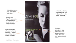
Image of artist, matches image
on digipak – star appeal
Artist name – bold,
eye-catching
Album name – direct link to
digipak
Mention of hit singles – attracts
fans, direct link to digipak,
language such as ‘#1
international smash’ implies
quality/credibility
Link to artist website –
technological/cultural
convergence
Institutional logos
Same colour scheme,
image, text, font and
style as digipak
Artist/album name –
bold, eye-catching
focal point
Mention of hit
single/language such
as ‘grammy award
winner’ to imply
quality/credibility
Same colour scheme,
image style, text, font
and overall aesthetic
quality as digipak
‘Available
everywhere now’
information (uses
and gratifications)
which encourages
fans to purchase the
album
Image of digipak –
allows consumers to
recognise it, makes it
clear which product
is being marketed
Institutional information
Summary of key features
• Use of same colour scheme, image, text, font and style as digipak – creates a
direct link to the product being marketed and allows a consistent brand/product
identity to be created, making the product more recognisable to consumers
• Artist/album names as bold, eye-catching focal points – reinforces the product
being advertised whilst simultaneously attracting fans
• Mention of hit singles with language such as ‘#1 international smash’- implies
quality/credibility/popularity which entices new consumers, whilst also allowing
people with an existing personal relationship (uses and gratifications theory) with
the product to recognise it
• Institutional information/logos – a requirement of a symbiotic relationship, but
arguably adds to the products’ connotations (i.e a conglomerate company
suggests credibility, whilst an independent company suggests uniqueness)

Poster annotation

  • 1.
    Image of artist,matches image on digipak – star appeal Artist name – bold, eye-catching Album name – direct link to digipak Mention of hit singles – attracts fans, direct link to digipak, language such as ‘#1 international smash’ implies quality/credibility Link to artist website – technological/cultural convergence Institutional logos Same colour scheme, image, text, font and style as digipak
  • 2.
    Artist/album name – bold,eye-catching focal point Mention of hit single/language such as ‘grammy award winner’ to imply quality/credibility Same colour scheme, image style, text, font and overall aesthetic quality as digipak ‘Available everywhere now’ information (uses and gratifications) which encourages fans to purchase the album Image of digipak – allows consumers to recognise it, makes it clear which product is being marketed Institutional information
  • 3.
    Summary of keyfeatures • Use of same colour scheme, image, text, font and style as digipak – creates a direct link to the product being marketed and allows a consistent brand/product identity to be created, making the product more recognisable to consumers • Artist/album names as bold, eye-catching focal points – reinforces the product being advertised whilst simultaneously attracting fans • Mention of hit singles with language such as ‘#1 international smash’- implies quality/credibility/popularity which entices new consumers, whilst also allowing people with an existing personal relationship (uses and gratifications theory) with the product to recognise it • Institutional information/logos – a requirement of a symbiotic relationship, but arguably adds to the products’ connotations (i.e a conglomerate company suggests credibility, whilst an independent company suggests uniqueness)