
Recommended
More Related Content
What's hot
What's hot (20)
Viewers also liked
Viewers also liked (11)
Similar to Albums
Similar to Albums (20)
More from TiffanySLB
Recently uploaded
Recently uploaded (20)
Albums
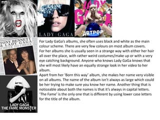
- 1. For Lady GaGa’s albums, she often uses black and white as the main colour scheme. There are very few colours on most album covers. For her albums she is usually seen in a strange way with either her hair all over the place, with rather weird costumes/make up or with a very eye catching background. Anyone who knows Lady GaGa knows that she will most likely have an equally strange look in her video to her album. Apart from her ‘Born this way’ album, she makes her name very visible on all albums. The name of the album isn’t always as large which could be her trying to make sure you know her name. Another thing that is noticeable about both the names is that it’s always in capital letters. ‘The Fame’ is the only one that is different by using lower case letters for the title of the album.
- 2. The title ‘DNA’ and the name Little Mix on the last 2 albums are written in a similar font. After their first album they began using the same font style for their name. The colour of the titles and names are all very contrasting and bright to the rest of the album cover to stand out against it and be easily seen. In every album of theirs we see each member equally which shows they are part of a group. Their clothes are also similar in the sense that they all have light coloured costumes or all have dark coloured costumes. In their last album, they all have patterned costume that match up to the wall with different patterns behind them. In each album, they use very bright colours that are very eye catching. Since they haven’t been around for a very long time, they will want to grab people’s attention in the shops.
- 3. Take That’s albums usually are very simple. ‘Nobody else’ being the exception with a rather elaborate scene. Each album uses images that are quite bright for lighting. The name Take That is almost always in capital letters for their albums. ‘Everything Changes’ uses all Lower case letters for the name. On each album the name of the group is larger than the name of the album making it very clear as to who the group is. In the album images, we can see that the costumes worn by everyone are very similar to each other.
- 4. In all of Olly Murs’ albums we can see that he is the solo artists because he is the only person we see and he is always in the middle of the picture. In his first 3 albums his name is written in a similar way. Except ‘Never been better’ they all use the same font. Each album uses the same idea of making his name the biggest text. This is so people will see it’s Olly Murs straight away. Capital letters are mostly used for the title of the album except the album called ‘Olly Murs’ since it’s the artists’ name as well. The main colours seen on all his albums is white or a light grey. It’s usually the background colour. His album ‘Right place Right time’ has him wearing a white shirt with white text behind him on a slight blueish grey wall. This one is the odd one out. Red is common to see in small amounts but not on ‘Never been better’.
- 5. For most of The Script’s albums the have used the same font style for their name. Their first album is different which shows they decided on a different style after their first album. One similarity between the first album and the rest is the ‘The’ is smaller than the ‘Script’ The title of their albums are different as there is a variety of sizes. Their first album doesn’t have a title at all meaning the name of the group is the title of the album. ‘#3’ is the biggest title they have. For most of their albums they have their name as the biggest text to show people who the album is by. For their album covers, they have used darker colours mostly. They have also decided to have images that mostly don’t feature them. ‘#3’ is the only album with their faces on it. This makes it harder for people to know what they look like ‘Science and Faith’ and ‘#3’ are the most alike as they have a very limited number of colours using black, white, yellow and brown. The other 2 albums use a larger colour range.
- 6. For Jessie J’s albums we can clearly see straight away that she uses black a lot. Her clothes and hair in the first and last albums are black. In her second album, it’s just the title of the album that’s black. Gold is another colour used on her albums. In the first it was just for her name, the second used gold on the hair and earrings and the third has her wearing golden accessories. For her last 2 albums, she has used the same font style for her name. This shows that she has a style now after her first album that she will keep using. Her name is also rather small in the last 2 albums. In the second album the title is larger showing people what the albums is called before they see her name. For this album she may have been relying on people to know that she had cut her hair and would still recognise her. For her third album, she is keeping her name the same size but making the title of the album smaller. This shows that the title of the album isn’t as important as her name and she wants people to know it’s her now that she has hair again. The album ‘Sweet Talker’ also uses a different background colour. In the first 2 albums it was white but in her last album it’s grey.
- 7. In Bruno Mars’ album covers, we don’t see him. This makes it harder for people to know what he looks like since they can’t see him on the cover. He has kept this consistent throughout these covers. In the album images it’s just illustrations. The last one links with the title as there is a jukebox next to a gorilla. Each album uses one colour as its main colour. Red, yellow and an off white are the colours used in the backgrounds. These make the albums stand out quite well and would grab someone’s attention if they were to download the song from somewhere like iTunes. For his name, the font seems to be different. This shows that there isn’t one clear set style for the artist. The 2nd and 3rd albums have similar font styles but one is done with neon lights. The title of each album is always smaller than the name showing that he wants people to know it’s him that created the album rather than hoping people recognise his albums.
- 8. For Girls Aloud, most of their album covers have them on the front. We can see each girl clearly showing that they are part of a group. ‘Tangled Up’ is the only album that doesn’t have them on the front for the image. Instead we only see the name of the group and the title of the album. For each album, we see there is a large use of bold colours. In their 1st album the bold colours are in the background With them wearing silver costumes. With the background mostly black, their costumes stand out a lot and draws our focus to the group. In the 2nd and 3rd album we can’t see their costumes as much so it’s harder to tell what they’re wearing. In the 3rd one we can see some pink on 3 of the girls so we assume that everyone is wearing pink. For the text on the covers we can see that there is a different font for each album. The name of the group doesn’t use the same font making each album look slightly different from the others. The images are rather simple and would only require some pieces of equipment to make.