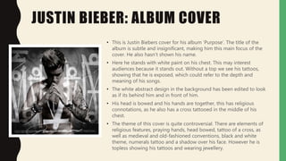
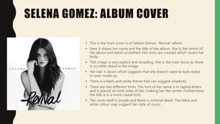
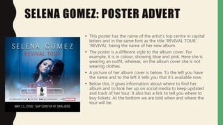
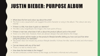
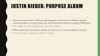
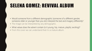
ANNOTATED
DIGIPAK AND
ADVERT
RESEARCH
JUSTIN BIEBER: ALBUM COVER
• This is Justin Biebers cover for his album ‘Purpose’. The title of the
album is subtle and insignificant, making him this main focus of the
cover. He also hasn’t shown his name.
• Here he stands with white paint on his chest. This may interest
audiences because it stands out. Without a top we see his tattoos,
showing that he is exposed, which could refer to the depth and
meaning of his songs.
• The white abstract design in the background has been edited to look
as if its behind him and in front of him.
• His head is bowed and his hands are together, this has religious
connotations, as he also has a cross tattooed in the middle of his
chest.
• The theme of this cover is quite controversial. There are elements of
religious features, praying hands, head bowed, tattoo of a cross, as
well as medieval and old-fashioned conventions, black and white
theme, numerals tattoo and a shadow over his face. However he is
topless showing his tattoos and wearing jewellery.
JUSTIN BIEBER: BACK COVER
• This back cover correspond well with the front cover
design. Furthermore, they have continued the black and
white theme, and a white blurred font.
• Alongside this, there are further notes that show other
artists that feature in the songs. This font appears to
look hand-written, which shows a casual and informal
layout, possibly corresponding with his attitude or
characteristic in this album.
• We can assume that it is him walking across the
aeroplane because we do not see his face as he is
wearing a hood. He also appears to be holding a skate
board.
• The plane could be edited in or it could be a piece of
set. This is impressive and dangerous. This will appeal to
audiences because it’s an interesting image.
JUSTIN BIEBER: POSTER ADVERT
• Here he has maintained the black and white theme.
However this image is clearer and simpler in
comparison to his album, this is because the image has
to stand out to interest audiences. Therefore the
poster needs to be obvious and appealing.
• In comparison to the album cover, here his head is
lifted and we can recognise that it is him.
• In the poster he highlights his name and tour, this is an
important message as this is what will appeal to
audiences.
• The font is clear but still casual. Distinct font is
important so that people can read the dates, location
and website details. The poster states the key
information.
SELENA GOMEZ: ALBUM COVER
• This is the front cover is of Selena Gomez, ‘Revival’ album.
• Here it shows her name and the title of the album. She is the centre of
the album and stand unclothed. Her arms are crossed which covers her
body.
• This image is very explicit and revealing. She is the main focus as there
is no other detail in the image.
• Her hair is down which suggests that she doesn't want to look styled
or over-made up.
• There is a black and white theme that can suggest simplicity.
• There are two different fonts. The font of her name is in capital letters
and is placed on both sides of her, making her the centre. Furthermore,
the title is in a more causal font.
• The cover itself is simple and there is minimal detail. The black and
white colour may suggest her style of music.
SELENA GOMEZ: BACK COVER
• Here we see the colour orange with is the title of the
songs.
• The songs are in a similar font to her name on the
front cover.
• We see her again, but here she is wearing clothing on
her lower half. She is also showing her tattoo.
• The back cover is still very exposing. The song list font
and size are small and simple, inferring that Selena
should be the centre of attention. The pink is the first
colour we notice on her whole album. The font is the
same to how her name is written to continue the
formality of the cover. Possible to gain elegance and
professionalism to the theme of nudity
SELENA GOMEZ: POSTER ADVERT
• This poster has the name of the artist’s top centre in capital
letters and in the same font as the title ‘REVIVAL TOUR’.
‘REVIVAL’ being the name of her new album.
• The poster is a different style to the album cover. For
example, it is in colour, showing blue and pink. Here she is
wearing an outfit, whereas, on the album cover she is not
wearing clothes.
• A picture of her album cover is below. To the left you have
the name and to the left it tells you that it’s available now.
• Below this, it gives information about where to find her
album and to look her up on social media to keep updated
and track of her tour. It also has a link to tell you where to
buy tickets. At the bottom we are told when and where the
tour will be.
JUSTIN BIEBER: PURPOSE ALBUM
• What does the font and colour say about the artist?
• The font is very casual which can suggest the artist character or song in the album. The colours are very
neutral.
• If there is a title, how does it grab our attention?
• The title is very insignificant, the image is the main point of focus.
• If there is main text, what does it tell us about the product (album) and or the artist?
• There is no other text. However, there are abreact designs that add detail to the image.
• Does the advert sell the reader on the product's lifestyle benefits (telling you how cool you'll be when
using the product, for example)?
• The poster does not include any product lifestyle benefits. It shows the title, name of artist and information
of tour.
• Can we interact with any of the text?
• There is no text to interact with.
• How does the text relate to the images?
• the text continues a similar theme to the image, as the text is informal and unfocussed.
JUSTIN BIEBER: PURPOSE ALBUM
• How does the photograph/image grab our attention?
• The phot grabs our attention because it shows his bowed head that may make audiences want to understand further
the image.
• Is the picture depicting the artist themselves?
• I think the picture shows the characteristics of the artist because the album is very nonchalant, which may be an
interpretation that he wants audiences to assume.
• Does the photograph show us a lifestyle associated with the product (essentially telling us how the product would make
our life better)?
• The cover does not show or suggest a type of lifestyle.
• Is the image representing a demographic? (gender, age etc)
• It does not represent a demographic except the features of himself. He is a male and his age is 25.
• If there is a person used, what costumes, colours are used? What does this say about the artist?
• In the cover image, the artist is seen not wearing a top and neutral colours are used. I think this describes his character as
being quite controversial.
• How do the images relate to the text?
• The image relates to the text because the title is difficult to read, reinforced by the image detail.
JUSTIN BIEBER: PURPOSE ALBUM
• Would someone from a different demographic (someone of a different gender,
someone older or younger than you etc) interpret the text and imagery differently?
• The image can be interpreted by any demographic.
• What values does the advert contain (is it young, hip, mature, playful, exciting)?
• The front cover suggest the artist is modern.
SELENA GOMEZ: REVIVAL ALBUM
• What does the font and colour say about the artist?
• The font style is very simple and plain, however I do not think this corresponds with the artist. I believe that they have wanted to make their album style just
focus on the basics, and possibly create a deep meaning.
• If there is a title, how does it grab our attention?
• The title grabs our attention because it is a different font from the artist names and appears larger on the font over. Additionally, the title may suggest
about the music or the artist.
• If there is main text, what does it tell us about the product (album) and or the artist?
• There is no other text.
• Does the advert sell the reader on the product's lifestyle benefits (telling you how cool you'll be when using the product, for example)?
• The poster advert states the artist’s names, title, details of tour and purchasing methods but doesn’t promote the album through lifestyle benefits.
• Can we interact with any of the text?
• There is no text to interact with.
• How does the text relate to the images?
• The text relates to the image, because the style of both is very minimal. However the title ‘Revival’, does not show relation to the image.
SELENA GOMEZ: REVIVAL ALBUM
• How does the photograph/image grab our attention?
• The image grabs our attention because it is
• Is the picture depicting the artist themselves?
• She is using nudity to show her emotions, which are exposing her true features. This may have relation to the album songs.
• Does the photograph show us a lifestyle associated with the product (essentially telling us how the product would make our life
better)?
• The product does not promote a better lifestyle. This is because the image is very explicit and allows for audiences to interpret it
themselves.
• Is the image representing a demographic? (gender, age etc)
• The image does not represent a demographic. However the artist we see in female and her age is 26.
• If there is a person used, what costumes, colours are used? What does this say about the artist?
• The artist is posing unclothes and black and white colours are used.
• How do the images relate to the text?
• The image relates to the text because the image is very clear and overt. Whereby, the text states her name and the title of the
an obvious way.
SELENA GOMEZ: REVIVAL ALBUM
• Would someone from a different demographic (someone of a different gender,
someone older or younger than you etc) interpret the text and imagery differently?
• The image can be interpreted by any demographic.
• What values does the advert contain (is it young, hip, mature, playful, exciting)?
• From this cover we can understand that it is a mature album.

Lo1 c) annotated digipak and advert research

  • 1.
  • 2.
    JUSTIN BIEBER: ALBUMCOVER • This is Justin Biebers cover for his album ‘Purpose’. The title of the album is subtle and insignificant, making him this main focus of the cover. He also hasn’t shown his name. • Here he stands with white paint on his chest. This may interest audiences because it stands out. Without a top we see his tattoos, showing that he is exposed, which could refer to the depth and meaning of his songs. • The white abstract design in the background has been edited to look as if its behind him and in front of him. • His head is bowed and his hands are together, this has religious connotations, as he also has a cross tattooed in the middle of his chest. • The theme of this cover is quite controversial. There are elements of religious features, praying hands, head bowed, tattoo of a cross, as well as medieval and old-fashioned conventions, black and white theme, numerals tattoo and a shadow over his face. However he is topless showing his tattoos and wearing jewellery.
  • 3.
    JUSTIN BIEBER: BACKCOVER • This back cover correspond well with the front cover design. Furthermore, they have continued the black and white theme, and a white blurred font. • Alongside this, there are further notes that show other artists that feature in the songs. This font appears to look hand-written, which shows a casual and informal layout, possibly corresponding with his attitude or characteristic in this album. • We can assume that it is him walking across the aeroplane because we do not see his face as he is wearing a hood. He also appears to be holding a skate board. • The plane could be edited in or it could be a piece of set. This is impressive and dangerous. This will appeal to audiences because it’s an interesting image.
  • 4.
    JUSTIN BIEBER: POSTERADVERT • Here he has maintained the black and white theme. However this image is clearer and simpler in comparison to his album, this is because the image has to stand out to interest audiences. Therefore the poster needs to be obvious and appealing. • In comparison to the album cover, here his head is lifted and we can recognise that it is him. • In the poster he highlights his name and tour, this is an important message as this is what will appeal to audiences. • The font is clear but still casual. Distinct font is important so that people can read the dates, location and website details. The poster states the key information.
  • 5.
    SELENA GOMEZ: ALBUMCOVER • This is the front cover is of Selena Gomez, ‘Revival’ album. • Here it shows her name and the title of the album. She is the centre of the album and stand unclothed. Her arms are crossed which covers her body. • This image is very explicit and revealing. She is the main focus as there is no other detail in the image. • Her hair is down which suggests that she doesn't want to look styled or over-made up. • There is a black and white theme that can suggest simplicity. • There are two different fonts. The font of her name is in capital letters and is placed on both sides of her, making her the centre. Furthermore, the title is in a more causal font. • The cover itself is simple and there is minimal detail. The black and white colour may suggest her style of music.
  • 6.
    SELENA GOMEZ: BACKCOVER • Here we see the colour orange with is the title of the songs. • The songs are in a similar font to her name on the front cover. • We see her again, but here she is wearing clothing on her lower half. She is also showing her tattoo. • The back cover is still very exposing. The song list font and size are small and simple, inferring that Selena should be the centre of attention. The pink is the first colour we notice on her whole album. The font is the same to how her name is written to continue the formality of the cover. Possible to gain elegance and professionalism to the theme of nudity
  • 7.
    SELENA GOMEZ: POSTERADVERT • This poster has the name of the artist’s top centre in capital letters and in the same font as the title ‘REVIVAL TOUR’. ‘REVIVAL’ being the name of her new album. • The poster is a different style to the album cover. For example, it is in colour, showing blue and pink. Here she is wearing an outfit, whereas, on the album cover she is not wearing clothes. • A picture of her album cover is below. To the left you have the name and to the left it tells you that it’s available now. • Below this, it gives information about where to find her album and to look her up on social media to keep updated and track of her tour. It also has a link to tell you where to buy tickets. At the bottom we are told when and where the tour will be.
  • 8.
    JUSTIN BIEBER: PURPOSEALBUM • What does the font and colour say about the artist? • The font is very casual which can suggest the artist character or song in the album. The colours are very neutral. • If there is a title, how does it grab our attention? • The title is very insignificant, the image is the main point of focus. • If there is main text, what does it tell us about the product (album) and or the artist? • There is no other text. However, there are abreact designs that add detail to the image. • Does the advert sell the reader on the product's lifestyle benefits (telling you how cool you'll be when using the product, for example)? • The poster does not include any product lifestyle benefits. It shows the title, name of artist and information of tour. • Can we interact with any of the text? • There is no text to interact with. • How does the text relate to the images? • the text continues a similar theme to the image, as the text is informal and unfocussed.
  • 9.
    JUSTIN BIEBER: PURPOSEALBUM • How does the photograph/image grab our attention? • The phot grabs our attention because it shows his bowed head that may make audiences want to understand further the image. • Is the picture depicting the artist themselves? • I think the picture shows the characteristics of the artist because the album is very nonchalant, which may be an interpretation that he wants audiences to assume. • Does the photograph show us a lifestyle associated with the product (essentially telling us how the product would make our life better)? • The cover does not show or suggest a type of lifestyle. • Is the image representing a demographic? (gender, age etc) • It does not represent a demographic except the features of himself. He is a male and his age is 25. • If there is a person used, what costumes, colours are used? What does this say about the artist? • In the cover image, the artist is seen not wearing a top and neutral colours are used. I think this describes his character as being quite controversial. • How do the images relate to the text? • The image relates to the text because the title is difficult to read, reinforced by the image detail.
  • 10.
    JUSTIN BIEBER: PURPOSEALBUM • Would someone from a different demographic (someone of a different gender, someone older or younger than you etc) interpret the text and imagery differently? • The image can be interpreted by any demographic. • What values does the advert contain (is it young, hip, mature, playful, exciting)? • The front cover suggest the artist is modern.
  • 11.
    SELENA GOMEZ: REVIVALALBUM • What does the font and colour say about the artist? • The font style is very simple and plain, however I do not think this corresponds with the artist. I believe that they have wanted to make their album style just focus on the basics, and possibly create a deep meaning. • If there is a title, how does it grab our attention? • The title grabs our attention because it is a different font from the artist names and appears larger on the font over. Additionally, the title may suggest about the music or the artist. • If there is main text, what does it tell us about the product (album) and or the artist? • There is no other text. • Does the advert sell the reader on the product's lifestyle benefits (telling you how cool you'll be when using the product, for example)? • The poster advert states the artist’s names, title, details of tour and purchasing methods but doesn’t promote the album through lifestyle benefits. • Can we interact with any of the text? • There is no text to interact with. • How does the text relate to the images? • The text relates to the image, because the style of both is very minimal. However the title ‘Revival’, does not show relation to the image.
  • 12.
    SELENA GOMEZ: REVIVALALBUM • How does the photograph/image grab our attention? • The image grabs our attention because it is • Is the picture depicting the artist themselves? • She is using nudity to show her emotions, which are exposing her true features. This may have relation to the album songs. • Does the photograph show us a lifestyle associated with the product (essentially telling us how the product would make our life better)? • The product does not promote a better lifestyle. This is because the image is very explicit and allows for audiences to interpret it themselves. • Is the image representing a demographic? (gender, age etc) • The image does not represent a demographic. However the artist we see in female and her age is 26. • If there is a person used, what costumes, colours are used? What does this say about the artist? • The artist is posing unclothes and black and white colours are used. • How do the images relate to the text? • The image relates to the text because the image is very clear and overt. Whereby, the text states her name and the title of the an obvious way.
  • 13.
    SELENA GOMEZ: REVIVALALBUM • Would someone from a different demographic (someone of a different gender, someone older or younger than you etc) interpret the text and imagery differently? • The image can be interpreted by any demographic. • What values does the advert contain (is it young, hip, mature, playful, exciting)? • From this cover we can understand that it is a mature album.