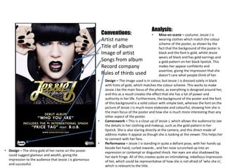
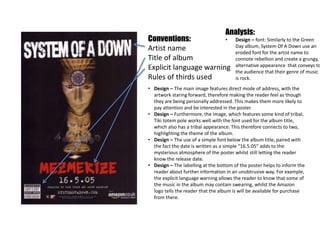
Conventions:
Artist name
Title of album
Songs from album
Rules of thirds used
Analysis:
• Design – font: All of the fonts used
throughout the poster have an eroded,
distorted design to them, giving the
poster a grungy, raw appearance and
connoting rebellion and youth. This
would therefore appeal to audiences
such as skaters and alternative fans.
• Design – The main image looks like it has been spray painted onto a
wall, giving it the effect of grafitti. This can also be seen in the title of
the album, which has paint tracks as though the title has also been
spray painted on. Similarly to the font, this could connote rebellion
and independence, such as going against the ‘status quo’, which is a
common theme in rock music.
• Design – The colour scheme consists oranges, reds and yellows,
relating to the colours of fire. This therefore could be considered to
create a fierce, defiant atmosphere to the poster, and also causing
the mood to appear quite aggressive.
• Design – The main image features a teenage couple kissing, which
works to relate to a young audience, who are more likely to be
interested in the rebellious atmosphere of the poster and Green
Day’s music. For this reason, using a teenage couple on the front
works to make it more appealing to a teenage audience, as opposed
to having adults on the cover.
• Design – The caption that reads “CD & Download out 15th May” is
effective is not only the release date of the album, but telling the
reader the different formats it will be available in.
Conventions:
Artist name
Title of album
Image of artist
Songs from album
Record company
Rules of thirds used
Analysis:
• Mise-en-scene – costume: Jessie J is
wearing clothes which match the colour
scheme of the poster, as shown by the
fact that the background of the poster is
black and the font is gold, whilst Jessie
wears all black and has gold earrings and
a gold pattern on her black lipstick. This
makes her appear confidents and
assertive, giving the impression that she
doesn’t care what people think of her.
• Design – The image used is in colour, but Jessie J is dressed solely in black
with hints of gold, which matches the colour scheme. This works to make
Jessie J be the main focus of the photo, as everything is designed around her,
and this as a result creates the effect that she has a lot of power and
authority in her life. Furthermore, the background of the poster and the font
of this background is a solid colour with simple text, whereas the font on the
picture of Jessie J is much more elaborate and colourful, showing him she is
the main focus of the poster and how she is much more interesting than any
other aspect of the poster.
• Camerawork – This is a close up of Jessie J, which allows the audience to see
the details in her clothing and makeup, such as the gold pattern in her
lipstick. She is also staring directly at the camera, and this direct mode of
address makes it appear as though she is looking at the viewer. This helps her
to connect with her fans.
• Performance – Jessie J is standing in quite a defiant pose, with her hands up
beside her hand, curled inwards , and her nose scrunched up into an
expression or contempt or disgusted shock. Her eyes are also shadowed by
her dark fringe. All of this creates quite an intimidating, rebellious impression
of her, which could be representative of how she is not afraid of ‘who she is’,
which is relevant to the title.
• Design – The shiny gold of her name on the poster
could suggest glamour and wealth, giving the
impression to the audience that Jessie J is glamorous
and successful.
Conventions:
Artist name
Title of album
Explicit language warning
Rules of thirds used
Analysis:
• Design – font: Similarly to the Green
Day album, System Of A Down use an
eroded font for the artist name to
connote rebellion and create a grungy,
alternative appearance that conveys to
the audience that their genre of music
is rock.
• Design – The main image features direct mode of address, with the
artwork staring forward, therefore making the reader feel as though
they are being personally addressed. This makes them more likely to
pay attention and be interested in the poster.
• Design – Furthermore, the image, which features some kind of tribal,
Tiki totem pole works well with the font used for the album title,
which also has a tribal appearance. This therefore connects to two,
highlighting the theme of the album.
• Design – The use of a simple font below the album title, paired with
the fact the date is written as a simple “16.5.05” adds to the
mysterious atmosphere of the poster whilst still letting the reader
know the release date.
• Design – The labelling at the bottom of the poster helps to inform the
reader about further information in an unobtrusive way. For example,
the explicit language warning allows the reader to know that some of
the music in the album may contain swearing, whilst the Amazon
logo tells the reader that the album is will be available for purchase
from there.

Album poster analysis

  • 1.
    Conventions: Artist name Title ofalbum Songs from album Rules of thirds used Analysis: • Design – font: All of the fonts used throughout the poster have an eroded, distorted design to them, giving the poster a grungy, raw appearance and connoting rebellion and youth. This would therefore appeal to audiences such as skaters and alternative fans. • Design – The main image looks like it has been spray painted onto a wall, giving it the effect of grafitti. This can also be seen in the title of the album, which has paint tracks as though the title has also been spray painted on. Similarly to the font, this could connote rebellion and independence, such as going against the ‘status quo’, which is a common theme in rock music. • Design – The colour scheme consists oranges, reds and yellows, relating to the colours of fire. This therefore could be considered to create a fierce, defiant atmosphere to the poster, and also causing the mood to appear quite aggressive. • Design – The main image features a teenage couple kissing, which works to relate to a young audience, who are more likely to be interested in the rebellious atmosphere of the poster and Green Day’s music. For this reason, using a teenage couple on the front works to make it more appealing to a teenage audience, as opposed to having adults on the cover. • Design – The caption that reads “CD & Download out 15th May” is effective is not only the release date of the album, but telling the reader the different formats it will be available in.
  • 2.
    Conventions: Artist name Title ofalbum Image of artist Songs from album Record company Rules of thirds used Analysis: • Mise-en-scene – costume: Jessie J is wearing clothes which match the colour scheme of the poster, as shown by the fact that the background of the poster is black and the font is gold, whilst Jessie wears all black and has gold earrings and a gold pattern on her black lipstick. This makes her appear confidents and assertive, giving the impression that she doesn’t care what people think of her. • Design – The image used is in colour, but Jessie J is dressed solely in black with hints of gold, which matches the colour scheme. This works to make Jessie J be the main focus of the photo, as everything is designed around her, and this as a result creates the effect that she has a lot of power and authority in her life. Furthermore, the background of the poster and the font of this background is a solid colour with simple text, whereas the font on the picture of Jessie J is much more elaborate and colourful, showing him she is the main focus of the poster and how she is much more interesting than any other aspect of the poster. • Camerawork – This is a close up of Jessie J, which allows the audience to see the details in her clothing and makeup, such as the gold pattern in her lipstick. She is also staring directly at the camera, and this direct mode of address makes it appear as though she is looking at the viewer. This helps her to connect with her fans. • Performance – Jessie J is standing in quite a defiant pose, with her hands up beside her hand, curled inwards , and her nose scrunched up into an expression or contempt or disgusted shock. Her eyes are also shadowed by her dark fringe. All of this creates quite an intimidating, rebellious impression of her, which could be representative of how she is not afraid of ‘who she is’, which is relevant to the title. • Design – The shiny gold of her name on the poster could suggest glamour and wealth, giving the impression to the audience that Jessie J is glamorous and successful.
  • 3.
    Conventions: Artist name Title ofalbum Explicit language warning Rules of thirds used Analysis: • Design – font: Similarly to the Green Day album, System Of A Down use an eroded font for the artist name to connote rebellion and create a grungy, alternative appearance that conveys to the audience that their genre of music is rock. • Design – The main image features direct mode of address, with the artwork staring forward, therefore making the reader feel as though they are being personally addressed. This makes them more likely to pay attention and be interested in the poster. • Design – Furthermore, the image, which features some kind of tribal, Tiki totem pole works well with the font used for the album title, which also has a tribal appearance. This therefore connects to two, highlighting the theme of the album. • Design – The use of a simple font below the album title, paired with the fact the date is written as a simple “16.5.05” adds to the mysterious atmosphere of the poster whilst still letting the reader know the release date. • Design – The labelling at the bottom of the poster helps to inform the reader about further information in an unobtrusive way. For example, the explicit language warning allows the reader to know that some of the music in the album may contain swearing, whilst the Amazon logo tells the reader that the album is will be available for purchase from there.