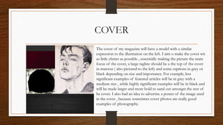
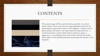
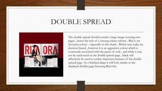
COLOUR SCHEME
Leah Allie
COVER
The cover of my magazine will have a model with a similar
expression to the illustration on the left. I aim o make the cover wit
as little clutter as possible , essentially making the picture the main
focus of the cover, a large tagline should be a the top of the cover
in maroon ( also pictured to the left) and some captions in grey or
black depending on size and importance. For example, less
significant examples of featured articles will be in grey with a
medium size , while highly significant examples will be in black and
will be made larger and more bold to sand out amongst the rest of
he cover. I also had an idea to advertise a poster of the image used
in the cover , because sometimes cover photos are really good
examples of photography.
CONTENTS
The contents page will be as professional as possible , for a short
break I want to move away from my target population and focus on
presenting key points about what is in the magazine . Colours such as
black and grey still relate to the main theme but rather than red , I
would incorporate a colour which doesn’t connote to anger or
aggression , a cool calming colour such as blue refreshes the reader
and it makes it more professional when announcing the features of the
magazine.
DOUBLE SPREAD
The double spread should contain a large image covering two
pages , hence the lack of a varying colour scheme , Red is my
favourite colour – especially in this shade . Which may make my
decision biased , however it is an aggressive colour which is
commonly associated with the genre of rock , and while it may
not be used much in the double spread page , black will
affectively be used to outline important features of the double
spread page. As a finished deign it will look similar to the
displayed double page featuring Rita Ora.

My ideas

  • 1.
  • 2.
    COVER The cover ofmy magazine will have a model with a similar expression to the illustration on the left. I aim o make the cover wit as little clutter as possible , essentially making the picture the main focus of the cover, a large tagline should be a the top of the cover in maroon ( also pictured to the left) and some captions in grey or black depending on size and importance. For example, less significant examples of featured articles will be in grey with a medium size , while highly significant examples will be in black and will be made larger and more bold to sand out amongst the rest of he cover. I also had an idea to advertise a poster of the image used in the cover , because sometimes cover photos are really good examples of photography.
  • 3.
    CONTENTS The contents pagewill be as professional as possible , for a short break I want to move away from my target population and focus on presenting key points about what is in the magazine . Colours such as black and grey still relate to the main theme but rather than red , I would incorporate a colour which doesn’t connote to anger or aggression , a cool calming colour such as blue refreshes the reader and it makes it more professional when announcing the features of the magazine.
  • 4.
    DOUBLE SPREAD The doublespread should contain a large image covering two pages , hence the lack of a varying colour scheme , Red is my favourite colour – especially in this shade . Which may make my decision biased , however it is an aggressive colour which is commonly associated with the genre of rock , and while it may not be used much in the double spread page , black will affectively be used to outline important features of the double spread page. As a finished deign it will look similar to the displayed double page featuring Rita Ora.