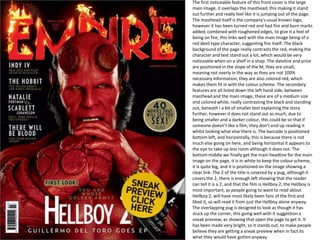
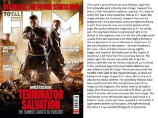
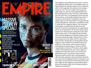
This magazine cover uses a large main image of a red devil character overlapping the masthead to make it stand out. The masthead has been altered to look burned with fire to match the devil image. Secondary features are listed on the left in white text against the black background. The main headline is placed on the image in white to link it clearly. The second cover again uses a large overlapping main image, this time of two characters, with text placed strategically around it. The third cover stands out with its big bright red magazine title not overlapped by the image. It features a recognizable Harry Potter face needing no film title. All covers strategically place additional text to enhance the color schemes and draw the eye without over
I conducted this research to generate ideas for my magazine ancillary task and to identify the elements of a magazine spread featuring a film review, that create a professional style.
Premium MEAN Stack Development Solutions for Modern BusinessesSynapseIndia
Stay ahead of the curve with our premium MEAN Stack Development Solutions. Our expert developers utilize MongoDB, Express.js, AngularJS, and Node.js to create modern and responsive web applications. Trust us for cutting-edge solutions that drive your business growth and success.
Know more: https://www.synapseindia.com/technology/mean-stack-development-company.html
RMD24 | Retail media: hoe zet je dit in als je geen AH of Unilever bent? Heid...BBPMedia1
Grote partijen zijn al een tijdje onderweg met retail media. Ondertussen worden in dit domein ook de kansen zichtbaar voor andere spelers in de markt. Maar met die kansen ontstaan ook vragen: Zelf retail media worden of erop adverteren? In welke fase van de funnel past het en hoe integreer je het in een mediaplan? Wat is nu precies het verschil met marketplaces en Programmatic ads? In dit half uur beslechten we de dilemma's en krijg je antwoorden op wanneer het voor jou tijd is om de volgende stap te zetten.
Putting the SPARK into Virtual Training.pptxCynthia Clay
This 60-minute webinar, sponsored by Adobe, was delivered for the Training Mag Network. It explored the five elements of SPARK: Storytelling, Purpose, Action, Relationships, and Kudos. Knowing how to tell a well-structured story is key to building long-term memory. Stating a clear purpose that doesn't take away from the discovery learning process is critical. Ensuring that people move from theory to practical application is imperative. Creating strong social learning is the key to commitment and engagement. Validating and affirming participants' comments is the way to create a positive learning environment.
The world of search engine optimization (SEO) is buzzing with discussions after Google confirmed that around 2,500 leaked internal documents related to its Search feature are indeed authentic. The revelation has sparked significant concerns within the SEO community. The leaked documents were initially reported by SEO experts Rand Fishkin and Mike King, igniting widespread analysis and discourse. For More Info:- https://news.arihantwebtech.com/search-disrupted-googles-leaked-documents-rock-the-seo-world/
Buy Verified PayPal Account | Buy Google 5 Star Reviewsusawebmarket
Buy Verified PayPal Account
Looking to buy verified PayPal accounts? Discover 7 expert tips for safely purchasing a verified PayPal account in 2024. Ensure security and reliability for your transactions.
PayPal Services Features-
🟢 Email Access
🟢 Bank Added
🟢 Card Verified
🟢 Full SSN Provided
🟢 Phone Number Access
🟢 Driving License Copy
🟢 Fasted Delivery
Client Satisfaction is Our First priority. Our services is very appropriate to buy. We assume that the first-rate way to purchase our offerings is to order on the website. If you have any worry in our cooperation usually You can order us on Skype or Telegram.
24/7 Hours Reply/Please Contact
usawebmarketEmail: support@usawebmarket.com
Skype: usawebmarket
Telegram: @usawebmarket
WhatsApp: +1(218) 203-5951
USA WEB MARKET is the Best Verified PayPal, Payoneer, Cash App, Skrill, Neteller, Stripe Account and SEO, SMM Service provider.100%Satisfection granted.100% replacement Granted.
Affordable Stationery Printing Services in Jaipur | Navpack n PrintNavpack & Print
Looking for professional printing services in Jaipur? Navpack n Print offers high-quality and affordable stationery printing for all your business needs. Stand out with custom stationery designs and fast turnaround times. Contact us today for a quote!
Memorandum Of Association Constitution of Company.pptseri bangash
www.seribangash.com
A Memorandum of Association (MOA) is a legal document that outlines the fundamental principles and objectives upon which a company operates. It serves as the company's charter or constitution and defines the scope of its activities. Here's a detailed note on the MOA:
Contents of Memorandum of Association:
Name Clause: This clause states the name of the company, which should end with words like "Limited" or "Ltd." for a public limited company and "Private Limited" or "Pvt. Ltd." for a private limited company.
https://seribangash.com/article-of-association-is-legal-doc-of-company/
Registered Office Clause: It specifies the location where the company's registered office is situated. This office is where all official communications and notices are sent.
Objective Clause: This clause delineates the main objectives for which the company is formed. It's important to define these objectives clearly, as the company cannot undertake activities beyond those mentioned in this clause.
www.seribangash.com
Liability Clause: It outlines the extent of liability of the company's members. In the case of companies limited by shares, the liability of members is limited to the amount unpaid on their shares. For companies limited by guarantee, members' liability is limited to the amount they undertake to contribute if the company is wound up.
https://seribangash.com/promotors-is-person-conceived-formation-company/
Capital Clause: This clause specifies the authorized capital of the company, i.e., the maximum amount of share capital the company is authorized to issue. It also mentions the division of this capital into shares and their respective nominal value.
Association Clause: It simply states that the subscribers wish to form a company and agree to become members of it, in accordance with the terms of the MOA.
Importance of Memorandum of Association:
Legal Requirement: The MOA is a legal requirement for the formation of a company. It must be filed with the Registrar of Companies during the incorporation process.
Constitutional Document: It serves as the company's constitutional document, defining its scope, powers, and limitations.
Protection of Members: It protects the interests of the company's members by clearly defining the objectives and limiting their liability.
External Communication: It provides clarity to external parties, such as investors, creditors, and regulatory authorities, regarding the company's objectives and powers.
https://seribangash.com/difference-public-and-private-company-law/
Binding Authority: The company and its members are bound by the provisions of the MOA. Any action taken beyond its scope may be considered ultra vires (beyond the powers) of the company and therefore void.
Amendment of MOA:
While the MOA lays down the company's fundamental principles, it is not entirely immutable. It can be amended, but only under specific circumstances and in compliance with legal procedures. Amendments typically require shareholder
LA HUG - Video Testimonials with Chynna Morgan - June 2024Lital Barkan
Have you ever heard that user-generated content or video testimonials can take your brand to the next level? We will explore how you can effectively use video testimonials to leverage and boost your sales, content strategy, and increase your CRM data.🤯
We will dig deeper into:
1. How to capture video testimonials that convert from your audience 🎥
2. How to leverage your testimonials to boost your sales 💲
3. How you can capture more CRM data to understand your audience better through video testimonials. 📊
Personal Brand Statement:
As an Army veteran dedicated to lifelong learning, I bring a disciplined, strategic mindset to my pursuits. I am constantly expanding my knowledge to innovate and lead effectively. My journey is driven by a commitment to excellence, and to make a meaningful impact in the world.
Business Valuation Principles for EntrepreneursBen Wann
This insightful presentation is designed to equip entrepreneurs with the essential knowledge and tools needed to accurately value their businesses. Understanding business valuation is crucial for making informed decisions, whether you're seeking investment, planning to sell, or simply want to gauge your company's worth.
Implicitly or explicitly all competing businesses employ a strategy to select a mix
of marketing resources. Formulating such competitive strategies fundamentally
involves recognizing relationships between elements of the marketing mix (e.g.,
price and product quality), as well as assessing competitive and market conditions
(i.e., industry structure in the language of economics).
2. The first noticeable feature of this front cover is the large main image, it overlaps the masthead, this making it stand out further and really feel like it is jumping out of the page. The masthead itself is the company’s usual known logo, however it has been turned red and had fire and burn marks added, combined with roughened edges, to give it a feel of being on fire, this links well with the main image being of a red devil type character, suggesting fire itself. The black background of the page really contrasts the red, making the character and text stand out a lot, which would be very noticeable when on a shelf in a shop. The dateline and price are positioned in the slope of the M, they are small, meaning not overly in the way as they are not 100% necessary information, they are also colored red, which makes them fit in with the colour scheme. The secondary features are all listed down the left hand side, between masthead and the main image, these are of a medium size and colored white, really contrasting the black and standing out, beneath I a bit of smaller text explaining the story further, however it does not stand out as much, due to being smaller and a darker colour, this could be so that if someone doesn’t like a film, they don’t end up reading it whilst looking what else there is. The barcode is positioned bottom left, and horizontally, this is because there is not much else going on here, and being horizontal it appears to the eye to take up less room although it does not. The bottom middle we finally get the main headline for the main image on the page, it is in white to keep the colour scheme, it is quite big, and it is positioned on the image showing a clear link. The 2 of the title is covered by a pug, although it covers the 2, there is enough left showing that the reader can tell it is a 2, and that the film is Hellboy 2, the Hellboy is most important, as people going to want to read about Hellboy 2, will have most likely been fans of the first and liked it, so will read it from just the Hellboy alone anyway. The overlapping pug is designed to look as though it has stuck up the corner, this going well with it suggestion a sneak preview, as showing that open the page to get it. It has been made very bright, so it stands out, to make people believe they are getting a sneak preview when in fact its what they would have gotten anyway.
3. This cover is very minimal yet very effective, again the first noticeable part is the big main image, however this time a 2 shot instead of a medium close up, this could be as the film has 2 main characters instead of 1. Again the image overlaps the masthead, however this time the background is no a plain black, and is an explosion fitting in with the scene the men are at at the bottom of the page, this really making the image feel as if it is coming out. The secondary feature is positioned right in the skyline of the magazine, and is in red, this although would usually make text stand out a lot, here slightly blends to the background as it not as obtrusive in comparison to the main headline at the bottom. The main headline is the same colour and font, however being slightly bigger, and based on the darker part of the picture, it stands out a lot more then the secondary feature. The poster again like the last uses white bits of text to contrast with the red, for the less important parts of text. In the masthead again they have hidden dateline and web address in the M’s slope. The masthead as well has had the ;total’ part of text cleared through, to show the background image, to give it it’s colour, this is nice as it adds to the colour scheme. The secondary features have been positioned both left and right hand side of the image on this magazine, this allows them to be slightly bigger then if were just on one side to fit them, yet still doesn’t become obtrusive and cover the main image. The last feature is that the barcode again is positioned in a bottom corner, and is vertical as opposed to horizontal, it again seems to take up less space, although would use the same if it was twisted 90 degrees to horizontal.
4. This magazine is very different to the others. The first noticeable part of this cover is the magazine title, it is big and bright red making it stand out a lot. Unlike the other 2 the image does not overlap it, this making it stand out more. The main image is still a large full page image. It is also of a very recognized face from the harry potter film series. This links in with the fact the title of the film is not displayed on the front cover like the others, as the reader already knows who it is and what it will be about. The dateline, price and website again are all nicely hidden in the gap of the M, and just beneath the, masthead in a small font to hide it, along with the magazines tag line. The secondary stories again are placed down the left hand side, however it has been illustrated with an image bottom left, so as the text doesn’t fit, the main feature which stands out in white has been linked over to the other side by a blue asterix. The image that the text leads onto, has been designed as a polaroid, however the 3 characters overlap the edge, making it feel as if they are jumping out at the reader, and this really helps them to feel as though they are being pulled into the magazine. The 3 characters are linked to text at the bottom of 3 film names, and this can be told by it overlapping one of there legs, so it feels as if there images lead on to this text. The colour scheme again uses the red and white text, with a dark image as a background. A few other colours such as blue and yellow have crept in, but these are very minimal. Along the bottom and the side a striped diagonal effect has been placed on, these just help to draw the eye away from the background when reading text, and also make sure you look there rater then just the main parts. Again on this magazine, the barcode has been placed in the bottom right corner, facing vertically as opposed to horizontally