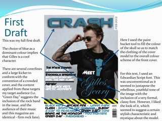
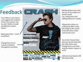
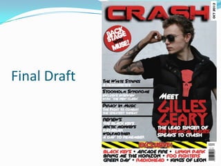
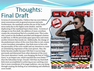
By Luka Delic
Photo Shoot Images
I thought this image was                                                               In comparison to the
quite a good one. The                                                                  opposite image, I believe
close up leaves enough                                                                 that this one fulfils my
space at the top for the                                                               aim much better. The use
masthead and the                                                                       of sunglasses and the
coverlines . The grenade                                                               ability to see the Punisher
in the background is a                                                                 logo create the
nice touch as it gives an                                                              impression of a sort of
incendiary, anarchic feel.                                                             punkish rebel, which was
However, I felt it did not                                                             my intention for the cover
fit my aim of creating an                                                              image. The off-kilter pose
image of a                                                                             of him with his mouth
rebellious, rock star who                                                              wide open suggests a hint
commands authority for                                                                 of defiance, that I think
the front cover. This is                                                               the reader may find
because it features the                                                                appealing. The pose is
slightly, which
model smile does not emit an                             also more suited to a front cover of a rock magazine,
intimating, authoritative quality and is not a pose      more than the smirk in the image on the left.
often seen on a cover image. Additionally, I wanted      Additionally, the sunglasses add a layer of mystery
his rebellious persona to be reflected in his clothing   that may entice the reader. Overall, I thought that this
and props, which isn’t reflected as much here because    image showed that I was more aware of my target
his Punisher t-shirt is hidden, and his tattoo sleeve    audience and of the rock genre of my magazine, and I
can’t be seen.                                           considered this as a possibility for my cover photo.
I left enough space here for the

     Chosen Image                    masthead to reside at the top.
                                     The sunglasses hide the eyes,
                                     which are commonly referred to
This is the image that I chose for   as the “door to your soul”. The
my cover. One of the reasons         fact that he’s hiding the “door to
why I chose this was due to the      his soul” intimidates the reader.
clearer visibility of the elements   Additionally, obscuring them
of the mise en scene, especially     creates a sense of mystery,
clothing, in the photo.              enticing them to open the cover
                                     to discover his true personality.
The tattoo sleeves clearly           The close up/ medium shot
connote rebellion (one of the        suggests that he’s under the
main impressions rock stars          spotlight, connoting that the
provide) and youth, targeting        reader will gain insight into
the late teen, young adult           him. However, the head turned
audience.                            away, with no direct eye
                                     contact, suggesting the
The skull connotes death (which      attention from the audience he
is a recurring theme in rock         receives is unimportant to him.
songs) and an awareness of           All that is important is him and
popular culture, due to it being     his music.
the trademark logo of the            I was aware of taking a photo
Punisher, a character from           against a white background, in
Marvel comics.                       order to create a colour scheme
                                     that contrasted well.
First                         Another early
                                draft of my
                               magazine cover

 Drafts
During the creation of my
front cover, I created
several first
drafts, experimenting
several styles and
designs, while still
maintaining the same basic
structure and content that
my mock-up outlined.

The main reason why I
liked this draft was because
of the poster edges
effect, which projects an
edgy vibe akin to the film
‘Sin City’, and still
maintains an intimidating
quality. Its
unconventionality was
appealing to me as well.
First
 Draft
This was my full first draft.   Here I used the paint
                                bucket tool to fill the colour
The choice of blue as a         of the skull so as to match
dominant colour implies         the clothing of the cover
that Gilles is a cool           model to the overall colour
character.                      scheme of the front cover.

There are several coverlines
and a large kicker to           For this text, I used an
conform with the                Edwardian Script font. This
convention of a crowded         was unconventional as it
cover, and the content          seemed to juxtapose the
applied from these targets      rebellious, youthful tone of
my target audience (i.e.        the image with the
“Green Day” suggests the        inclusion of a very formal,
inclusion of the rock band      classy font. However, I liked
in the issue, and the           the look of it, which
audience of their music         seemed to suggest a certain
and this magazine are           stylish characteristic and
identical - firm rock fans).    mystique about the model.
Feedback
                              Masthead does not catch
                              the eye of the reader as it
                              doesn’t stand
                              out, experiment with
Use of blue is nice choice    adding effects to it maybe
as it suggests the coolness
of the cover person, but
try red, I think it would     Filling this in blue is a
probably be a better          really good effect, links
choice                        the image to the overall
                              look and colour codes
                              used on the cover
Spare space here – more
coverlines?

                              Use of this ‘formal’ font
                              does not match well with
Change font size to
                              the other fonts used.
remain consistent
                              Change font to one that
throughout coverlines
                              matches better, Impact or
                              serif?


                              Add one more band to fill
                              this kicker fully
Final Draft
Thoughts:
Final Draft
In terms of conventionality, I believe that my cover follows
most conventions with its general structure and style.
Furthermore, the masthead catches the eye of the reader
more easily due to the higher noise shadow, and the
duplicating of the masthead layers three times. In terms of
changes to my first draft, the addition of more coverlines
creates the conventional feel of a crowded cover. This is also
why I acted on the feedback provided and designed a button
to add here, to fill the previously spare space here and create
another element that stands out. Additionally, the change of
the predominant colour of the cover from blue to red, creates
a more incendiary atmosphere, that feels more in line with
the personality of the cover model and my intention to create
an intimidating impression of the cover person. Also, the
kicker became smaller because I felt that it was too large
previously and distracted from other elements of the cover.
One more alteration I made, was changing the font of ‘Gilles
Geary’ to an Impact one, which matched the cover better
than the Edwardian Script. Overall, I feel that my final draft
feels more accomplished in achieving an eye-catching cover
that is more considerate of its target audience, one way being
through creating the feeling of an intimidating and rebellious
cover model.

Front Cover Commentary

  • 1.
  • 2.
    Photo Shoot Images Ithought this image was In comparison to the quite a good one. The opposite image, I believe close up leaves enough that this one fulfils my space at the top for the aim much better. The use masthead and the of sunglasses and the coverlines . The grenade ability to see the Punisher in the background is a logo create the nice touch as it gives an impression of a sort of incendiary, anarchic feel. punkish rebel, which was However, I felt it did not my intention for the cover fit my aim of creating an image. The off-kilter pose image of a of him with his mouth rebellious, rock star who wide open suggests a hint commands authority for of defiance, that I think the front cover. This is the reader may find because it features the appealing. The pose is slightly, which model smile does not emit an also more suited to a front cover of a rock magazine, intimating, authoritative quality and is not a pose more than the smirk in the image on the left. often seen on a cover image. Additionally, I wanted Additionally, the sunglasses add a layer of mystery his rebellious persona to be reflected in his clothing that may entice the reader. Overall, I thought that this and props, which isn’t reflected as much here because image showed that I was more aware of my target his Punisher t-shirt is hidden, and his tattoo sleeve audience and of the rock genre of my magazine, and I can’t be seen. considered this as a possibility for my cover photo.
  • 3.
    I left enoughspace here for the Chosen Image masthead to reside at the top. The sunglasses hide the eyes, which are commonly referred to This is the image that I chose for as the “door to your soul”. The my cover. One of the reasons fact that he’s hiding the “door to why I chose this was due to the his soul” intimidates the reader. clearer visibility of the elements Additionally, obscuring them of the mise en scene, especially creates a sense of mystery, clothing, in the photo. enticing them to open the cover to discover his true personality. The tattoo sleeves clearly The close up/ medium shot connote rebellion (one of the suggests that he’s under the main impressions rock stars spotlight, connoting that the provide) and youth, targeting reader will gain insight into the late teen, young adult him. However, the head turned audience. away, with no direct eye contact, suggesting the The skull connotes death (which attention from the audience he is a recurring theme in rock receives is unimportant to him. songs) and an awareness of All that is important is him and popular culture, due to it being his music. the trademark logo of the I was aware of taking a photo Punisher, a character from against a white background, in Marvel comics. order to create a colour scheme that contrasted well.
  • 4.
    First Another early draft of my magazine cover Drafts During the creation of my front cover, I created several first drafts, experimenting several styles and designs, while still maintaining the same basic structure and content that my mock-up outlined. The main reason why I liked this draft was because of the poster edges effect, which projects an edgy vibe akin to the film ‘Sin City’, and still maintains an intimidating quality. Its unconventionality was appealing to me as well.
  • 5.
    First Draft This wasmy full first draft. Here I used the paint bucket tool to fill the colour The choice of blue as a of the skull so as to match dominant colour implies the clothing of the cover that Gilles is a cool model to the overall colour character. scheme of the front cover. There are several coverlines and a large kicker to For this text, I used an conform with the Edwardian Script font. This convention of a crowded was unconventional as it cover, and the content seemed to juxtapose the applied from these targets rebellious, youthful tone of my target audience (i.e. the image with the “Green Day” suggests the inclusion of a very formal, inclusion of the rock band classy font. However, I liked in the issue, and the the look of it, which audience of their music seemed to suggest a certain and this magazine are stylish characteristic and identical - firm rock fans). mystique about the model.
  • 6.
    Feedback Masthead does not catch the eye of the reader as it doesn’t stand out, experiment with Use of blue is nice choice adding effects to it maybe as it suggests the coolness of the cover person, but try red, I think it would Filling this in blue is a probably be a better really good effect, links choice the image to the overall look and colour codes used on the cover Spare space here – more coverlines? Use of this ‘formal’ font does not match well with Change font size to the other fonts used. remain consistent Change font to one that throughout coverlines matches better, Impact or serif? Add one more band to fill this kicker fully
  • 7.
  • 8.
    Thoughts: Final Draft In termsof conventionality, I believe that my cover follows most conventions with its general structure and style. Furthermore, the masthead catches the eye of the reader more easily due to the higher noise shadow, and the duplicating of the masthead layers three times. In terms of changes to my first draft, the addition of more coverlines creates the conventional feel of a crowded cover. This is also why I acted on the feedback provided and designed a button to add here, to fill the previously spare space here and create another element that stands out. Additionally, the change of the predominant colour of the cover from blue to red, creates a more incendiary atmosphere, that feels more in line with the personality of the cover model and my intention to create an intimidating impression of the cover person. Also, the kicker became smaller because I felt that it was too large previously and distracted from other elements of the cover. One more alteration I made, was changing the font of ‘Gilles Geary’ to an Impact one, which matched the cover better than the Edwardian Script. Overall, I feel that my final draft feels more accomplished in achieving an eye-catching cover that is more considerate of its target audience, one way being through creating the feeling of an intimidating and rebellious cover model.