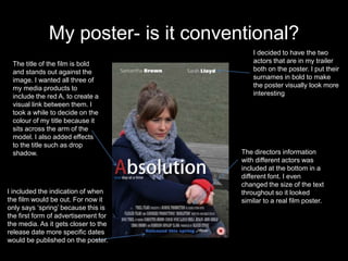
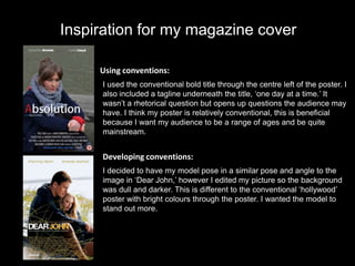
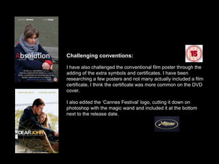
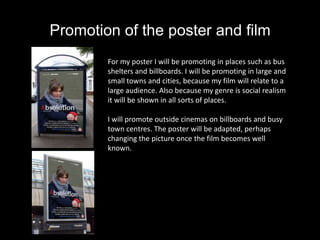
Question 1 (Poster)

How does my poster use, develop
and challenge the conventions of
          real posters?
What is the use of a film trailer?

                    ‘Contains an image with text’- Wikipedia


‘Text contains the masthead in large lettering and often the names of the actors’ –
                                   Wikipedia


                  ‘A poster is used for advertising’ – Wikipedia
What a conventional poster has…
  The main image should be
  interesting and captivate the
                                              The main actors names
  audience. The image should
                                              are clearly stated either
  reflect the film and trailer
                                              above them, or beside
  and perhaps present a
                                              them.
  relationship like this poster.


               The title of the film is     There is sometimes
               relatively bold and          information about the
               can be read from a           director or book above the
               distance.                    title. For example from the
                                            ‘best selling author of’ or
                                            ‘from the director of.’
 The tagline is placed
 under the title of the film.
 The tagline should be
                                          The information about the film
 relatively short and
                                          company, director and actors is
 sometimes is a rhetorical
                                          placed at the bottom of the
 question.
                                          poster. In smaller text and
                                          shouldn’t detect the audience’s
There is an indication when the           attention from the rest of the
film will be released, this is            poster
placed at the bottom of the
page.
My poster- is it conventional?
                                          I decided to have the two
 The title of the film is bold            actors that are in my trailer
 and stands out against the               both on the poster. I put their
 image. I wanted all three of             surnames in bold to make
 my media products to                     the poster visually look more
 include the red A, to create a           interesting
 visual link between them. I
 took a while to decide on the
 colour of my title because it
 sits across the arm of the
 model. I also added effects
 to the title such as drop
 shadow.                              The directors information
                                      with different actors was
                                      included at the bottom in a
                                      different font. I even
                                      changed the size of the text
I included the indication of when     throughout so it looked
the film would be out. For now it     similar to a real film poster.
only says ‘spring’ because this is
the first form of advertisement for
the media. As it gets closer to the
release date more specific dates
would be published on the poster.
Inspiration for my magazine cover

     Using conventions:
     I used the conventional bold title through the centre left of the poster. I
     also included a tagline underneath the title, ‘one day at a time.’ It
     wasn’t a rhetorical question but opens up questions the audience may
     have. I think my poster is relatively conventional, this is beneficial
     because I want my audience to be a range of ages and be quite
     mainstream.


     Developing conventions:
     I decided to have my model pose in a similar pose and angle to the
     image in ‘Dear John,’ however I edited my picture so the background
     was dull and darker. This is different to the conventional ‘hollywood’
     poster with bright colours through the poster. I wanted the model to
     stand out more.
Challenging conventions:

I have also challenged the conventional film poster through the
adding of the extra symbols and certificates. I have been
researching a few posters and not many actually included a film
certificate, I think the certificate was more common on the DVD
cover.

I also edited the ‘Cannes Festival’ logo, cutting it down on
photoshop with the magic wand and included it at the bottom
next to the release date.
Promotion of the poster and film
        For my poster I will be promoting in places such as bus
        shelters and billboards. I will be promoting in large and
        small towns and cities, because my film will relate to a
        large audience. Also because my genre is social realism
        it will be shown in all sorts of places.

        I will promote outside cinemas on billboards and busy
        town centres. The poster will be adapted, perhaps
        changing the picture once the film becomes well
        known.

Question 1 (poster)

  • 1.
    Question 1 (Poster) Howdoes my poster use, develop and challenge the conventions of real posters?
  • 2.
    What is theuse of a film trailer? ‘Contains an image with text’- Wikipedia ‘Text contains the masthead in large lettering and often the names of the actors’ – Wikipedia ‘A poster is used for advertising’ – Wikipedia
  • 3.
    What a conventionalposter has… The main image should be interesting and captivate the The main actors names audience. The image should are clearly stated either reflect the film and trailer above them, or beside and perhaps present a them. relationship like this poster. The title of the film is There is sometimes relatively bold and information about the can be read from a director or book above the distance. title. For example from the ‘best selling author of’ or ‘from the director of.’ The tagline is placed under the title of the film. The tagline should be The information about the film relatively short and company, director and actors is sometimes is a rhetorical placed at the bottom of the question. poster. In smaller text and shouldn’t detect the audience’s There is an indication when the attention from the rest of the film will be released, this is poster placed at the bottom of the page.
  • 4.
    My poster- isit conventional? I decided to have the two The title of the film is bold actors that are in my trailer and stands out against the both on the poster. I put their image. I wanted all three of surnames in bold to make my media products to the poster visually look more include the red A, to create a interesting visual link between them. I took a while to decide on the colour of my title because it sits across the arm of the model. I also added effects to the title such as drop shadow. The directors information with different actors was included at the bottom in a different font. I even changed the size of the text I included the indication of when throughout so it looked the film would be out. For now it similar to a real film poster. only says ‘spring’ because this is the first form of advertisement for the media. As it gets closer to the release date more specific dates would be published on the poster.
  • 5.
    Inspiration for mymagazine cover Using conventions: I used the conventional bold title through the centre left of the poster. I also included a tagline underneath the title, ‘one day at a time.’ It wasn’t a rhetorical question but opens up questions the audience may have. I think my poster is relatively conventional, this is beneficial because I want my audience to be a range of ages and be quite mainstream. Developing conventions: I decided to have my model pose in a similar pose and angle to the image in ‘Dear John,’ however I edited my picture so the background was dull and darker. This is different to the conventional ‘hollywood’ poster with bright colours through the poster. I wanted the model to stand out more.
  • 6.
    Challenging conventions: I havealso challenged the conventional film poster through the adding of the extra symbols and certificates. I have been researching a few posters and not many actually included a film certificate, I think the certificate was more common on the DVD cover. I also edited the ‘Cannes Festival’ logo, cutting it down on photoshop with the magic wand and included it at the bottom next to the release date.
  • 7.
    Promotion of theposter and film For my poster I will be promoting in places such as bus shelters and billboards. I will be promoting in large and small towns and cities, because my film will relate to a large audience. Also because my genre is social realism it will be shown in all sorts of places. I will promote outside cinemas on billboards and busy town centres. The poster will be adapted, perhaps changing the picture once the film becomes well known.