This cover is a 2006 issue. As we can see from the cover, this issue’s main review is the new James Bond film ‘Quantum of Solace”, it is made very clear by the name of the film being placed over the main image on the front cover, even though it is in a light text colour, it still stands out against the dark image of Daniel Craig.  The font of the title of the film, is in italic which is the same in other promotional texts that the producers have created.  Below the title of the film is a slogan which the magazine has created themselves, its their personal opinion of the film, stating that it’s the ‘bloodiest bond ever’. This gives a small insight as to what the film is like. To make the issue more appealing the editors have put in special features, with a 007 picture special, so fans of the bond franchise may be more persuaded to buy the magazine, it adds a ‘buy me!’ touch to the magazine, this same concept is used in our additions of the magazine with things such as competitions, exclusive interviews, and giveaways such as posters (like in this issue). The title of the magazine ‘EMPIRE’ is very prominent, and because the title is mostly covered up by the image of Daniel Craig you can tell that it has already got first-rate recognition in the media industry because its title is like its logo, it has been the same since it started so the readers know without seeing the whole text what the magazine is. So, when making our own magazine we need to consider whether it is already well established, or not as this will take effect on how we position the images and title together. The title itself is bright red, and in capitals, it covers across the top quarter of the cover and is clearly viewable. Below, is the magazines slogan ‘THE WORLD’S BIGGEST MOVIE MAGAZINE’  which gives the magazine great credit as you don’t get that sort of status for nothing. On the opposite side is the magazines website. The font for these are around a 14 size, dark grey and the slogan is in capitals where as the website address isn’t. This makes the slogan stand out, but doesn’t really show up on the page or distract you unless you look a little closer, because you don’t want to take attention away from the main stories and reviews of the issue. They’re sort of blend in with  the background of the cover,  but are still noticeable.  The image of Craig’s character (Bond)  dominates the entire page, and when you first glance at the cover it is what your attention is immediately  drawn to. With most film magazine covers, the main character is  on the cover with other pictures of smaller leads within the actual article text. This image of Bond looks as though it has been taken straight from a still frame shot of the film, and not a posed image like with other magazines, this is a typical trait that you would find on film magazines as they are not promoting the actor they’re promoting the film.  This particular shot of Daniel Craig, is a fierce and angry image of the usually very nonchalant James Bond, and coincide with the short snippet of the review of the film, of how it is the bloodiest Bond yet. It isn’t a particular iconographic image of James Bond, as he is usually pictured with a slick black tux on, with the oval image and blood running down, with a gun in his hand.  On this particular cover, there isn’t much to do with other articles in the magazine apart from a small section at the bottom right of the page. I have realised that magazine’s usually promote their most exclusive articles and reviews on the cover and don’t promote their ‘usual’ articles on the front cover.  So, like on this cover big movies and names like ‘Twilight’, Kevin Costner, Eva Mendes and Ricky Gervais have been promoted because they are house hold names, and its what draws the audience in.
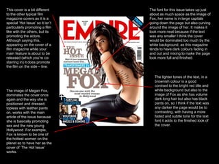
This cover is a bit different to the other typical film magazine covers as it is a special ‘Hot Issue’ so it isn’t particularly promoting a film like with the others, but its promoting the actors. Although saying this, appearing on the cover of a film magazine while your main feature is about to be released (which you’re co-starring in) it does promote the film on the side – line.  The image of Megan Fox, dominates the cover once again and the way she is positioned and dressed; topless with leather pants on, works with the main article of the issue because she is basically promoting sex and the new young Hollywood. For example, Fox is known to be one of the hottest women on the planet so to have her as the cover of ‘The Hot Issue’ works.  The font for this issue takes up just about as much space as the image of Fox, her name is in large capitals going down the page but also curving around the image of her. It makes it look more neat because if the text was any smaller I think the cover would be dominated too much by the white background, as this magazine tends to have dark colours fading in and out and mixing to make the page look more full and finished.  The lighter tones of the text, in a brownish colour is a good contrast to the bright red title and white background but also to the image of Fox as she has volume dark long hair but also has black pants on, so I think if the text was any darker the page would be to contrasting, with having a more faded and subtle tone for the text font it adds to the finished look of the cover.
This cover is of the very successful film, ‘The Dark Knight’, the main image on the page is of the joker played by Heath Ledger. Although he isn’t the main character, he still plays a dominant part in the film and so it is accepted for him and not batman to be on the cover of the promotional copy of this issue of empire.  The image itself is a screen shot from the film, and the way Ledger is positioned with his legs open feet pointing outwards with heels almost touching, his hands on his knees, head slightly slanted downwards and is kind of sneering at the camera shows that he is the ‘bad guy’. He just looks plain evil. The back ground of the image is of him in a jail cell, which is a really good connotation of who this person is and what his character is like in the film.  The colours which are used in the cover all work around him, we have green, purple, pink and white.  Unlike with the other covers, the name of the film isn’t dominating the text, in this cover it’s the joker that is the main focus of this article. But at the very top above the title of the magazine it has the name of the film, logo and ‘World Exclusive’ which portrays how big a film ‘The Dark Knight’ became, to have the biggest magazine in the world do a large spread and exclusive it must have a made a lot of money and good publicity.  The fonts for the title of the article, are very much childlike and less formal than the other covers. The word ‘joker’ is in different sizes, and fonts with a couple of the letters having a filled background and a non-fill font to show up the letter. It almost looks as though its been done by stencil, or spray paint, which works well with the context of the ‘joker’ character. This same effect has been used for the ‘meet the’ above the joker, which is a good effect as to presenting the ‘joker’ it shows the personality of the joker, and the way his character behaves in the film.  Below the title is a quote, from the interview in the article “He’s a cold blooded, mass murdering clown” which I think is a good indication of what is to be expected of the film, and seeing as this is a promotion of what to expect in the film having small quotes and slogans about the film on the cover, is a good and inviting idea to the rest of the article and film.

Magazine Analysis

  • 1.
    This cover isa 2006 issue. As we can see from the cover, this issue’s main review is the new James Bond film ‘Quantum of Solace”, it is made very clear by the name of the film being placed over the main image on the front cover, even though it is in a light text colour, it still stands out against the dark image of Daniel Craig. The font of the title of the film, is in italic which is the same in other promotional texts that the producers have created. Below the title of the film is a slogan which the magazine has created themselves, its their personal opinion of the film, stating that it’s the ‘bloodiest bond ever’. This gives a small insight as to what the film is like. To make the issue more appealing the editors have put in special features, with a 007 picture special, so fans of the bond franchise may be more persuaded to buy the magazine, it adds a ‘buy me!’ touch to the magazine, this same concept is used in our additions of the magazine with things such as competitions, exclusive interviews, and giveaways such as posters (like in this issue). The title of the magazine ‘EMPIRE’ is very prominent, and because the title is mostly covered up by the image of Daniel Craig you can tell that it has already got first-rate recognition in the media industry because its title is like its logo, it has been the same since it started so the readers know without seeing the whole text what the magazine is. So, when making our own magazine we need to consider whether it is already well established, or not as this will take effect on how we position the images and title together. The title itself is bright red, and in capitals, it covers across the top quarter of the cover and is clearly viewable. Below, is the magazines slogan ‘THE WORLD’S BIGGEST MOVIE MAGAZINE’ which gives the magazine great credit as you don’t get that sort of status for nothing. On the opposite side is the magazines website. The font for these are around a 14 size, dark grey and the slogan is in capitals where as the website address isn’t. This makes the slogan stand out, but doesn’t really show up on the page or distract you unless you look a little closer, because you don’t want to take attention away from the main stories and reviews of the issue. They’re sort of blend in with the background of the cover, but are still noticeable. The image of Craig’s character (Bond) dominates the entire page, and when you first glance at the cover it is what your attention is immediately drawn to. With most film magazine covers, the main character is on the cover with other pictures of smaller leads within the actual article text. This image of Bond looks as though it has been taken straight from a still frame shot of the film, and not a posed image like with other magazines, this is a typical trait that you would find on film magazines as they are not promoting the actor they’re promoting the film. This particular shot of Daniel Craig, is a fierce and angry image of the usually very nonchalant James Bond, and coincide with the short snippet of the review of the film, of how it is the bloodiest Bond yet. It isn’t a particular iconographic image of James Bond, as he is usually pictured with a slick black tux on, with the oval image and blood running down, with a gun in his hand. On this particular cover, there isn’t much to do with other articles in the magazine apart from a small section at the bottom right of the page. I have realised that magazine’s usually promote their most exclusive articles and reviews on the cover and don’t promote their ‘usual’ articles on the front cover. So, like on this cover big movies and names like ‘Twilight’, Kevin Costner, Eva Mendes and Ricky Gervais have been promoted because they are house hold names, and its what draws the audience in.
  • 2.
    This cover isa bit different to the other typical film magazine covers as it is a special ‘Hot Issue’ so it isn’t particularly promoting a film like with the others, but its promoting the actors. Although saying this, appearing on the cover of a film magazine while your main feature is about to be released (which you’re co-starring in) it does promote the film on the side – line. The image of Megan Fox, dominates the cover once again and the way she is positioned and dressed; topless with leather pants on, works with the main article of the issue because she is basically promoting sex and the new young Hollywood. For example, Fox is known to be one of the hottest women on the planet so to have her as the cover of ‘The Hot Issue’ works. The font for this issue takes up just about as much space as the image of Fox, her name is in large capitals going down the page but also curving around the image of her. It makes it look more neat because if the text was any smaller I think the cover would be dominated too much by the white background, as this magazine tends to have dark colours fading in and out and mixing to make the page look more full and finished. The lighter tones of the text, in a brownish colour is a good contrast to the bright red title and white background but also to the image of Fox as she has volume dark long hair but also has black pants on, so I think if the text was any darker the page would be to contrasting, with having a more faded and subtle tone for the text font it adds to the finished look of the cover.
  • 3.
    This cover isof the very successful film, ‘The Dark Knight’, the main image on the page is of the joker played by Heath Ledger. Although he isn’t the main character, he still plays a dominant part in the film and so it is accepted for him and not batman to be on the cover of the promotional copy of this issue of empire. The image itself is a screen shot from the film, and the way Ledger is positioned with his legs open feet pointing outwards with heels almost touching, his hands on his knees, head slightly slanted downwards and is kind of sneering at the camera shows that he is the ‘bad guy’. He just looks plain evil. The back ground of the image is of him in a jail cell, which is a really good connotation of who this person is and what his character is like in the film. The colours which are used in the cover all work around him, we have green, purple, pink and white. Unlike with the other covers, the name of the film isn’t dominating the text, in this cover it’s the joker that is the main focus of this article. But at the very top above the title of the magazine it has the name of the film, logo and ‘World Exclusive’ which portrays how big a film ‘The Dark Knight’ became, to have the biggest magazine in the world do a large spread and exclusive it must have a made a lot of money and good publicity. The fonts for the title of the article, are very much childlike and less formal than the other covers. The word ‘joker’ is in different sizes, and fonts with a couple of the letters having a filled background and a non-fill font to show up the letter. It almost looks as though its been done by stencil, or spray paint, which works well with the context of the ‘joker’ character. This same effect has been used for the ‘meet the’ above the joker, which is a good effect as to presenting the ‘joker’ it shows the personality of the joker, and the way his character behaves in the film. Below the title is a quote, from the interview in the article “He’s a cold blooded, mass murdering clown” which I think is a good indication of what is to be expected of the film, and seeing as this is a promotion of what to expect in the film having small quotes and slogans about the film on the cover, is a good and inviting idea to the rest of the article and film.