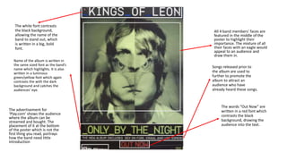
1. The white font contrasts
the black background,
allowing the name of the
band to stand out, which
is written in a big, bold
font.
Songs released prior to
the album are used to
further to promote the
album to attract an
audience who have
already heard these songs.
All 4 band members’ faces are
featured in the middle of the
poster to highlight their
importance. The mixture of all
their faces with an eagle would
appeal to an audience and
draw them in.
Name of the album is written in
the same sized font as the band’s
name which highlights. It is also
written in a luminous
green/yellow font which again
contrasts the with the dark
background and catches the
audiences’ eye.
The words “Out Now” are
written in a red font which
contrasts the black
background, drawing the
audience into the text.
The advertisement for
‘Play.com’ shows the audience
where the album can be
streamed and bought. The
placement of it at the bottom
of the poster which is not the
first thing you read, portrays
how the band need little
introduction