1. Digipak Analysis - Green day - American idiot
In my groups project we are required to produce a successful Digipak (CD cover and jacket, and
album artwork) advertising our final media product. To gain insight further into what makes up a
Digipak we have chosen to analyse some examples that reflect our chosen genre.
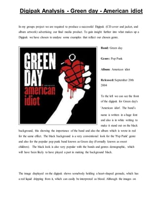
Band: Green day
Genre: Pop Punk
Album: American idiot
Released: September 20th
2004
To the left we can see the front
of the digipak for Green day's
'American idiot'. The band’s
name is written in a huge font
and also is in white writing to
make it stand out on the black
background, this showing the importance of the band and also the album which is wrote in red
for the same effect. The black background is a very conventional look for the 'Pop Punk' genre
and also for the popular pop punk band known as Green day (Formally known as sweet
children). The black look is also very popular with the bands and genres demographic, which
will have been likely to have played a part in making the background black.
The image displayed on the digipak shows somebody holding a heart-shaped grenade, which has
a red liquid dripping from it, which can easily be interpreted as blood. Although the images on
2. the cover do not reveal the meaning of the songs, the lyrics of the songs on the album are filled
with resent towards the American government (Don't wanna be an American idiot. Don't want a
nation under the new mania and can you hear the sound of hysteria? The subliminal mind fuck
America.), its foreign policies, and its actions in the world. As the album is mostly politically
motivated, it is only natural that the band would also use the images on their album art to portray
the same message they do in their lyrics. The heart shaped grenade can represent many things.
For example the grenade represents war, Americans fighting in the war are usually there because
they're proud of their country or because of proper gander. The heart can then represent the
passion the soldiers have for their country and the pride they have fighting for it. However the
two images combined can mean that soldiers go to war with their heart however it is exploded
during war (Grenade) (broken) because of the things they see during war and also because of the
lies which they're told by the government (proper gander).
Another way which the image can be viewed is that the heart-shaped grenade represents the heart
of the American public, it's very delicate but if tampered with can be very dangerous, and the
white forearm represents the American government, the message which Green day are
symbolising is that the government have the heart of the public gripped firmly in their hands, the
grenade means that the government have the power to destroy the heart at just the pull of a pin.
The back of the digipak shows the conventional song listing along with record labels and
parental advisory. On this
side there is also an image
however this time there is no
heart or grenade but on the
pull pin from the grenade.
This is a look into the future
(Heart-shaped grenade being
present time) where Green
day are saying the
government will have ruined
the American public and
3. pulled the pin if changes are not made.
As mentioned before, parental advisory has been included in the digipak, this is because Green
day are known for being a very controversial band and some parents may be offended having
their children listen to their product, however in attempt to sell more albums, the parental
advisory is left on the back to try to avoid the beady-eye of parents. Alike most bands, the record
label is displayed on the bottom left of the digipak, this showing that they are sticking to the
convention. The track listing is in white writing, again to make it stand out on the black
background however it isn't in as big as a font as the band’s name for the obvious reason that
The image on the disk inside the
album adds to my theory of the
government ‘pulling the pin’ as the
image shows the hand
(government) with the pull ring
handing of the figure, showing that
the pin has in fact been pulled.
Again the disc sticks to the black
and red theme, which has been
consistent throughout the digipak.
It also has the band’s name 'Green
day, once again written in the same
white font along with the album
name 'American idiot' in the red
font. On the left hand side of the
disc we can again see the track
listing also again in the white font.
The record label has also been
included on the disc however it has
been made much smaller than
'Green day' in order to ensure that
the band gets the full credit for the
product.
they’d be no space for every track on the album.
4. Here we can see one of the
inserts from inside the digipak,
the digipak has a page
designated to each song from
the album, the pages include
the lyrics from each song in a
hand written font, this helps
the band try develop an
connection with the
demographic as it feels as if
the band are being more
immediate with the readers and
fans giving them a sense of
connection with the band. Here
the band have strayed away from their usual black and red theme however this is to create the
feeling that the readers are reading directly from the artist’s song book.
This is the back of the above
insert. Here we can see that the
band has again returned back to
the back and red theme used
throughout the digipak. Included
on this page we can see a list of
the band members names along
with their roles in the band (Billie
Joe Armstrong (Guitar, lead
vocals) Mike Drint (Bass, vocals)
Tré Cool (Drums, Vocals)). Here
we can see that the band have
used the 'Nick name for one of the
members (Tré Cool, who is really
5. called Frank Edwin Wright III ) which again makes the readers feel more immediate with the
band. On the right hand side we can see the names and roles of people who were involved the
production and distribution of the album. Finally at the bottom there is information for website
addresses and descriptions.