
Recommended
More Related Content
What's hot
What's hot (17)
Viewers also liked
Viewers also liked (14)
Similar to Textual Analysis of Magazine Adverts
Similar to Textual Analysis of Magazine Adverts (20)
Recently uploaded
Recently uploaded (20)
Textual Analysis of Magazine Adverts
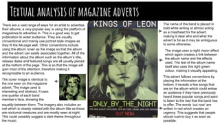
- 1. Textualanalysisofmagazineadverts There are a vast range of ways for an artist to advertise their albums; a very popular way is using the platform of magazines to advertise in. This is a good way to get publication to wider audience. They are usually conventional and mainly use portrait style images as they fit the A4 page well. Other conventions include using the album cover as the image so that the album and the advert can easily associated together. All of the information about the album such as the album’s title, release dates and featured songs are all usually placed at the bottom of the page. This is so that the image will gain most of the attention, therefore making it recognisable to an audience. The cover image is identical to the one seen on the magazine advert. The image used is interesting and abstract. It uses one quarter of each band member’s face, showing the equality between them. The imagery also includes an owl which is closely related with the album title as these are nocturnal creatures and are mostly seen at night. This could possibly suggest a dark theme throughout the music. This advert follows conventions by placing the information at the bottom. It reveals a few songs that are on the album which could entise an audience if they have previously heard these popular songs and want to listen to the rest that the band has to offer. The words ‘out now’ are written in red which creates an urgency. This suggests that people should rush to buy it as soon as possible. The image uses a night vision effect which again creates a link between the album name and the effects used. The text of the album name itself also uses this light green colour, making it visually appealing. The name of the band is placed in bold white writing at almost acting as a masthead for the advert, making it clear who and what the advert is for as it may be ambiguous to some otherwise.
- 2. Again, here the album cover is the same image as seen on the advert so that consumers can associate them easily. The information about the album is placed at the bottom of the page. It includes the variety of forms of media that the album can be purchased on such as vinyl etc and the release date which builds up anticipation for the album. The addition of pink flowers on a dark background suggests that the style of the music may be alternative yet the flowers add an element of feminism, showing that it could incorporate some romanticism, attracting a more feminine audience. The main image is identical to the album cover and shows the lead of the band with a pair of lungs displayed on her chest which are clearly placed here to tie directly with the name of the album. The chest area is highlighted, emphasising that this is the main focus. The fact that the imagery links directly to the album creates good continuity and it flows well. The white writing of the font contrasts well with the dark background. The use of an alternative font for the band’s name differentiates it from the rest of the text so that the band name can stand out which is a good form of promotion. This font is used across most of their products and albums, creating a distinguishable indentity.This also makes the ad look appealing as it frames the image, making it seem more unified. The title of the album has the largest lettering showing it is the most important feature. The use of bold white and capitalisation draws the audience’s attention immediately. There is a website displayed at the bottom of the page also which allows fans more access to the band. The way the artist is positioned allows her to seem elegant and sophisticated. Her arms are spread out and the lungs are revealed showing that she may be exposed and vulnerable, relating to the emotions of the music.She is not making a direct connection with the audience as her eyes are closed, however this creates a mysterious atmosphere causing the audience to be intrigued. Florence and the Machine are an indie rock band and the contrast between light and dark plays a big role in portraying the style of music. This suggests that there will be a number of positive and negative themes involved in the music; possibly love, life or loss.
- 3. As is seen with the rest of the adverts, we can see that the cover is the same as the magazine ad, making them easily relatable. The band’s name is placed at the top of the page in bold white lettering making it easily noticeable to an audience. The font used is a kind of logo for the band as it is commonly used across their albums and products, creating a recognisable identity (similar to Florence and the Machine). The symbol placed in the middle of the page is something which is easily associated with the band and their artwork. This is used as the main image on the cover of the album, again, following the convention of using the album image for advertisement elsewhere. The image portrays soundwaves in a particular shape, allowing the audience to create an immediate connection between the advert and its purpose; it is clearly promoting music. The advert also follows the typical convention of including information about the album at the bottom. The release date along with the album name are presented in the same bold white font making it noticeable, whilst creating continuity. The black and white colour scheme, minimal layout and minimal content represent how established the Arctic Monkeys are as a band. This advert shows that they do not feel the need to complicate the ad with lots of images or text to be recognised. The fact that the band have not complicated the ad is useful to consumers as they realise what the message is quickly and it allows the audience to focus on this rather than other images etc. The simplicity is very effective as it looks stylish and sophisticated and also represents the style of the band, suggesting that they are laid back and do not conform to the stereotypical ways of other artists in the industry.