
Recommended
More Related Content
What's hot
What's hot (20)
Viewers also liked
Similar to Evaluation question 2
Similar to Evaluation question 2 (20)
Recently uploaded
Recently uploaded (20)
Evaluation question 2
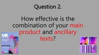
- 1. Question 2. How effective is the combination of your main product and ancillary texts?
- 2. Brief • The initial brief regarding our print work was to create a magazine advertisement that would be placed in a suitable magazine for the target market of 14-28 year olds. • Of which the sole purpose was to promote the release of a new digipak which we also had to create.
- 3. Print work in regards to genre • The genre of dance tends to have its print work centred around vibrant colouring which helps stabilise it to the dance scene with bright lights etc. • Moreover it also helps to reinforce the representations the genre holds concerning the younger generation, illustrating them as being free and adventurous. • When looking at original print work from the genre such as the Hedkandi album for “beach house” it was clear that they conformed to stereotypes linked with the genre .
- 4. Existing bands conforming to genre • Artists such as ‘Disclosure’ are seen to have large associations with urban locations, which is a stereotypical location for the dance genre. • Additionally the two brothers which form the duo of Disclosure are also shown to represent youth in a mischievous way shown through their existing promotional products.
- 5. Initial research into design • Our initial research aided our ideas for the design of the album cover for the digital pack. • Through the creation of mood boards linked to album artwork, it was clear that in order to conform to the genre our band must generate a design that corresponds to a contemporary style of design.
- 6. Magazine Advertising Platforms • For our advertisements we decided that the magazine MixMag and Maxumi were most appropriate if we were to both reach the target market for age and for genre as they are both focused around the dance genre. • Also they both promote smaller artists and this would be ideal for MK as this would be his first album, also Mixmag has promoted MK before.
- 7. Our Magazine Advertisement On the left is our portrait magazine advert, we used the style of portrait so that the advert could cover a page in a magazine such as Mixmag. The clear reading path goes from the logo MK which allows the audience to establish who the production is by due to the bold logo. Then you look down to the image of Bradley from the video, and then the review from Clublife magazine, then back up to the release date “out now” and finally down to the thumbnail for the album itself.
- 8. Digital Pack advertisement Front pane Back pane Two middle panes There’s a clear colour scheme throughout the digipak of a purple/blue style which is then echoed through to our magazine advert as well. Overall creating a cohesive marketing campaign.
- 9. Visual Motifs • Visual motifs used in our video include the vibrant colours in the opening which have further been implemented in the magazine advert using shots taken from our video. • We used this in order to link the video with the print advertisements, and giving youth a positive light in our production by the colour in the image, represent youth as vibrant.
- 10. Reading Path • There were distinct features to the reading path in order to entice the customer in to purchasing the product. • At first there is the enticing image which is linked to our music video, which in the case of the magazine ad was the paint shot, and for the digipak was the meat shots of Brad.
- 11. • Secondly there was a large logo or title allowing for the customer to relate to the product through the artist. In the case of both the digital pack and the magazine ad was the large MK logo which was in the top right hand corner of the digital pack front cover and in the top left corner of the magazine ad.
- 12. Typography • Regarding the positioning of the typography within our media texts, they are either positioned in the left or right third of the image so that we can follow the rule of thirds, which is also respected on the middle panes of the digipak as brad is placed 2/3 on the right side of the image. • Existing products produced by artists like Duke Dumont help illustrate how text is centered to create a sense of hegemony in its reference to the band, however we decided to challenge this by putting it in the corner of the shot
- 13. Font • For the print work we tried to find a font which was as close to the MK logo as possible. We had a look around and found one that satisfied a san-serif format as this was easier to read and free flowing in its placement. • We created clear hegemonic status amongst font sizing, with the artists name having prevalence over all of the other text. Next was the fact that the album was out and finally the rest followed on.
- 14. Intertextuality • The narrative of our music video was heavily influenced by a few of Duke Dumont’s videos where an individual has the capability to influence other peoples actions, Duke Dumont – The Giver and Duke Dumont – Wish You Were Mine. This was a key narrative code for our production, and like his videos it influenced us to have a highly narrative based video, focused around a main protagonist.