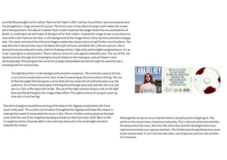
1. Lana Del Reybrought outher album‘Bornto Die’back in2012 and has foundthatit wasverypopularand
has broughthera huge amountof success.The front coverof the albumto beginwithmakesthe viewer
ask a fewquestions.The albumisnamed‘born todie’howeverthe image shownhasnoconnotationsof
death,or anythingtodo withtopicof dyingat all for that matter.Insteadthe image showsaverycleancut
Lana witha sternlookon her face.Inthe backgroundof the image there isblue skythat promotesahappy
vibe.Thisclearcontrastof the title andimagerymakesthe viewerwanttolookfurtherintothe album.The
waythat she is dressedalsosaysa lotabout the style of music,andwhat she islike asa person.She is
dressedveryprecisely andneatly,withherflowingredhair,highcollarandstraightuprightposture.It’sas
if she’sposingfora school photo.There isalsoso sense of a sex appeal relatedtoLana.The use of the red
lipstickandsee throughshirtshowingherbraall relatestothe male gaze,and will drawinmen
stereotypically.She alsogivesthe senseof astrong independentwomanthroughthe waythatshe is
standingwithherseriousface.
The lightblue thatis inthe backgroundconnotesinnocence.Thiscontrasts Lanaas she has
a veryseriousexpressiononherface,aswell aswearingquite provocativeclothing.The use
of the lowangle shotalsogivesa sense thatshe hassome sort of authorityoverusas the
audience.All of these factorsgive afeelingthatalthoughLanamaylooklike she isok,but
she isin fact sufferingonthe inside. The use of the highcontrastcolourssuch as the light
blue andthe white givesthe image afake effect.Thisaddstosense of tryingto coverup
howshe is trulyfeeling.
The white backgroundandblue writingof the backof the digipakcomplimentsthe front
coverreallywell.Thiscreatescontinuationthroughoutthe digipakanddrawsthe viewerin
makingthemwantto knowwhat the musicislike.There isfurthercontinuationonthe back
coverwiththe use of the negative wordingasshownonthe frontcoverwith‘Born to Die’
tisnegative choice of wordsaddsto the intensityandpushesthe meaningful narrative
towardsthe viewer.
Althoughthe cdseemsverysimplisticthere’sactuallyquitealotgoingon.The
white onthe cd connotesinnocence andpurity.Thisisthendirectlycontrastedby
the deepredof the roses.Notonlythe colourbut alsothe ideologiesthatroses
representpromote lust,passionandlove.ThisfurtherputsforwardhowLana want
to be represented.It’sasif she hastwosides,one of passionandlustand another
of innocence.
2. I forgetwhere we were releasedin2014 is the secondalbumto be broughtout bythe singer/song
writerBenHoward.Beingthat thiswasn’thisfirstalbumhe had alreadymade a prominentfootprintin
the musicindustry,andhad developedalarge following.The factthat Benisalreadya reasonablywell
knowartistcan be showninthe cover of hisalbum.The cover showsanimage of Beninblack white in
lightingthatcan be describedaschiaroscuro.Due to thisitmakesit quite difficulttotell whoitisinthe
image.Asa resultthisshowsthatBen alreadyisa prominentartistaspeople whohave heardhismusic
will be able totell whoitison the front of the cover.Asa resultit showshe alreadyhasa decentfan
base that thisalbumappealsto.
The way the image of the flowershasbeenlayeredandgivenasortof 3D effectdistorts
the image.Thisrelateswell tothe style of the musicthatBenmakesas it givesoff a
chilledout,relaxedfeel thatisstronglyshowninhisstyle of music.Howeverthe use of
the distortedimage canalsoshowconfusion.Thislinksintothe title of the album‘Iforget
where we are’.The use of thispatternisusedthroughoutthe albumandgivesthe sense
that there isan elementof uncertaintywithinthe album.
houghsome may
othe opposite.
within,makes
asa decent
sa large fanbase
e digipakall tiedintoone.The flowerdesignhas
ckandwhite effecthasbeenusedonthe main
n a dark greycolour.Thisbringsall of the design
be shownto draw the viewerinfromthe outer
placed.
3. The image of the man shownonthe front of the albumdisplaysanaverage,normal,workingclass
guy.The audience caneasilyrelate tothisperson,itjustlookslikeanaverage guyyou’dsee onthe
street.Due to thisinstantrelationsome people mayhave withthe albumcoveritmaymake them
more likelytobuythe albumas itdraws themin.
The style of musiccan clearlybe shownthroughthe digipak.ArcticMonkeysare knownfortheir
indie rockmusic,this isshownthroughthe picture usedinthe blackand white filter.The image
showsthe man smokingacigarette,thisisstereotypicallyan“edgy”thing to dothat can be related
to indie rock.People interestedinthisstyle of musiccaninstantlyrelate tothe albumcover,without
evenhearingtheirmusicorknowingthemasa band.
The Arctic Monkeysreleasedtheirdebutalbum‘whateverpeoplesay,that’swhatI’mnot’in 2006.
Beingthatthis wasthere firstalbumtheyhadto make an impressiononthe public,aswell as
creatinga target audience. Due tothe Arctic Monkeystryingtomake a place forthemselvesinan
everexpandingmusicworldtheyneededtostickout,while alsosettlingintoaspecificgenre to
create a solidfanbase.
The colour scheme alsoreflectsthe styleof musicquite obviouslythroughthe blackand
white thathas beenused.Darkercoloursare commonplace inindie musicasit directly
promotesthe genre of music.The colourscan be linkedtoa more meaningful feel tothe
musicthat ismore relatable tothe male audience,hence the use of darkercolours
throughoutindie rockmusic.
The imagesof the cigarettesgivesthe senseof rebellion.It’sseenasquite a
‘badass’ thingto do.This can relate totheirmusicas inthe waythat theygo
againstsocietybyportrayingsmokingascool theyalsogo againstwhat the
people mightactuallywanttolistento.They’vedone theirownthing,
talkingabouttheirownexperiencesandthingsthey’vegone throughintheir
ownpersonal lives,ratherthanthe commongenerictopicscoveredbythe
majorityof artistsaboutat the time.
done toaim the
wthemin and
inthe Artic
rawnoutbitsof
winstantly