1. Draft 2
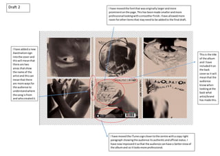
I have movedthe iTunessignclosertothe centre witha copy right
paragraph showingthe audience itsauthenticandofficial status.I
have nowimproveditsothat the audience canhave a betterviewof
the albumand so itlooksmore professional.
I have movedthe fontthat wasoriginallylargerandmore
prominentonthe page.Thishas beenmade smallerandmore
professionallookingwithasmootherfinish.Ihave allowedmore
room forotheritemsthat mayneedto be addedto the final draft.
I have addeda new
Awolnationsign
intothe cover and
thiswill meanthat
there are two
areas thatshow
the name of the
artistand thiscan
meanthat there
are more waysfor
the audience to
understandwhere
the song isfrom
and whocreatedit.
Thisis the title
of the album
and I have
includediton
the back
coveras it will
meanthat the
audience
knowwhen
lookingatthe
back what
artist/brand
has made this.
2. I have usedthiscolour(pastel pink)
to make sure that there isa slight
edge to the digipakwithmore than
justblackand white due towanting
to create a more professional look
for the audience.Thisiscompleted
frominvertingthe image.
I have includedthe AWOLNATIONname onthe spine
of the coverto make sure that whenthe audience tidy
away theirCD’stheyare still able tosee whatalbum
theyare choosingwhenviewinginformthe side.
I have usedthe same fontthroughoutthisdigipakandthiscreatesa sense of
continuityandIwouldlike tomake sure that thisisusedfor myfinal draftand I have
placedthemonthe lefthandside tomake sure that the audience canread itclearly
and logically.
I have insertedthiswheel circularshape toshowwhere the
actual CD will be placed,Ihave chosenadarker image so
that the lightercolouraroundcan be seenandthere is
more contrast.
I am usingblackpaint
withinthese photos,
and wheninvertedit
meansthat I am able
to showthiscolouras
white/lightpink.
Draft 1