
Recommended
More Related Content
What's hot
What's hot (20)
Similar to The 1975 album annotation
Similar to The 1975 album annotation (20)
More from Jasminep_media
More from Jasminep_media (20)
Recently uploaded
Recently uploaded (20)
The 1975 album annotation
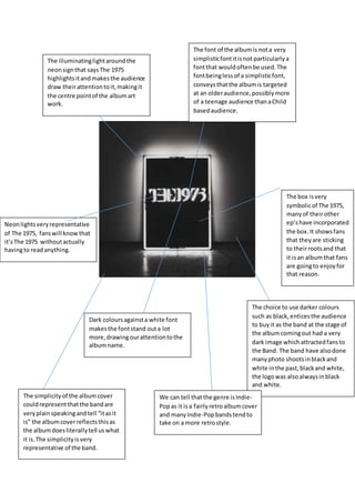
- 1. The font of the albumis nota very simplisticfontitisnot particularlya fontthat wouldoftenbe used.The fontbeinglessof a simplisticfont, conveysthatthe albumis targeted at an olderaudience,possiblymore of a teenage audience thanaChild basedaudience. Dark coloursagainsta white font makesthe fontstand outa lot more,drawingourattentiontothe albumname. The choice to use darker colours such as black,enticesthe audience to buyit as the band at the stage of the albumcomingout had a very dark image whichattractedfansto the Band. The band have alsodone manyphoto shootsinblackand white inthe past,blackand white, the logowas alsoalwaysinblack and white. The illuminatinglightaroundthe neonsignthat saysThe 1975 highlightsitandmakesthe audience draw theirattentiontoit,makingit the centre pointof the albumart work. The box isvery symbolicof The 1975, manyof theirother ep’shave incorporated the box.It showsfans that theyare sticking to theirrootsand that it isan albumthat fans are goingto enjoyfor that reason. Neonlightsveryrepresentative of The 1975, fanswill knowthat it’sThe 1975 withoutactually havingto readanything. We can tell thatthe genre isIndie- Popas it isa fairlyretroalbumcover and manyIndie-Popbandstendto take on a more retrostyle. The simplicityof the albumcover couldrepresentthatthe bandare veryplainspeakingandtell “itasit is” the albumcoverreflectsthisas the albumdoesliterallytell uswhat it is.The simplicityisvery representative of the band.