The poster uses imagery and design elements to represent the artist's music and draw in the audience. A close-up photo of the artist in black clothing and makeup against a black background conveys a sense of darkness and rebellion. Gold logo text stands out and could represent the hip-hop genre. Minimal textual information targets younger audiences with less reading and highlights that it is a debut album including a number one single. The black, white, and gold color scheme contrasts while also possibly representing different sides to the music.
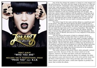
1. One of the first things the audience is drawn to is the imagery on
the advertisement. The main and only image on the poster is a close up
of the artist herself. A dominant colour surrounding the artist is black
as her hair, make-up and clothes are all black. The black may connote
with darkness and rebellion which may represent the music within the
album advertised. The facial expression of the artist again may
represent rebellion as she isn’t smiling and looks sort of angry. The
artist has a direct mode of address with the audience which may be to
help the audience connect with the artist and her music. However, the
way that the artist’s hair is styled covers up part of her face, close to
her eyes. Although the direct mode of address may connect with the
audience, the way that her eyes are nearly covered may pull the
audience away.
The artist’s logo for her name and her album is a significant part
of the poster. The gold and white against the black clothing make it
stand out to the audience, making them familiar with the artists name
and what the poster is advertising. The colour, shine and positioning of
the text make the logo look as if it is a piece of jewellery. This may be
used to represent the genre of the music within the album, hip-hop.
This is because big, gold jewellery is iconic of the hip-hop genre. Also,
the logo is a way to identify the artist as it’s on a majority of the pieces
related the album.
The text used on the poster is kept to a minimal, which is
attractive to the audience as they don’t have to spend a lot of time
reading the poster. Also, the little text may target a younger audience
as a younger audience are less likely to want to read a lot of text. The
text, however, may be attractive to the audience as it states that it is a
‘debut album’. The fact that the album is a debut may be attractive to
the audience and they may be intrigued as to what the album and artist
is like, leading them to buy the album. Also, the way that the album
includes a number one single, may also be attractive to the audience
especially if they know and like the single.
The colour scheme of the poster, black, white and gold, contrast
against each other. Because of this, the colours stand out to the
audience. However, the black and white could also represent two
different sides to the music within the album. For example, the white
may represent a pure and innocent side to the artist and her music but
the black could represent a more sharp and edgy side to her music.
These colours, and in fact music, could come together to produce the
music that is within the album.