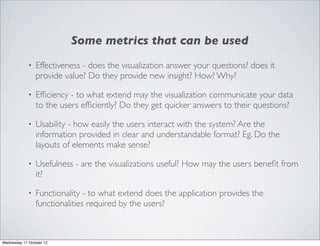
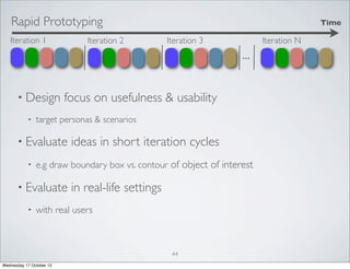
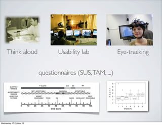
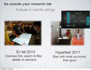
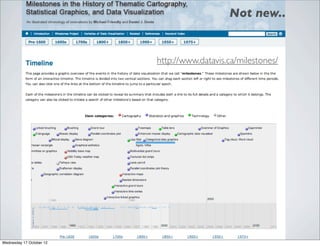
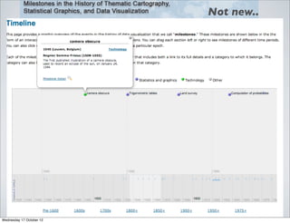
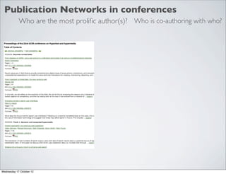
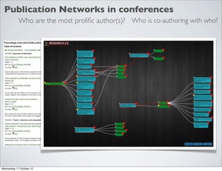
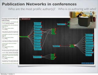
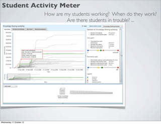
The document appears to be a presentation on information visualization. It discusses definitions of information visualization, examples of early information visualizations throughout history, and potential applications like visualizing publication networks and student activity data. It also covers best practices for visualization like ensuring visuals are designed to be easily interpreted and don't mislead, using proper scaling and layouts, and considering the cognitive strengths and limitations of human perception when designing visualizations.
Mazza introduction-to-information-visualization-2004Elsa von Licy
This document provides an introduction to information visualization. It defines information visualization as using computer-supported interactive visual representations of abstract data to amplify cognition. Effective visualization allows people to more easily understand complex ideas, patterns in data, and develop a deeper understanding. The document discusses how visualization can aid thinking by reducing cognitive load and enhancing pattern recognition. It also examines some historical contributors to the field and different techniques used in information visualization.
CensusGIV - Geographic Information Visualisation of Census DataCASA, UCL
The document discusses the development of CensusGIV, a prototype for providing innovative geographic visualization of UK census small area statistics. It aims to develop an interactive web-based mapping application using open source technologies to allow users to easily explore and analyze census data through dynamic choropleth maps and other visualization techniques. The document outlines the objectives, design considerations, system architecture, and timeline for the CensusGIV prototype. Key aspects discussed include data access, map creation, color theory, and a modular client-server architecture.
The document describes a geospatial viewer developed for Scottish Water by Kemeling Consulting to provide a single repository for asset information and new layers of information. The viewer is browser-based, hosted on the intranet, and aimed at planners. It allows various layers of asset data to be visualized for a fictional town, including reactive repairs, environmental incidents, known issues, and planned/identified work. The project used an agile approach and open source software, providing functionality quickly and manageably while meeting Scottish Water's needs cost-effectively.
The document discusses interaction techniques for information visualization. It describes three interlocking feedback loops: the data manipulation loop, exploration and navigation loop, and problem-solving loop. It discusses theories for how users interact with and navigate data, including Hick-Hyman's Law, Fitt's Law, and Siegel and White's model of developing a cognitive spatial map. It also covers focus, context, and scale in information visualization.
This document summarizes an experiment comparing a boat with tape surrounding its bowl and balloon to one without tape. The boat with tape held an average of 14.25 grams across 10 trials, while the one without tape held only 5.5 grams on average. The author learned that the tape helps the aluminum foil adhere better to the bowl, preventing water from seeping in, which improves how much mass the boat can hold.
The document discusses concepts related to information visualization including Gestalt laws of perception, visual properties for encoding data dimensions, techniques for visualizing patterns over time, proportions, relations and spatial relationships. It provides examples of visualizations and concludes with a checklist for designing effective data visualizations.
Multimedia les - intro tot informatie visualisatieJoris Klerkx
Information visualization uses interactive visual representations to help make sense of large amounts of data. It can help discover patterns, communicate information more effectively, and facilitate exploration and understanding. The visualization process involves gathering and cleaning data, applying visual encodings like size, color and position, and designing for interactivity and usability testing. Key principles include using common sense, avoiding misleading visuals, and leveraging human perceptual strengths through techniques like Gestalt grouping laws.
By Ruichen Jiang, Rob Garruccio and Samantha Limbrick
The document summarizes a visualization created by the authors to illustrate data from the Australian Bureau of Statistics regarding the participation of Australian children ages 5-14 in various recreational activities over a two week period. The visualization shows the percentages of males and females who participated in activities like skateboarding, bicycle riding, watching TV, arts and crafts, reading, and homework for 20 or more hours during the period. The authors believe visualizing this data has potential to more clearly engage audiences and generate discussion around influencing factors like school, advertising, and parenting on children's recreation choices.
This document provides tips for effective data visualization (DV). It discusses how the human visual system works differently than cameras, with selective attention and constant adaptation. Effective DV designs consider visual perceptual properties like color, position, length, area and encode data dimensions accordingly. Designs should also follow principles like expressing only the facts in the data set and maintaining consistency. Overall, the document aims to explain how understanding human visual cognition can help create visualizations that facilitate insight from data.
1) The document discusses challenges with 3D visualization of geographic and mapping data compared to traditional 2D representations.
2) Specifically, it notes that symbols used in 2D maps do not always translate well to 3D environments and questions whether a single symbol set can represent information effectively in both 2D and 3D.
3) The document explores issues with scales, perspectives, lighting and other factors that make consistent representation of symbols across dimensions difficult.
A short history (and even shorter future) of information visualisationErik Duval
This document provides a short history of information visualization through examples of influential figures. It describes Charles Minard's visualization of Napoleon's 1812 campaign, William Playfair's creation of the line graph, bar chart and pie chart between 1786-1801, Florence Nightingale's polar area diagram in 1858 showing mortality rates in the Crimean War, John Snow's 1854 map showing clusters of cholera cases in London near a water pump, and Harry Beck's innovative 1933 diagram of the London Underground system. The document suggests these examples helped establish key foundations of the field of information visualization.
The document discusses foundations of information visualization. It begins by explaining the goal of visualization is to transfer information from one point to another, such as from data to understanding. Different types of visualization like exploratory and explanatory are introduced. Exploratory visualization is used to analyze and understand data, while explanatory aims to communicate findings to others. The concept of information architecture and organizing data to support usability is also covered. Finally, the document discusses how functions constrain forms in visualization design and the relationship between the two is bidirectional.
This document introduces Google Chart Tools, which allows users to create interactive charts and maps from various data sources. It has several advantages, including customization of charts to fit websites, cross-browser compatibility using HTML5/SVG, and the ability to connect to dynamic real-time data. The tool includes a library of chart types that can be customized and populated with data from JavaScript data tables. Charts are created by loading libraries, populating data tables, customizing options, and drawing the chart. Various chart types are described, including area, bar, gauge, geo, table, tree, combo, line, scatter, candlestick, and organizational charts. Examples of coding charts from Google Spreadsheets and custom data are provided.
Visualisation: VALA 2014 L Plate sessionKate Davis
The document discusses different types of data visualization including infographics, visual thinking, information design, and creative visualization. It notes that visualization helps make complex data more accessible and helps communicate ideas visually. Reasons for the increasing importance of visualization include the proliferation of open data, big data, and visualization tools. Examples are provided of visualizations that tell stories with data from different sources in an engaging manner.
This document discusses various techniques for information visualization, including static and interactive representations. It provides examples of early static visualizations from clay tablets to printed timetables, as well as more recent interactive visualizations enabled by advances in computing. Key aspects of visualization design are covered such as choosing appropriate representations, using interaction to reduce trade-offs, and addressing challenges of very large datasets. Classic visualization types like scatterplots, treemaps, and faceted browsing are explained through examples.
The document announces the 7th annual international workshop on Lifelong Learning within European Frameworks to be held in April 2016 in Mogilev, Belarus. The workshop will bring together academics, educators, and experts from various European states to promote collaboration, share new findings and concepts, and help develop common European education frameworks. It provides important dates, submission guidelines, registration information, and contact details for the event.
Information Visualisation (Multimedia 2009 course)Joris Klerkx
This document summarizes research on information visualization techniques for exploring abstract data. It discusses how visualization can amplify cognition by using interactive visual representations. Several techniques are examined, including tree maps and node-link graphs for displaying hierarchical and network data. Case studies describe prototypes that apply these techniques to domains like learning object repositories and social bookmarking data. The prototypes are evaluated through expert reviews and user studies to assess their effectiveness and usability. Pointers to related libraries and readings are also provided.
The document discusses implementing business intelligence (BI) systems using Agile methods. It begins with an overview of Agile and how it differs from traditional waterfall approaches. The benefits of Agile, such as business engagement and quicker response to change, are outlined. The document also discusses common misconceptions about Agile and explains why Agile is well-suited for BI projects given that businesses are always changing. Tips for implementing Agile BI are provided, such as prototyping and using reusable models. Essential tools for Agile BI, like JIRA and Microsoft Team Foundation Server (TFS), are also described.
The document discusses different types of data that can be visualized, including entities, relationships, attributes, and operations. It describes entities as objects of interest and relationships as structures that relate entities. Attributes are properties of entities or relationships, and can have multiple dimensions. The document also discusses types of numbers according to Stanley Smith Stevens' taxonomy, including nominal, ordinal, interval, and ratio scales. Finally, it covers data aggregations at different levels from individual transactions to factoids.
Information visualisation: Data ink design principlesErik Duval
The document discusses Erik Duval's presentation on Edward Tufte's principles of data ink design. It outlines Tufte's key principles: showing the data above all else, maximizing the data-ink ratio by removing non-data ink, erasing redundant data ink, and revising and editing visualizations. The data-ink ratio refers to the proportion of ink devoted to displaying non-redundant data information. The principles aim to clearly display the maximum amount of data with the minimum amount of graphical elements.
Introduction to information visualisation for humanities PhDsMia
Training workshop for the CHASE Arts and Humanities in the Digital Age programme. (
This session will give you an overview of a variety of techniques and tools available for data visualisation and analysis in the humanities. You will learn about common types of visualisations and the role of exploratory and explanatory visualisations, explore examples of scholarly visualisations, try some visualisation tools, and know where to find further information about analysing and building data visualisations.
Visualiation of quantitative informationJames Neill
This document discusses data visualization and graphing techniques. It covers levels of measurement, principles of graphing, and types of univariate graphs like bar charts, pie charts, histograms, and box plots. It emphasizes graphical integrity and avoiding distortion to clearly communicate the true story of the data.
This document introduces infographics and data visualization. It defines infographics as visual representations of information used to support and strengthen information in a sensitive context, while data visualization visually displays measured quantities using points, lines, and other graphical elements. The document provides examples of effective data visualization patterns and preattentive variables that convey information preattentively. It also discusses interactivity and categories of visualization, looking at examples from Descry, Gapminder, and Google Visualization.
This document discusses human-computer interaction and visualization techniques for teaching and learning (TEL). It introduces concepts like using visualizations to find relevant learning materials, understand learning materials, provoke collaboration between learners, and provoke awareness and self-reflection. It also discusses the visualization pipeline, which involves formulating questions about a dataset, gathering the data, applying visual mappings to encode the data visually using techniques like size, color, and Gestalt principles of proximity, symmetry, similarity, and common fate. The goal is to leverage human perceptual abilities and use interactive visualizations to amplify cognition.
This is a lecture I gave to undergraduates and Masters students at the Communication Design School at Texas State University. Thank you to Jill Fantauzza for the invitation!
I would give up my laptop/desktop before giving up my smartphone
Source: The Mobile Movement Study, Google/Ipsos OTX MediaCT , Apr 2011
Base: Smartphone Users (5013) Q. If you had to give up either your laptop/desktop computer or your smartphone, which would you be willing to give up?
http://www.flickr.com/photos/jcfrog/4692750598
Tuesday, October 16, 2012
28
Mobile Phone Fragmentation
‣ Multiple OS platforms (iOS, Android, Blackberry, Windows Mobile)
‣ Multiple device types (phones, tablets)
‣ Multiple screen sizes
‣ Multiple
Los Angeles R users group - Nov 17 2010 - Part 2rusersla
The document provides an outline for a talk on the future of R. It discusses R's current strengths and criticisms, as well as challenges like handling big data. It proposes 5 potential solutions: 1) Using R with other tools; 2) Packages for large data; 3) Improving R's capabilities; 4) Starting from scratch; 5) Adopting aspects of Clojure. Clojure is presented as having libraries for statistics, machine learning, and querying big data, positioning it as a potential model for R's evolution.
Mobile Accessibility - Accessibility Camp TorontoTed Drake
This presentation is similar to the version I gave at Silicon Valley Code Camp that can also be seen on Slideshare. This version introduced videos for Android 4.2 and Surface.
Visit http://last-child.com/mobile-accessibility/
The document discusses how PR professionals can amplify the human digital channel for their clients. It provides tips such as cultivating visibility through storytelling, earning leverage through loyal fans, and focusing on inclusion and belonging. The key points are to cultivate visibility by making the customer the hero, earn leverage through relationships and serendipity, and view business as about belonging and opening up connections.
This document provides an overview of a post-academic course on Big Data taught by Joris Klerkx. It discusses the Augment group's mission to augment human intellect through tools and technologies. Their research focuses on capturing physiological and behavioral signals through sensors to create meaningful feedback loops. Application domains discussed include technology-enhanced learning, media consumption, science, and health. Guidelines for visualizing big data emphasize using interactive visual encodings to promote recognition over recall by humans. Interactivity, overview first approaches, and checking data quality are advised.
My talk regarding measuring reader engagement through the use of physiological sensors at the one hand, and visualizing this information at the LICT workshop on "Information Processing in Social Media"
This document outlines the schedule and content for Lesson 9 of an information visualization course. It discusses upcoming session dates and times. It provides an evaluation of the course so far and discusses paper requirements. Students will do show-and-tell presentations and receive design critique feedback. The finale demo is scheduled for May 9th.
This document contains the schedule and content for an information visualization course. It discusses the following:
- The schedule for practical sessions over several weeks in April and May 2016.
- A summary of the "Data-Ink Design Principles" presented by the instructor, including maximizing the data-ink ratio and erasing non-data ink.
- Student groups presenting their work and receiving feedback on their visualizations from the instructor and other students.
- The assignment for next class, which involves continuing work on an individual spreadsheet and team implementation, as well as preparing a blog post and draft paper.
Les 7 - informatie visualisatie - interactieJoris Klerkx
This document discusses interactive visualization and summarizes key points from an article on interactive dynamics for visual analysis. It outlines how interaction can support exploration of large datasets by enabling data and view specification, view manipulation, and recording analysis processes and provenance. Effective interactive visualizations allow users to explore data at their own pace, support overview first with zoom/filter capabilities, and facilitate comparison through coordinated/multiple linked views.
This document discusses steps for designing and prototyping useful apps, including brainstorming ideas and prototyping one's own app. It recommends starting with defining the app's purpose and goals. Key steps include developing personas based on user research, creating storyboards to map user flows, and building paper prototypes to test design ideas with users before implementing a digital prototype. The overall process emphasizes user-centered design and rapid prototyping to get feedback early in the design cycle.
This document discusses a lesson on information visualization. It covers pre-attentive visual properties that can be detected quickly by the human visual system, such as hue, length, orientation and closure. It also discusses best practices for visual mapping, including using position and color to encode data attributes and relationships. The document provides examples of effective and ineffective visual encodings and asks students to present their group projects for feedback to incorporate before next week's work on data collection and implementation.
This document provides an overview and summary of an information visualization lesson. It discusses topics covered in the previous lesson such as D3.js and creating blog posts. Guidelines for data visualization best practices are presented, including an overview of perceptual abilities and limitations of humans. Common mantras and techniques like overview first, zoom and filter, and details-on-demand are covered. The document concludes with an exercise to visualize a small dataset and assigning a practical project to create an interactive visualization.
20160208 informatie visualisatie les 1Joris Klerkx
This document provides an introduction to an information visualization course. It outlines the goals of the course, which are to provide insights into fundamentals of infovis and its applications, as well as concrete skills for designing, implementing, and evaluating infovis applications. It discusses topics that will be covered like data abundance, visualization examples, the definition of infovis, and introduces the D3.js library. Students are expected to complete a group project, write a paper, and provide feedback to other groups.
Visualisation - techniques, interaction dynamics, big dataJoris Klerkx
Module 3 - cursus Big Data - Visualisation - deel 2
Instituut voor Permanente Vorming
Various visualisation techniques
(adapted from Heer, J., Bostock, M., & Ogievetsjy, V. (2010, May). A Tour through the Visualization Zoo - A survey of powerful visualisation techniques, from the obvious to the obscure. ACM Graphics , 8 (5), https://queue.acm.org/detail.cfm?id=1805128 )
Various interaction techniques
(adapted from Heer, J., & Shneiderman, B. (2012, February). Interactive Dynamics for Visual Analysis. Magazine Queue - Microprocessors , 10 (2), p. 30. http://queue.acm.org/detail.cfm?id=2146416 )
Big data to big to visualize?
Introduction to the course at the KU Leuven on fundamentals of human computer interaction - http://onderwijsaanbod.kuleuven.be/syllabi/n/G0Q55AN.htm#activetab=doelstellingen_idp1326000
Bring your own idea - Visual learning analyticsJoris Klerkx
Workshop on visual learning analytics that was part of LASI 2014 - http://www.solaresearch.org/events/lasi-2/lasi2014/
Examples of learning dashboards were presented during the workshop by Sven Charleer:
http://www.slideshare.net/svencharleer/learning-dashboard-visual-learning-analytics-workshop-lasi2014-h-harvard
Quantified Self - LICT workshop - KU LeuvenJoris Klerkx
Joris Klerkx gave a presentation on the Quantified Self movement. The Quantified Self involves self-tracking of metrics like health, sleep, productivity, and more using technologies like fitness trackers and apps. Klerkx's research focuses on how data from self-tracking can be captured, made sense of, and evaluated for usefulness. Some of his past student projects include tracking lucid dreams, measuring brainwaves, and using location data and badges for motivation. Key research questions for Quantified Self include how to capture relevant actions, what can and should be tracked, how to understand and interpret the data, and how to assess the value of self-tracking tools and data.
This document discusses potential cooperation between the DM2E (Digital Manuscripts to Europeana) project and the Europeana Cloud project. It describes three case studies of tools that could help researchers find, navigate, and share information from digitized content collections: 1) The ARIADNE Finder tool helps researchers find relevant content. 2) A timeline visualization of the Wittgenstein Nachlass could help navigate that content. 3) The TiNYARM tool allows researchers to see what papers their colleagues are reading and sharing to stay aware of their work. The document seeks feedback on what content and tools would be most relevant for DM2E researchers and how the tools could be evaluated.
This document discusses user experience (UX) and the importance of user-centered design. It provides examples of how technology should aim to remove friction between users and information by being easy to learn, efficient to use, and pleasant. The document emphasizes that UX design is not just about usability, but involves understanding users, studying their behaviors and workflows, and designing based on real-world usage through iterative testing. The goal of UX is to create intuitive solutions tailored to user needs and goals.
JTELSS - pimp your learning analytics with proper visualisation techniquesJoris Klerkx
This document provides guidance on creating effective learning analytics visualizations. It discusses using visualization to find patterns in data, communicating stories through data, and empowering users to make informed decisions. Key recommendations include using interactive visuals, following perceptual and cognitive principles like Gestalt laws, and evaluating designs based on how well they help users achieve goals. Examples are provided of different visualization types and tools that can be used to create dashboards for exploring educational data.
the EMurgency project - LICT workshop on ICT in healthJoris Klerkx
The document summarizes the EmUrgency project, which aims to increase survival rates from out-of-hospital cardiac arrests through faster response times. The project involves developing a multi-channel notification system to alert nearby trained volunteers and dispatch emergency responders. It also aims to raise public awareness of CPR through educational videos, school programs, and recruiting more volunteers. The partners involved in the 3-year project are universities and hospitals from Belgium, Germany, and the Netherlands.
D3.js is a JavaScript library for binding data to documents and rendering interactive data visualizations in web browsers. It allows binding arbitrary data to a Document Object Model (DOM) and applying data-driven transformations to the DOM. D3 works with common web technologies like HTML, SVG, CSS, and JSON, and supports all modern browsers. It provides an extensive API for manipulating documents based on data.
ISO/IEC 27001, ISO/IEC 42001, and GDPR: Best Practices for Implementation and...PECB
Denis is a dynamic and results-driven Chief Information Officer (CIO) with a distinguished career spanning information systems analysis and technical project management. With a proven track record of spearheading the design and delivery of cutting-edge Information Management solutions, he has consistently elevated business operations, streamlined reporting functions, and maximized process efficiency.
Certified as an ISO/IEC 27001: Information Security Management Systems (ISMS) Lead Implementer, Data Protection Officer, and Cyber Risks Analyst, Denis brings a heightened focus on data security, privacy, and cyber resilience to every endeavor.
His expertise extends across a diverse spectrum of reporting, database, and web development applications, underpinned by an exceptional grasp of data storage and virtualization technologies. His proficiency in application testing, database administration, and data cleansing ensures seamless execution of complex projects.
What sets Denis apart is his comprehensive understanding of Business and Systems Analysis technologies, honed through involvement in all phases of the Software Development Lifecycle (SDLC). From meticulous requirements gathering to precise analysis, innovative design, rigorous development, thorough testing, and successful implementation, he has consistently delivered exceptional results.
Throughout his career, he has taken on multifaceted roles, from leading technical project management teams to owning solutions that drive operational excellence. His conscientious and proactive approach is unwavering, whether he is working independently or collaboratively within a team. His ability to connect with colleagues on a personal level underscores his commitment to fostering a harmonious and productive workplace environment.
Date: May 29, 2024
Tags: Information Security, ISO/IEC 27001, ISO/IEC 42001, Artificial Intelligence, GDPR
-------------------------------------------------------------------------------
Find out more about ISO training and certification services
Training: ISO/IEC 27001 Information Security Management System - EN | PECB
ISO/IEC 42001 Artificial Intelligence Management System - EN | PECB
General Data Protection Regulation (GDPR) - Training Courses - EN | PECB
Webinars: https://pecb.com/webinars
Article: https://pecb.com/article
-------------------------------------------------------------------------------
For more information about PECB:
Website: https://pecb.com/
LinkedIn: https://www.linkedin.com/company/pecb/
Facebook: https://www.facebook.com/PECBInternational/
Slideshare: http://www.slideshare.net/PECBCERTIFICATION
A review of the growth of the Israel Genealogy Research Association Database Collection for the last 12 months. Our collection is now passed the 3 million mark and still growing. See which archives have contributed the most. See the different types of records we have, and which years have had records added. You can also see what we have for the future.
Main Java[All of the Base Concepts}.docxadhitya5119
This is part 1 of my Java Learning Journey. This Contains Custom methods, classes, constructors, packages, multithreading , try- catch block, finally block and more.
This presentation includes basic of PCOS their pathology and treatment and also Ayurveda correlation of PCOS and Ayurvedic line of treatment mentioned in classics.
This presentation was provided by Steph Pollock of The American Psychological Association’s Journals Program, and Damita Snow, of The American Society of Civil Engineers (ASCE), for the initial session of NISO's 2024 Training Series "DEIA in the Scholarly Landscape." Session One: 'Setting Expectations: a DEIA Primer,' was held June 6, 2024.
Walmart Business+ and Spark Good for Nonprofits.pdfTechSoup
"Learn about all the ways Walmart supports nonprofit organizations.
You will hear from Liz Willett, the Head of Nonprofits, and hear about what Walmart is doing to help nonprofits, including Walmart Business and Spark Good. Walmart Business+ is a new offer for nonprofits that offers discounts and also streamlines nonprofits order and expense tracking, saving time and money.
The webinar may also give some examples on how nonprofits can best leverage Walmart Business+.
The event will cover the following::
Walmart Business + (https://business.walmart.com/plus) is a new shopping experience for nonprofits, schools, and local business customers that connects an exclusive online shopping experience to stores. Benefits include free delivery and shipping, a 'Spend Analytics” feature, special discounts, deals and tax-exempt shopping.
Special TechSoup offer for a free 180 days membership, and up to $150 in discounts on eligible orders.
Spark Good (walmart.com/sparkgood) is a charitable platform that enables nonprofits to receive donations directly from customers and associates.
Answers about how you can do more with Walmart!"
Beyond Degrees - Empowering the Workforce in the Context of Skills-First.pptxEduSkills OECD
Iván Bornacelly, Policy Analyst at the OECD Centre for Skills, OECD, presents at the webinar 'Tackling job market gaps with a skills-first approach' on 12 June 2024
BÀI TẬP BỔ TRỢ TIẾNG ANH 8 CẢ NĂM - GLOBAL SUCCESS - NĂM HỌC 2023-2024 (CÓ FI...
intro to information visualization
1. HUMAN COMPUTER INTERACTION LAB
INFORMATION
VISUALISATION
capita selecta 17/10/2012
Joris Klerkx
@jkofmsk
Wednesday 17 October 12
2. Imagine you never saw a car...
Would the following definitions help to explain it?
http://www.thefreedictionary.com/car
Wednesday 17 October 12
3. Imagine you never saw a car...
Would the following definitions help to explain it?
http://www.thefreedictionary.com/car
1. It’s an automobile
Wednesday 17 October 12
4. Imagine you never saw a car...
Would the following definitions help to explain it?
http://www.thefreedictionary.com/car
1. It’s an automobile
A phone that automatically takes a call..
Wednesday 17 October 12
5. Imagine you never saw a car...
Would the following definitions help to explain it?
http://www.thefreedictionary.com/car
1. It’s an automobile
A phone that automatically takes a call..
2. It’s a vehicle, such as a streetcar
Wednesday 17 October 12
6. Imagine you never saw a car...
Would the following definitions help to explain it?
http://www.thefreedictionary.com/car
1. It’s an automobile
A phone that automatically takes a call..
2. It’s a vehicle, such as a streetcar
Wednesday 17 October 12
7. Imagine you never saw a car...
Would the following definitions help to explain it?
http://www.thefreedictionary.com/car
1. It’s an automobile
A phone that automatically takes a call..
2. It’s a vehicle, such as a streetcar
3. It’s a boxlike enclosure for passengers, with wheels
Wednesday 17 October 12
8. Imagine you never saw a car...
Would the following definitions help to explain it?
http://www.thefreedictionary.com/car
1. It’s an automobile
A phone that automatically takes a call..
2. It’s a vehicle, such as a streetcar
3. It’s a boxlike enclosure for passengers, with wheels
Wednesday 17 October 12
9. Imagine you never saw a car...
Would the following definitions help to explain it?
http://www.thefreedictionary.com/car
1. It’s an automobile
A phone that automatically takes a call..
2. It’s a vehicle, such as a streetcar
3. It’s a boxlike enclosure for passengers, with wheels
4. A chariot, carriage, or cart
Wednesday 17 October 12
10. Imagine you never saw a car...
Would the following definitions help to explain it?
http://www.thefreedictionary.com/car
1. It’s an automobile
A phone that automatically takes a call..
2. It’s a vehicle, such as a streetcar
3. It’s a boxlike enclosure for passengers, with wheels
4. A chariot, carriage, or cart
Wednesday 17 October 12
11. Imagine you never saw a car...
Would the following definitions help to explain it?
http://www.thefreedictionary.com/car
1. It’s an automobile
A phone that automatically takes a call..
2. It’s a vehicle, such as a streetcar
3. It’s a boxlike enclosure for passengers, with wheels
4. A chariot, carriage, or cart
A picture is worth a 1000 words
Wednesday 17 October 12
12. A definition...
Information Visualisation is the use of interactive
visual representations to amplify cognition [Card. et. al]
Wednesday 17 October 12
13. A definition...
Information Visualisation is the use of interactive
visual representations to amplify cognition [Card. et. al]
Find out what a data set is about
What are the stories behind the data?
Communicating data
Facilitate human interaction for exploration and understanding
Empower people to make informed decisions
Wednesday 17 October 12
15. Not new..
http://www.datavis.ca/milestones/
Wednesday 17 October 12
16. Not new..
http://www.datavis.ca/milestones/
Wednesday 17 October 12
17. Publication Networks in conferences
Who are the most prolific author(s)? Who is co-authoring with who?
Wednesday 17 October 12
18. Publication Networks in conferences
Who are the most prolific author(s)? Who is co-authoring with who?
Wednesday 17 October 12
19. Publication Networks in conferences
Who are the most prolific author(s)? Who is co-authoring with who?
Wednesday 17 October 12
20. Publication Networks in conferences
Who are the most prolific author(s)? Who is co-authoring with who?
Wednesday 17 October 12
21. Student Activity Meter
How are my students working? When do they work?
Are there students in trouble? ...
Wednesday 17 October 12
22. Student Activity Meter
How are my students working? When do they work?
Are there students in trouble? ...
Wednesday 17 October 12
23. Student Activity Meter
How are my students working? When do they work?
Are there students in trouble? ...
Wednesday 17 October 12
24. Step up!
Make students aware about their activity in the course
Wednesday 17 October 12
25. MUSE - Visualizing the origins and connections of institutions
based on co-authorship of publications
Nagel, T., Duval, E.: Muse:Visualizing the origins and connections of institutions based
on co-authorship of publications. Science2.0 for TEL workshop at EC-TEL 2010, Barcelona, Spain
Wednesday 17 October 12
26. On the menu...
graph
Some design basics
visualization
How to design a visualisation (application)?
Wednesday 17 October 12
27. What has the bigger share?
‘Real Estate’ or ‘Bonds’ has the bigger share?
http://www.perceptualedge.com/
Wednesday 17 October 12
28. What has the bigger share?
‘Real Estate’ or ‘Bonds’ has the bigger share?
Size & angle are not preattentive
http://www.perceptualedge.com/
Wednesday 17 October 12
29. “Save the pies for dessert” S. Few
What has the bigger share?
‘Real Estate’ or ‘Bonds’ has the bigger share?
Size & angle are not preattentive
http://www.perceptualedge.com/
Wednesday 17 October 12
40. DON’T USE VISUALISATIONS TO MISLEAD...
BP - leak in gulf of mexico
http://flowingdata.com/category/statistics/mistaken-data/
Wednesday 17 October 12
41. DON’T USE VISUALISATIONS TO MISLEAD...
BP - leak in gulf of mexico
http://flowingdata.com/category/statistics/mistaken-data/
Wednesday 17 October 12
42. DON’T USE VISUALIZATIONS TO LIE... (1/2)
http://www.perceptualedge.com/
http://flowingdata.com/category/statistics/mistaken-data/
Wednesday 17 October 12
43. DON’T USE VISUALIZATIONS TO LIE... (1/2)
http://www.perceptualedge.com/
http://flowingdata.com/category/statistics/mistaken-data/
Wednesday 17 October 12
44. DON’T USE VISUALIZATIONS TO LIE... (1/2)
http://www.perceptualedge.com/
http://flowingdata.com/category/statistics/mistaken-data/
Wednesday 17 October 12
45. DON’T USE VISUALIZATIONS TO LIE... (1/2)
http://www.perceptualedge.com/
http://flowingdata.com/category/statistics/mistaken-data/
Wednesday 17 October 12
46. DON’T USE VISUALIZATIONS TO LIE... (2/2)
http://flowingdata.com/category/statistics/mistaken-data/
Wednesday 17 October 12
47. DON’T USE VISUALIZATIONS TO LIE... (2/2)
http://flowingdata.com/category/statistics/mistaken-data/
Wednesday 17 October 12
48. USE COMMON SENSE (1/3)
Which of these line graphs is easier to read?
http://www.perceptualedge.com/
Wednesday 17 October 12
49. USE COMMON SENSE (2/3)
Which of these two tables is easier to read?
http://www.perceptualedge.com/
Wednesday 17 October 12
50. USE COMMON SENSE (3/3)
Which labels are easier to read?
http://www.perceptualedge.com/
Wednesday 17 October 12
51. Choose graphs that best communicates your data or
answer your questions about your data
Which graph makes it easier to focus on the pattern of change through
time, instead of the individual values?
http://www.perceptualedge.com/
Wednesday 17 October 12
52. THINK ABOUT WHAT YOU DO
Seems ok?
http://www.perceptualedge.com/
Wednesday 17 October 12
53. THINK ABOUT WHAT YOU DO
Seems ok?
http://www.perceptualedge.com/
Wednesday 17 October 12
54. THINK ABOUT WHAT YOU DO
Seems ok?
Equal interval scale
http://www.perceptualedge.com/
Wednesday 17 October 12
55. Which graph makes it easier to determine
R&Ds travel expense?
http://www.perceptualedge.com/
Wednesday 17 October 12
56. Which graph makes it easier to determine
R&Ds travel expense?
BE CAREFUL WITH 3D (DON’T USE IT)
http://www.perceptualedge.com/
Wednesday 17 October 12
57. On the menu...
Some graph design basics
visualization
How to design a visualisation (application)?
Wednesday 17 October 12
58. 2 Facts to keep in mind
Wednesday 17 October 12
59. 2 Facts to keep in mind
Humans have advanced perceptual abilities
Wednesday 17 October 12
60. 2 Facts to keep in mind
Humans have advanced perceptual abilities
Our brains makes us extremely good at recognizing visual patterns
Wednesday 17 October 12
61. 2 Facts to keep in mind
Humans have advanced perceptual abilities
Our brains makes us extremely good at recognizing visual patterns
Humans have little short term memory
Wednesday 17 October 12
62. 2 Facts to keep in mind
Humans have advanced perceptual abilities
Our brains makes us extremely good at recognizing visual patterns
Humans have little short term memory
Our brains remember relatively little of what we perceive
Wednesday 17 October 12
63. 2 Facts to keep in mind
Humans have advanced perceptual abilities
Our brains makes us extremely good at recognizing visual patterns
Make Use of Gestalt principles
Humans have little short term memory
Our brains remember relatively little of what we perceive
Wednesday 17 October 12
64. 2 Facts to keep in mind
Humans have advanced perceptual abilities
Our brains makes us extremely good at recognizing visual patterns
Make Use of Gestalt principles
Make it interactive, provide visual help
Humans have little short term memory
Our brains remember relatively little of what we perceive
Wednesday 17 October 12
66. Step 1: Think of a dataset,
Formulate the questions
Wednesday 17 October 12
67. Step 1: Think of a dataset,
Formulate the questions
“where” “when’’ “how much” “how often” (“why”)
Wednesday 17 October 12
68. Step 1: Think of a dataset,
Formulate the questions
“where” “when’’ “how much” “how often” (“why”)
Who are your intended users?
Wednesday 17 October 12
69. Example data-set :
Facebook privacy statement
Offer precise controls for sharing on the Internet...
Wednesday 17 October 12
70. Example data-set :
Facebook privacy statement
Offer precise controls for sharing on the Internet...
Users should navigate through 50 settings with more than 170 options
Wednesday 17 October 12
71. Example data-set :
Facebook privacy statement
Offer precise controls for sharing on the Internet...
Users should navigate through 50 settings with more than 170 options
Questions?
Wednesday 17 October 12
72. Example data-set :
Facebook privacy statement
Offer precise controls for sharing on the Internet...
Users should navigate through 50 settings with more than 170 options
Questions?
How did it change over time?
Wednesday 17 October 12
73. Example data-set :
Facebook privacy statement
Offer precise controls for sharing on the Internet...
Users should navigate through 50 settings with more than 170 options
Questions?
How did it change over time?
How does it compare to privacy statements of other tools?
Wednesday 17 October 12
74. Example data-set :
Facebook privacy statement
Offer precise controls for sharing on the Internet...
Users should navigate through 50 settings with more than 170 options
Questions?
How did it change over time?
How does it compare to privacy statements of other tools?
What are the options?
Wednesday 17 October 12
77. Step 2: Gather the dataset
eg. open data, census.gov, NY Times API, etc
Wednesday 17 October 12
78. Step 2: Gather the dataset
eg. open data, census.gov, NY Times API, etc
Define the characteristics of the data
Wednesday 17 October 12
79. Step 2: Gather the dataset
eg. open data, census.gov, NY Times API, etc
Define the characteristics of the data
Time? hierarchical? 1D? 2D? nD? network data?
Wednesday 17 October 12
80. Step 2: Gather the dataset
eg. open data, census.gov, NY Times API, etc
Define the characteristics of the data
Time? hierarchical? 1D? 2D? nD? network data?
scales?
Wednesday 17 October 12
81. Step 2: Gather the dataset
eg. open data, census.gov, NY Times API, etc
Define the characteristics of the data
Time? hierarchical? 1D? 2D? nD? network data?
scales?
https://www.facebook.com/about/privacy
Wednesday 17 October 12
82. Step 3: Apply a visual mapping
Wednesday 17 October 12
83. Step 3: Apply a visual mapping
Encode data characteristics into visual form
Wednesday 17 October 12
84. Step 3: Apply a visual mapping
Encode data characteristics into visual form
Simplicity is the ultimate sophistication.
Leonardo da Vinci
Wednesday 17 October 12
85. Size
most commonly used (?)
Wednesday 17 October 12
86. Colors
used for identifying patterns & anomalies in big datasets
Color Principles - Hue, Saturation, and Value
Wednesday 17 October 12
87. Gestalt Principles
¡ Law
of
Proximity
The closer objects are to each other,
the more likely they are to be
perceived as a group (Ehrenstein,
2004)
http://www.slideshare.net/chelsc/gestalt-laws-and-design-presentation
Wednesday 17 October 12
88. Gestalt Principles
¡ Law
of
Proximity
The closer objects are to each other,
the more likely they are to be
perceived as a group (Ehrenstein,
2004)
http://www.slideshare.net/chelsc/gestalt-laws-and-design-presentation
Wednesday 17 October 12
89. Gestalt Principles
¡ Law
of
Proximity
The closer objects are to each other,
the more likely they are to be
perceived as a group (Ehrenstein,
2004)
¡ Law
of
Symmetry
Objects must be balanced or symmetrical
to be seen as complete or whole (Chang,
2002).
http://www.slideshare.net/chelsc/gestalt-laws-and-design-presentation
Wednesday 17 October 12
90. Gestalt Principles
¡ Law
of
Proximity
The closer objects are to each other,
the more likely they are to be
perceived as a group (Ehrenstein,
2004)
¡ Law
of
Symmetry
Objects must be balanced or symmetrical
to be seen as complete or whole (Chang,
2002).
http://www.slideshare.net/chelsc/gestalt-laws-and-design-presentation
Wednesday 17 October 12
91. Gestalt Principles
¡ Law
of
Similarity
Objects that are similar, with like
components or attributes are more
likely to be organised together
(Schamber, 1986).
Objects are viewed in vertical rows because
of their similar attributes.
http://www.slideshare.net/chelsc/gestalt-laws-and-design-presentation
Wednesday 17 October 12
92. Gestalt Principles
¡ Law
of
Similarity
Objects that are similar, with like
components or attributes are more
likely to be organised together
(Schamber, 1986).
Objects are viewed in vertical rows because
of their similar attributes.
¡ Law
of
Common
Fate
Objects with a common movement, that move
in the same direction, at the same pace , at the
same time are organised as a group
(Ehrenstein, 2004).
http://www.slideshare.net/chelsc/gestalt-laws-and-design-presentation
Wednesday 17 October 12
93. Gestalt Principles
¡ Law
of
Similarity
Objects that are similar, with like
components or attributes are more
likely to be organised together
(Schamber, 1986).
Objects are viewed in vertical rows because
of their similar attributes.
¡ Law
of
Common
Fate
Objects with a common movement, that move
in the same direction, at the same pace , at the
same time are organised as a group
(Ehrenstein, 2004).
http://www.slideshare.net/chelsc/gestalt-laws-and-design-presentation
Wednesday 17 October 12
94. Gestalt Principles
¡ Law
of
Similarity
Objects that are similar, with like
components or attributes are more
likely to be organised together
(Schamber, 1986).
Objects are viewed in vertical rows because
of their similar attributes.
¡ Law
of
Common
Fate
Objects with a common movement, that move
in the same direction, at the same pace , at the
same time are organised as a group
(Ehrenstein, 2004).
http://www.slideshare.net/chelsc/gestalt-laws-and-design-presentation
Wednesday 17 October 12
95. Gestalt Principles
¡ Law
of
Continuation
Objects will be grouped as a whole if
they are co-linear, or follow a direction
(Chang, 2002; Lyons, 2001).
http://www.slideshare.net/chelsc/gestalt-laws-and-design-presentation
Wednesday 17 October 12
96. Gestalt Principles
¡ Law
of
Continuation
Objects will be grouped as a whole if
they are co-linear, or follow a direction
(Chang, 2002; Lyons, 2001).
¡ Law
of
Isomorphism
Is similarity that can be behavioural or
perceptual, and can be a response based
on the viewers previous experiences
(Luchins & Luchins, 1999; Chang, 2002).
This law is the basis for symbolism
(Schamber, 1986).
http://www.slideshare.net/chelsc/gestalt-laws-and-design-presentation
Wednesday 17 October 12
97. Gestalt Principles
¡ Law
of
Continuation
Objects will be grouped as a whole if
they are co-linear, or follow a direction
(Chang, 2002; Lyons, 2001).
¡ Law
of
Isomorphism
Is similarity that can be behavioural or
perceptual, and can be a response based
on the viewers previous experiences
(Luchins & Luchins, 1999; Chang, 2002).
This law is the basis for symbolism
(Schamber, 1986).
http://www.slideshare.net/chelsc/gestalt-laws-and-design-presentation There are more!
Wednesday 17 October 12
98. Step 3: Apply a visual mapping
Shape - circles, rectangles, stars, icons,..
Location - maps
Network -node-link graphs
Time - animations
...
Wednesday 17 October 12
99. HOW DID IT CHANGE OVER TIME?
http://www.nytimes.com/interactive/2010/05/12/business/facebook-privacy.html
Wednesday 17 October 12
100. HOW DID IT CHANGE OVER TIME?
http://www.nytimes.com/interactive/2010/05/12/business/facebook-privacy.html
Wednesday 17 October 12
101. HOW DID IT CHANGE OVER TIME?
http://www.nytimes.com/interactive/2010/05/12/business/facebook-privacy.html
Wednesday 17 October 12
102. HOW DOES FB COMPARE
TO STATEMENTS OF OTHER TOOLS?
http://www.nytimes.com/interactive/2010/05/12/business/facebook-privacy.html
Wednesday 17 October 12
103. HOW DOES FB COMPARE
TO STATEMENTS OF OTHER TOOLS?
http://www.nytimes.com/interactive/2010/05/12/business/facebook-privacy.html
Wednesday 17 October 12
107. e.g. sketch on paper
e.g. what kind of filtering mechanisms?
Wednesday 17 October 12
108. Step 3: Apply a visual mapping to your dataset
e.g. sketch on paper
e.g. what kind of filtering mechanisms?
Wednesday 17 October 12
109. Step 3: Apply a visual mapping to your dataset
e.g. sketch on paper
Step 4: Think about interaction of visualisation app
e.g. what kind of filtering mechanisms?
Wednesday 17 October 12
110. Step 5: How to evaluate visualisations?
Build Usable & Useful Visualisations
Wednesday 17 October 12
111. Step 5: How to evaluate visualisations?
Typical HCI metrics don’t always work that well
•time required to learn the system
•time required to achieve a goal
•error rates
•retention of the use of the interface over time
Wednesday 17 October 12
112. Step 5: How to evaluate visualisations?
Not so easy: how to measure improved insights?
Typical HCI metrics don’t always work that well
•time required to learn the system
•time required to achieve a goal
•error rates
•retention of the use of the interface over time
Wednesday 17 October 12
113. Step 5: How to evaluate visualisations?
Not so easy: how to measure improved insights?
Typical HCI metrics don’t always work that well
•time required to learn the system
•time required to achieve a goal
•error rates
•retention of the use of the interface over time
Wednesday 17 October 12
115. Some metrics that can be used
• Effectiveness - does the visualization answer your questions? does it
provide value? Do they provide new insight? How? Why?
• Efficiency - to what extend may the visualization communicate your data
to the users efficiently? Do they get quicker answers to their questions?
• Usability - how easily the users interact with the system? Are the
information provided in clear and understandable format? Eg. Do the
layouts of elements make sense?
• Usefulness - are the visualizations useful? How may the users benefit from
it?
• Functionality - to what extend does the application provides the
functionalities required by the users?
Wednesday 17 October 12
116. Rapid Prototyping Time
Iteration 1 Iteration 2 Iteration 3 Iteration N
...
• Design focus on usefulness & usability
• target personas & scenarios
• Evaluate ideas in short iteration cycles
• e.g draw boundary box vs. contour of object of interest
• Evaluate in real-life settings
• with real users
44
Wednesday 17 October 12
117. Think aloud Usability lab Eye-tracking
questionnaires (SUS, TAM, ...)
Wednesday 17 October 12
118. Go outside your research lab
Evaluate in real-life settings
46
Wednesday 17 October 12
119. Go outside your research lab
Evaluate in real-life settings
Ec-tel 2010
Figure 4: Setting of the evaluation.
Hypertext 2011
Overview first, search & filter, Start with what you know,
details on demand then grow
46
Wednesday 17 October 12
122. To conclude..
Lets try to bust 2 myths in this course...
Wednesday 17 October 12
123. To conclude..
Lets try to bust 2 myths in this course...
Visualisations are just cool graphics
Wednesday 17 October 12
124. To conclude..
Lets try to bust 2 myths in this course...
Visualisations are just cool graphics
Graphics part of bigger picture of what stories to communicate & how
Wednesday 17 October 12
125. To conclude..
Lets try to bust 2 myths in this course...
Visualisations are just cool graphics
Graphics part of bigger picture of what stories to communicate & how
Only experts can create good visualizations
Wednesday 17 October 12
126. To conclude..
Lets try to bust 2 myths in this course...
Visualisations are just cool graphics
Graphics part of bigger picture of what stories to communicate & how
Only experts can create good visualizations
Maybe faster, but there are simple techniques anyone can apply
Wednesday 17 October 12
127. POINTERS
• http://wearecolorblind.com/articles/quick-tips/
• http://infosthetics.com
• http://www.visualcomplexity.com/vc/
• http://bestario.org/research/remap
• ... (a lot more online! )
Wednesday 17 October 12
129. FURTHER READINGS
• “Readings in Information Visualization: Using Vision to Think”,
Card, S et al
• “Now i see”, “Show Me the Numbers”, Few, S.
• “Beautiful Evidence”, Tufte, E.
• “Information Visualization. Perception for design”, Ware, C.
• Beautiful Visualization: Looking at Data through the Eyes of
Experts (Theory in Practice): Julie Steele, Noah Iliinsky
Wednesday 17 October 12
130. THANK YOU FOR YOUR
ATTENTION!
joris.klerkx@cs.kuleuven.be
@jkofmsk
52
Wednesday 17 October 12