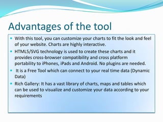
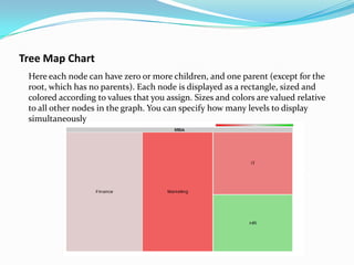
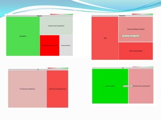
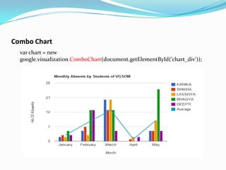
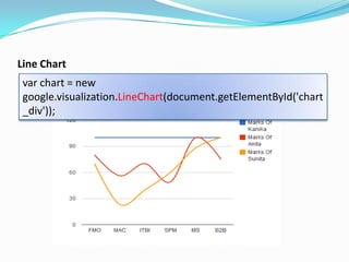
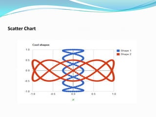
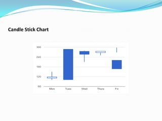
Kanika Garg 10BM60035
Lavanya R. 10BM60042
Introduction
 GCT is a tool for creating charts and maps from data available
 Any data source which uses the “Chart Tools Data Source” Protocol
  can be used to pick up data to create these charts.
 Various Data sources:
    Google Spreadsheets
    Google Fusion Tables and
    Some third party data providers like ‘Salesforce’
    If you own a website and implement this protocol, you can also
     become a data provider for Google Chart Tools.
Advantages of the tool
 With this tool, you can customize your charts to fit the look and feel
  of your website. Charts are highly interactive.
 HTML5/SVG technology is used to create these charts and it
  provides cross-browser compatibility and cross platform
  portability to iPhones, iPads and Android. No plugins are needed.
 It is a Free Tool which can connect to your real time data (Dynamic
  Data)
 Rich Gallery: It has a vast library of charts, maps and tables which
  can be used to visualize and customize your data according to your
  requirements
Building Blocks
 Chart Library - Charts are exposed as JavaScript classes. The charts
  can be customized easily according to the look and feel of your
  website.
 Data Tables - The charts are populated with the data from the
  JavaScript DataTable class. The common data structure facilitates
  easily switching between different types
 Data Sources - The data can be queried from the websites that
  implement the Chart Tools Datasource.
Chart Creation
The charts can be rendered in your webpage by coding the charts and
  customizing it according to your needs.
Important Parts of the Script :
    Loading the chart libraries
            The Google JSAPI API

            The Google Visualization library and

            The library for the chart itself
 Data for charts
    Data should be wrapped in a JavaScript class called google.
     visualization.DataTable.
    DataTable is two-dimensional table with rows and columns. Each
     column has a datatype, an optional ID and an optional Label.
    Various Ways To Create and Populate the Data Tables:
        Create a new DataTable, then call
         addColumn()/addRows()/addRow()/setCell()
        arrayToDataTable()
        JavaScript literal initializer
        Sending a Datasource Query
 Customizing the chart
    Each chart has options including title, colours, line
     thickness, backgroundfill, and so on that are customizable to
     your needs.
    Specify custom options for your chart by defining a JavaScript
     object with option_name/option_value properties.
    Every chart has its own list of options and a default value for the
     option.
 Draw the Chart
   The final step is to draw the chart and for that you must first
    instantiate an instance the chart followed by calling the draw().
    The chart type is based on a class and the appropriate package of
    the base class should have been included in the library. The
    instance would look like:
     var chart =
       new google.visualization.Piechart(document.getElementById(‘c
       hart_div’));

   Data and the options for the chart should be prepared before the
    chart is drawn. Along with this the <div> element of the HTML
    page should also be ready to place the chart you are about to
    draw.
Chart Types
Area Chart
var ac = new
google.visualization.AreaChart(document.getElementById('visualizatio
n'));

ac.draw(data, {
  title : 'Monthly Coffee Retail Price by Country',
  isStacked: true,
  width: 600,
  height: 400,
  vAxis: {title: "Price"},
  hAxis: {title: "Month"}
 });
Bar Chart
google.visualization.BarChart(
document.getElementById('visualization')).
Gauge Chart
  Gauge chart(dial chart) reperesents one or more values as needles on
 a circular or semi-circular surface. This is rendered using 'Gauge'
 which is in the package 'gauge'.

 new google.visualization.Gauge(document.getElementById('visualiz
 ation')).
     draw(data);
var data = new google.visualization.DataTable();
   data.addColumn('string', 'Label');
   data.addColumn('number', 'Value');
   data.addRows(3);
   data.setValue(0, 0, 'Speed');
   data.setValue(0, 1, 80);
   data.setValue(1, 0, 'Petrol');
   data.setValue(1, 1, 8);
   data.setValue(2, 0, 'Temperature');
   data.setValue(2, 1, 25);
Geo Chart
var chart = new
  google.visualization.GeoChart(document.getElement
  ById('chart_div'));
Table Chart
 Boolean values are displayed as check marks.

 var table = new
 google.visualization.Table(document.getElementById('table_div'));
var data = new google.visualization.DataTable();
    data.addColumn('string', 'Name');
    data.addColumn('number', 'RollNo');
    data.addColumn('boolean', 'Have ITBI Elective');
    data.addRows(3);
    data.setCell(0, 0, 'Kanika');
    data.setCell(1, 0, 'Anita');
    data.setCell(2, 0, 'Lavanya');
    data.setCell(0, 1, 35);
    data.setCell(1, 1, 100);
    data.setCell(2, 1, 42);
    data.setCell(0, 2, true);
    data.setCell(1, 2, false);
    data.setCell(2, 2, true);
Tree Map Chart
 Here each node can have zero or more children, and one parent (except for the
 root, which has no parents). Each node is displayed as a rectangle, sized and
 colored according to values that you assign. Sizes and colors are valued relative
 to all other nodes in the graph. You can specify how many levels to display
 simultaneously
Combo Chart
  var chart = new
  google.visualization.ComboChart(document.getElementById('chart_div'));
Line Chart
 var chart = new
 google.visualization.LineChart(document.getElementById('chart
 _div'));
Line Chart
Scatter Chart
Candle Stick Chart
Example 1:
function drawVisualization() {
      var data = new google.visualization.DataTable();
      data.addColumn('string', ‘DivisionName');
      data.addColumn('string', 'Falls Under');
      data.addRows(15);
      data.setCell(0, 0, 'PwC Global Model');
      data.setCell(1, 0,
        'Advisory', 'Advisory<br/><font color="red"><i>Comes for Placements to
  VGSOM<i></font>');
      data.setCell(1, 1, 'PwC Global Model');
      data.setCell(2, 0, 'Tax and regulatory Services');
      data.setCell(2, 1, 'PwC Global Model');
      data.setCell(3, 0, 'Assurance');
      data.setCell(3, 1, 'PwC Global Model');
      data.setCell(4, 0, 'Consulting');
      data.setCell(4, 1, 'Advisory');
      data.setCell(5, 0, 'GRID');
      data.setCell(5, 1, 'Advisory');
data.setCell(6, 0, 'Financial Advisory Services');
    data.setCell(6, 1, 'Advisory');
    data.setCell(7, 0, 'Internal Audit Services');
    data.setCell(7, 1, 'Advisory');
    data.setCell(8, 0, 'Mergers and Acquisitions');
    data.setCell(8, 1, 'Tax and regulatory Services');
    data.setCell(9, 0, 'Indirect Tax');
    data.setCell(9, 1, 'Tax and regulatory Services');
    data.setCell(10, 0, 'Direct Tax');
    data.setCell(10, 1, 'Tax and regulatory Services');
    data.setCell(11, 0, 'Transfer Pricing');
    data.setCell(11, 1, 'Tax and regulatory Services');
    data.setCell(11, 0, 'System Process Assurance');
    data.setCell(11, 1, 'Assurance');
    data.setCell(12, 0, 'Statutory Audit');
    data.setCell(12, 1, 'Assurance');

       // Create and draw the visualization.
       new google.visualization.OrgChart(document.getElementById('visualization')).
          draw(data, {allowHtml: true});
   }
Organisational Chart
Example 2:
 function drawVisualization() {
    var query = new google.visualization.Query(
        'https://docs.google.com/spreadsheet/ccc?key=0AsVUeZINdWEmdGl4R2dCMVhFbGhGWGxISEJB
RFBCNmc#gid=0');
    query.setQuery('SELECT A,D WHERE D > 5000 ORDER BY A');
    query.send(handleQueryResponse);
  }
  function handleQueryResponse(response) {
    if (response.isError()) {
      alert('Error in query: ' + response.getMessage() + ' ' + response.getDetailedMessage());
      return;
    }

      var data = response.getDataTable();
      visualization = new google.visualization.LineChart(document.getElementById('visualization'));
      visualization.draw(data, {legend: 'bottom'});
  }
Line Chart
Business Value Added
 It’s a powerful Visualisation tool with Interactivity feature
  which gives data a meaningful look and helps easy analysis of
  the data.
 It reduces time spent on analysis of big data tables by
  converting these into easy to analyze charts
 The charts are created in an easy to use URLs which can be
  embedded anywhere in your webpage.
 Managers and Decision makers have less time to look at big
  data tables and do number crunching to come to decisions.
  They need data visualisation tools like charts to have an overall
  look at the data and compare them to arrive at decisions.
Thank You

Google Chart Tools

  • 1.
  • 2.
    Introduction  GCT isa tool for creating charts and maps from data available  Any data source which uses the “Chart Tools Data Source” Protocol can be used to pick up data to create these charts.  Various Data sources:  Google Spreadsheets  Google Fusion Tables and  Some third party data providers like ‘Salesforce’  If you own a website and implement this protocol, you can also become a data provider for Google Chart Tools.
  • 3.
    Advantages of thetool  With this tool, you can customize your charts to fit the look and feel of your website. Charts are highly interactive.  HTML5/SVG technology is used to create these charts and it provides cross-browser compatibility and cross platform portability to iPhones, iPads and Android. No plugins are needed.  It is a Free Tool which can connect to your real time data (Dynamic Data)  Rich Gallery: It has a vast library of charts, maps and tables which can be used to visualize and customize your data according to your requirements
  • 4.
    Building Blocks  ChartLibrary - Charts are exposed as JavaScript classes. The charts can be customized easily according to the look and feel of your website.  Data Tables - The charts are populated with the data from the JavaScript DataTable class. The common data structure facilitates easily switching between different types  Data Sources - The data can be queried from the websites that implement the Chart Tools Datasource.
  • 6.
    Chart Creation The chartscan be rendered in your webpage by coding the charts and customizing it according to your needs. Important Parts of the Script :  Loading the chart libraries  The Google JSAPI API  The Google Visualization library and  The library for the chart itself
  • 7.
     Data forcharts  Data should be wrapped in a JavaScript class called google. visualization.DataTable.  DataTable is two-dimensional table with rows and columns. Each column has a datatype, an optional ID and an optional Label.  Various Ways To Create and Populate the Data Tables:  Create a new DataTable, then call addColumn()/addRows()/addRow()/setCell()  arrayToDataTable()  JavaScript literal initializer  Sending a Datasource Query
  • 8.
     Customizing thechart  Each chart has options including title, colours, line thickness, backgroundfill, and so on that are customizable to your needs.  Specify custom options for your chart by defining a JavaScript object with option_name/option_value properties.  Every chart has its own list of options and a default value for the option.
  • 9.
     Draw theChart  The final step is to draw the chart and for that you must first instantiate an instance the chart followed by calling the draw(). The chart type is based on a class and the appropriate package of the base class should have been included in the library. The instance would look like:  var chart = new google.visualization.Piechart(document.getElementById(‘c hart_div’));  Data and the options for the chart should be prepared before the chart is drawn. Along with this the <div> element of the HTML page should also be ready to place the chart you are about to draw.
  • 10.
  • 11.
    var ac =new google.visualization.AreaChart(document.getElementById('visualizatio n')); ac.draw(data, { title : 'Monthly Coffee Retail Price by Country', isStacked: true, width: 600, height: 400, vAxis: {title: "Price"}, hAxis: {title: "Month"} });
  • 12.
  • 13.
    Gauge Chart Gauge chart(dial chart) reperesents one or more values as needles on a circular or semi-circular surface. This is rendered using 'Gauge' which is in the package 'gauge'. new google.visualization.Gauge(document.getElementById('visualiz ation')). draw(data);
  • 14.
    var data =new google.visualization.DataTable(); data.addColumn('string', 'Label'); data.addColumn('number', 'Value'); data.addRows(3); data.setValue(0, 0, 'Speed'); data.setValue(0, 1, 80); data.setValue(1, 0, 'Petrol'); data.setValue(1, 1, 8); data.setValue(2, 0, 'Temperature'); data.setValue(2, 1, 25);
  • 15.
    Geo Chart var chart= new google.visualization.GeoChart(document.getElement ById('chart_div'));
  • 16.
    Table Chart Booleanvalues are displayed as check marks. var table = new google.visualization.Table(document.getElementById('table_div'));
  • 17.
    var data =new google.visualization.DataTable(); data.addColumn('string', 'Name'); data.addColumn('number', 'RollNo'); data.addColumn('boolean', 'Have ITBI Elective'); data.addRows(3); data.setCell(0, 0, 'Kanika'); data.setCell(1, 0, 'Anita'); data.setCell(2, 0, 'Lavanya'); data.setCell(0, 1, 35); data.setCell(1, 1, 100); data.setCell(2, 1, 42); data.setCell(0, 2, true); data.setCell(1, 2, false); data.setCell(2, 2, true);
  • 18.
    Tree Map Chart Here each node can have zero or more children, and one parent (except for the root, which has no parents). Each node is displayed as a rectangle, sized and colored according to values that you assign. Sizes and colors are valued relative to all other nodes in the graph. You can specify how many levels to display simultaneously
  • 20.
    Combo Chart var chart = new google.visualization.ComboChart(document.getElementById('chart_div'));
  • 21.
    Line Chart varchart = new google.visualization.LineChart(document.getElementById('chart _div'));
  • 22.
  • 23.
  • 24.
  • 25.
    Example 1: function drawVisualization(){ var data = new google.visualization.DataTable(); data.addColumn('string', ‘DivisionName'); data.addColumn('string', 'Falls Under'); data.addRows(15); data.setCell(0, 0, 'PwC Global Model'); data.setCell(1, 0, 'Advisory', 'Advisory<br/><font color="red"><i>Comes for Placements to VGSOM<i></font>'); data.setCell(1, 1, 'PwC Global Model'); data.setCell(2, 0, 'Tax and regulatory Services'); data.setCell(2, 1, 'PwC Global Model'); data.setCell(3, 0, 'Assurance'); data.setCell(3, 1, 'PwC Global Model'); data.setCell(4, 0, 'Consulting'); data.setCell(4, 1, 'Advisory'); data.setCell(5, 0, 'GRID'); data.setCell(5, 1, 'Advisory');
  • 26.
    data.setCell(6, 0, 'FinancialAdvisory Services'); data.setCell(6, 1, 'Advisory'); data.setCell(7, 0, 'Internal Audit Services'); data.setCell(7, 1, 'Advisory'); data.setCell(8, 0, 'Mergers and Acquisitions'); data.setCell(8, 1, 'Tax and regulatory Services'); data.setCell(9, 0, 'Indirect Tax'); data.setCell(9, 1, 'Tax and regulatory Services'); data.setCell(10, 0, 'Direct Tax'); data.setCell(10, 1, 'Tax and regulatory Services'); data.setCell(11, 0, 'Transfer Pricing'); data.setCell(11, 1, 'Tax and regulatory Services'); data.setCell(11, 0, 'System Process Assurance'); data.setCell(11, 1, 'Assurance'); data.setCell(12, 0, 'Statutory Audit'); data.setCell(12, 1, 'Assurance'); // Create and draw the visualization. new google.visualization.OrgChart(document.getElementById('visualization')). draw(data, {allowHtml: true}); }
  • 27.
  • 28.
    Example 2: functiondrawVisualization() { var query = new google.visualization.Query( 'https://docs.google.com/spreadsheet/ccc?key=0AsVUeZINdWEmdGl4R2dCMVhFbGhGWGxISEJB RFBCNmc#gid=0'); query.setQuery('SELECT A,D WHERE D > 5000 ORDER BY A'); query.send(handleQueryResponse); } function handleQueryResponse(response) { if (response.isError()) { alert('Error in query: ' + response.getMessage() + ' ' + response.getDetailedMessage()); return; } var data = response.getDataTable(); visualization = new google.visualization.LineChart(document.getElementById('visualization')); visualization.draw(data, {legend: 'bottom'}); }
  • 29.
  • 30.
    Business Value Added It’s a powerful Visualisation tool with Interactivity feature which gives data a meaningful look and helps easy analysis of the data.  It reduces time spent on analysis of big data tables by converting these into easy to analyze charts  The charts are created in an easy to use URLs which can be embedded anywhere in your webpage.  Managers and Decision makers have less time to look at big data tables and do number crunching to come to decisions. They need data visualisation tools like charts to have an overall look at the data and compare them to arrive at decisions.
  • 31.