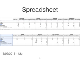
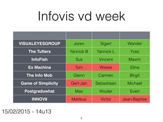
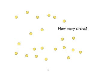
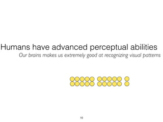
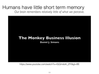
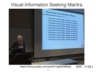
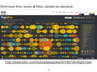
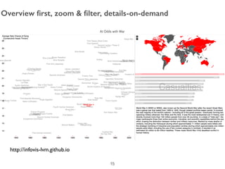
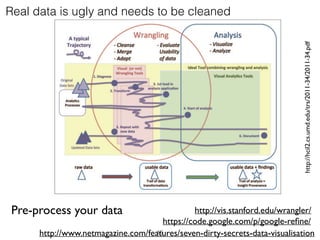
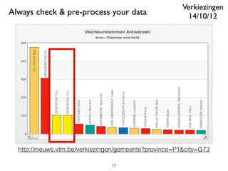
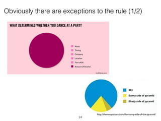
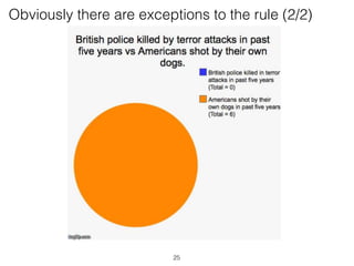
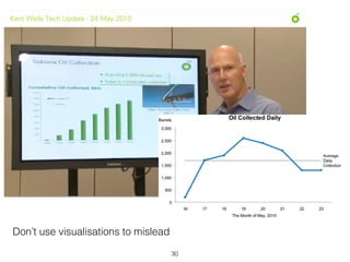
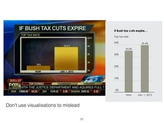
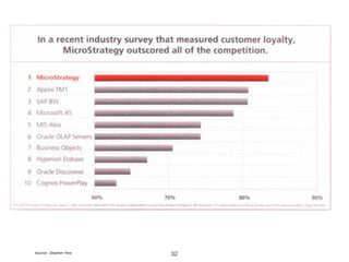
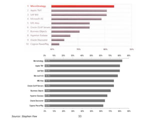
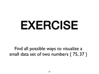
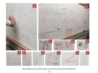
Hybridoma Technology ( Production , Purification , and Application )
Interactive Data Visualization of Student Performance
1. Informatie visualisatie:
Les 2
Joris Klerkx - Erik Duval
http://hci.cs.kuleuven.be
joris.klerkx@cs.kuleuven.be
Human-Computer Interaction
Dept. Computerwetenschappen
KU Leuven
1
2. Opdracht vorige week
• Individueel:
• d3.js aanleren
• d3.js van spreadsheet als simpele case study
• kort presenteren in volgende sessie
• Spreadsheet aanvullen
• Per team:
• blog opzetten en op slack aankondigen
• Wiki pagina aanvullen
• Infovis van de week posten op blog
• (digitaal/analoog, individueel)
2
4. Infovis vd week
VISUALEYESGROUP Joren Sigert Wander
The Tufters Yannick B Yannick L Yves
InfoFish Sus Vincent Maxim
Ex Machina Tom Wietse Eline
The Info Mob Glenn Carmen Birgit
Game of Simplicity Gert-Jan Sebastiaan Michael
Postgraduwhat Max Wouter Evert
INNOV8 Matteus Victor Jean-Baptise
15/02/2015 - 14u13
4
10. Humans have advanced perceptual abilities
Our brains makes us extremely good at recognizing visual patterns
10
11. 11
Humans have little short term memory
Our brain remembers relatively little of what we perceive.
https://www.youtube.com/watch?v=IGQmdoK_ZfY&gl=BE
16. Real data is ugly and needs to be cleaned
http://hcil2.cs.umd.edu/trs/2011-34/2011-34.pdf
http://www.netmagazine.com/features/seven-dirty-secrets-data-visualisation
https://code.google.com/p/google-refine/
http://vis.stanford.edu/wrangler/Pre-process your data
16
20. Use small coordinated graphs to add variables
20
Forget about 3D graphs (on a 2D screen)
Source: Stephen Few
21. Which student has more blogposts?
• Size & angle are difficult to compare
• Without labels & legends, impossible to show exact quantitative
differences
• Limited Short term (visual) memory
21
22. Source: Stephen Few
Save the pies for dessert (S. Few)
Try using either of the pies to put the slices in order by size
22
27. 0" 10" 20" 30" 40" 50" 60"
Student"1"
Student"2"
Student"3"
Student"4"
blogposts"
tweets"
comments"on"blogs"
reports"submi:ed"
0%# 20%# 40%# 60%# 80%# 100%#
Student#1#
Student#2#
Student#3#
Student#4#
blogposts#
tweets#
comments#on#blogs#
reports#submi;ed#
Use Common Sense
What are you comparing?
What story do you get from it?
27
28. Which graph makes it easier to focus on the pattern of change
through time, instead of the individual values?
Choose graph that answers your questions about your data
28Source: Stephen Few