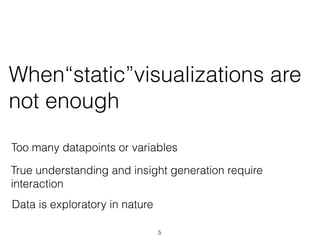
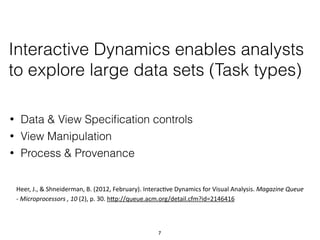
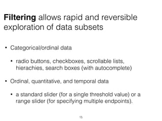
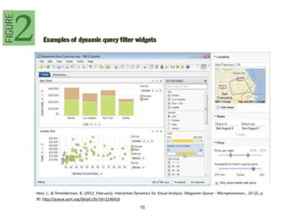
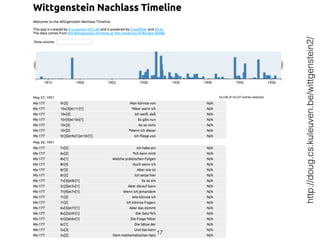
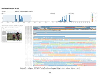
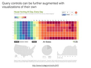
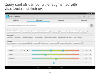
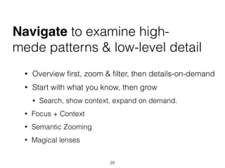
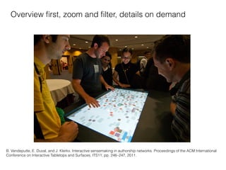
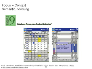
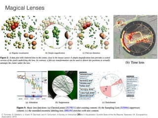
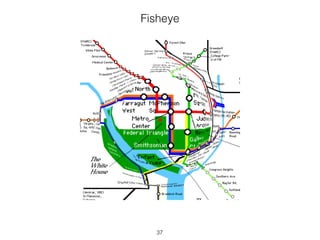
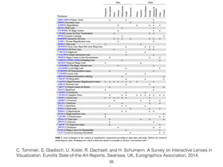
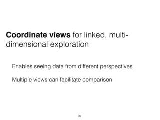
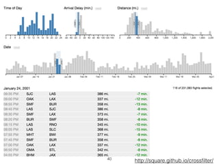
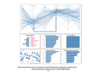
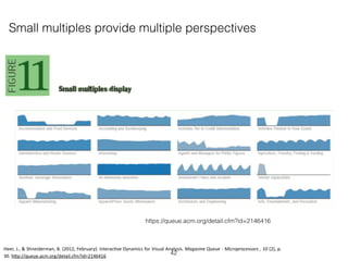
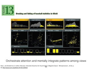
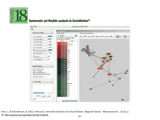
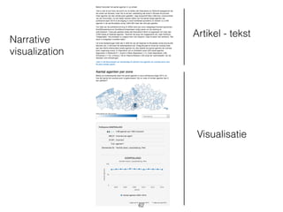
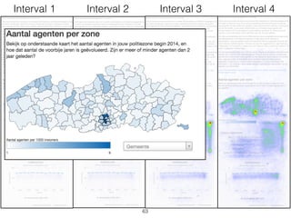
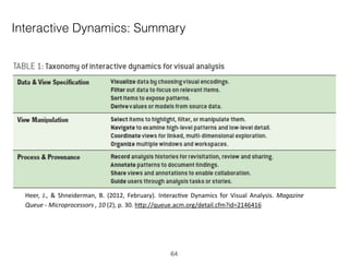
This document discusses interactive visualization and summarizes key points from an article on interactive dynamics for visual analysis. It outlines how interaction can support exploration of large datasets by enabling data and view specification, view manipulation, and recording analysis processes and provenance. Effective interactive visualizations allow users to explore data at their own pace, support overview first with zoom/filter capabilities, and facilitate comparison through coordinated/multiple linked views.
Visualisation - techniques, interaction dynamics, big dataJoris Klerkx
Module 3 - cursus Big Data - Visualisation - deel 2
Instituut voor Permanente Vorming
Various visualisation techniques
(adapted from Heer, J., Bostock, M., & Ogievetsjy, V. (2010, May). A Tour through the Visualization Zoo - A survey of powerful visualisation techniques, from the obvious to the obscure. ACM Graphics , 8 (5), https://queue.acm.org/detail.cfm?id=1805128 )
Various interaction techniques
(adapted from Heer, J., & Shneiderman, B. (2012, February). Interactive Dynamics for Visual Analysis. Magazine Queue - Microprocessors , 10 (2), p. 30. http://queue.acm.org/detail.cfm?id=2146416 )
Big data to big to visualize?
Embedding young learners into the information societyChristophe Guéret
A couple of years ago, One Laptop Per Child embarked on a mission to "create educational opportunities for the world's poorest children by providing each child with a rugged, low-cost, low-power, connected laptop with content and software designed for collaborative, joyful, self-empowered learning". Today, this vision is achieved through the learning environment "Sugar" and the laptop "XO". This talk will start with an overview of OLPC's mission and the XO before focusing more on Sugar. This environment centered around "activities", a model in between document and application centric interfaces, features an interesting data model and data sharing capabilities. However, most of the data produced on the XO stays on the XO and is not accessible to the other devices. I will describe how Semantic Web technologies can be employed to further share and interconnect the data and give an overview of use-cases being implemented on top of "SemanticXO", the Semantic Web toolkit for Sugar.
Data visualization trends in Business Intelligence: Allison Sapka at Analytic...Fitzgerald Analytics, Inc.
Allison Sapka's presentation at the Analytics and Data in Financial Services Meetup in Dec 2012. Alison discusses trends in Data Visualization, including why visualization is so powerful when implemented well, and confusing or misleading when done badly
1Dr. LaMar D. Brown PhD, MBAExecutive MSITUnivEttaBenton28
1
Dr. LaMar D. Brown PhD, MBA
Executive MSIT
University of the Cumberlands
Course: 2019-SPR-IG-ITS530-21: 2019_SPR_IG_Analyzing and Visualizing Data_21
Chapter Readings Reflections Journal
Chapter 1: Defining Data Visualization
Summary
In Chapter 1, the author Mr. Kirk describes about the concept of Data Visualization. Data visualization was defined as the visual analysis and communication of data. The chapter also included the historical background survey definition of data visualization by various other authors.
Also, in the book was a set of fascinating recipes that of the components in that involve in the definition. The type of data that is required to be visually analyzed is important before it is being subjected to further processing before visualization.
Mr. Kirk also emphasized the significance of the art and science of making data analysis a fun filled technical and an analytical reading that encourages the use of human perception to make decisions in assistance of visual treats that come in the form of graphs, pie charts among others. The science of data visualization is defined with the implication of truth, evidence and rules that govern the process of visualizing a set of data that can be quintessential in determining the path of an enterprise or an organization.
Highlights:
Upon reading the chapter 1 in this book that was in depth into data visualization, I was able to grasp essential technical and analytical definitions and can say they are quiet telling in terms of the importance on the concept and visual representation of the definitions. The use of some of the citations was a key indicator that data visualization can be defined in various ways and can assist in technical improvements if used in way that is beneficial to all parties.
Ideas and thoughts:
The chapter was a thorough analysis of the concept. However, I was also keen on looking for live examples of visual tools or results of analysis inculcated in this defining place of the book. The big positive is the use of the concept of science and art that can be implemented in the day to day activities to introduce data visualization in any area and can help in making decisions that can set a trend for the growth of an organization. In terms of the course, it was a great read to write this review journal and can hopefully add a firm base to the things to come.
Application:
The concept of data visualization can be implemented in my current work environment. As an IT personnel, I deal with the network infrastructure and constantly come across large chunk of data that will need to be analyzed for its usage stats, bandwidth, performance and benefits of choosing the hardware or software accordingly. To best impact this, the monitoring tools such a s NetFlow helps us in verifying bandwidth over utilization or underutilization to perform a set of tasks before troubleshooting any related issues. Now, the concept of data visualization can be implemented here ...
Delineating Cancer Genomics through Data VisualizationRupam Das
In spite in advances in technologies for working with data, people spend undue amount of time in understanding the data and manipulating it into holistic visualization. Data visualization software for complex dataset such as in cancer genomics (which we have taken as case study) are not able to provide effective visualization for the users. Identification and characterization of cancer detection are important areas of research that are based on the integrated analysis of multiple heterogeneous genomics datasets. In this report, we review the key issues and challenges associated with cancer genomics through exploration of data visualization techniques, interactions and methods, which will in-turn advance the state of the art.
Stacked Generalization of Random Forest and Decision Tree Techniques for Libr...IJEACS
The huge amount of library data stored in our modern research and statistic centers of organizations is springing up on daily bases. These databases grow exponentially in size with respect to time, it becomes exceptionally difficult to easily understand the behavior and interpret data with the relationships that exist between attributes. This exponential growth of data poses new organizational challenges like the conventional record management system infrastructure could no longer cope to give precise and detailed information about the behavior data over time. There is confusion and novel concern in selecting tools that can support and handle big data visualization that deals with multi-dimension. Viewing all related data at once in a database is a problem that has attracted the interest of data professionals with machine learning skills. This is a lingering issue in the data industry because the existing techniques cannot be used to remove or filter noise from relevant data and pad up missing values in order to get the required information. The aim is to develop a stacked generalization model that combines the functionality of random forest and decision tree to visualization library database visualization. In this paper, the random forest and decision tree techniques were employed to effectively visualize large amounts of school library data. The proposed system was implemented with a few lines of Python code to create visualizations that can help users at a glance understand and interpret the behavior of data and its relationships. The model was trained and tested to learn and extract hidden patterns of data with a cross-validation test. It combined the functionalities of both models to form a stacked generalization model that performed better than the individual techniques. The stacked model produced 95% followed by the RF which produced a 95% accuracy rate and 0.223600 RMSE error value in comparison with the DT which recorded an 80.00% success rate and 0.15990 RMSE value.
Does Search Engine Optimization come along with high-quality content?Sebastian Schultheiß
Searching for medical information is both a common and important activity since it influences decisions people make about their healthcare. Using search engine optimization (SEO), content producers seek to increase the visibility of their content. SEO is more likely to be practiced by commercially motivated content producers such as pharmaceutical companies than by non-commercial providers such as governmental bodies. In this study, we ask whether content quality correlates with the presence or absence of SEO measures on a web page. We conducted a user study in which N = 61 participants comprising laypeople as well as experts in health information assessment evaluated health-related web pages classified as either optimized or non-optimized. The subjects rated the expertise of non-optimized web pages as higher than the expertise of optimized pages, justifying their appraisal by the more competent and reputable appearance of non-optimized pages. In addition, comments about the website operators of the non-optimized pages were exclusively positive, while optimized pages tended to receive positive as well as negative assessments. We found no differences between the ratings of laypeople and experts. Since non-optimized, but high-quality content may be outranked by optimized content of lower quality, trusted sources should be prioritized in rankings.
https://searchstudies.org/research/seo-effekt/
CORE: Cognitive Organization for Requirements ElicitationScott M. Confer
Orbitz.com ia case study poster describes a rules-based soft systems methodology for collaborative decision-making: Cognitive Organization for Requirements Elicitation (CORE). The case study is of a specific project to develop features for the Orbitz.com leisure travel site. For this project, the information architect was faced with a need to rapidly develop specifications for the new features. Produced in the absence of use cases, functional requirements, or business requirements these new specifications had to be both culturally and technically acceptable, and meet changing business and user needs.
Organisering av digitale prosjekt: Hva har IT-bransjen lært om store prosjekter?Torgeir Dingsøyr
IT-bransjen har gjort store endringer i måten de gjennomfører prosjekter på gjennom bruk av smidige metoder. Disse metodene ble først brukt på små, samlokaliserte team men brukes nå også i store prosjekter med mange team og flere hundre utviklere. Hvordan jobber IT-bransjen for å sikre vellykkede store prosjekter?
My talk regarding measuring reader engagement through the use of physiological sensors at the one hand, and visualizing this information at the LICT workshop on "Information Processing in Social Media"
Introduction to the course at the KU Leuven on fundamentals of human computer interaction - http://onderwijsaanbod.kuleuven.be/syllabi/n/G0Q55AN.htm#activetab=doelstellingen_idp1326000
Bring your own idea - Visual learning analyticsJoris Klerkx
Workshop on visual learning analytics that was part of LASI 2014 - http://www.solaresearch.org/events/lasi-2/lasi2014/
Examples of learning dashboards were presented during the workshop by Sven Charleer:
http://www.slideshare.net/svencharleer/learning-dashboard-visual-learning-analytics-workshop-lasi2014-h-harvard
Unit 8 - Information and Communication Technology (Paper I).pdfThiyagu K
This slides describes the basic concepts of ICT, basics of Email, Emerging Technology and Digital Initiatives in Education. This presentations aligns with the UGC Paper I syllabus.
June 3, 2024 Anti-Semitism Letter Sent to MIT President Kornbluth and MIT Cor...Levi Shapiro
Letter from the Congress of the United States regarding Anti-Semitism sent June 3rd to MIT President Sally Kornbluth, MIT Corp Chair, Mark Gorenberg
Dear Dr. Kornbluth and Mr. Gorenberg,
The US House of Representatives is deeply concerned by ongoing and pervasive acts of antisemitic
harassment and intimidation at the Massachusetts Institute of Technology (MIT). Failing to act decisively to ensure a safe learning environment for all students would be a grave dereliction of your responsibilities as President of MIT and Chair of the MIT Corporation.
This Congress will not stand idly by and allow an environment hostile to Jewish students to persist. The House believes that your institution is in violation of Title VI of the Civil Rights Act, and the inability or
unwillingness to rectify this violation through action requires accountability.
Postsecondary education is a unique opportunity for students to learn and have their ideas and beliefs challenged. However, universities receiving hundreds of millions of federal funds annually have denied
students that opportunity and have been hijacked to become venues for the promotion of terrorism, antisemitic harassment and intimidation, unlawful encampments, and in some cases, assaults and riots.
The House of Representatives will not countenance the use of federal funds to indoctrinate students into hateful, antisemitic, anti-American supporters of terrorism. Investigations into campus antisemitism by the Committee on Education and the Workforce and the Committee on Ways and Means have been expanded into a Congress-wide probe across all relevant jurisdictions to address this national crisis. The undersigned Committees will conduct oversight into the use of federal funds at MIT and its learning environment under authorities granted to each Committee.
• The Committee on Education and the Workforce has been investigating your institution since December 7, 2023. The Committee has broad jurisdiction over postsecondary education, including its compliance with Title VI of the Civil Rights Act, campus safety concerns over disruptions to the learning environment, and the awarding of federal student aid under the Higher Education Act.
• The Committee on Oversight and Accountability is investigating the sources of funding and other support flowing to groups espousing pro-Hamas propaganda and engaged in antisemitic harassment and intimidation of students. The Committee on Oversight and Accountability is the principal oversight committee of the US House of Representatives and has broad authority to investigate “any matter” at “any time” under House Rule X.
• The Committee on Ways and Means has been investigating several universities since November 15, 2023, when the Committee held a hearing entitled From Ivory Towers to Dark Corners: Investigating the Nexus Between Antisemitism, Tax-Exempt Universities, and Terror Financing. The Committee followed the hearing with letters to those institutions on January 10, 202
A Strategic Approach: GenAI in EducationPeter Windle
Artificial Intelligence (AI) technologies such as Generative AI, Image Generators and Large Language Models have had a dramatic impact on teaching, learning and assessment over the past 18 months. The most immediate threat AI posed was to Academic Integrity with Higher Education Institutes (HEIs) focusing their efforts on combating the use of GenAI in assessment. Guidelines were developed for staff and students, policies put in place too. Innovative educators have forged paths in the use of Generative AI for teaching, learning and assessments leading to pockets of transformation springing up across HEIs, often with little or no top-down guidance, support or direction.
This Gasta posits a strategic approach to integrating AI into HEIs to prepare staff, students and the curriculum for an evolving world and workplace. We will highlight the advantages of working with these technologies beyond the realm of teaching, learning and assessment by considering prompt engineering skills, industry impact, curriculum changes, and the need for staff upskilling. In contrast, not engaging strategically with Generative AI poses risks, including falling behind peers, missed opportunities and failing to ensure our graduates remain employable. The rapid evolution of AI technologies necessitates a proactive and strategic approach if we are to remain relevant.
Normal Labour/ Stages of Labour/ Mechanism of LabourWasim Ak
Normal labor is also termed spontaneous labor, defined as the natural physiological process through which the fetus, placenta, and membranes are expelled from the uterus through the birth canal at term (37 to 42 weeks
Read| The latest issue of The Challenger is here! We are thrilled to announce that our school paper has qualified for the NATIONAL SCHOOLS PRESS CONFERENCE (NSPC) 2024. Thank you for your unwavering support and trust. Dive into the stories that made us stand out!
Macroeconomics- Movie Location
This will be used as part of your Personal Professional Portfolio once graded.
Objective:
Prepare a presentation or a paper using research, basic comparative analysis, data organization and application of economic information. You will make an informed assessment of an economic climate outside of the United States to accomplish an entertainment industry objective.
Biological screening of herbal drugs: Introduction and Need for
Phyto-Pharmacological Screening, New Strategies for evaluating
Natural Products, In vitro evaluation techniques for Antioxidants, Antimicrobial and Anticancer drugs. In vivo evaluation techniques
for Anti-inflammatory, Antiulcer, Anticancer, Wound healing, Antidiabetic, Hepatoprotective, Cardio protective, Diuretics and
Antifertility, Toxicity studies as per OECD guidelines
15. • Categorical/ordinal data
• radio buttons, checkboxes, scrollable lists,
hierachies, search boxes (with autocomplete)
• Ordinal, quantitative, and temporal data
• a standard slider (for a single threshold value) or a
range slider (for specifying multiple endpoints).
Filtering allows rapid and reversible
exploration of data subsets
15
20. Query controls can be further augmented with
visualizations of their own
20
21. Sorting enables popping up of
trends, clusters,…
• Choices in a toolbar
• Clicks on the header in a table
• Can be complicated in the case of multiple view
displays
21
25. Select items to hightlight, filter or
manipulate them
• Mouse clicks, free-form lassos, area cursors
(‘brushes’), mouse hovering, etc
• depends on the device
• Various expressive power
• selections of a collection of items
• selections as queries over the data (eg drawing
rectangle -> range query)
25
27. Select by slope and tolerance
Heer, J., & Shneiderman, B. (2012, February). Interac=ve Dynamics for Visual Analysis. Magazine Queue - Microprocessors , 10 (2), p.
30. hHp://queue.acm.org/detail.cfm?id=2146416 27
28. Mapping mouse gestures to query patterns
Heer, J., & Shneiderman, B. (2012, February). Interac=ve Dynamics for Visual Analysis. Magazine Queue - Microprocessors , 10 (2), p.
30. hHp://queue.acm.org/detail.cfm?id=2146416
28
29. Navigate to examine high-
mede patterns & low-level detail
• Overview first, zoom & filter, then details-on-demand
• Start with what you know, then grow
• Search, show context, expand on demand.
• Focus + Context
• Semantic Zooming
• Magical lenses
29
30. $
f con-
cation
n this
of the
zoom
what
isible,
e user
on the
more
rectly
3, for
ber of
dmark
Figure 4: Setting of the evaluation.
B. Vandeputte, E. Duval, and J. Klerkx. Interactive sensemaking in authorship networks. Proceedings of the ACM International
Conference on Interactive Tabletops and Surfaces, ITS11, pp. 246–247, 2011.
Overview first, zoom and filter, details on demand
30
31. B. Vandeputte, E. Duval, and J. Klerkx. Applying design principles in authorship networks-a case study. In CHI EA’12:
Proceedings of the 2012 ACM annual conference extended abstracts on Human Factors in Computing Systems, pages 741–
744, 2012. (https://www.youtube.com/watch?v=R5CeTEejdBA)
Start with what you know, then grow
Search, show context, expand on demand
31
35. Focus + Context
Semantic Zooming
Heer, J., & Shneiderman, B. (2012, February). Interac=ve Dynamics for Visual Analysis. Magazine Queue - Microprocessors , 10 (2), p.
30. hHp://queue.acm.org/detail.cfm?id=2146416 35
36. Magical Lenses
C. Tominski, S. Gladisch, U. Kister, R. Dachselt, and H. Schumann. A Survey on Interactive Lenses in Visualization. EuroVis State-of-the-Art Reports, Swansea, UK, Eurographics
Association, 2014.
36
38. C. Tominski, S. Gladisch, U. Kister, R. Dachselt, and H. Schumann. A Survey on Interactive Lenses in
Visualization. EuroVis State-of-the-Art Reports, Swansea, UK, Eurographics Association, 2014.
38
39. Coordinate views for linked, multi-
dimensional exploration
Enables seeing data from different perspectives
Multiple views can facilitate comparison
39
45. Organize multiple windows & workspaces
• Tiled approaches (different widgets) allows to see
all information and selectors at once, minimizing
distracting scrolling or window operations, while
enabling analysts to concentrate on extracting and
reporting insights.
• Layout organization tools will become decisive
factors in creating effective user experience
45
46. Orchestrate attention and mentally integrate patterns among views
Heer, J., & Shneiderman, B. (2012, February). Interac=ve Dynamics for Visual Analysis. Magazine Queue - Microprocessors , 10 (2), p.
30. hHp://queue.acm.org/detail.cfm?id=2146416
46
54. Annotate patterns to document
findings
Record, organize, and communicate insights gained
during visual exploration
54
55. Freeform graphical annotations without explicit tie to the
underlying data
Data-aware annotations
Heer, J., & Shneiderman, B. (2012, February). Interac=ve Dynamics for Visual Analysis. Magazine Queue - Microprocessors , 10 (2), p.
30. hHp://queue.acm.org/detail.cfm?id=2146416
55
57. Share views and annotations to
enable collaboration
Real-world analysis is very much a social process
that may involve multiple interpretations,
discussion, and dissemination of results.
57
60. Guide users through analysis tasks or
stories
• Incorporate guided analytics to lead analysts
through workflows for common tasks.
• Narrative visualization
60
64. Interactive Dynamics: Summary
Heer, J., & Shneiderman, B. (2012, February). Interac=ve Dynamics for Visual Analysis. Magazine
Queue - Microprocessors , 10 (2), p. 30. hHp://queue.acm.org/detail.cfm?id=2146416
64
65. Humans have advanced perceptual abilities
Humans have little short term memory
Externalize data by using interactive, visual encodings
Our brains makes us extremely good at recognizing visual patterns
Our brains remember relatively little of what we perceive
65
68. Beoordeling:
• Visualisatie & paper (“50-50”)
• Feedback aan andere groepjes in studio-sessies
• Belangrijk is blijk te geven van inzicht & concrete vaardigheden
https://onderwijsaanbod.kuleuven.be/2015/syllabi/n/H04I2AN.htm
68
70. Paper
• doel en doelpubliek
• dataset: oorsprong, eigenschappen, …
• verwant werk, web & literatuur
• visualisatie en interactie
• eventueel: opeenvolgende versies
• belangrijkste ontwerp-beslissingen (!)
• Discussie/outro: wat zou je anders doen, wat zou je extra doen
als je tijd had, wat heb je geleerd, …
• besluit
70
72. Paper
• max 8 pages
• max is niet min!
• incl. referenties, figuren, enz.
• (ook
• youtube (2-4 min) met voice-over
• max 10 screenshots)
• tussentijdse versies voor feedback
72
73. Tegen volgende les
(11 april)
• Individueel:
• Spreadsheet
• infovis van de “week”
• Team:
• Vervolg implementatie
• Blog post -> wat geleerd vandaag en hoe kan je dat
terugkoppelen naar project?
• Show-and-Tell - obv online visualisatie
• Wat kan je eruit afleiden?
• vooruitgang - problemen - planning - etc.
• Draft paper
73