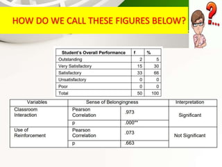
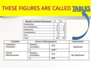
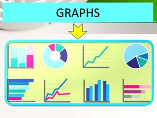
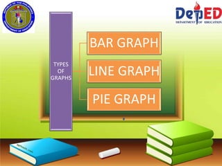
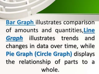
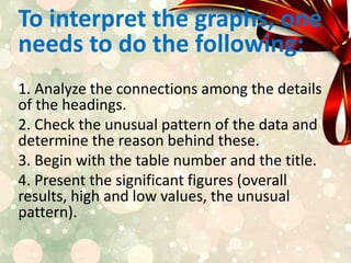
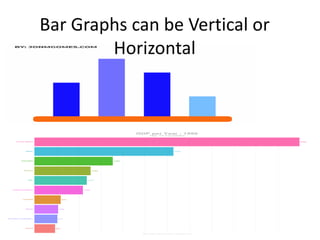
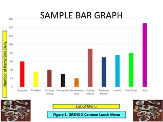
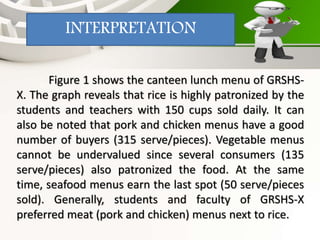
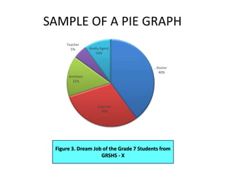
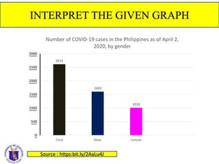
RECAP
HOW DO WE CALL THESE FIGURES BELOW?
THESE FIGURES ARE CALLED
TABLES
Tables - help summarize
and categorize data using
columns and rows. It contains
headings that indicate the
most important information
about your study.
HOW DO WE CALL THESE FIGURES BELOW?
GRAPHS
DO YOU HAVE ANY
IDEA ON WHAT ARE
THE USES OF THESE
GRAPHS?
QUARTER 2 MODULE 5
DATA PRESENTATION AND
INTERPRETATION
LESSON 3 :
GRAPHS
Objective : To interpret
graphs using suggested
guidelines
Graphs - focuses on how
a change in one variable
relates to another.
Graphs use bars, lines,
circles, and pictures in
representing the data.
In interpreting the graph, it is
the same process in table. In
choosing what type of graph to
use, determine the specific
purpose of the presentation.
TYPES
OF
GRAPHS
BAR GRAPH
LINE GRAPH
PIE GRAPH
Bar Graph illustrates comparison
of amounts and quantities,Line
Graph illustrates trends and
changes in data over time, while
Pie Graph (Circle Graph) displays
the relationship of parts to a
whole.
To interpret the graphs, one
needs to do the following:
1. Analyze the connections among the details
of the headings.
2. Check the unusual pattern of the data and
determine the reason behind these.
3. Begin with the table number and the title.
4. Present the significant figures (overall
results, high and low values, the unusual
pattern).
5. Refrain from repeating again
what’s inside the table.
6. Support your findings with
literature and studies that confirms
or contrasts your results.
7. Establish the practical
implications of the results. This will
add value to your research findings.
8. End with a brief generalization
Bar Graphs can be Vertical or
Horizontal
SAMPLE BAR GRAPH
0
20
40
60
80
100
120
140
160
Chopsuey Pinakbet Tortang
Talong
Pritong Isda Sinabawang
Isda
Pritong
Manok
Adobong
Manok
Humba Pork Chop Rice
List of Menu
Number
of
Items
Sold
Daily
Figure 1. GRSHS-X Canteen Lunch Menu
Figure 1 shows the canteen lunch menu of GRSHS-
X. The graph reveals that rice is highly patronized by the
students and teachers with 150 cups sold daily. It can
also be noted that pork and chicken menus have a good
number of buyers (315 serve/pieces). Vegetable menus
cannot be undervalued since several consumers (135
serve/pieces) also patronized the food. At the same
time, seafood menus earn the last spot (50 serve/pieces
sold). Generally, students and faculty of GRSHS-X
preferred meat (pork and chicken) menus next to rice.
INTERPRETATION
SAMPLE OF A LINE GRAPH
General
Quarterly
Average
by
Section
Figure 2. Students Quarterly Average Grade by Sections in
Elective Mathematics (S.Y. 2019 -2020)
93.02%
93.16%
94.65%
95.03%
93.20%
93.86%
94.76%
95.20%
91.50%
92.00%
92.50%
93.00%
93.50%
94.00%
94.50%
95.00%
95.50%
First Second Third Fourth
Students Quarterly Average Grade by Sections in Elective
Mathematics (S.Y. 2019-2020)
Grade 10-Max Grade 10-Min
Figure 2 showed changes in the average
grade of Elective Mathematics between Grade
10-Max and Grade 10- Min from the first
quarter to the fourth quarter for S.Y. 2019-
2020. From the Graph it is evident that both
sections are performing well but Grade 10-
Max managed to maintain consistently its high
performance than Grade 10-Min every
quarter.
INTERPRETATION
SAMPLE OF A PIE GRAPH
Figure 3. Dream Job of the Grade 7 Students from
GRSHS - X
Doctor
40%
Engineer
30%
Architect
15%
Teacher
5% Realty Agent
10%
Figure 3 showed the result of the survey conducted
to Grade 7 students when asked about their dream job.
From the graph, forty percent (40%) and thirty percent (30)
of the participants wanted to become a doctor and an
engineer, respectively with just thirty percent (30%) left for
other professions. Only about five percent (5%) wanted to
become a teacher. From the data, more than 70% of the
Grade 7 students will likely pursue STEM strand courses
when they graduate in high school.
INTERPRETATION
APPLICATION
INTERPRET THE GIVEN GRAPH
2613
1603
1010
0
500
1000
1500
2000
2500
3000
Total Male Female
Number of COVID-19 cases in the Philippines as of April 2,
2020, by gender
Source : https:bit.ly/2AaLu4J
INTERPRETATION
• During April 2, 2020 the
number of COVID-19
Cases sums up to 2, 613
and Evidently, there is a
great number occurrences
of COVID-19 cases to
Males (1,603 cases) than
that of the Females which
is only 1,010 cases.
QUESTIONS:
1.Which graph uses a line to
represent data?
EVALUATION
LINE GRAPH
2. _________ are bits of
information or facts known by
everyone?
DATA
3. What type of graph displays
the relationship of parts to a
whole?
PIE GRAPH
4. WHAT TYPE OF GRAPH THAT
REFERS TO THE GRAPHICAL
REPRESENTATION OF DATA,
QUANTITIES OR NUMBER USING
STRIPS.
BAR GRAPH
TO GOD BE THE GLORY
• THANK YOU
THANK YOU
References :
• https://www.google.com/url?sa=i&url=https%3A%2F%
2Ftenor.com%2Fview%2Fboy-thinking-deliberate-
determine-envisioning-gif-
15112786&psig=AOvVaw3jE5d48rtgah7vo__ax4lc&ust
=1635149479741000&source=images&cd=vfe&ved=0
CAsQjRxqFwoTCNCxydHM4vMCFQAAAAAdAAAAABAD
Using Awesome Backgrounds
References :
• Barrot, Jessie S. Practical Research 2 for Senior High
School. Quezon City, Philippines: C & E Publishing, Inc.,
2017.
• Fraenkel, Jack R. and Wallen, Norman E. How to Design
and Evaluate Research in Education. Asia: McGraw Hill
Companies, Inc., 2006.
• Fraenkel, Jack R. and Wallen, Norman E. 2020. How to
Design and Evaluate Research in Education. 6 th ed.,
McGraw-Hill Global Education Holdings, LLC. Accessed
June 3, 2020. https://bit.ly/3eBIVrs

Instructional Video Lesson.pptx

  • 1.
  • 2.
    HOW DO WECALL THESE FIGURES BELOW?
  • 3.
  • 4.
    TABLES Tables - helpsummarize and categorize data using columns and rows. It contains headings that indicate the most important information about your study.
  • 5.
    HOW DO WECALL THESE FIGURES BELOW?
  • 6.
  • 7.
    DO YOU HAVEANY IDEA ON WHAT ARE THE USES OF THESE GRAPHS?
  • 8.
    QUARTER 2 MODULE5 DATA PRESENTATION AND INTERPRETATION LESSON 3 : GRAPHS
  • 9.
    Objective : Tointerpret graphs using suggested guidelines
  • 10.
    Graphs - focuseson how a change in one variable relates to another. Graphs use bars, lines, circles, and pictures in representing the data.
  • 11.
    In interpreting thegraph, it is the same process in table. In choosing what type of graph to use, determine the specific purpose of the presentation.
  • 12.
  • 13.
    Bar Graph illustratescomparison of amounts and quantities,Line Graph illustrates trends and changes in data over time, while Pie Graph (Circle Graph) displays the relationship of parts to a whole.
  • 14.
    To interpret thegraphs, one needs to do the following: 1. Analyze the connections among the details of the headings. 2. Check the unusual pattern of the data and determine the reason behind these. 3. Begin with the table number and the title. 4. Present the significant figures (overall results, high and low values, the unusual pattern).
  • 15.
    5. Refrain fromrepeating again what’s inside the table. 6. Support your findings with literature and studies that confirms or contrasts your results. 7. Establish the practical implications of the results. This will add value to your research findings. 8. End with a brief generalization
  • 16.
    Bar Graphs canbe Vertical or Horizontal
  • 17.
    SAMPLE BAR GRAPH 0 20 40 60 80 100 120 140 160 ChopsueyPinakbet Tortang Talong Pritong Isda Sinabawang Isda Pritong Manok Adobong Manok Humba Pork Chop Rice List of Menu Number of Items Sold Daily Figure 1. GRSHS-X Canteen Lunch Menu
  • 18.
    Figure 1 showsthe canteen lunch menu of GRSHS- X. The graph reveals that rice is highly patronized by the students and teachers with 150 cups sold daily. It can also be noted that pork and chicken menus have a good number of buyers (315 serve/pieces). Vegetable menus cannot be undervalued since several consumers (135 serve/pieces) also patronized the food. At the same time, seafood menus earn the last spot (50 serve/pieces sold). Generally, students and faculty of GRSHS-X preferred meat (pork and chicken) menus next to rice. INTERPRETATION
  • 19.
    SAMPLE OF ALINE GRAPH General Quarterly Average by Section Figure 2. Students Quarterly Average Grade by Sections in Elective Mathematics (S.Y. 2019 -2020) 93.02% 93.16% 94.65% 95.03% 93.20% 93.86% 94.76% 95.20% 91.50% 92.00% 92.50% 93.00% 93.50% 94.00% 94.50% 95.00% 95.50% First Second Third Fourth Students Quarterly Average Grade by Sections in Elective Mathematics (S.Y. 2019-2020) Grade 10-Max Grade 10-Min
  • 20.
    Figure 2 showedchanges in the average grade of Elective Mathematics between Grade 10-Max and Grade 10- Min from the first quarter to the fourth quarter for S.Y. 2019- 2020. From the Graph it is evident that both sections are performing well but Grade 10- Max managed to maintain consistently its high performance than Grade 10-Min every quarter. INTERPRETATION
  • 21.
    SAMPLE OF APIE GRAPH Figure 3. Dream Job of the Grade 7 Students from GRSHS - X Doctor 40% Engineer 30% Architect 15% Teacher 5% Realty Agent 10%
  • 22.
    Figure 3 showedthe result of the survey conducted to Grade 7 students when asked about their dream job. From the graph, forty percent (40%) and thirty percent (30) of the participants wanted to become a doctor and an engineer, respectively with just thirty percent (30%) left for other professions. Only about five percent (5%) wanted to become a teacher. From the data, more than 70% of the Grade 7 students will likely pursue STEM strand courses when they graduate in high school. INTERPRETATION
  • 23.
  • 24.
    INTERPRET THE GIVENGRAPH 2613 1603 1010 0 500 1000 1500 2000 2500 3000 Total Male Female Number of COVID-19 cases in the Philippines as of April 2, 2020, by gender Source : https:bit.ly/2AaLu4J
  • 25.
    INTERPRETATION • During April2, 2020 the number of COVID-19 Cases sums up to 2, 613 and Evidently, there is a great number occurrences of COVID-19 cases to Males (1,603 cases) than that of the Females which is only 1,010 cases.
  • 26.
    QUESTIONS: 1.Which graph usesa line to represent data? EVALUATION LINE GRAPH
  • 27.
    2. _________ arebits of information or facts known by everyone? DATA
  • 28.
    3. What typeof graph displays the relationship of parts to a whole? PIE GRAPH
  • 29.
    4. WHAT TYPEOF GRAPH THAT REFERS TO THE GRAPHICAL REPRESENTATION OF DATA, QUANTITIES OR NUMBER USING STRIPS. BAR GRAPH
  • 30.
    TO GOD BETHE GLORY • THANK YOU THANK YOU
  • 31.
  • 32.
    References : • Barrot,Jessie S. Practical Research 2 for Senior High School. Quezon City, Philippines: C & E Publishing, Inc., 2017. • Fraenkel, Jack R. and Wallen, Norman E. How to Design and Evaluate Research in Education. Asia: McGraw Hill Companies, Inc., 2006. • Fraenkel, Jack R. and Wallen, Norman E. 2020. How to Design and Evaluate Research in Education. 6 th ed., McGraw-Hill Global Education Holdings, LLC. Accessed June 3, 2020. https://bit.ly/3eBIVrs