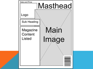
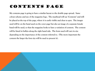
Price: £2-    Colour
          £2.50         Scheme: Red,
                        White,
Style:                  Light Blue
Comical                 and Black.
and
catchy


              Plan          Target
                            audience: 16-25
                            years
Indie
Music
                          Male
                          Target
          Cover (main     audience
          image) Boy
          Band
TITLE IDEAS
·   Flare- this sounds almost like ‘Snare’ (a type of drum) so fits with the style of music
    that my magazine is going to focus on.
·   Unique- one-worded titles always stink in the reader’s mind. Because it is a word
    from the English language people are familiar with it. Lots of people like to think of
    themselves as unique.
·   Latch- when you latch onto something you become stuck to it. This is what I want
    my audience to feel, like they cannot put down my music magazine. They are
    ‘latched’ onto.
THE COST OF MY
MAGAZINE


I want my magazine to be affordable, especially because my target audience are young
people that are likely to either be in full time education or on a low budget. So I would
expect to price it at around £2.50. My magazine will be released monthly just like ‘Q’
magazine. The total number of pages in a ‘Q’ magazine varies, but usually it reaches
around 100 pages. My magazine will have to be a reasonable price for the young target
audience that it is aimed at, because of their assumed disposable income I want them to
feel as though they can afford it, so I will price my magazine at around £3.50 and include
less pages than ‘Q’ magazines.
THE STYLE OF MY
MAGAZINE


The style is going to be almost comical, so that it attracts the eyes of the younger
readers. It will follow a strict colour scheme of: black, white, grey, light blue and
red. The target audience focusing on males. Blue connotes a male target audience, so
should attract them. The bands that I am going to focus on are going to be mostly male
orientated so that they can be seen by the male target audience as aspirational figures.
THE GENRE OF MY
MAGAZINE


The style of my magazine is going to be ‘Indie’/Rock. Lots of guitarists will be within the
content. The music genre will obviously also be indie. The images used will be of boy
bands mostly, holding and playing guitars, drums and keyboards. Pictures will be taken
in the music practice rooms and hopefully in one of the recording studios in college.
This is so that the images used looked professional and eye catching to the audience.
MY MAGAZINE
CONTENT

It will include information about the current state of the Indie music industry. I decided upon this
magazine genre after analysing my results from my survey. The results showed that this genre of
music was very popular within the eyes of young people. It will keep the readers updated on new
releases from bands that the target audience are bound to enjoy. It will include information about
music that dates back into the past that some readers will like to be reminded of. The content will be
fairly informal and chatty so that it appeal to my young, male target audience. The colour scheme
will stay constant throughout the whole of the issue so that the audience can familiarise themselves
with the magazine and recognise the colour scheme immediately. As well as using a male band so
attract the eyes of the male target audience I am going to use images of a female band that should
attract the eyes through the theory of the male gaze. By ensuring that the characters look pretty and
are wearing revealing clothes the audience should be attracted.
MAIN IMAGE IDEAS
        Low key lighting in the background. High key on
        the faces of the band members


                               Use props in
        Low angle shot         my image
Date and Price


                 Masthead
 Logo

 Sub Heading


 Magazine
 Content
                   Main
 Listed
                  Image
COVER PAGE
My cover page is going to include a large image of a boy band. The subheading is
going to cover a small section of the top of the image, so is the magazine content
(which is listed down the side of the magazine). The barcode will be placed in the
bottom right hand corner of the cover, a typical place to locate this expected
convention on a magazine. The date and price of the magazine will be printed in
smaller font at the top of the page. The size of the font will be:

Mast Head: 60
Magazine content: 18
Date & price: 12
Logo
           Contents

Bulleted
contents   Main Image
           (Same person
           as on the front
           cover however
           different image).


            2 More
            images
CONTENTS PAGE
My contents page is going to have a similar layout to the double page spread. Same
colour scheme and use of the magazine logo. The masthead will say ‘Contents’ and will
be placed at the top of the page, where it is easily visible and clear to spot. The images
used will be on the band used on the cover page but also an image of a separate female
band will be used, so that the magazine looks to have a variation of content. The content
will be listed in bullets along the right hand side. The fonts used will vary in size
depending on the importance of the content referred to. (The more important the
content the larger the font size will be used to present it).
Title-faded letters. Main image is
brought to the front

                            Sub Heading


                                                  Main story


             Main
             image                   Main Story
                                     Continued
DOUBLE PAGE SPREAD


The double page spread is going to include a main image of one of the males from the
band that I am using. Behind the image is going to be the main heading, it’s going to
fade into the background so that the main focus is still on the character in the main
image. The subheading will be placed on the right hand side in large, bold font so that
it appeals to the male target audience. The content will fill only one page of the double
page spread so that the audience are not overwhelmed with words. The image that is
used will be presented mostly on the left hand side of the double page spread but it will
overlap onto the second half also, so that this is the main focus.

Pre production drafting

  • 2.
    Price: £2- Colour £2.50 Scheme: Red, White, Style: Light Blue Comical and Black. and catchy Plan Target audience: 16-25 years Indie Music Male Target Cover (main audience image) Boy Band
  • 3.
    TITLE IDEAS · Flare- this sounds almost like ‘Snare’ (a type of drum) so fits with the style of music that my magazine is going to focus on. · Unique- one-worded titles always stink in the reader’s mind. Because it is a word from the English language people are familiar with it. Lots of people like to think of themselves as unique. · Latch- when you latch onto something you become stuck to it. This is what I want my audience to feel, like they cannot put down my music magazine. They are ‘latched’ onto.
  • 4.
    THE COST OFMY MAGAZINE I want my magazine to be affordable, especially because my target audience are young people that are likely to either be in full time education or on a low budget. So I would expect to price it at around £2.50. My magazine will be released monthly just like ‘Q’ magazine. The total number of pages in a ‘Q’ magazine varies, but usually it reaches around 100 pages. My magazine will have to be a reasonable price for the young target audience that it is aimed at, because of their assumed disposable income I want them to feel as though they can afford it, so I will price my magazine at around £3.50 and include less pages than ‘Q’ magazines.
  • 5.
    THE STYLE OFMY MAGAZINE The style is going to be almost comical, so that it attracts the eyes of the younger readers. It will follow a strict colour scheme of: black, white, grey, light blue and red. The target audience focusing on males. Blue connotes a male target audience, so should attract them. The bands that I am going to focus on are going to be mostly male orientated so that they can be seen by the male target audience as aspirational figures.
  • 6.
    THE GENRE OFMY MAGAZINE The style of my magazine is going to be ‘Indie’/Rock. Lots of guitarists will be within the content. The music genre will obviously also be indie. The images used will be of boy bands mostly, holding and playing guitars, drums and keyboards. Pictures will be taken in the music practice rooms and hopefully in one of the recording studios in college. This is so that the images used looked professional and eye catching to the audience.
  • 7.
    MY MAGAZINE CONTENT It willinclude information about the current state of the Indie music industry. I decided upon this magazine genre after analysing my results from my survey. The results showed that this genre of music was very popular within the eyes of young people. It will keep the readers updated on new releases from bands that the target audience are bound to enjoy. It will include information about music that dates back into the past that some readers will like to be reminded of. The content will be fairly informal and chatty so that it appeal to my young, male target audience. The colour scheme will stay constant throughout the whole of the issue so that the audience can familiarise themselves with the magazine and recognise the colour scheme immediately. As well as using a male band so attract the eyes of the male target audience I am going to use images of a female band that should attract the eyes through the theory of the male gaze. By ensuring that the characters look pretty and are wearing revealing clothes the audience should be attracted.
  • 8.
    MAIN IMAGE IDEAS Low key lighting in the background. High key on the faces of the band members Use props in Low angle shot my image
  • 10.
    Date and Price Masthead Logo Sub Heading Magazine Content Main Listed Image
  • 11.
    COVER PAGE My coverpage is going to include a large image of a boy band. The subheading is going to cover a small section of the top of the image, so is the magazine content (which is listed down the side of the magazine). The barcode will be placed in the bottom right hand corner of the cover, a typical place to locate this expected convention on a magazine. The date and price of the magazine will be printed in smaller font at the top of the page. The size of the font will be: Mast Head: 60 Magazine content: 18 Date & price: 12
  • 12.
    Logo Contents Bulleted contents Main Image (Same person as on the front cover however different image). 2 More images
  • 13.
    CONTENTS PAGE My contentspage is going to have a similar layout to the double page spread. Same colour scheme and use of the magazine logo. The masthead will say ‘Contents’ and will be placed at the top of the page, where it is easily visible and clear to spot. The images used will be on the band used on the cover page but also an image of a separate female band will be used, so that the magazine looks to have a variation of content. The content will be listed in bullets along the right hand side. The fonts used will vary in size depending on the importance of the content referred to. (The more important the content the larger the font size will be used to present it).
  • 14.
    Title-faded letters. Mainimage is brought to the front Sub Heading Main story Main image Main Story Continued
  • 15.
    DOUBLE PAGE SPREAD Thedouble page spread is going to include a main image of one of the males from the band that I am using. Behind the image is going to be the main heading, it’s going to fade into the background so that the main focus is still on the character in the main image. The subheading will be placed on the right hand side in large, bold font so that it appeals to the male target audience. The content will fill only one page of the double page spread so that the audience are not overwhelmed with words. The image that is used will be presented mostly on the left hand side of the double page spread but it will overlap onto the second half also, so that this is the main focus.