SlideShare a Scribd company logo
1 of 16
EVALUATIONAlice Bates
In what ways does your media product use,
develop or challenge forms and conventions of
real media products?
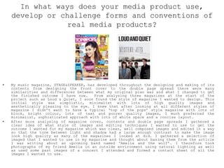
• My music magazine, STAGE&SPEAKER, has developed throughout the designing and making of its
contents from designing the front cover to the double page spread there were many
similarities and differences between what my original plan was and what I changed to get
the finished outcome I have now. From analysing three magazines at the start of the
project such as Loud & Quiet, I soon found the style of magazine I wanted to design. This
initial style was simplistic, minimalist with lots of high quality images and
aesthetically pleasing to the eye. I knew that after looking at all different styles of
magazine I didn’t want to have a typical ‘top of the pops’ style magazine with lots of
block, bright colour, lots of text and poorer quality images, I much preferred the
minimalist, sophisticated approach with lots of white space and a concise layout.
• After more analysing of magazine cover, contents and double page spreads I gathered a
clear idea of what style of images and editing techniques I wanted to use to get the
outcome I wanted for my magazine which was clear, well composed images and edited in a way
so that the tone between light and shadow had a large enough contrast to make the image
look high quality as many of the magazines I looked at did. I gathered a selection of
imaged that I wanted to use in my magazine and thought about basing them from the article
I was writing about an upcoming band named ‘Amelia and the wolf’. I therefore took
photographs of my friend Amelia in an outside environment using natural lighting as well
as used some past images of a concert I attended and formed a contact sheet of all the
images I wanted to use.
FRONT COVER
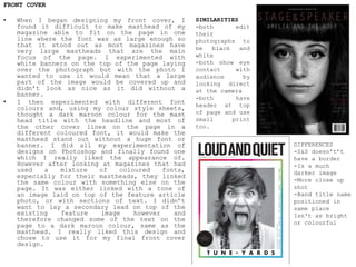
• When I began designing my front cover, I
found it difficult to make masthead of my
magazine able to fit on the page in one
line where the font was as large enough so
that it stood out as most magazines have
very large mastheads that are the main
focus of the page. I experimented with
white banners on the top of the page laying
over the photograph but with the photo I
wanted to use it would mean that a large
part of the image would be covered up and
didn’t look as nice as it did without a
banner.
• I then experimented with different font
colours and, using my colour style sheets,
thought a dark maroon colour for the mast
head title with the headline and most of
the other cover lines on the page in a
different coloured font, it would make the
masthead stand out without a huge font or
banner. I did all my experimentation of
designs on Photoshop and finally found one
which I really liked the appearance of.
However after looking at magazines that had
used a mixture of coloured fonts,
especially for their mastheads, they linked
the same colour with something else on the
page. It was either linked with a tone of
an image laid on top of the feature article
photo, or with sections of text. I didn’t
want to lay a secondary lead on top of the
existing feature image however and
therefore changed some of the text on the
page to a dark maroon colour, same as the
masthead. I really liked this design and
chose to use it for my final front cover
design.
SIMILARITIES
-both edit
their
photographs to
be black and
white
-both show eye
contact with
audience by
looking direct
at the camera
-both have
header at top
of page and use
small print
too.
DIFFERENCES
-S&S doesn't’t
have a border
-Is a much
darker image
-More close up
shot
-Band title name
positioned in
same place
Isn't as bright
or colourful
CONTENTS PAGE
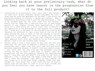
• I then started designing my contents on in design; I
took inspiration from Loud &Quiets contents page I had
earlier analysed, however after using their layout
with my appropriate contents. I didn’t like it at all.
This was because it didn’t look like a conventional
magazine contents page that is usually full with
information and images. It was too minimalist and
therefore I decided to change it completely to a more
commonly used contents page layout that most magazines
use within the music industry. I wrote up my contents
titles and what key information I wanted to include on
the contents with their selected images. I really
liked the magazine ‘music & riots’ contents page
design that used a linked colour scheme from their
front cover throughout to their double page spread. I
thought that I could us the monochrome and dark maroon
colour scheme I had previously used on the front cover
and began to insert my contents and experimented with
different font size, colour and layout. The layout I
chose followed the strict concise layout that a lot of
magazines use however I put my own twist on it by
enlarging the page numbers and changing someone the
text to a dark maroon and used images that also
followed the colour scheme and this was the actual
final one I decided to go for.
DOUBLE PAGE SPREAD
• My original design for my double page spread that I
made sample dummies of was very different to the
actual outcome I decided to go with. My original
design was to have a white background and my images
placed on top with columns for my contextual
information instead I wanted to use one image for the
whole background so that the main subject of the
photograph is on the right side of the double page
spread and the text on the left. I got this idea from
‘Clash’ magazines double page spread I analysed
previously and is something that quite a lot of
magazines do within their layout and design.
How does your media product represent
particular social groups?
• My media magazine product represents particular social
groups in a number of different ways, the photograph
featured on the front cover of my friend Amelia of her
staring directly at the camera infers that she is
confident and direct to her audience. The way in which
I have cropped the photograph means that her eyes are
at the audience’s eye level and therefore appears like
she’s staring at them. Looking into someone’s eyes is
seen as an emotional gateway and suggests that within
the magazine there will be an insight into her story
and the reason for her confidence. In relation to
social groups, women, especially young women, are
usually portrayed in the media as been weaker than men
with low confidence however by having the front cover
inferring confidence her, this goes against
stereotypical views on young women.
• I did this because from my audience research I found
that a larger percentage of girls would read a acoustic
genre magazine and therefore aimed this at the target
audience and to hopefully inspire them to not be a
stereotype. Makeup and appearance is thought about
within the composition of the shoot too, I wanted to
portray Amelia in a way that way original and
fashionable which is a common interest of women within
age ranges of 16-19 years and shows the modernism of
Amelia who is shown to be strong yet beautiful, a
common desire of young women and tried to show this on
the image used on the contents page on the top left
hand corner. This shot was taken from the side to show
a different side to her, her body language and
composition of shot show that she’s more closed and
gives a more mysterious outlook on her personality. The
quote at the top right of the page from Amelia is
related to the strong pose and is stating her view on
sexist traits within the music industry which is from a
different page to the article I wrote. I did this so
that her views on the music industry as well as her
story link the whole magazine and she is features
throughout small parts of the magazine.
• The statement shown on the contents page to young women who are interested I music and possible are
musicians themselves will be interested in her character which again empowers young people to not
let stereotypical views limit them. I wanted to portray her as instead of being sexualised like
some empowering women have been in the media I wanted to show her as been an artist instead that is
more of a desirable thing to be in the likes of the target audience and to not encourage been s
sexual object like the media portrays some females as a good thing.
• Women that I wanted Amelia in my magazine to be alike are women such as Lucy rose who is a acoustic
guitarist and singer from England and although isn’t as famous as other female artists comes across
as been very grateful and a generally normal, lovely person with a magnificent talent. To me this is
the sort of people young people should be idolising not the well known big artists we see in the
media that seem like an object and something to be stared at which I don’t think is a good thing.
• On the double page spread, the background image is again a different view to Amelia and her facial
expression that’s less serious and more informal is more relatable to her quotes and story within
the article. Most people when seeing the images of her might assume that she and the band have a
large amount of money due to the way they dress and there performance displays shown on the contents
right page, however reading the article is about how they started as young individuals busking in
Leeds to get some money for themselves and how through their music managed to work their way up and
are now successful within the music industry. In my design I wanted to make the magazine picture
order be a story of the band and I think that this will draw the viewers in but also every image
contradicts a stereotypical view on youth, class and gender.
• Another way that my magazine represents social groups is that it
shows that In some areas and communities in modern society they
aren’t as multicultural as others. My photographs I have used in my
magazine do not feature any people of a different ethnicity, this is
because the area in which I live isn’t a very multicultural
community and therefore has a minority of ethnic groups. However my
magazine is within the genre of Acoustic music which in the media,
acoustic artists are predominately white unlike many other music
genres within the media where artists aren’t from an predominate
ethnic group. My magazine is a representation of what which artists
have been shown to be successful within the acoustic genre in the
media which was a common representation in many of the magazines I
earlier analysed. Although I disagree with how success in this area
of the music industry is shown in the media and I think that there
should be more musicians from different ethnicities, this style of
music is a very common style of music within western societies,
which may be a possible reason as to why the media representing this
genre are accommodating for the majority of the target audiences
ethnicity.
MULTICULTURE
• Youth is also a social group that has been represented within my
magazine; this is because when I did my audience research I found
that the main target audience is 16-18 year olds. I therefore
addressed my contents to be within common interests of that age
range which is why my contents page content had be well thought
out and was something I had to change multiple times. I tried to
focus on events coming up around the summer time when this
magazine issue would be published such as music festivals,
upcoming artists and their tour dates, interviews and tips on how
to survive festivals. I tried to include interviews and other
contextual information within the magazine other than ideal
interest of that age Range group because I do think the layout I
have chosen isn’t a stereotypical style of magazine aimed 16-18
year olds and may attract people in their early twenties whose
interests would be slightly different to the younger audience.
YOUTH
What kind of media institution might
distribute your media product and why?
• During my magazine research I found that a UK company called Anthem publishing that
published a range of music magazines that were within the acoustic genre. They all used
the typical ‘music mag’ layout to them that other magazines use such as NME or Ker rang
that use bold, large writing and tend to use a red, white and black colour schemes. This
aspect I really liked, however I preferred the more simplistic layout from individual
publishing companies. This is one of the disadvantages of large publishing companies
because they can lack individuality in their variation in design compared to other
magazines or even their own magazines. Due to this, some of the public that read
magazines published by larger companies may want a magazine with similar themes of
content but with a different way of writing and design as I myself would prefer.
• I therefore think that there is a gap in the publishing market for this style and want
of the public which is the area in which I wanted to fill. I did this through using
similarities such as the common colour scheme of red, white and black that’s used in lots
of magazines but with a more simplistic design and layout.
Advantages and Disadvantages
• Advantages of large publishing companies
such as Anthem publishing is that
because so many other music magazine
publishing companies with a similar
design and style of writing it means
that when members of the public are
looking to subscribe to a magazine and
invest their money within the company
they may find it difficult to want to
commit if there are lots of other
magazines similar.
• However there are also disadvantages to
large publishing companies, this is
that, just like Anthem Publishing, they
also publish different magazines within
the company. This could either be
magazines of different genres or
magazines about topics that aim their
contents at a different target audience.
This includes magazines like cooking,
gardening, guitar that aim for the older
audience where as the acoustic magazines
are aimed for a 16-18 year old age
range. This could be seen as an
advantage because it means more people
invest in the company it’s a more
versatile publishing company. However
this is also a disadvantage because it
means that the company aren’t
specifically linked to music magazines
and therefore the offers and information
about music may be limited because they
are a company of many branches.
Who would be the audience for your media
product?
• My magazine I tried to aim at 16-18 year olds, this was because when I was doing
my audience research I found that the majority of people that did my survey were
within that age group. I knew that I didn’t want to do a typical young persons
magazine like top of the pops because I think that the bright, colourful large
printed text and topics aren’t very sophisticated and more addressed to younger
girls, below the age of sixteen. Through more research I really liked the more
simplistic layout where the colour scheme uses minimalist, neutral colouring and
its content is well structured with high quality images. I think that this style
of magazine is one that is more aimed at 16-18 year olds that have an eye for
the arts and enjoy reading and taking inspiration from the design on board but
also the people that are interested in new upcoming band within the booming
music industry. From my questionnaire I discovered that the majority of people
that took did the questionnaire where girls and I gathered that they weren't
very confident within themselves. This is why I addressed the main article and
main feature article on Amelia who is a strong willed, young, talented artist
that worked her way up and is now confident enough to be able to perform to
hundreds, I thought that this would perhaps inspire some of the young readers
and give them more confidence.
• Another way in which I aimed my magazine at
the target audience is by dressing Amelia in
a way that follows current trends but with
her own individual twist. The majority of
the readers of my magazine from my research
would be girls who like shops such as urban
outfitters or Top shop and therefore thought
that I would style Amelia in a way that
would be available to them to buy but style
it a way that suits them. On the front cover
it features a picture of Amelia with winged
eyeliner and a short fringe which is quite a
unique look , the contents picture of her
shows her looking very elegant and well
dressed which would suggest that she is
stylish but has her own style. I tried to do
this purposefully so that Amelia inspires
them to be individual but also from reading
the article and her story it may also gibe
them inspiration to work hard at what they
enjoy because it does work out. I used a
monochrome colour scheme with flecks of red
running throughout the magazine which are
usually associated with higher quality
magazines such as vogue but also a large
majority of music genre magazines on the
market today such as NME. I thought that
this colour scheme therefore is better
addressed to 16-18 year olds because it
gives them that sophisticated style of
writing and layout they cant find in
magazines such as top of the pops who use a
very different approach to attract their
target audience.
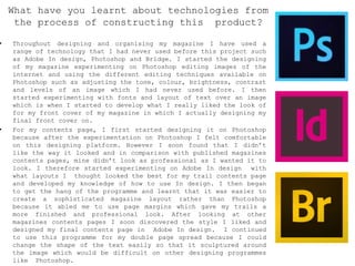
• Throughout designing and organising my magazine I have used a
range of technology that I had never used before this project such
as Adobe In design, Photoshop and Bridge. I started the designing
of my magazine experimenting on Photoshop editing images of the
internet and using the different editing techniques available on
Photoshop such as adjusting the tone, colour, brightness, contrast
and levels of an image which I had never used before. I then
started experimenting with fonts and layout of text over an image
which is when I started to develop what I really liked the look of
for my front cover of my magazine in which I actually designing my
final front cover on.
• For my contents page, I first started designing it on Photoshop
because after the experimentation on Photoshop I felt comfortable
on this designing platform. However I soon found that I didn’t
like the way it looked and in comparison with published magazines
contents pages, mine didn’t look as professional as I wanted it to
look. I therefore started experimenting on Adobe In design with
what layouts I thought looked the best for my trail contents page
and developed my knowledge of how to use In design. I then began
to get the hang of the programme and learnt that it was easier to
create a sophisticated magazine layout rather than Photoshop
because it abled me to use page margins which gave my trails a
more finished and professional look. After looking at other
magazines contents pages I soon discovered the style I liked and
designed my final contents page in Adobe In design. I continued
to use this programme for my double page spread because I could
change the shape of the text easily so that it sculptured around
the image which would be difficult on other designing programmes
like Photoshop.
What have you learnt about technologies from
the process of constructing this product?
• Throughout the designing of my
magazine the photographs in which id
taken for them I uploaded and made
contact sheets on Adobe Bridge which
organises the images in order and
lays them out in a way that make it
easier to observe what images and
the quality of them I have taken.
This is a also a new programme I
haven’t used before but was a quick
and easy ways to display my images.
• Therefore overall by making my
magazine it has taught me and
allowed me to use lots of new
programmes I had never used before
but enjoyed the process of creating
my magazine on them and I think that
using them gave me an insight on how
real publishing companies make there
products look sophisticated and
attract their audience in the
correct way.
• I also think that learning the
basic skills on these programmes
will help me in the future to have
the confidence to expand my
knowledge and skills on the
programmes.
Looking back at your preliminary task, what do
you feel you have learnt in the progression from
it to the full product?
• Looking back at my preliminary task I feel like I have gained a
lot more skill within different design programmes but also I
think that my style had developed too and what I like within the
publishing industry in relation to design and contents. When I
completed my preliminary task I used the same photograph I used
on my contents page for the front cover this was because I
really like the image that I used and think its in good enough
quality to use. However through later experimenting I don’t
think it’s a good choice for a front cover. This is because of
the composition of the photograph in that because it’s a medium
shot a large part of the photo is her shoulders and clothing and
therefore its difficult to have a mast head at the top of the
image because her face is right at the top instead on central.
In relation to other magazines this is a design floor and even
though it’s a nice image it isn’t the right composition for an
ideal magazine front cover and therefore for my final magazine
design I used it for the contents page instead.
• Another thing I think I have learnt is what font and text size
looks best for the style of magazine I wanted to create, in my
preliminary task I used a font that isn’t used very much within
published magazines because it doesn’t look very sophisticated.
I also think that the font size and the different coloured
writing the way in which I have done it doesn’t look very
professional and now from magazine research and experimenting
myself I know what does and doesn’t look right for the style of
magazine I like. I think that the image I used didn’t suit the
font I chose and therefore they didn’t go very together and
just looked as if it had been thrown together rather than been
thought out. This shows that I have found the sort of style I
really like and was able to show it in my final outcome and
improve from my preliminary tasks quality in design.
• I also think I have learnt and progressed in my
skills using design software as I can see from my
previous posts on my blog to now. The ways in which I
present my work, the font, the colours and the style
have all changed since I began my magazine course
work. At the beginning I loved the idea of a retro
style magazine in the genre of old, jazz, classic
music. However after market research I discovered
that it would be difficult to sell my magazine to a
range of different people and therefore would have to
have a very specific target audience. I therefore
decided to do a genre of music more people would be
interested in and chose acoustic which Is another
area I’m interested in, this is why my preliminary
task front covers font and mast head were in a retro
style of type.
• As well as these software's I have also learnt things
that I didn’t know before by using websites such as
survey monkey, slide share and blogger that have all
helped me gather target research and upload my work
onto the internet which were all things I have never
done before.
• My first experiments at designing a front cover I
used Photo shop and experimented with using banners
to lay the mast head over the top so that it stand
out and without it, borders, different compositions
of photography and how it looked on the page. These
were all things I wasn’t aware would make such a
difference on the page and I soon found the style of
layout I like which was a full page image with the
mast head laid over the top.
• Overall my style and skill from the beginning of this
project has developed which has helped me to
further my understanding of how professional
publishing companies design and write their
magazines.

More Related Content

What's hot

Print project – music magazine (evaluation)
Print project – music magazine (evaluation)Print project – music magazine (evaluation)
Print project – music magazine (evaluation)Blackburn
 
Print Project – Music Magazine (Evaluation)
Print Project – Music Magazine (Evaluation)Print Project – Music Magazine (Evaluation)
Print Project – Music Magazine (Evaluation)Blackburn
 
AS MEDIA STUDIES EVALUATION: UNIT G321
AS MEDIA STUDIES EVALUATION: UNIT G321AS MEDIA STUDIES EVALUATION: UNIT G321
AS MEDIA STUDIES EVALUATION: UNIT G321nbakoakela
 
Evaluation Q1 & Q2
Evaluation Q1 & Q2Evaluation Q1 & Q2
Evaluation Q1 & Q2ella potton
 
How my magazine appeals to the target audience
How my magazine appeals to the target audienceHow my magazine appeals to the target audience
How my magazine appeals to the target audienceKieran Gore
 
Media as coursework – music magazine evaluation
Media as coursework – music magazine evaluationMedia as coursework – music magazine evaluation
Media as coursework – music magazine evaluationHannahLuise
 
Textual analysis presentation
Textual analysis presentationTextual analysis presentation
Textual analysis presentationDarbySavage
 

What's hot (16)

Magazine evaluation
Magazine evaluationMagazine evaluation
Magazine evaluation
 
Print project – music magazine (evaluation)
Print project – music magazine (evaluation)Print project – music magazine (evaluation)
Print project – music magazine (evaluation)
 
Print Project – Music Magazine (Evaluation)
Print Project – Music Magazine (Evaluation)Print Project – Music Magazine (Evaluation)
Print Project – Music Magazine (Evaluation)
 
AS MEDIA STUDIES EVALUATION: UNIT G321
AS MEDIA STUDIES EVALUATION: UNIT G321AS MEDIA STUDIES EVALUATION: UNIT G321
AS MEDIA STUDIES EVALUATION: UNIT G321
 
Evaluation Q1 & Q2
Evaluation Q1 & Q2Evaluation Q1 & Q2
Evaluation Q1 & Q2
 
How my magazine appeals to the target audience
How my magazine appeals to the target audienceHow my magazine appeals to the target audience
How my magazine appeals to the target audience
 
Media as coursework – music magazine evaluation
Media as coursework – music magazine evaluationMedia as coursework – music magazine evaluation
Media as coursework – music magazine evaluation
 
Question 5
Question 5 Question 5
Question 5
 
Question 5
Question 5 Question 5
Question 5
 
Evaluation
EvaluationEvaluation
Evaluation
 
Poser
PoserPoser
Poser
 
Poser
PoserPoser
Poser
 
Poser
PoserPoser
Poser
 
Photoshoot
PhotoshootPhotoshoot
Photoshoot
 
Textual analysis presentation
Textual analysis presentationTextual analysis presentation
Textual analysis presentation
 
Evaluation
EvaluationEvaluation
Evaluation
 

Viewers also liked

Magazine analysis
Magazine analysisMagazine analysis
Magazine analysisAlice Bates
 
Audience research
Audience researchAudience research
Audience researchAlice Bates
 
Evaluation powerpoint
Evaluation powerpointEvaluation powerpoint
Evaluation powerpointAlice Bates
 
Evaluation powerpoint
Evaluation powerpointEvaluation powerpoint
Evaluation powerpointAlice Bates
 
Evaluation powerpoint
Evaluation powerpointEvaluation powerpoint
Evaluation powerpointAlice Bates
 
Magazine analysis
Magazine analysisMagazine analysis
Magazine analysisAlice Bates
 
Magazine analysis
Magazine analysisMagazine analysis
Magazine analysisAlice Bates
 
Magazine analysis
Magazine analysisMagazine analysis
Magazine analysisAlice Bates
 
Design development
Design developmentDesign development
Design developmentAlice Bates
 
Magazine analysis
Magazine analysisMagazine analysis
Magazine analysisAlice Bates
 

Viewers also liked (15)

Magazine analysis
Magazine analysisMagazine analysis
Magazine analysis
 
Magazine plan
Magazine planMagazine plan
Magazine plan
 
Audience research
Audience researchAudience research
Audience research
 
Evaluation powerpoint
Evaluation powerpointEvaluation powerpoint
Evaluation powerpoint
 
Evaluation powerpoint
Evaluation powerpointEvaluation powerpoint
Evaluation powerpoint
 
Music magazine
Music magazineMusic magazine
Music magazine
 
Evaluation powerpoint
Evaluation powerpointEvaluation powerpoint
Evaluation powerpoint
 
Magazine analysis
Magazine analysisMagazine analysis
Magazine analysis
 
Magazine analysis
Magazine analysisMagazine analysis
Magazine analysis
 
Magazine analysis
Magazine analysisMagazine analysis
Magazine analysis
 
Music magazine
Music magazineMusic magazine
Music magazine
 
Jazz powerpoint
Jazz powerpointJazz powerpoint
Jazz powerpoint
 
Design development
Design developmentDesign development
Design development
 
Magazine plan
Magazine planMagazine plan
Magazine plan
 
Magazine analysis
Magazine analysisMagazine analysis
Magazine analysis
 

Similar to Evaluation powerpoint

Evaluation question 1
Evaluation question 1Evaluation question 1
Evaluation question 1jodiea
 
41 Evaluation
41  Evaluation41  Evaluation
41 EvaluationJordan
 
Media evaluation presentation
Media evaluation presentationMedia evaluation presentation
Media evaluation presentationmuminab
 
Media evaluation presentation
Media evaluation presentationMedia evaluation presentation
Media evaluation presentationmuminab
 
Media evaluation presentation
Media evaluation presentationMedia evaluation presentation
Media evaluation presentationmuminab
 
41. Evaluation
41.  Evaluation 41.  Evaluation
41. Evaluation Jordan
 
Magazine analysis Questions
Magazine analysis QuestionsMagazine analysis Questions
Magazine analysis Questionshenryguymalcolm
 
Music magazine analysis
Music magazine analysisMusic magazine analysis
Music magazine analysisdncA2media
 
Evaluation Of My Music Magazine
Evaluation Of My Music MagazineEvaluation Of My Music Magazine
Evaluation Of My Music Magazinehargravee1
 
Media Evaluationdd
Media EvaluationddMedia Evaluationdd
Media Evaluationddguest11ad11d
 
Evaluation
EvaluationEvaluation
Evaluationalex
 
Evaluation Question 1
Evaluation Question 1Evaluation Question 1
Evaluation Question 1taylzz1
 
Evaluation- music magazine
Evaluation-  music magazineEvaluation-  music magazine
Evaluation- music magazineadambowie97
 
Media Evaluation
Media EvaluationMedia Evaluation
Media EvaluationJennieTott
 

Similar to Evaluation powerpoint (20)

Evaluation
EvaluationEvaluation
Evaluation
 
Evaluation
EvaluationEvaluation
Evaluation
 
My evaluation!
My evaluation!My evaluation!
My evaluation!
 
Evaluation
EvaluationEvaluation
Evaluation
 
Evaluation question 1
Evaluation question 1Evaluation question 1
Evaluation question 1
 
41 Evaluation
41  Evaluation41  Evaluation
41 Evaluation
 
Media evaluation presentation
Media evaluation presentationMedia evaluation presentation
Media evaluation presentation
 
Media evaluation presentation
Media evaluation presentationMedia evaluation presentation
Media evaluation presentation
 
Media evaluation presentation
Media evaluation presentationMedia evaluation presentation
Media evaluation presentation
 
41. Evaluation
41.  Evaluation 41.  Evaluation
41. Evaluation
 
Question 1 f
Question 1 fQuestion 1 f
Question 1 f
 
Magazine analysis Questions
Magazine analysis QuestionsMagazine analysis Questions
Magazine analysis Questions
 
Music magazine analysis
Music magazine analysisMusic magazine analysis
Music magazine analysis
 
Evaluation Of My Music Magazine
Evaluation Of My Music MagazineEvaluation Of My Music Magazine
Evaluation Of My Music Magazine
 
Evaluation
EvaluationEvaluation
Evaluation
 
Media Evaluationdd
Media EvaluationddMedia Evaluationdd
Media Evaluationdd
 
Evaluation
EvaluationEvaluation
Evaluation
 
Evaluation Question 1
Evaluation Question 1Evaluation Question 1
Evaluation Question 1
 
Evaluation- music magazine
Evaluation-  music magazineEvaluation-  music magazine
Evaluation- music magazine
 
Media Evaluation
Media EvaluationMedia Evaluation
Media Evaluation
 

More from Alice Bates

Shootingschedule
ShootingscheduleShootingschedule
ShootingscheduleAlice Bates
 
Digital package analysis
Digital package analysisDigital package analysis
Digital package analysisAlice Bates
 
Olivver the kid attica
Olivver the kid  atticaOlivver the kid  attica
Olivver the kid atticaAlice Bates
 
Reserach of the band
Reserach of the band Reserach of the band
Reserach of the band Alice Bates
 
Music video analysis 2
Music video analysis 2Music video analysis 2
Music video analysis 2Alice Bates
 
Olivver the kid b bblue
Olivver the kid b bblueOlivver the kid b bblue
Olivver the kid b bblueAlice Bates
 
Music video analysis 2
Music video analysis 2Music video analysis 2
Music video analysis 2Alice Bates
 
Audience research
Audience researchAudience research
Audience researchAlice Bates
 
Audience research
Audience researchAudience research
Audience researchAlice Bates
 

More from Alice Bates (13)

Shootingschedule
ShootingscheduleShootingschedule
Shootingschedule
 
Digital package analysis
Digital package analysisDigital package analysis
Digital package analysis
 
Olivver the kid attica
Olivver the kid  atticaOlivver the kid  attica
Olivver the kid attica
 
Reserach of the band
Reserach of the band Reserach of the band
Reserach of the band
 
Music video analysis 2
Music video analysis 2Music video analysis 2
Music video analysis 2
 
Olivver the kid b bblue
Olivver the kid b bblueOlivver the kid b bblue
Olivver the kid b bblue
 
Raleigh ritchie
Raleigh ritchieRaleigh ritchie
Raleigh ritchie
 
Music video
Music videoMusic video
Music video
 
Music video analysis 2
Music video analysis 2Music video analysis 2
Music video analysis 2
 
Audience research
Audience researchAudience research
Audience research
 
Magazine plan
Magazine planMagazine plan
Magazine plan
 
Audience research
Audience researchAudience research
Audience research
 
Magazine plan
Magazine planMagazine plan
Magazine plan
 

Recently uploaded

Science lesson Moon for 4th quarter lesson
Science lesson Moon for 4th quarter lessonScience lesson Moon for 4th quarter lesson
Science lesson Moon for 4th quarter lessonJericReyAuditor
 
18-04-UA_REPORT_MEDIALITERAСY_INDEX-DM_23-1-final-eng.pdf
18-04-UA_REPORT_MEDIALITERAСY_INDEX-DM_23-1-final-eng.pdf18-04-UA_REPORT_MEDIALITERAСY_INDEX-DM_23-1-final-eng.pdf
18-04-UA_REPORT_MEDIALITERAСY_INDEX-DM_23-1-final-eng.pdfssuser54595a
 
POINT- BIOCHEMISTRY SEM 2 ENZYMES UNIT 5.pptx
POINT- BIOCHEMISTRY SEM 2 ENZYMES UNIT 5.pptxPOINT- BIOCHEMISTRY SEM 2 ENZYMES UNIT 5.pptx
POINT- BIOCHEMISTRY SEM 2 ENZYMES UNIT 5.pptxSayali Powar
 
ENGLISH5 QUARTER4 MODULE1 WEEK1-3 How Visual and Multimedia Elements.pptx
ENGLISH5 QUARTER4 MODULE1 WEEK1-3 How Visual and Multimedia Elements.pptxENGLISH5 QUARTER4 MODULE1 WEEK1-3 How Visual and Multimedia Elements.pptx
ENGLISH5 QUARTER4 MODULE1 WEEK1-3 How Visual and Multimedia Elements.pptxAnaBeatriceAblay2
 
Organic Name Reactions for the students and aspirants of Chemistry12th.pptx
Organic Name Reactions  for the students and aspirants of Chemistry12th.pptxOrganic Name Reactions  for the students and aspirants of Chemistry12th.pptx
Organic Name Reactions for the students and aspirants of Chemistry12th.pptxVS Mahajan Coaching Centre
 
Software Engineering Methodologies (overview)
Software Engineering Methodologies (overview)Software Engineering Methodologies (overview)
Software Engineering Methodologies (overview)eniolaolutunde
 
The Most Excellent Way | 1 Corinthians 13
The Most Excellent Way | 1 Corinthians 13The Most Excellent Way | 1 Corinthians 13
The Most Excellent Way | 1 Corinthians 13Steve Thomason
 
भारत-रोम व्यापार.pptx, Indo-Roman Trade,
भारत-रोम व्यापार.pptx, Indo-Roman Trade,भारत-रोम व्यापार.pptx, Indo-Roman Trade,
भारत-रोम व्यापार.pptx, Indo-Roman Trade,Virag Sontakke
 
internship ppt on smartinternz platform as salesforce developer
internship ppt on smartinternz platform as salesforce developerinternship ppt on smartinternz platform as salesforce developer
internship ppt on smartinternz platform as salesforce developerunnathinaik
 
Presiding Officer Training module 2024 lok sabha elections
Presiding Officer Training module 2024 lok sabha electionsPresiding Officer Training module 2024 lok sabha elections
Presiding Officer Training module 2024 lok sabha electionsanshu789521
 
ECONOMIC CONTEXT - LONG FORM TV DRAMA - PPT
ECONOMIC CONTEXT - LONG FORM TV DRAMA - PPTECONOMIC CONTEXT - LONG FORM TV DRAMA - PPT
ECONOMIC CONTEXT - LONG FORM TV DRAMA - PPTiammrhaywood
 
Alper Gobel In Media Res Media Component
Alper Gobel In Media Res Media ComponentAlper Gobel In Media Res Media Component
Alper Gobel In Media Res Media ComponentInMediaRes1
 
Blooming Together_ Growing a Community Garden Worksheet.docx
Blooming Together_ Growing a Community Garden Worksheet.docxBlooming Together_ Growing a Community Garden Worksheet.docx
Blooming Together_ Growing a Community Garden Worksheet.docxUnboundStockton
 
Introduction to ArtificiaI Intelligence in Higher Education
Introduction to ArtificiaI Intelligence in Higher EducationIntroduction to ArtificiaI Intelligence in Higher Education
Introduction to ArtificiaI Intelligence in Higher Educationpboyjonauth
 
History Class XII Ch. 3 Kinship, Caste and Class (1).pptx
History Class XII Ch. 3 Kinship, Caste and Class (1).pptxHistory Class XII Ch. 3 Kinship, Caste and Class (1).pptx
History Class XII Ch. 3 Kinship, Caste and Class (1).pptxsocialsciencegdgrohi
 
How to Make a Pirate ship Primary Education.pptx
How to Make a Pirate ship Primary Education.pptxHow to Make a Pirate ship Primary Education.pptx
How to Make a Pirate ship Primary Education.pptxmanuelaromero2013
 
Computed Fields and api Depends in the Odoo 17
Computed Fields and api Depends in the Odoo 17Computed Fields and api Depends in the Odoo 17
Computed Fields and api Depends in the Odoo 17Celine George
 
How to Configure Email Server in Odoo 17
How to Configure Email Server in Odoo 17How to Configure Email Server in Odoo 17
How to Configure Email Server in Odoo 17Celine George
 

Recently uploaded (20)

Science lesson Moon for 4th quarter lesson
Science lesson Moon for 4th quarter lessonScience lesson Moon for 4th quarter lesson
Science lesson Moon for 4th quarter lesson
 
18-04-UA_REPORT_MEDIALITERAСY_INDEX-DM_23-1-final-eng.pdf
18-04-UA_REPORT_MEDIALITERAСY_INDEX-DM_23-1-final-eng.pdf18-04-UA_REPORT_MEDIALITERAСY_INDEX-DM_23-1-final-eng.pdf
18-04-UA_REPORT_MEDIALITERAСY_INDEX-DM_23-1-final-eng.pdf
 
POINT- BIOCHEMISTRY SEM 2 ENZYMES UNIT 5.pptx
POINT- BIOCHEMISTRY SEM 2 ENZYMES UNIT 5.pptxPOINT- BIOCHEMISTRY SEM 2 ENZYMES UNIT 5.pptx
POINT- BIOCHEMISTRY SEM 2 ENZYMES UNIT 5.pptx
 
ENGLISH5 QUARTER4 MODULE1 WEEK1-3 How Visual and Multimedia Elements.pptx
ENGLISH5 QUARTER4 MODULE1 WEEK1-3 How Visual and Multimedia Elements.pptxENGLISH5 QUARTER4 MODULE1 WEEK1-3 How Visual and Multimedia Elements.pptx
ENGLISH5 QUARTER4 MODULE1 WEEK1-3 How Visual and Multimedia Elements.pptx
 
Organic Name Reactions for the students and aspirants of Chemistry12th.pptx
Organic Name Reactions  for the students and aspirants of Chemistry12th.pptxOrganic Name Reactions  for the students and aspirants of Chemistry12th.pptx
Organic Name Reactions for the students and aspirants of Chemistry12th.pptx
 
Software Engineering Methodologies (overview)
Software Engineering Methodologies (overview)Software Engineering Methodologies (overview)
Software Engineering Methodologies (overview)
 
The Most Excellent Way | 1 Corinthians 13
The Most Excellent Way | 1 Corinthians 13The Most Excellent Way | 1 Corinthians 13
The Most Excellent Way | 1 Corinthians 13
 
भारत-रोम व्यापार.pptx, Indo-Roman Trade,
भारत-रोम व्यापार.pptx, Indo-Roman Trade,भारत-रोम व्यापार.pptx, Indo-Roman Trade,
भारत-रोम व्यापार.pptx, Indo-Roman Trade,
 
internship ppt on smartinternz platform as salesforce developer
internship ppt on smartinternz platform as salesforce developerinternship ppt on smartinternz platform as salesforce developer
internship ppt on smartinternz platform as salesforce developer
 
Model Call Girl in Tilak Nagar Delhi reach out to us at 🔝9953056974🔝
Model Call Girl in Tilak Nagar Delhi reach out to us at 🔝9953056974🔝Model Call Girl in Tilak Nagar Delhi reach out to us at 🔝9953056974🔝
Model Call Girl in Tilak Nagar Delhi reach out to us at 🔝9953056974🔝
 
Staff of Color (SOC) Retention Efforts DDSD
Staff of Color (SOC) Retention Efforts DDSDStaff of Color (SOC) Retention Efforts DDSD
Staff of Color (SOC) Retention Efforts DDSD
 
Presiding Officer Training module 2024 lok sabha elections
Presiding Officer Training module 2024 lok sabha electionsPresiding Officer Training module 2024 lok sabha elections
Presiding Officer Training module 2024 lok sabha elections
 
ECONOMIC CONTEXT - LONG FORM TV DRAMA - PPT
ECONOMIC CONTEXT - LONG FORM TV DRAMA - PPTECONOMIC CONTEXT - LONG FORM TV DRAMA - PPT
ECONOMIC CONTEXT - LONG FORM TV DRAMA - PPT
 
Alper Gobel In Media Res Media Component
Alper Gobel In Media Res Media ComponentAlper Gobel In Media Res Media Component
Alper Gobel In Media Res Media Component
 
Blooming Together_ Growing a Community Garden Worksheet.docx
Blooming Together_ Growing a Community Garden Worksheet.docxBlooming Together_ Growing a Community Garden Worksheet.docx
Blooming Together_ Growing a Community Garden Worksheet.docx
 
Introduction to ArtificiaI Intelligence in Higher Education
Introduction to ArtificiaI Intelligence in Higher EducationIntroduction to ArtificiaI Intelligence in Higher Education
Introduction to ArtificiaI Intelligence in Higher Education
 
History Class XII Ch. 3 Kinship, Caste and Class (1).pptx
History Class XII Ch. 3 Kinship, Caste and Class (1).pptxHistory Class XII Ch. 3 Kinship, Caste and Class (1).pptx
History Class XII Ch. 3 Kinship, Caste and Class (1).pptx
 
How to Make a Pirate ship Primary Education.pptx
How to Make a Pirate ship Primary Education.pptxHow to Make a Pirate ship Primary Education.pptx
How to Make a Pirate ship Primary Education.pptx
 
Computed Fields and api Depends in the Odoo 17
Computed Fields and api Depends in the Odoo 17Computed Fields and api Depends in the Odoo 17
Computed Fields and api Depends in the Odoo 17
 
How to Configure Email Server in Odoo 17
How to Configure Email Server in Odoo 17How to Configure Email Server in Odoo 17
How to Configure Email Server in Odoo 17
 

Evaluation powerpoint

  • 2. In what ways does your media product use, develop or challenge forms and conventions of real media products? • My music magazine, STAGE&SPEAKER, has developed throughout the designing and making of its contents from designing the front cover to the double page spread there were many similarities and differences between what my original plan was and what I changed to get the finished outcome I have now. From analysing three magazines at the start of the project such as Loud & Quiet, I soon found the style of magazine I wanted to design. This initial style was simplistic, minimalist with lots of high quality images and aesthetically pleasing to the eye. I knew that after looking at all different styles of magazine I didn’t want to have a typical ‘top of the pops’ style magazine with lots of block, bright colour, lots of text and poorer quality images, I much preferred the minimalist, sophisticated approach with lots of white space and a concise layout. • After more analysing of magazine cover, contents and double page spreads I gathered a clear idea of what style of images and editing techniques I wanted to use to get the outcome I wanted for my magazine which was clear, well composed images and edited in a way so that the tone between light and shadow had a large enough contrast to make the image look high quality as many of the magazines I looked at did. I gathered a selection of imaged that I wanted to use in my magazine and thought about basing them from the article I was writing about an upcoming band named ‘Amelia and the wolf’. I therefore took photographs of my friend Amelia in an outside environment using natural lighting as well as used some past images of a concert I attended and formed a contact sheet of all the images I wanted to use.
  • 3. FRONT COVER • When I began designing my front cover, I found it difficult to make masthead of my magazine able to fit on the page in one line where the font was as large enough so that it stood out as most magazines have very large mastheads that are the main focus of the page. I experimented with white banners on the top of the page laying over the photograph but with the photo I wanted to use it would mean that a large part of the image would be covered up and didn’t look as nice as it did without a banner. • I then experimented with different font colours and, using my colour style sheets, thought a dark maroon colour for the mast head title with the headline and most of the other cover lines on the page in a different coloured font, it would make the masthead stand out without a huge font or banner. I did all my experimentation of designs on Photoshop and finally found one which I really liked the appearance of. However after looking at magazines that had used a mixture of coloured fonts, especially for their mastheads, they linked the same colour with something else on the page. It was either linked with a tone of an image laid on top of the feature article photo, or with sections of text. I didn’t want to lay a secondary lead on top of the existing feature image however and therefore changed some of the text on the page to a dark maroon colour, same as the masthead. I really liked this design and chose to use it for my final front cover design. SIMILARITIES -both edit their photographs to be black and white -both show eye contact with audience by looking direct at the camera -both have header at top of page and use small print too. DIFFERENCES -S&S doesn't’t have a border -Is a much darker image -More close up shot -Band title name positioned in same place Isn't as bright or colourful
  • 4. CONTENTS PAGE • I then started designing my contents on in design; I took inspiration from Loud &Quiets contents page I had earlier analysed, however after using their layout with my appropriate contents. I didn’t like it at all. This was because it didn’t look like a conventional magazine contents page that is usually full with information and images. It was too minimalist and therefore I decided to change it completely to a more commonly used contents page layout that most magazines use within the music industry. I wrote up my contents titles and what key information I wanted to include on the contents with their selected images. I really liked the magazine ‘music & riots’ contents page design that used a linked colour scheme from their front cover throughout to their double page spread. I thought that I could us the monochrome and dark maroon colour scheme I had previously used on the front cover and began to insert my contents and experimented with different font size, colour and layout. The layout I chose followed the strict concise layout that a lot of magazines use however I put my own twist on it by enlarging the page numbers and changing someone the text to a dark maroon and used images that also followed the colour scheme and this was the actual final one I decided to go for. DOUBLE PAGE SPREAD • My original design for my double page spread that I made sample dummies of was very different to the actual outcome I decided to go with. My original design was to have a white background and my images placed on top with columns for my contextual information instead I wanted to use one image for the whole background so that the main subject of the photograph is on the right side of the double page spread and the text on the left. I got this idea from ‘Clash’ magazines double page spread I analysed previously and is something that quite a lot of magazines do within their layout and design.
  • 5. How does your media product represent particular social groups? • My media magazine product represents particular social groups in a number of different ways, the photograph featured on the front cover of my friend Amelia of her staring directly at the camera infers that she is confident and direct to her audience. The way in which I have cropped the photograph means that her eyes are at the audience’s eye level and therefore appears like she’s staring at them. Looking into someone’s eyes is seen as an emotional gateway and suggests that within the magazine there will be an insight into her story and the reason for her confidence. In relation to social groups, women, especially young women, are usually portrayed in the media as been weaker than men with low confidence however by having the front cover inferring confidence her, this goes against stereotypical views on young women. • I did this because from my audience research I found that a larger percentage of girls would read a acoustic genre magazine and therefore aimed this at the target audience and to hopefully inspire them to not be a stereotype. Makeup and appearance is thought about within the composition of the shoot too, I wanted to portray Amelia in a way that way original and fashionable which is a common interest of women within age ranges of 16-19 years and shows the modernism of Amelia who is shown to be strong yet beautiful, a common desire of young women and tried to show this on the image used on the contents page on the top left hand corner. This shot was taken from the side to show a different side to her, her body language and composition of shot show that she’s more closed and gives a more mysterious outlook on her personality. The quote at the top right of the page from Amelia is related to the strong pose and is stating her view on sexist traits within the music industry which is from a different page to the article I wrote. I did this so that her views on the music industry as well as her story link the whole magazine and she is features throughout small parts of the magazine.
  • 6. • The statement shown on the contents page to young women who are interested I music and possible are musicians themselves will be interested in her character which again empowers young people to not let stereotypical views limit them. I wanted to portray her as instead of being sexualised like some empowering women have been in the media I wanted to show her as been an artist instead that is more of a desirable thing to be in the likes of the target audience and to not encourage been s sexual object like the media portrays some females as a good thing. • Women that I wanted Amelia in my magazine to be alike are women such as Lucy rose who is a acoustic guitarist and singer from England and although isn’t as famous as other female artists comes across as been very grateful and a generally normal, lovely person with a magnificent talent. To me this is the sort of people young people should be idolising not the well known big artists we see in the media that seem like an object and something to be stared at which I don’t think is a good thing. • On the double page spread, the background image is again a different view to Amelia and her facial expression that’s less serious and more informal is more relatable to her quotes and story within the article. Most people when seeing the images of her might assume that she and the band have a large amount of money due to the way they dress and there performance displays shown on the contents right page, however reading the article is about how they started as young individuals busking in Leeds to get some money for themselves and how through their music managed to work their way up and are now successful within the music industry. In my design I wanted to make the magazine picture order be a story of the band and I think that this will draw the viewers in but also every image contradicts a stereotypical view on youth, class and gender.
  • 7. • Another way that my magazine represents social groups is that it shows that In some areas and communities in modern society they aren’t as multicultural as others. My photographs I have used in my magazine do not feature any people of a different ethnicity, this is because the area in which I live isn’t a very multicultural community and therefore has a minority of ethnic groups. However my magazine is within the genre of Acoustic music which in the media, acoustic artists are predominately white unlike many other music genres within the media where artists aren’t from an predominate ethnic group. My magazine is a representation of what which artists have been shown to be successful within the acoustic genre in the media which was a common representation in many of the magazines I earlier analysed. Although I disagree with how success in this area of the music industry is shown in the media and I think that there should be more musicians from different ethnicities, this style of music is a very common style of music within western societies, which may be a possible reason as to why the media representing this genre are accommodating for the majority of the target audiences ethnicity. MULTICULTURE
  • 8. • Youth is also a social group that has been represented within my magazine; this is because when I did my audience research I found that the main target audience is 16-18 year olds. I therefore addressed my contents to be within common interests of that age range which is why my contents page content had be well thought out and was something I had to change multiple times. I tried to focus on events coming up around the summer time when this magazine issue would be published such as music festivals, upcoming artists and their tour dates, interviews and tips on how to survive festivals. I tried to include interviews and other contextual information within the magazine other than ideal interest of that age Range group because I do think the layout I have chosen isn’t a stereotypical style of magazine aimed 16-18 year olds and may attract people in their early twenties whose interests would be slightly different to the younger audience. YOUTH
  • 9. What kind of media institution might distribute your media product and why? • During my magazine research I found that a UK company called Anthem publishing that published a range of music magazines that were within the acoustic genre. They all used the typical ‘music mag’ layout to them that other magazines use such as NME or Ker rang that use bold, large writing and tend to use a red, white and black colour schemes. This aspect I really liked, however I preferred the more simplistic layout from individual publishing companies. This is one of the disadvantages of large publishing companies because they can lack individuality in their variation in design compared to other magazines or even their own magazines. Due to this, some of the public that read magazines published by larger companies may want a magazine with similar themes of content but with a different way of writing and design as I myself would prefer. • I therefore think that there is a gap in the publishing market for this style and want of the public which is the area in which I wanted to fill. I did this through using similarities such as the common colour scheme of red, white and black that’s used in lots of magazines but with a more simplistic design and layout.
  • 10. Advantages and Disadvantages • Advantages of large publishing companies such as Anthem publishing is that because so many other music magazine publishing companies with a similar design and style of writing it means that when members of the public are looking to subscribe to a magazine and invest their money within the company they may find it difficult to want to commit if there are lots of other magazines similar. • However there are also disadvantages to large publishing companies, this is that, just like Anthem Publishing, they also publish different magazines within the company. This could either be magazines of different genres or magazines about topics that aim their contents at a different target audience. This includes magazines like cooking, gardening, guitar that aim for the older audience where as the acoustic magazines are aimed for a 16-18 year old age range. This could be seen as an advantage because it means more people invest in the company it’s a more versatile publishing company. However this is also a disadvantage because it means that the company aren’t specifically linked to music magazines and therefore the offers and information about music may be limited because they are a company of many branches.
  • 11. Who would be the audience for your media product? • My magazine I tried to aim at 16-18 year olds, this was because when I was doing my audience research I found that the majority of people that did my survey were within that age group. I knew that I didn’t want to do a typical young persons magazine like top of the pops because I think that the bright, colourful large printed text and topics aren’t very sophisticated and more addressed to younger girls, below the age of sixteen. Through more research I really liked the more simplistic layout where the colour scheme uses minimalist, neutral colouring and its content is well structured with high quality images. I think that this style of magazine is one that is more aimed at 16-18 year olds that have an eye for the arts and enjoy reading and taking inspiration from the design on board but also the people that are interested in new upcoming band within the booming music industry. From my questionnaire I discovered that the majority of people that took did the questionnaire where girls and I gathered that they weren't very confident within themselves. This is why I addressed the main article and main feature article on Amelia who is a strong willed, young, talented artist that worked her way up and is now confident enough to be able to perform to hundreds, I thought that this would perhaps inspire some of the young readers and give them more confidence.
  • 12. • Another way in which I aimed my magazine at the target audience is by dressing Amelia in a way that follows current trends but with her own individual twist. The majority of the readers of my magazine from my research would be girls who like shops such as urban outfitters or Top shop and therefore thought that I would style Amelia in a way that would be available to them to buy but style it a way that suits them. On the front cover it features a picture of Amelia with winged eyeliner and a short fringe which is quite a unique look , the contents picture of her shows her looking very elegant and well dressed which would suggest that she is stylish but has her own style. I tried to do this purposefully so that Amelia inspires them to be individual but also from reading the article and her story it may also gibe them inspiration to work hard at what they enjoy because it does work out. I used a monochrome colour scheme with flecks of red running throughout the magazine which are usually associated with higher quality magazines such as vogue but also a large majority of music genre magazines on the market today such as NME. I thought that this colour scheme therefore is better addressed to 16-18 year olds because it gives them that sophisticated style of writing and layout they cant find in magazines such as top of the pops who use a very different approach to attract their target audience.
  • 13. • Throughout designing and organising my magazine I have used a range of technology that I had never used before this project such as Adobe In design, Photoshop and Bridge. I started the designing of my magazine experimenting on Photoshop editing images of the internet and using the different editing techniques available on Photoshop such as adjusting the tone, colour, brightness, contrast and levels of an image which I had never used before. I then started experimenting with fonts and layout of text over an image which is when I started to develop what I really liked the look of for my front cover of my magazine in which I actually designing my final front cover on. • For my contents page, I first started designing it on Photoshop because after the experimentation on Photoshop I felt comfortable on this designing platform. However I soon found that I didn’t like the way it looked and in comparison with published magazines contents pages, mine didn’t look as professional as I wanted it to look. I therefore started experimenting on Adobe In design with what layouts I thought looked the best for my trail contents page and developed my knowledge of how to use In design. I then began to get the hang of the programme and learnt that it was easier to create a sophisticated magazine layout rather than Photoshop because it abled me to use page margins which gave my trails a more finished and professional look. After looking at other magazines contents pages I soon discovered the style I liked and designed my final contents page in Adobe In design. I continued to use this programme for my double page spread because I could change the shape of the text easily so that it sculptured around the image which would be difficult on other designing programmes like Photoshop. What have you learnt about technologies from the process of constructing this product?
  • 14. • Throughout the designing of my magazine the photographs in which id taken for them I uploaded and made contact sheets on Adobe Bridge which organises the images in order and lays them out in a way that make it easier to observe what images and the quality of them I have taken. This is a also a new programme I haven’t used before but was a quick and easy ways to display my images. • Therefore overall by making my magazine it has taught me and allowed me to use lots of new programmes I had never used before but enjoyed the process of creating my magazine on them and I think that using them gave me an insight on how real publishing companies make there products look sophisticated and attract their audience in the correct way. • I also think that learning the basic skills on these programmes will help me in the future to have the confidence to expand my knowledge and skills on the programmes.
  • 15. Looking back at your preliminary task, what do you feel you have learnt in the progression from it to the full product? • Looking back at my preliminary task I feel like I have gained a lot more skill within different design programmes but also I think that my style had developed too and what I like within the publishing industry in relation to design and contents. When I completed my preliminary task I used the same photograph I used on my contents page for the front cover this was because I really like the image that I used and think its in good enough quality to use. However through later experimenting I don’t think it’s a good choice for a front cover. This is because of the composition of the photograph in that because it’s a medium shot a large part of the photo is her shoulders and clothing and therefore its difficult to have a mast head at the top of the image because her face is right at the top instead on central. In relation to other magazines this is a design floor and even though it’s a nice image it isn’t the right composition for an ideal magazine front cover and therefore for my final magazine design I used it for the contents page instead. • Another thing I think I have learnt is what font and text size looks best for the style of magazine I wanted to create, in my preliminary task I used a font that isn’t used very much within published magazines because it doesn’t look very sophisticated. I also think that the font size and the different coloured writing the way in which I have done it doesn’t look very professional and now from magazine research and experimenting myself I know what does and doesn’t look right for the style of magazine I like. I think that the image I used didn’t suit the font I chose and therefore they didn’t go very together and just looked as if it had been thrown together rather than been thought out. This shows that I have found the sort of style I really like and was able to show it in my final outcome and improve from my preliminary tasks quality in design.
  • 16. • I also think I have learnt and progressed in my skills using design software as I can see from my previous posts on my blog to now. The ways in which I present my work, the font, the colours and the style have all changed since I began my magazine course work. At the beginning I loved the idea of a retro style magazine in the genre of old, jazz, classic music. However after market research I discovered that it would be difficult to sell my magazine to a range of different people and therefore would have to have a very specific target audience. I therefore decided to do a genre of music more people would be interested in and chose acoustic which Is another area I’m interested in, this is why my preliminary task front covers font and mast head were in a retro style of type. • As well as these software's I have also learnt things that I didn’t know before by using websites such as survey monkey, slide share and blogger that have all helped me gather target research and upload my work onto the internet which were all things I have never done before. • My first experiments at designing a front cover I used Photo shop and experimented with using banners to lay the mast head over the top so that it stand out and without it, borders, different compositions of photography and how it looked on the page. These were all things I wasn’t aware would make such a difference on the page and I soon found the style of layout I like which was a full page image with the mast head laid over the top. • Overall my style and skill from the beginning of this project has developed which has helped me to further my understanding of how professional publishing companies design and write their magazines.