Planning
Reader Profile
My magazine target audience will be aged between 16 and 24
still in either full time or part time education. They will be
primarily female but the magazine will be suited for both
genders. My target audience will be very interested in music
listening to it hurly but also be interested on a technically level
and will more than likely have some musical training or has self
taught to play an instrument this means my magazine can also
include analysis of up and coming music in a more educated in-
depth manner. They will be interested in a wide range of music
genres but will more than likely favor popular modern music.
They will be very kind and caring towards others and this will
contribute to the quality of there social life, they will all keep
up with date will social media but will have varying sizes of
social circles; some will prefer to stay indoors and watch Netflix
while other will have massive social circles often going out and
participating in social gatherings such as meals and attending
the cinema. They hold objects with sentimental value close to
there hearts such as childhood toys but they are also very
involved with technology such as there phones and there
laptops. My main demographic are very appearance conscious
and spend much for there money they earn from part time jobs
on clothing, make-up and nail polish as they are very keen with
keeping up with the latest trends.
Mission Statement
My Magazine is the ultimate guide to pop and many other genres, well respected by
artists and desired by all music lovers; my magazine is the pinnacle of modern music
entertainment. It will include exclusive information on all the most up to date artist’s.
My magazine is friendly and informed, its only is to inform and entertain; to keep its
target audience updated to the latest happenings in the music industry today. The
magazine will deliver to latest information in a very relatable and reader manner
including many exclusive interviews, competitions and images from up to date photo
shoots. The tone and attitude will also have a quirky aspect to interest the
younger readers. It will gain its readers and buyers by providing the latest, up to
date information on popular artists, giving reviews on gigs and featuring
interviews with developing artists as well as well known artists. The magazine
will also incorporate latest fashion and band merchandise associated will the
different types of genres that the magazine is based on and will provide the
latest entertainment news.
In short term are aim is to provide the most informative and latest music
relating to an ever changing music industry.
Cover Price and Frequency
My magazine will be priced at £4.99. My target audience will be either be at the end of full time education
or in part time education at college or university. This means that they will more than likely have part time
jobs or still rely on there parents for money. By pricing it at £4.99 it makes it affordable for my target
audience to buy as it is also pocket money price.
The magazine will be published monthly as my survey showed that my target audience would be more
interested in buying a music magazine monthly rather than weekly or fortnightly. This also means that I can
include more information meaning I will produce a 120 page magazine packed will all the latest happenings
within the music industry. This also means that I can charge the £4.99 as the target audience will be paying
for more pages also meaning the magazine will cost more to produce; the higher price covers this.
Colour Inspiration
I really dislike these colours as they
are to light and to femanine. I think
by having colours such as these I
will be excluding a male audience
as colours such as these are
stereotypes with relating to female
this may disinterest a potential
male audience. There lack of
vibrancy will also not make the
magazine stand out against the
other ones this will no increase the
amount of people who will look at
the magazine.
I again don’t really like these
colours I think that they are very
dull and would not attract they eye
of my target audience. On the
other hand by using a wider range
of colours that work harmoniously
together it would appeal to a wider
audience but these are not colours
that I would relate with music
magazine cover. I also think by
using these colours the
masterhead, puffs and other
features would not sand out
enough.
I really like these colour’s. Out of
all these colour charts this is my
they are very vibrant and eye
catching, they would catch the eye
of my target audience easily
against other magazine as the
colour's are bold and vibrant. I do
not like the off white and would
much rather substitute it for a pure
white. These colour’s are the
colour's I think I will use for my
magazine.
I again really like these colour's. I
think they are very relaxing
colour's and would give a calming
feel to my magazine. On the other
hand I don’t think that they would
stand out enough to catch the
attention of my target audience
when the magazine is in the store
on the shelf, they would blend in. I
have also taken great inspiration
from Q for my magazine therefore
think that the red, black and white
colour's will be better.
Fonts and Title.
This font is very dark and would easily catch the eye of my target audience. The title Rebel sound is very new
and has an urban appeal that would appeal the target audience. When abbreviated it saved lots of much
needed space on the cover but I have concerns that the term rebel would be unsuitable to the pop and indie
side of the audience as these are my main consumers it would be unsuitable.
I really like this font as it is very eye catching yet will still appeal to the more sophisticated older side of my
target audience. I chose the title Vinyl as my music content will span back over generations of music and vinyl
was one of the original ways of playing music showing that my magazine is top of the range and is changing the
way we perceive music much like vinyl did. It becomes to difficult to read when abbreviated.
I don’t like this font I think that it is very harsh and messy rather being slick like the one above is. NS would
stand for new sound as my magazine looks at many genres but mainly pop it is constantly revelling new sounds
to the target audience there for the name would be fitting. I do like this title but the abbreviations my not be
eye catching like a full title would be.
I do like this font much like vinyl it is very easy to read but also still eye catching and clear to a reader. The title
major would be taking inspiration from a musical term referring to the major scale which has positive
connotations with being used firstly with most pop songs but also for it happy light nature. As my target
audience will have some musical background they will more than likely get the connection.
Cover Picture Inspiration and Plan
The type of model I will be
looking for needs to be
female as my target
audience are also female
therefore creating common
ground between the model
and reader. She will be aged
between 17-20, by having a
model this age it will connect
with my target audience on a
personal level but it will also
attract them as a friendly
face and make then trust the
magazine.
I really like there images. By using a medium close up/close up shoot of the model it creates a focuses for
the magazine cover. I will also when editing the images make them black and white; by having the images in
black and white the masterhead, plugs and other features of the magazine cover will stand out and become
very eye catching to the audience. The modal will have very natural make as I want her to appear as a role
model and a person to aspire to be in a good way. I don want my model to intimidate the audience I want
her to appear to be friendly and someone the target audience can relate to. My lighting will either be behind
the model creating a soft feeling or focusing on one portion of the face such as the right depending on the
poses the model does.
Content Page Picture Inspiration and Plan
Like most content pages my magazine will include a verity of images on this page. Some will include
images of instruments the audience may win, others will be live action images including the strip of
4 bellow which are image I took at an all time low concert however they will remain small due to
there poor quality. I estimate about 6 images on this page including images such as instrument
shots, artist shots and concert shots. I the font will take up most of the room on the page however
to make it clear and easy for the reader to see the location of the content of the magazine. The
page will be very clear and easy to understand yet still vibrant and clear.
Double Page Picture Inspiration and Plan
For my double page spread I am looking to divide
it directly into two. One half will be a portrait A4
size image of the featuring artist. For this image I
am looking for the featuring artist to have a indie
look to extenuate the point that my magazine
deals with lots of different genres. I will also mire
than likely include a musical instrument like a
guitar that spans across all three thirds of the A4
page, this is so that my magazine is constantly
linking back to music but also because a guitar is
often linked with music and will be very familiar to
my target audience. My model will be female this
is because most of my target audience are female
and will more then likely be able to relate to a
female artist more than a male artist. The image
will be in full colour and vibrate with more than
likely and harsh white background. The bright
colours will be used as a tactic to catch the
attention of my target audience and keep the
constantly interested. The other page will include a
smaller image of the artist but mainly writing as
my double page spread is an interview with an up
and coming artist.
Setting and Location
I will take all my images in a studio with a white paper
background and high key lighting to the left and the right of the
subject. To create the feel of shadowing the lighting on the right
hand side of the models face to create dimension. My main
subject will be doing a vast amount of movement such as
standing so I can capture medium shots and long shots to
include the guitar in the image. Also for my front cover images
she will be sat on a stool therefore the set needs to be quite
large so I can have her directly in front of the lighting rather then
under the lighting ; this way I can control the shadows created
ready for me to apply the black and white filters in Photoshop.
The studio will be set
up the same way as it
is in the image here.
The subject in the
middle directly in front
of the camera with the
lighting either side.
My front cover will have a very simple layout. It will consist of a splash image filling
the whole A4 page with the master head, top and bottom strips, plugs and cover line
overlaying the image. I will used the rule of thirds and have most of my information
on the left side of the cover and the main focus of the image will fill up most of the
empty space on the right of the image with only a small plug overlaying the focus of
the image. Although I will also include a banner across the main artist.
My cover page will be one A4 page with a long strip of images running down the first
third of the page almost to look like a strip of images you would get from a photo
booth. I will also include 2 columns of information informing the target audience
what content is on what pages. The top strip will include some extra information in a
more eye catching manner. This will be information that may not be included in the
columns of information. There will also be a images of the double page artist slightly
larger then the strip images.
My double page spread will be divided equally into two. One side of the double page
spread will be a A4 sized image of the featuring artist. Then on the other half there
will more or less a full page of an interview between the interviewer and the artist.
There will also be a plug relating to the plug on the front page. I will have a heading
and a subheading relating to the interview.
Magazine
Title
New
Music
Win tickets to
Leeds festival!
Could Fall
Out Boy
and All
Your Low
Tour
Again?
Go
online
to win!
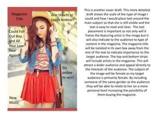
This is another cover draft. This more detailed
draft shows the scale of the type of image I
could and how I would place text around the
main subject so that she is still visible and the
text is easy to read and clear. The text
placement is important as not only will it
frame the featuring artist in the image but it
will also indicate to the audience to type of
content in the magazine. The magazine title
will be isolated in its own box away from the
rest of the text to indicate importance to the
target audience. The top and bottom strips
will include artists in the magazine. This will
attract a wider audience and appeal directly to
the interests of the audience. The subject of
the image will be female as my target
audience is primarily female. By including
someone of the same gender as the audience
they will be able to relate to her on a more
personal level increasing the possibility of
them buying the magazine.

Planning

  • 1.
  • 2.
    Reader Profile My magazinetarget audience will be aged between 16 and 24 still in either full time or part time education. They will be primarily female but the magazine will be suited for both genders. My target audience will be very interested in music listening to it hurly but also be interested on a technically level and will more than likely have some musical training or has self taught to play an instrument this means my magazine can also include analysis of up and coming music in a more educated in- depth manner. They will be interested in a wide range of music genres but will more than likely favor popular modern music. They will be very kind and caring towards others and this will contribute to the quality of there social life, they will all keep up with date will social media but will have varying sizes of social circles; some will prefer to stay indoors and watch Netflix while other will have massive social circles often going out and participating in social gatherings such as meals and attending the cinema. They hold objects with sentimental value close to there hearts such as childhood toys but they are also very involved with technology such as there phones and there laptops. My main demographic are very appearance conscious and spend much for there money they earn from part time jobs on clothing, make-up and nail polish as they are very keen with keeping up with the latest trends.
  • 3.
    Mission Statement My Magazineis the ultimate guide to pop and many other genres, well respected by artists and desired by all music lovers; my magazine is the pinnacle of modern music entertainment. It will include exclusive information on all the most up to date artist’s. My magazine is friendly and informed, its only is to inform and entertain; to keep its target audience updated to the latest happenings in the music industry today. The magazine will deliver to latest information in a very relatable and reader manner including many exclusive interviews, competitions and images from up to date photo shoots. The tone and attitude will also have a quirky aspect to interest the younger readers. It will gain its readers and buyers by providing the latest, up to date information on popular artists, giving reviews on gigs and featuring interviews with developing artists as well as well known artists. The magazine will also incorporate latest fashion and band merchandise associated will the different types of genres that the magazine is based on and will provide the latest entertainment news. In short term are aim is to provide the most informative and latest music relating to an ever changing music industry.
  • 4.
    Cover Price andFrequency My magazine will be priced at £4.99. My target audience will be either be at the end of full time education or in part time education at college or university. This means that they will more than likely have part time jobs or still rely on there parents for money. By pricing it at £4.99 it makes it affordable for my target audience to buy as it is also pocket money price. The magazine will be published monthly as my survey showed that my target audience would be more interested in buying a music magazine monthly rather than weekly or fortnightly. This also means that I can include more information meaning I will produce a 120 page magazine packed will all the latest happenings within the music industry. This also means that I can charge the £4.99 as the target audience will be paying for more pages also meaning the magazine will cost more to produce; the higher price covers this.
  • 5.
    Colour Inspiration I reallydislike these colours as they are to light and to femanine. I think by having colours such as these I will be excluding a male audience as colours such as these are stereotypes with relating to female this may disinterest a potential male audience. There lack of vibrancy will also not make the magazine stand out against the other ones this will no increase the amount of people who will look at the magazine. I again don’t really like these colours I think that they are very dull and would not attract they eye of my target audience. On the other hand by using a wider range of colours that work harmoniously together it would appeal to a wider audience but these are not colours that I would relate with music magazine cover. I also think by using these colours the masterhead, puffs and other features would not sand out enough. I really like these colour’s. Out of all these colour charts this is my they are very vibrant and eye catching, they would catch the eye of my target audience easily against other magazine as the colour's are bold and vibrant. I do not like the off white and would much rather substitute it for a pure white. These colour’s are the colour's I think I will use for my magazine. I again really like these colour's. I think they are very relaxing colour's and would give a calming feel to my magazine. On the other hand I don’t think that they would stand out enough to catch the attention of my target audience when the magazine is in the store on the shelf, they would blend in. I have also taken great inspiration from Q for my magazine therefore think that the red, black and white colour's will be better.
  • 6.
    Fonts and Title. Thisfont is very dark and would easily catch the eye of my target audience. The title Rebel sound is very new and has an urban appeal that would appeal the target audience. When abbreviated it saved lots of much needed space on the cover but I have concerns that the term rebel would be unsuitable to the pop and indie side of the audience as these are my main consumers it would be unsuitable. I really like this font as it is very eye catching yet will still appeal to the more sophisticated older side of my target audience. I chose the title Vinyl as my music content will span back over generations of music and vinyl was one of the original ways of playing music showing that my magazine is top of the range and is changing the way we perceive music much like vinyl did. It becomes to difficult to read when abbreviated. I don’t like this font I think that it is very harsh and messy rather being slick like the one above is. NS would stand for new sound as my magazine looks at many genres but mainly pop it is constantly revelling new sounds to the target audience there for the name would be fitting. I do like this title but the abbreviations my not be eye catching like a full title would be. I do like this font much like vinyl it is very easy to read but also still eye catching and clear to a reader. The title major would be taking inspiration from a musical term referring to the major scale which has positive connotations with being used firstly with most pop songs but also for it happy light nature. As my target audience will have some musical background they will more than likely get the connection.
  • 7.
    Cover Picture Inspirationand Plan The type of model I will be looking for needs to be female as my target audience are also female therefore creating common ground between the model and reader. She will be aged between 17-20, by having a model this age it will connect with my target audience on a personal level but it will also attract them as a friendly face and make then trust the magazine. I really like there images. By using a medium close up/close up shoot of the model it creates a focuses for the magazine cover. I will also when editing the images make them black and white; by having the images in black and white the masterhead, plugs and other features of the magazine cover will stand out and become very eye catching to the audience. The modal will have very natural make as I want her to appear as a role model and a person to aspire to be in a good way. I don want my model to intimidate the audience I want her to appear to be friendly and someone the target audience can relate to. My lighting will either be behind the model creating a soft feeling or focusing on one portion of the face such as the right depending on the poses the model does.
  • 8.
    Content Page PictureInspiration and Plan Like most content pages my magazine will include a verity of images on this page. Some will include images of instruments the audience may win, others will be live action images including the strip of 4 bellow which are image I took at an all time low concert however they will remain small due to there poor quality. I estimate about 6 images on this page including images such as instrument shots, artist shots and concert shots. I the font will take up most of the room on the page however to make it clear and easy for the reader to see the location of the content of the magazine. The page will be very clear and easy to understand yet still vibrant and clear.
  • 9.
    Double Page PictureInspiration and Plan For my double page spread I am looking to divide it directly into two. One half will be a portrait A4 size image of the featuring artist. For this image I am looking for the featuring artist to have a indie look to extenuate the point that my magazine deals with lots of different genres. I will also mire than likely include a musical instrument like a guitar that spans across all three thirds of the A4 page, this is so that my magazine is constantly linking back to music but also because a guitar is often linked with music and will be very familiar to my target audience. My model will be female this is because most of my target audience are female and will more then likely be able to relate to a female artist more than a male artist. The image will be in full colour and vibrate with more than likely and harsh white background. The bright colours will be used as a tactic to catch the attention of my target audience and keep the constantly interested. The other page will include a smaller image of the artist but mainly writing as my double page spread is an interview with an up and coming artist.
  • 10.
    Setting and Location Iwill take all my images in a studio with a white paper background and high key lighting to the left and the right of the subject. To create the feel of shadowing the lighting on the right hand side of the models face to create dimension. My main subject will be doing a vast amount of movement such as standing so I can capture medium shots and long shots to include the guitar in the image. Also for my front cover images she will be sat on a stool therefore the set needs to be quite large so I can have her directly in front of the lighting rather then under the lighting ; this way I can control the shadows created ready for me to apply the black and white filters in Photoshop. The studio will be set up the same way as it is in the image here. The subject in the middle directly in front of the camera with the lighting either side.
  • 11.
    My front coverwill have a very simple layout. It will consist of a splash image filling the whole A4 page with the master head, top and bottom strips, plugs and cover line overlaying the image. I will used the rule of thirds and have most of my information on the left side of the cover and the main focus of the image will fill up most of the empty space on the right of the image with only a small plug overlaying the focus of the image. Although I will also include a banner across the main artist.
  • 12.
    My cover pagewill be one A4 page with a long strip of images running down the first third of the page almost to look like a strip of images you would get from a photo booth. I will also include 2 columns of information informing the target audience what content is on what pages. The top strip will include some extra information in a more eye catching manner. This will be information that may not be included in the columns of information. There will also be a images of the double page artist slightly larger then the strip images.
  • 13.
    My double pagespread will be divided equally into two. One side of the double page spread will be a A4 sized image of the featuring artist. Then on the other half there will more or less a full page of an interview between the interviewer and the artist. There will also be a plug relating to the plug on the front page. I will have a heading and a subheading relating to the interview.
  • 14.
    Magazine Title New Music Win tickets to Leedsfestival! Could Fall Out Boy and All Your Low Tour Again? Go online to win! This is another cover draft. This more detailed draft shows the scale of the type of image I could and how I would place text around the main subject so that she is still visible and the text is easy to read and clear. The text placement is important as not only will it frame the featuring artist in the image but it will also indicate to the audience to type of content in the magazine. The magazine title will be isolated in its own box away from the rest of the text to indicate importance to the target audience. The top and bottom strips will include artists in the magazine. This will attract a wider audience and appeal directly to the interests of the audience. The subject of the image will be female as my target audience is primarily female. By including someone of the same gender as the audience they will be able to relate to her on a more personal level increasing the possibility of them buying the magazine.