If you are using jQuery, you need to understand the Document Object Model and how it accounts for all the elements inside any HTML document or Web page.
Std 10 Computer Chapter 3 Handling Images in HTML (Part 1)Nuzhat Memon
Std 10 Computer Chapter 3 Handling Images in HTML (Part 1) by Nuzhat Memon
Image Element
Inline and Empty Element
Attribute of Image Tag
src attribute of image tag
alt attribute of image tag
height and width attribute of image tag
align attribute of image tag
border attribute of image tag
ID attribute of image tag
lowsrc attribute of image tag
hspace and vspace attribute of image tag
Different Image File Format
HTML5 Tutorial For Beginners - Learning HTML 5 in simple and easy steps with examples covering 2D Canvas, Audio, Video, New Semantic Elements, Geolocation, Persistent Local Storage, Web Storage, Forms Elements,Application Cache,Inline SVG,Document
Types of Layouts by ADMEC Multimedia InstituteRavi Bhadauria
ADMEC Multimedia Institute is growing institute that is providing industry oriented training to the world at large. Being a multimedia institute we offers training for creating or designing content for information technology mainly.
SEF 2014 - Responsive Design in SharePoint 2013Marc D Anderson
Presented with Christian Ståhl
Everyone is talking about responsive design. But are you really ready to bring SharePoint to mobile and tablets? While you may have an idea of what your site will look like when finished, there are many basic concepts and pitfalls that aren’t always outlined in the “How To’s”.
In this session, we will go through foundational steps to planning a responsive SharePoint site including how to handle a hybrid content scenario that uses publishing and team sites. You will learn what tools and templates can make your life easier during design, build and testing. If you are excited about the capability of bringing SharePoint to any device but not sure where to start, check out this session to get the foundational understanding of the concept, best practices and examples to get you started.
This presentation is entirely for new responsive website designers. We have given basics and very useful tips to create a very basic responsive website. Apart from this you will read very useful facts and records about mobile website designing here.
In today's internet scenario responsive websites are the most popular way of putting a website in worldwide web, as this a form in which your website can be seen in multiple devices without any problem. In this slide we tried to explain step by step processes in responsive website design.
Liquidizer.js: A Responsive Web Design Algorithmtheijes
Internet technology is dynamically changing at lightning speeds that the academic brains cannot absorb.
Emerging technologies such as Internet of Things (IoT), fog computing, cloud computing and just to mention a
few have recently emerged as novel technologies. These technologies have not yet sunk in to the minds of
academic scholars, while superior techniques are currently emerging. As a result of these fluid changes, the
study is intrigued by the Responsive Web Design (RWD) technology. RWD is a novel paradigm to develop one
single website for different screen sizes of smart phones, tablets, laptops, and desktops among others. The
websites become responsive by being accessible anytime, anywhere, and on any such devices. Although lots of
ink has been spilled on responsive algorithm framework development, the study developed an enhanced
algorithm with dynamic attributes such as text color, background color, font family, and font size manipulation.
These attributes can be changed on the fly and be accessed by a single line of code by web designers. The
methodology employed to develop the algorithm was jQuery library framework. The outcome of the study was
threefold; first, to develop an enhanced algorithm coined Liquidizer.js, second, to distribute the source code of
Liquidizer.js under the GNU General Public License, and third, to extend the jQuery library platform.
Responsive Web Design ~ Best Practices for Maximizing ROIJuan Carlos Duron
Implementing a Responsive design for SharePoint? Consider these best practices to ensure you’re delivering an optimized experience for your users. This session discusses RWD principles and industry leading best practice guidelines, followed by a review of public facing SharePoint sites and design elements that can impact project costs and timelines.
If you are looking for some examples and tools to help you discover, analyze and build better websites using responsive design you may want to take a look here.
Best, -Cordell
Zambig, Inc.
With great power, comes great responsive-ability web design.
Responsive web design (RWD) will be demystified. Believe it or not, it's more than just media queries, although those will be discussed. It starts with proper UI design and application architecture, and then the dive into CSS - but not too deep! You don't have to be an expert to do RWD, but it helps to have some idea of what you are doing.
Since the highly-publicized 2011 Boston Globe redesign, Responsive Design (RD) has exploded in adoption and has become Google’s recommended architecture for SEO. However, there are cases where alternatives should be considered.
In nine quick slides, we’ll introduce you to RD and help you decide whether or not you should use it on your next website redesign.
Responsive Web Design for Universal Access 2016Kate Walser
You can improve how well your website works and looks across different devices using responsive web design techniques. But did you know you can also improve access for all users, including those with disabilities, by applying responsive techniques? Learn how.
Macroeconomics- Movie Location
This will be used as part of your Personal Professional Portfolio once graded.
Objective:
Prepare a presentation or a paper using research, basic comparative analysis, data organization and application of economic information. You will make an informed assessment of an economic climate outside of the United States to accomplish an entertainment industry objective.
Model Attribute Check Company Auto PropertyCeline George
In Odoo, the multi-company feature allows you to manage multiple companies within a single Odoo database instance. Each company can have its own configurations while still sharing common resources such as products, customers, and suppliers.
Palestine last event orientationfvgnh .pptxRaedMohamed3
An EFL lesson about the current events in Palestine. It is intended to be for intermediate students who wish to increase their listening skills through a short lesson in power point.
Synthetic Fiber Construction in lab .pptxPavel ( NSTU)
Synthetic fiber production is a fascinating and complex field that blends chemistry, engineering, and environmental science. By understanding these aspects, students can gain a comprehensive view of synthetic fiber production, its impact on society and the environment, and the potential for future innovations. Synthetic fibers play a crucial role in modern society, impacting various aspects of daily life, industry, and the environment. ynthetic fibers are integral to modern life, offering a range of benefits from cost-effectiveness and versatility to innovative applications and performance characteristics. While they pose environmental challenges, ongoing research and development aim to create more sustainable and eco-friendly alternatives. Understanding the importance of synthetic fibers helps in appreciating their role in the economy, industry, and daily life, while also emphasizing the need for sustainable practices and innovation.
The Roman Empire A Historical Colossus.pdfkaushalkr1407
The Roman Empire, a vast and enduring power, stands as one of history's most remarkable civilizations, leaving an indelible imprint on the world. It emerged from the Roman Republic, transitioning into an imperial powerhouse under the leadership of Augustus Caesar in 27 BCE. This transformation marked the beginning of an era defined by unprecedented territorial expansion, architectural marvels, and profound cultural influence.
The empire's roots lie in the city of Rome, founded, according to legend, by Romulus in 753 BCE. Over centuries, Rome evolved from a small settlement to a formidable republic, characterized by a complex political system with elected officials and checks on power. However, internal strife, class conflicts, and military ambitions paved the way for the end of the Republic. Julius Caesar’s dictatorship and subsequent assassination in 44 BCE created a power vacuum, leading to a civil war. Octavian, later Augustus, emerged victorious, heralding the Roman Empire’s birth.
Under Augustus, the empire experienced the Pax Romana, a 200-year period of relative peace and stability. Augustus reformed the military, established efficient administrative systems, and initiated grand construction projects. The empire's borders expanded, encompassing territories from Britain to Egypt and from Spain to the Euphrates. Roman legions, renowned for their discipline and engineering prowess, secured and maintained these vast territories, building roads, fortifications, and cities that facilitated control and integration.
The Roman Empire’s society was hierarchical, with a rigid class system. At the top were the patricians, wealthy elites who held significant political power. Below them were the plebeians, free citizens with limited political influence, and the vast numbers of slaves who formed the backbone of the economy. The family unit was central, governed by the paterfamilias, the male head who held absolute authority.
Culturally, the Romans were eclectic, absorbing and adapting elements from the civilizations they encountered, particularly the Greeks. Roman art, literature, and philosophy reflected this synthesis, creating a rich cultural tapestry. Latin, the Roman language, became the lingua franca of the Western world, influencing numerous modern languages.
Roman architecture and engineering achievements were monumental. They perfected the arch, vault, and dome, constructing enduring structures like the Colosseum, Pantheon, and aqueducts. These engineering marvels not only showcased Roman ingenuity but also served practical purposes, from public entertainment to water supply.
How to Make a Field invisible in Odoo 17Celine George
It is possible to hide or invisible some fields in odoo. Commonly using “invisible” attribute in the field definition to invisible the fields. This slide will show how to make a field invisible in odoo 17.
Honest Reviews of Tim Han LMA Course Program.pptxtimhan337
Personal development courses are widely available today, with each one promising life-changing outcomes. Tim Han’s Life Mastery Achievers (LMA) Course has drawn a lot of interest. In addition to offering my frank assessment of Success Insider’s LMA Course, this piece examines the course’s effects via a variety of Tim Han LMA course reviews and Success Insider comments.
Instructions for Submissions thorugh G- Classroom.pptxJheel Barad
This presentation provides a briefing on how to upload submissions and documents in Google Classroom. It was prepared as part of an orientation for new Sainik School in-service teacher trainees. As a training officer, my goal is to ensure that you are comfortable and proficient with this essential tool for managing assignments and fostering student engagement.
Operation “Blue Star” is the only event in the history of Independent India where the state went into war with its own people. Even after about 40 years it is not clear if it was culmination of states anger over people of the region, a political game of power or start of dictatorial chapter in the democratic setup.
The people of Punjab felt alienated from main stream due to denial of their just demands during a long democratic struggle since independence. As it happen all over the word, it led to militant struggle with great loss of lives of military, police and civilian personnel. Killing of Indira Gandhi and massacre of innocent Sikhs in Delhi and other India cities was also associated with this movement.
June 3, 2024 Anti-Semitism Letter Sent to MIT President Kornbluth and MIT Cor...Levi Shapiro
Letter from the Congress of the United States regarding Anti-Semitism sent June 3rd to MIT President Sally Kornbluth, MIT Corp Chair, Mark Gorenberg
Dear Dr. Kornbluth and Mr. Gorenberg,
The US House of Representatives is deeply concerned by ongoing and pervasive acts of antisemitic
harassment and intimidation at the Massachusetts Institute of Technology (MIT). Failing to act decisively to ensure a safe learning environment for all students would be a grave dereliction of your responsibilities as President of MIT and Chair of the MIT Corporation.
This Congress will not stand idly by and allow an environment hostile to Jewish students to persist. The House believes that your institution is in violation of Title VI of the Civil Rights Act, and the inability or
unwillingness to rectify this violation through action requires accountability.
Postsecondary education is a unique opportunity for students to learn and have their ideas and beliefs challenged. However, universities receiving hundreds of millions of federal funds annually have denied
students that opportunity and have been hijacked to become venues for the promotion of terrorism, antisemitic harassment and intimidation, unlawful encampments, and in some cases, assaults and riots.
The House of Representatives will not countenance the use of federal funds to indoctrinate students into hateful, antisemitic, anti-American supporters of terrorism. Investigations into campus antisemitism by the Committee on Education and the Workforce and the Committee on Ways and Means have been expanded into a Congress-wide probe across all relevant jurisdictions to address this national crisis. The undersigned Committees will conduct oversight into the use of federal funds at MIT and its learning environment under authorities granted to each Committee.
• The Committee on Education and the Workforce has been investigating your institution since December 7, 2023. The Committee has broad jurisdiction over postsecondary education, including its compliance with Title VI of the Civil Rights Act, campus safety concerns over disruptions to the learning environment, and the awarding of federal student aid under the Higher Education Act.
• The Committee on Oversight and Accountability is investigating the sources of funding and other support flowing to groups espousing pro-Hamas propaganda and engaged in antisemitic harassment and intimidation of students. The Committee on Oversight and Accountability is the principal oversight committee of the US House of Representatives and has broad authority to investigate “any matter” at “any time” under House Rule X.
• The Committee on Ways and Means has been investigating several universities since November 15, 2023, when the Committee held a hearing entitled From Ivory Towers to Dark Corners: Investigating the Nexus Between Antisemitism, Tax-Exempt Universities, and Terror Financing. The Committee followed the hearing with letters to those institutions on January 10, 202
June 3, 2024 Anti-Semitism Letter Sent to MIT President Kornbluth and MIT Cor...
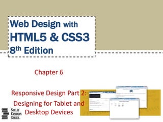
HTML & CSS: Chapter 06
1. Chapter 6
Responsive Design Part 2:
Designing for Tablet and
Desktop Devices
Web Design with
HTML5 & CSS3
8th Edition
2. • Understand and use media query expressions
• Explain the design principles of a tablet website
• Insert a media query to target tablet viewports
• Create style rules for tablet viewports
• Explain the design principles of a desktop website
• Insert a media query to target desktop viewports
Chapter 6: Responsive Design Part 2: Designing for Tablet and Desktop Devices 2
Chapter Objectives
3. • Create style rules for desktop viewports
• Identify and modify breakpoints
• Explain pseudo-classes
• Apply pseudo-classes to a website
• Explain linear and radial gradients
• Apply a linear gradient to a webpage for a desktop
viewport
Chapter 6: Responsive Design Part 2: Designing for Tablet and Desktop Devices 3
Chapter Objectives (continued)
4. • Media query
– Detects the media type and the capabilities of the
device that the browser is running on
– It applies styles that work well for that situation, based
on the information provided
– Applies styles to move, hide, or display content on the
page, change text or colors, or add any other styles to
make the page easier to read in a particular situation
Chapter 6: Responsive Design Part 2: Designing for Tablet and Desktop Devices 4
Using Media Queries
5. – The following code provides a basic example of a
media query inserted into the link tag of an HTML
page:
<link rel="stylesheet"
href="css/styles.css"media="screen">
<link rel="stylesheet“
href="css/stylesprint.css“
media="print">
Chapter 6: Responsive Design Part 2: Designing for Tablet and Desktop Devices 5
Using Media Queries (continued
2)
6. • Breakpoint
– It is set to understand the code and syntax of how a
media query detects viewport size
– It is the point at which a webpage is required to
change
– It is where different styles are applied to the webpage
to cause it to change in a way that makes it easier to
read and navigate for a particular situation
Chapter 6: Responsive Design Part 2: Designing for Tablet and Desktop Devices 6
Using Media Queries (continued
3)
7. Chapter 6: Responsive Design Part 2: Designing for Tablet and Desktop Devices 7
Using Media Queries (continued
4)
• The Table 6–1 lists the three common viewport
sizes
8. • A media query can use a logical expression to test
whether a viewport has reached a particular
breakpoint
• The logical expression includes the name of a
media query feature, a characteristic of the
environment, and a breakpoint value to be tested
• If the logical expression evaluates to “true,” the
media query applies the styles that follow
Chapter 6: Responsive Design Part 2: Designing for Tablet and Desktop Devices 8
Media Query Expressions
9. • A media query can also test for both minimum
and maximum breakpoints
– Example:
<link rel="stylesheet"
href="css/styles-
tablet.css"media="screen and (min-
width: 481px) and (max-width: 768px)">
Chapter 6: Responsive Design Part 2: Designing for Tablet and Desktop Devices 9
Media Query Expressions
(continued 1)
10. – The code directs browsers to apply the styles-
tablet.css stylesheet in the css folder when screens
have a viewport width between 481px and 768px
– When testing for minimum and maximum widths, the
word “and” separates each part of the media attribute
value
Chapter 6: Responsive Design Part 2: Designing for Tablet and Desktop Devices 10
Media Query Expressions
(continued 2)
11. • Another way to implement media queries is to
code them directly into a single CSS file using the
@media rule
• The three most common types of media are
screen, print, and all
Chapter 6: Responsive Design Part 2: Designing for Tablet and Desktop Devices 11
Media Query Expressions
(continued 3)
12. Chapter 6: Responsive Design Part 2: Designing for Tablet and Desktop Devices 12
Media Query Expressions
(continued 4)
• Table 6–2 lists common media query features that
can be used in a logical expression
13. • In a mobile-first strategy, the mobile styles are
listed first as they are the default styles
• Next, media queries are used to add styles for
larger viewports, progressing from tablet to
desktop. Styles created for the smaller viewports
apply to larger viewports by default
• To modify the appearance of an element for a
larger viewport, a media query is created for the
larger viewport, and then a new style is created
Chapter 6: Responsive Design Part 2: Designing for Tablet and Desktop Devices 13
Adding Media Queries to an
External Style Sheet
14. • With so many tablet sizes, it is difficult to design a
“one size fits all” layout for a tablet device
• However, with the use of responsive web design
and media queries, designing multiple tablet
layouts is not required
• If a particular tablet device has a viewport smaller
than the minimum size specified in the media
query, then the layout will default to the mobile
viewport layout
Chapter 6: Responsive Design Part 2: Designing for Tablet and Desktop Devices 14
Designing for Tablet Viewports
15. • Figure 6–3 shows the code to create a media
query for a tablet viewport
Chapter 6: Responsive Design Part 2: Designing for Tablet and Desktop Devices 15
Designing for Tablet Viewports
(continued 1)
16. • Page Design for a Tablet Viewport
– When designing for a tablet viewport
oMaintain the same color scheme, typography, and general
look of the website
oThe appearance of the website should look the same from
viewport to viewport
oThe only thing that should change is layout and placement
of content
Chapter 6: Responsive Design Part 2: Designing for Tablet and Desktop Devices 16
Designing for Tablet Viewports
(continued 2)
17. – To determine the ideal layout for a website’s tablet
viewport, review the mobile site to confirm where the
content should be added and if any content should be
hidden
Chapter 6: Responsive Design Part 2: Designing for Tablet and Desktop Devices 17
Designing for Tablet Viewports
(continued 3)
18. • Navigation Design for a Tablet Viewport
– It is not necessary to maintain a vertical list of
navigation buttons as a tablet screen is larger than a
smartphone screen
– Align the navigation buttons in a horizontal line
– This frees space for the main content below the
navigation area, improving its visibility by displaying it
in the middle of the screen
Chapter 6: Responsive Design Part 2: Designing for Tablet and Desktop Devices 18
Designing for Tablet Viewports
(continued 4)
19. – To accomplish this design, create a style rule to display
the navigation list items as a single horizontal line
when displayed in a tablet viewport
– Add other properties and values that override the
defaults already set for the mobile viewport
Chapter 6: Responsive Design Part 2: Designing for Tablet and Desktop Devices 19
Designing for Tablet Viewports
(continued 5)
20. • Figure 6–5 shows the code to style the navigation
area for a tablet viewport
Chapter 6: Responsive Design Part 2: Designing for Tablet and Desktop Devices 20
Designing for Tablet Viewports
(continued 6)
21. • Figure 6–8 shows the code to style the style the
main element for a tablet viewport
Chapter 6: Responsive Design Part 2: Designing for Tablet and Desktop Devices 21
Designing for Tablet Viewports
(continued 7)
22. • Figure 6–10 shows the code to show and hide
content for a tablet viewport
Chapter 6: Responsive Design Part 2: Designing for Tablet and Desktop Devices 22
Designing for Tablet Viewports
(continued 8)
23. • When designing for desktop viewports
– Use simple, intuitive navigation, clear images, and
typography and apply the same color scheme
– Maintain the same look and feel of the site, but
change some formatting to best accommodate the
desktop viewport
– It also provides an opportunity for a multiple-column
layout
Chapter 6: Responsive Design Part 2: Designing for Tablet and Desktop Devices 23
Designing for Desktop Viewports
24. • Breakpoint
– It is the point at which different styles are applied to a
webpage depending on the viewport
– Set breakpoints as determined by the content on the
page
Chapter 6: Responsive Design Part 2: Designing for Tablet and Desktop Devices 24
Modifying Breakpoints
25. • Pseudo-classes
– They allow changes to the style of a link based on four
link states: link, visited, hover, and active
– They must be used in the following order: link, visited,
hover, active
Chapter 6: Responsive Design Part 2: Designing for Tablet and Desktop Devices 25
Using Pseudo-Classes
26. • The Table 6–3 describes each link state
Chapter 6: Responsive Design Part 2: Designing for Tablet and Desktop Devices 26
Using Pseudo-Classes (continued
1)
27. • A pseudo-class is attached to a selector with a
colon to specify a state or relation to the selector
to give the web developer more control over that
selector
• A unique style for normal, visited, hover, and
active links is defined by creating four separate
style rules with a:link, a:visited, a:hover, and
a:active as the selectors
Chapter 6: Responsive Design Part 2: Designing for Tablet and Desktop Devices 27
Using Pseudo-Classes (continued
2)
28. • It is not necessary to use all of the pseudo-
classes. However, if it is omitted from the design,
it is important to maintain the same order of the
pseudo-class styles in the CSS code
• They are used in a desktop viewport
• They are not used in mobile and tablet devices as
they do not have a hover or a click option
Chapter 6: Responsive Design Part 2: Designing for Tablet and Desktop Devices 28
Using Pseudo-Classes (continued
3)
29. • Figure 6–45 shows the code for link and visited
pseudo-classes
Chapter 6: Responsive Design Part 2: Designing for Tablet and Desktop Devices 29
Using Pseudo-Classes (continued
4)
30. • Figure 6–46 shows the code for hover and active
pseudo-classes
Chapter 6: Responsive Design Part 2: Designing for Tablet and Desktop Devices 30
Using Pseudo-Classes (continued
5)
31. • Gradient
– Is a gradual transition from one color to another
–CSS3 has two types of gradients: linear and
radial
Chapter 6: Responsive Design Part 2: Designing for Tablet and Desktop Devices 31
Using Gradients
32. • Linear Gradient
– It can transition from several different angles
– The default transition is from the top to the bottom
– It can also transition up, left, right, or diagonally
Chapter 6: Responsive Design Part 2: Designing for Tablet and Desktop Devices 32
Using Gradients (continued 1)
33. • Linear Gradient
– Use the linear-gradient property to create it
– The following is an example of how to apply a linear
gradient:
body {
background: linear- gradient(white,
blue);
}
Chapter 6: Responsive Design Part 2: Designing for Tablet and Desktop Devices 33
Using Gradients (continued 2)
34. • Linear Gradient
– To provide support for major browsers, use the
following prefixes:
-moz- for Mozilla Firefox
-o- for Opera
-webkit- for Google Chrome and Safari
Chapter 6: Responsive Design Part 2: Designing for Tablet and Desktop Devices 34
Using Gradients (continued 3)
35. • The following example of a linear gradient
includes all browser support prefixes:
body {
background: -moz-linear-gradient(white,
blue);
background: -o-linear-
gradient(white, blue);
Chapter 6: Responsive Design Part 2: Designing for Tablet and Desktop Devices 35
Using Gradients (continued 4)
37. • The Table 6–4 provides an overview of linear
gradients
Chapter 6: Responsive Design Part 2: Designing for Tablet and Desktop Devices 37
Using Gradients (continued 6)
38. • Radial gradients
– They are specified by their center
– The color begins in the center and transitions in a
radial direction to another color or colors
– To create a radial gradient, at least two colors must be
specified
Chapter 6: Responsive Design Part 2: Designing for Tablet and Desktop Devices 38
Using Gradients (continued 7)
39. • The following is an example of a radial gradient:
body {
background: -moz-radial-
gradient(red, white, blue);
background: -o-radial-
gradient(red, white, blue);
Chapter 6: Responsive Design Part 2: Designing for Tablet and Desktop Devices 39
Using Gradients (continued 8)
40. background: -webkit-radial-
gradient(red, white, blue);
background: radial-gradient(red,
white, blue);
}
Chapter 6: Responsive Design Part 2: Designing for Tablet and Desktop Devices 40
Using Gradients (continued 9)
41. • Figure 6–51 shows the code for creating a new
style rule to apply a linear gradient for a desktop
viewport
Chapter 6: Responsive Design Part 2: Designing for Tablet and Desktop Devices 41
Using Gradients (continued 10)