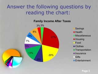
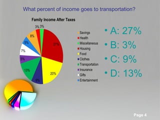
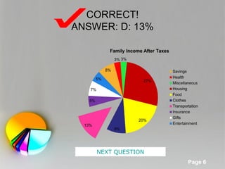
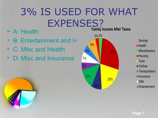
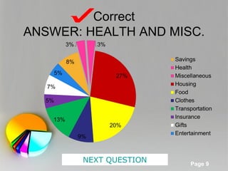
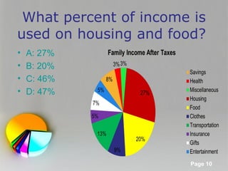
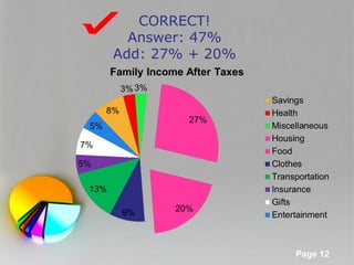
This document contains a series of pages from a PowerPoint presentation about reading and using circle graphs. It includes example circle graphs showing percentages of income spent on different expense categories like transportation, housing, food, and others. The document then asks the reader multiple choice questions about interpreting the values from the circle graphs.