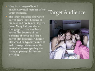
 Being the director of the trailer needed to research
  varieties of different horror and thriller trailers to
  understand how to capture the audience with fear
  without giving away the whole story. I develop the vision
  for the film and carry the vision out, deciding how the
  film should look; I make it come to life. As director I also
  have to turn the script into a sequence of shots, direct
  what tone it should have and what the audience should
  gain from the cinematic experience. I’m responsible for
  deciding camera angles, lens effects and lighting with
  the help of the cinematographer.
 The target audience are teenagers and
  young adults
 I arrived at this conclusion as I found horror
  films tend to attract a teenage audience
  because they relate with the teenage
  characters within the film, the characters are
  often dealing with teenage based situations
  which the target audience can relate to.
 Here is an image of how I
  imagine a typical member of my
  target audience.
 The target audience also watch
  horror genre films because of
  the rush and excitement it gives
  them. Many feel proud at a
  young age to have watched a
  horror film because of the
  elements of terror and fear a
  horror film produces. A horror
  film would be typically aimed at
  male teenagers because of the
  masculine stereotype they are
  trying to portray- fearless to
  anything.
I asked 3 different teenagers there opinion of horror movies and the concept of
mine and what they thought in order to get a better idea of what my research
should entail and the certain conventions which appeal to my target audience.

From my feedback I found that they all thought that there needs to be one
main character which is scary rather than many such as zombies or robots. I
also discovered that a horror film is most appealing when there is uncertainty
and you are kept on the edge of your seat not knowing what will happen. My
film will not conform to Propps seven character types and will challenge it,
there will be no hero.
 Raw 1                               Final 1


 On adobe Photoshop I removed the background and chose to use
  black and white instead of color as I found it suited the conventions of
  horror being dark and gloomy, this made the image stand out a lot
  more rather than blending in.
 Raw 2                                Final 2


I felt that the original photograph was too bright and therefore I used
adobe Photoshop and paint to change the colours to black and white but
also to blur the candle light and create a smoke mist effect for the
audience, which creates suspense of the unknown.
The writer and director of the film which is James Wan
      as we are told at the bottom of the poster has created
    previous horror films which all involve the supernatural,
                  therefore we can see a pattern.


          Medium                                         Dark
         close up of                                 background
                                                    suggests that
          the main                                  the film is set
            image                                     at night


 The subtitle which is also a metaphor, it links to the darkness of the
poster design and the idea about a journey. The layout of the poster is
  portrait design. The poster doesn't give too much away and looks
                        simplistic, this creates

             This is the poster for the horror film insidious. The
            title is in red a worn looking font could suggest that
           the film relates to a journey you must take in order to
                                     survive
 This is how it appeals to target
  audience: there is a main image
  which draws there attention,
  the colours which are dark
  suggesting the film is also dark
  and scary. A teenager would
  want to watch this film as a way
  of being seen as fearless.
I learnt that the colours were very effective From my feedback from
my target audience, I was able to edit my poster and redraft it. I also
found out that the font provoked feelings of fear and looks like
splattered blood.

I wanted ,y poster to fit to all the conventions of a modern horror
movie but still have some aspects of an older movie. This is why I
chose to use Photoshop to recolor the main image to black and
white like my professional model, but this is also typical of old horror
films to create fear.
1. I decided to use Photoshop to
brighten the colour of the eyes
in the main image to draw more
attention to them and make an
obvious link to the title
‘demented’ suggesting that
something has come over her.
This magazine has gone for an
                       unusual layout with a main
                        cover line being at the top
                          before the masthead.


 The main image
 demonstrate that
                          The masthead ‘toxic’ attracts your attention
    it’s a horror
                         straight away. instead of a unique selling line
  magazine as it
                         there is a subheading ‘horror’. Which makes
  would scare the
                          it clear that the audience they are appealing
 reader but make
                              to are likely to be interested in horror
them want to read
   on. It is also a
close up shot. The
     image also                 I chose this magazine as I felt it
corresponds to the            conformed to horror conventions.
  main cover line
                               The colours are bold but create a
                              fear especially with the use of the
                              font and the old effect it gives the
                                           magazine
•   I enlarged the masthead
    ‘filmax’ to make it stand
    out more as it draws
    attention to the magazine
    and then to the main
    image.
•   I also cropped the size of
    the barcode so that I was
    able to use the space to
    enlarge the cover lines
    which made the magazine
    more professional.
http://possessed-serenasblog.blogspot.co.uk/

Media powerpoint final

  • 4.
     Being thedirector of the trailer needed to research varieties of different horror and thriller trailers to understand how to capture the audience with fear without giving away the whole story. I develop the vision for the film and carry the vision out, deciding how the film should look; I make it come to life. As director I also have to turn the script into a sequence of shots, direct what tone it should have and what the audience should gain from the cinematic experience. I’m responsible for deciding camera angles, lens effects and lighting with the help of the cinematographer.
  • 5.
     The targetaudience are teenagers and young adults  I arrived at this conclusion as I found horror films tend to attract a teenage audience because they relate with the teenage characters within the film, the characters are often dealing with teenage based situations which the target audience can relate to.
  • 6.
     Here isan image of how I imagine a typical member of my target audience.  The target audience also watch horror genre films because of the rush and excitement it gives them. Many feel proud at a young age to have watched a horror film because of the elements of terror and fear a horror film produces. A horror film would be typically aimed at male teenagers because of the masculine stereotype they are trying to portray- fearless to anything.
  • 7.
    I asked 3different teenagers there opinion of horror movies and the concept of mine and what they thought in order to get a better idea of what my research should entail and the certain conventions which appeal to my target audience. From my feedback I found that they all thought that there needs to be one main character which is scary rather than many such as zombies or robots. I also discovered that a horror film is most appealing when there is uncertainty and you are kept on the edge of your seat not knowing what will happen. My film will not conform to Propps seven character types and will challenge it, there will be no hero.
  • 9.
     Raw 1  Final 1  On adobe Photoshop I removed the background and chose to use black and white instead of color as I found it suited the conventions of horror being dark and gloomy, this made the image stand out a lot more rather than blending in.
  • 10.
     Raw 2  Final 2 I felt that the original photograph was too bright and therefore I used adobe Photoshop and paint to change the colours to black and white but also to blur the candle light and create a smoke mist effect for the audience, which creates suspense of the unknown.
  • 11.
    The writer anddirector of the film which is James Wan as we are told at the bottom of the poster has created previous horror films which all involve the supernatural, therefore we can see a pattern. Medium Dark close up of background suggests that the main the film is set image at night The subtitle which is also a metaphor, it links to the darkness of the poster design and the idea about a journey. The layout of the poster is portrait design. The poster doesn't give too much away and looks simplistic, this creates This is the poster for the horror film insidious. The title is in red a worn looking font could suggest that the film relates to a journey you must take in order to survive
  • 12.
     This ishow it appeals to target audience: there is a main image which draws there attention, the colours which are dark suggesting the film is also dark and scary. A teenager would want to watch this film as a way of being seen as fearless.
  • 13.
    I learnt thatthe colours were very effective From my feedback from my target audience, I was able to edit my poster and redraft it. I also found out that the font provoked feelings of fear and looks like splattered blood. I wanted ,y poster to fit to all the conventions of a modern horror movie but still have some aspects of an older movie. This is why I chose to use Photoshop to recolor the main image to black and white like my professional model, but this is also typical of old horror films to create fear.
  • 14.
    1. I decidedto use Photoshop to brighten the colour of the eyes in the main image to draw more attention to them and make an obvious link to the title ‘demented’ suggesting that something has come over her.
  • 15.
    This magazine hasgone for an unusual layout with a main cover line being at the top before the masthead. The main image demonstrate that The masthead ‘toxic’ attracts your attention it’s a horror straight away. instead of a unique selling line magazine as it there is a subheading ‘horror’. Which makes would scare the it clear that the audience they are appealing reader but make to are likely to be interested in horror them want to read on. It is also a close up shot. The image also I chose this magazine as I felt it corresponds to the conformed to horror conventions. main cover line The colours are bold but create a fear especially with the use of the font and the old effect it gives the magazine
  • 17.
    I enlarged the masthead ‘filmax’ to make it stand out more as it draws attention to the magazine and then to the main image. • I also cropped the size of the barcode so that I was able to use the space to enlarge the cover lines which made the magazine more professional.
  • 18.