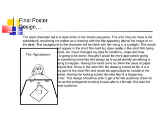
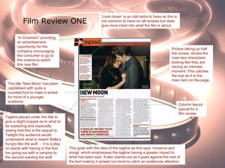
The document discusses conventions for film posters and reviews. It explains that comedy film posters typically use bright colors and images that convey humor. Horror posters commonly feature dark colors like red and images of victims or killers. Romance posters usually show intimate moments between couples. Short film posters center around the main character(s) and keep the design simple. Film reviews generally lead with a large image, include a star rating and short summary, and use a column layout for text.
Synthetic Fiber Construction in lab .pptxPavel ( NSTU)
Synthetic fiber production is a fascinating and complex field that blends chemistry, engineering, and environmental science. By understanding these aspects, students can gain a comprehensive view of synthetic fiber production, its impact on society and the environment, and the potential for future innovations. Synthetic fibers play a crucial role in modern society, impacting various aspects of daily life, industry, and the environment. ynthetic fibers are integral to modern life, offering a range of benefits from cost-effectiveness and versatility to innovative applications and performance characteristics. While they pose environmental challenges, ongoing research and development aim to create more sustainable and eco-friendly alternatives. Understanding the importance of synthetic fibers helps in appreciating their role in the economy, industry, and daily life, while also emphasizing the need for sustainable practices and innovation.
Francesca Gottschalk - How can education support child empowerment.pptxEduSkills OECD
Francesca Gottschalk from the OECD’s Centre for Educational Research and Innovation presents at the Ask an Expert Webinar: How can education support child empowerment?
Operation “Blue Star” is the only event in the history of Independent India where the state went into war with its own people. Even after about 40 years it is not clear if it was culmination of states anger over people of the region, a political game of power or start of dictatorial chapter in the democratic setup.
The people of Punjab felt alienated from main stream due to denial of their just demands during a long democratic struggle since independence. As it happen all over the word, it led to militant struggle with great loss of lives of military, police and civilian personnel. Killing of Indira Gandhi and massacre of innocent Sikhs in Delhi and other India cities was also associated with this movement.
Read| The latest issue of The Challenger is here! We are thrilled to announce that our school paper has qualified for the NATIONAL SCHOOLS PRESS CONFERENCE (NSPC) 2024. Thank you for your unwavering support and trust. Dive into the stories that made us stand out!
Honest Reviews of Tim Han LMA Course Program.pptxtimhan337
Personal development courses are widely available today, with each one promising life-changing outcomes. Tim Han’s Life Mastery Achievers (LMA) Course has drawn a lot of interest. In addition to offering my frank assessment of Success Insider’s LMA Course, this piece examines the course’s effects via a variety of Tim Han LMA course reviews and Success Insider comments.
The French Revolution, which began in 1789, was a period of radical social and political upheaval in France. It marked the decline of absolute monarchies, the rise of secular and democratic republics, and the eventual rise of Napoleon Bonaparte. This revolutionary period is crucial in understanding the transition from feudalism to modernity in Europe.
For more information, visit-www.vavaclasses.com
June 3, 2024 Anti-Semitism Letter Sent to MIT President Kornbluth and MIT Cor...Levi Shapiro
Letter from the Congress of the United States regarding Anti-Semitism sent June 3rd to MIT President Sally Kornbluth, MIT Corp Chair, Mark Gorenberg
Dear Dr. Kornbluth and Mr. Gorenberg,
The US House of Representatives is deeply concerned by ongoing and pervasive acts of antisemitic
harassment and intimidation at the Massachusetts Institute of Technology (MIT). Failing to act decisively to ensure a safe learning environment for all students would be a grave dereliction of your responsibilities as President of MIT and Chair of the MIT Corporation.
This Congress will not stand idly by and allow an environment hostile to Jewish students to persist. The House believes that your institution is in violation of Title VI of the Civil Rights Act, and the inability or
unwillingness to rectify this violation through action requires accountability.
Postsecondary education is a unique opportunity for students to learn and have their ideas and beliefs challenged. However, universities receiving hundreds of millions of federal funds annually have denied
students that opportunity and have been hijacked to become venues for the promotion of terrorism, antisemitic harassment and intimidation, unlawful encampments, and in some cases, assaults and riots.
The House of Representatives will not countenance the use of federal funds to indoctrinate students into hateful, antisemitic, anti-American supporters of terrorism. Investigations into campus antisemitism by the Committee on Education and the Workforce and the Committee on Ways and Means have been expanded into a Congress-wide probe across all relevant jurisdictions to address this national crisis. The undersigned Committees will conduct oversight into the use of federal funds at MIT and its learning environment under authorities granted to each Committee.
• The Committee on Education and the Workforce has been investigating your institution since December 7, 2023. The Committee has broad jurisdiction over postsecondary education, including its compliance with Title VI of the Civil Rights Act, campus safety concerns over disruptions to the learning environment, and the awarding of federal student aid under the Higher Education Act.
• The Committee on Oversight and Accountability is investigating the sources of funding and other support flowing to groups espousing pro-Hamas propaganda and engaged in antisemitic harassment and intimidation of students. The Committee on Oversight and Accountability is the principal oversight committee of the US House of Representatives and has broad authority to investigate “any matter” at “any time” under House Rule X.
• The Committee on Ways and Means has been investigating several universities since November 15, 2023, when the Committee held a hearing entitled From Ivory Towers to Dark Corners: Investigating the Nexus Between Antisemitism, Tax-Exempt Universities, and Terror Financing. The Committee followed the hearing with letters to those institutions on January 10, 202
2. Poster Convention feature length films…
-Large image relating to the film- usually main character and
Normally central
-Relation to the film genre- title appearance, colours,
key signifiers from the image
-Large title
-Names of director, actors involved etc
-Release date
-Tagline
-Ratings- (stars)
-Opinions
-Quotes
3. Comedy films usually have a plain, bold capitalised title. The image has some sort of comical element to it- most commonly
the facial expression is often the key part to it (grin). Usually have a bright colour contrast going with the comical theme to it
(bright-cheerful-put a smile on anyone's face leading to comedy). The main character centralised on the poster. Title either at
the top or bottom. Main actors at top of poster and any other important names at the bottom. Most often they are based on an
everyday event with some sort of comical twist to it e.g. :The Hangover, most people know what it is like to get drunk and so
could relate to this film as most people have a tendency of doing something stupid when they get in such a state which this
film takes to the extremes giving this film its comical element. Brides Maids, many people get married everyday and has to
choose a Bridesmaid, this film takes to the extreme by having the bridesmaids compete to be maid of honour. Each of these
films follow the conventions mentioned on the previous slide.
Comedy…
4. Horror…
Horror/ Thriller posters consist of a more dark colour scheme with the colour red often featured resembling blood and
death. They usually show the main character either the victim or the killer. The only exception to the ones above is the
cabin in the woods which shows a distorted house which also identifies it as being this genre as it is unusual as it is not a
typical image of a house that you would expect to see, and it is really creepy which goes well with the theme of horror/
thriller films. This is the same as the other comedy posters with the layout they have chosen to put it in. Names at the
bottom involved, a slogan or main actor from the film at the top. Centralized character. Each of these films follow the
conventions previously mentioned.
5. Romance…
Romance film posters usually contain an image of the couple having an intimate moment which is shown in the ones
above bar P.S. I love you which shows pictures of them together instead. They have a fairly bright contrast which goes
with the idea of them being quite happy. The female stands out in the majority of romance posters as she is usually
enlarged more than the male and since these are aimed more for a female audience would make sense to have the
female as the main character also showing her bigger would encourage the female audience as they are more dominant
in them. They move the story along giving the company there main selling point. All the above images are centralized bar
The Time Travellers wife where it is more to the left which makes it different from all the rest and could get an audience
interested in this film as it stands out from the rest. However, they still follow typical conventions of a poster.
6. Short Films
Conventions…
•Main central image-showing the main character/ two characters of the short
film
•Title-bold, usually central
•Only a few colours
•Company at the top
•Occasionally include names
•Simpler design
7. Short Film
Posters…Disney
Pixar…
The company that produced the
film placed at the top of the
poster. Disney/ Pixar are a well
known film company and would
encourage an audience to watch
this, especially if they have
watched other films produced by
them that they have enjoyed.
The title of the film placed below the
production company. The title is
relevant to what the film is about.
Appropriate to the genre.
The image shows the main
character/ characters of the short
film. It allows the audience to get
some idea as to what it is going to
be about but not giving too much of
the story away.
Simple background-allows the
image/text to stand out. Also having a
contrast relevant to the rest of the
poster and theme of the short film.
8. Short Film poster analysis
Disney Pixar continue…
Production company at the
top- main selling point
The title of the short film has a more
appropriate font to it. It goes well
with the theme of the short film. The
musical instruments enhance the
story of the short and emphasis that
something is going to happen to the
man but also showing him to play
more than one instrument going with
the idea of a band.
The image shows the main character
of the short but does not show her
face making the audience question
what will happen. The title says
‘Man’, which gives the audience
something to question as it is a girl
shown in the image making people
wonder what part she is going to be
playing.
The background to the
poster is more complex
than the other two Pixar
poster films. It shows the
setting to the short which
makes it different and
stands out.
This short film poster does have one difference to it than the other two, it shows the names of the main people
involved in the making of the film. Which is a good thing to include as it might show the names of people that
could be known to the audience and encourage them to watch it. However, since this is a short film it is not as
appropriate to include.
10. Analysis of Film
Festival posters…
‘RONAN’S ESCAPE’ a really simple poster that shows a person presumably the main character. It also
uses a simple background showing the location which enhances the escape of the person as there is no
buildings just a field in the middle of nowhere. Showing the main character to be a silhouette in the distance
emphasises he is running/ escaping from something leaving the audience to question what is going on. The
title has been made really small which is quite odd as usually the creator of the poster would draw the
attention of an audience through the use of the title but this does it through the use of its imagery. This also
includes the people that were involved in the making of the short film.
‘CHIEF’ another example from a film festival short film poster. This again shows one person on the poster
making him the main character of the short film which goes with the conventions of a short film poster. It also
shows the people involved in the making of the short film at the bottom of the poster which seems to be a
common convention of where this is placed. It seems that for the film festival posters they have a tendency
to include this.
The middle one still follows the conventions having a plain background with the main character centralised.
The title at the top. This also includes a release date in the top right hand corner.
11. Final Poster
Design…
The main character sat at a desk when in her dream sequence. The only thing on there is the
sketchbook containing the stalker as a drawing with the title appearing above the image or on
the desk. The background to the character will be black with her being in a spotlight. This would
not appear in the short film itself but does relate to the short film being
made. As I have changed my idea for locations, props and how
it is going to be done I thought it would be more appropriate going
for something more like this design as it would identify something is
going to happen. Having the hand come out from the piece of paper
depicts this. Since in the short film the drawing comes to life, it is a
key part to the short film and would be appropriate to include in the
poster. Having her looking scared denotes that it is happening
to her. This design should be able to get a female audience drawn to
this as the protagonist is being shown who is a female. But also the
male audience.
13. Film Review Conventions…
• Bold title- usually capitalised
• A large picture taking up half a page or full
depending on if it is a double page spread or
single- usually consisting of the main
character or an important part of the film.
• An opinion of the film with a star rating
• First paragraph containing a short summary
of the film
• Quotes from the film. (usually more for
feature length films.
• Very first letter usually bigger than the rest
and coloured differently to stand out to the
audience more.
• Actor’s names, directors.
14. Film Review
Templates…
These are some of the templates I have found while trying to find a structure of a film review to use.
Template 1- quite a basic layout. Uses two pictures. Could be used.
Template 2- similar to the first template but including a star rating and two columns of text. Since the ones I have
looked at uses a column layout this is the one that seems to be most appropriate to use.
Template 3- a lot of images in the layout not appropriate for mine as it is a short film, would be better for a feature
length
However, these are all double page spreads and I will probably just use a single as it is a short film.
15. Film Review ONE
Picture taking up half
the review, shows the
main two characters
looking like they are
having an intimate
moment. This catches
the eye as it is the
main item on the page.
The title ‘New Moon’ has been
capitalised with quite a
rounded font to make it aimed
for more of a younger
audience.
Column layout
typical for a
film review.
“In Cinema's” providing
an advertisement
opportunity for the
company encouraging
the consumer to go to
the cinema to watch
this new film.
Tagline placed under the title to
give a slight snippet as to what to
be expecting and especially
seeing that this is the sequel to
Twilight the audience would
understand what is meant ‘Bella’s
hungry like the wolf…’ It is a play
on words with having in the first
her going out with a vampire to
the second wanting the wolf.
This goes with the idea of the tagline as this says ‘romance and
snogs’ which emphasises the tagline having a greater impact to
what has been said. It also stands out as it goes against the rest of
the text making it spread out more to catch an audiences attention.
‘Look closer’ is an odd extra to have as this is
not common to have on all reviews but does
give more insist into what the film is about.
16. Film Review TWO
Main picture of a man and woman
with both in focus making them the main
characters of the film. Image stands
Out and would catch the
Audiences attention
Star rating placed at the bottom right hand
corner of the review which is a typical place
for this to be placed or under the title.
A lot of writing so target audience is aimed
at an older one a younger person would
lose interest.
Title at the top- usually the title would appear
below the image or just on the edge of the
picture at the bottom. By using white it stands
out against the picture catching the audiences
attention
Additional information, release
date, certification, cast etc. This
will provide the audience with
extra information and base
whether or not they would want
to watch it based on who is in it
Column layout
typical for a
film review.
Additional images used to
give more insight into the
film. This gives the
audience more to look at.
17. My Film Review…
What the film review looks so far. The image that I am
going to include is going to be something similar to
that of the poster I will be creating. This goes with
some of the conventions of a film review.
I have used a three column layout and left space on
the right hand side providing additional images from
the short film or other films that would be of interest.
At the top I have also provided additional information
of the film e.g. actors, this may get removed when the
picture is added.