SlideShare a Scribd company logo
CODES AND
CONVENTIONS OF
HORROR POSTERS
CONVENTIONS OF HORROR POSTERS
Poster Conventions
The film posters that are specifically created for horror films follows a series of conventions. These conventions have been created to fit the genre of the film and to meet the expectations of the target
audience. A common convention used in film posters is the use of having one main character featuring on the front cover. If you take a look at posters such as the ‘Scream’ and ‘Final Destination’ you
will be able to see only one character featuring on it. By using one image it will attract the audience even more to the magazine because it will give a scary and creepy effect to the audience. It will
also make the film more tempting to watch for the audience as they would want to know who the characters is and what the film is going to be about. Some of the main images used on a poster are
taken in an extreme close up shot. This is also a very clever technique to use on a poster because by having an extreme close up image it will limit the amount of suspense revealed about the film. Thi
creates an enigma because nothing else can be seen on the poster which means that only the emotions of the character can be felt and be relatable to the audience. Most images follow the rule of
thirds. They usually place the main image on the centre of the poster so that the audience is only focused on the main image and nothing else.
Background Colours/ Lighting
Bold and dark colours would normally be used in posters to create a scary effect to the audience. The most common colours that would feature in horror posters would be black, white, grey and red.
It generally depends on the sub- genre of the film. The colours could normally represent or reflect a person’s personality. The colours black and grey could represent a person who does not socialise
with anyone and is a very unusual person. These characteristics would normally feature in a horror film and you would tend to see the character being very lonely and isolated from others. By looking
at horror film posters you would be able to see that the colours are not used to grab the viewers’ attention in fact they are used to grab the intellectual side of the audience by making them think. By
looking at the background the audience would be able to establish where the film is set. When you look at the poster of ‘The Last House on the Left’ you would be able to understand that the main
film is going to be set in a house. All images would taken in a low – key lighting to make it clear that it is a horror film. The colour black normally symbolises the dark and negative side of life.
It is common to see the lighting of a poster dark. This will help create a dark cinematography effect to the audience. It is important to take into consideration the costume that the character is wearing
and the way he is presented on screen to create an enigma to the audience. In supernatural films you would be able to see certain settings of the film taken in a low key lighting to create that eerie
effect. In slasher films there will be a main weapon in the hands of the antagonist and the image of this will be taken in low key lighting as well to create more suspense to the audience. It is very
common to see low key lighting used on a poster alongside with red text for the title to make the sub-genre clear to the audience. Just by looking at the poster the audience will be able to feel that
the film is going to be full of gruesome deaths and violence which is going to be caused by the antagonist.
Font Style/ Font Colour
The font of the horror film poster would normally be written in bold. The font used would be very simple. You would be able to read the text without any difficulties because the font is not written in a
fancy complicated way. When looking at horror film posters another main convention you would be able to see is the colour of the font used. Normally you would be able to see the colour red used
in posters to reflect and symbolise blood. If you look at one of the posters for the film ‘Sinister’. You would be able to see that the font looks as if a young child has written it. This could reflect the idea
to the audience that the child has been possessed as it looks as if the child has written the word using blood. It is nowadays very common to see the font play a major part of the poster because fonts
can be written in the colour red but it could reflect so many features of the film. The colour red could symbolise the violent and gruesome part of the film and the different murders that may take
place throughout the film.
CODES AND CONVENTIONS OF HORROR POSTERS
Images/ Layout
A main convention of posters is the image. Normally an image would be taken in a close up angle to make it clear to the audience the emotions of the character. When you look at the posters below you
could see that each poster has an image of a character. Most posters contain a close up shot of the character. This is a technique used in horror posters to make the audience feel like there is no way to
escape. It is used to make the audience feel uncomfortable and scared. The layout of horror posters are usually the same. You would be able to see one main image being used in the poster to grab the
audiences attention. Sometimes the characters featuring on the poster could confuse the audience as they are not sure if they are going to be the one causing a disequilibrium in the horror film. The title
would be placed usually at the top or bottom of the poster. The title is also commonly shown in a bold font. So after the viewers look at the image the first thing they will see is the title. The layout is very
clear on horror posters. It is usually a very simple layout which catches the audiences attention.
Setting
It is quite predictable to know where about a horror film is set by just knowing the sub – genre of the film. Most horror films are set in an isolated place where you will not be able to get help if you are in
danger. If a horror film is set in a house it could potentially mean that the house is haunted or has evil spirits lurking around. It is now very conventional to see film posters use medium close ups and low
angle shots to show the setting of the film clearly to the audience. If you look at posters such as ‘Fright Night’ you will be able to see the setting of the house featuring on it as the main image. This is
nowadays very conventional to see. By adding a ghost effect to the poster through the use of shadows, will grab the audience’s attention because you can only see the setting feature on the poster as the
main image which is only conventional in specific sub genres such as supernatural horror films. Some of the colours used in horror posters have the capacity to attract the audience which builds more
suspense to them as they would wonder how the setting is linked with the film. When you look at the poster of ‘Friday the 13th’ you could clearly see that the image is taken in a forest. There has been a lot
of black colour used to surround the outline of the poster to make the audience feel that there is no way to escape once they have entered the forest. Posters which feature certain settings of a place like
the forests and the woods would create an enigma for the audience because they don’t know what problems are going to be caused by that specific location.
Character Representations/Costume Hair and Makeup
Characters are usually represented in a specific way in horror movies. It is conventional to have a blonde girl get killed first in horror movies. It is also very common to see girls flirt with boys and make them
look very sexualised. It is also very common to see girls half naked in horror movies to represent their personality and behaviour towards men. The main makeup that would be used in horror movies is the
blood especially on the victim's face. If you watch a lot of horror films you would mostly be able to see that the characters would usually have their hair down. This is used to create a evil and scary feel to
the audience and to make the antagonist look like a demonic figure.
Positioning (Rule of thirds)
Rule of thirds is used to see where the audiences eyes go first and this is usually to the middle of the page therefore that’s why the main image is always put on the middle of the poster. It is a very clever
technique to use by having the main image of the poster on the centre because the audience will look automatically at the centre before looking at anything else on the page.
CODES AND CONVENTIONS OF HORROR POSTERS
Analysing Specific Examples
When you look at the three posters below you would be able to see that there are different conventions and features that are included which makes the posters look common. All the
posters have a main face of a character being feature in the horror film poster. You will be able to see that a close up shot has been used for all three of the posters. One of the main
conventions used in all three posters is the colour. The colour black has been used to make it clear that it is advertising a horror film. The colour black could reflect that there will be
unpleasant and uncomfortable scenes in the film to make the audience feel disturbed and scared. Another convention used in two of the posters below is the colour use of red. The
colour red could represent the violent side of the film. It could also symbolise that someone is going to be killed in the film.
The next convention that has been used in all three posters is the emotion of all three images. Each of the character has an emotion that can be seen through the poster. On the first
poster on the left hand side you could see two people screaming where the eyes should be placed. This could reflect the idea that people may get trapped in this film and that there is
no way out or there is no solution to this problem. The next poster could symbolise that something unexpected could happed in the film. There may be jumpy scenes added in the film
to scare the audience. By looking at this poster we could also come up with the idea that the girl is an important character in the film and that something is going to happen to her.
When you look at the third poster it is actually a bit different to the other two posters. The girl has a mask on her face. This could be because she may have been possessed or trapped
by a person. The mask could represent the bad side of the film. As the mask has a smiley face drawn on it could give us an idea that the girl has been forced to wear a smile on her face
and that there are unpredictable events that will take place in the film. As the girl looks young from the image below it could also make us think that the antagonist is aiming to get
people who are young and innocent.
I would want to mainly use the main conventions that are used to make horror posters. I would want to have one main image used on the middle of the poster and then I would like to
use the colour red somewhere in the text to symbolise the blood that will be seen in the trailer. I would definitely try to also use low key lighting for the background to make it clear that
the poster is for a horror genre.
Main Image (Rule of thirds)
Film
Title
Strapline
Dark Background /
Low – Key Lighting
Used

More Related Content

What's hot

Poster Analysis 1
Poster Analysis 1Poster Analysis 1
Poster Analysis 1
Kalgani
 
Analyse existing media texts
Analyse existing media textsAnalyse existing media texts
Analyse existing media texts
tonym17
 
The Conjuring Film Poster Analysis
The Conjuring Film Poster AnalysisThe Conjuring Film Poster Analysis
The Conjuring Film Poster Analysis
EvieBerryCBA15
 
Film poster codes and conventions
Film poster codes and conventionsFilm poster codes and conventions
Film poster codes and conventionsNnadinee
 
Film poster analysis
Film poster analysisFilm poster analysis
Film poster analysis
lstafford97
 
Poster Analysis 3
Poster Analysis 3Poster Analysis 3
Poster Analysis 3
Kalgani
 
Codes & Conventions of Film Posters
Codes & Conventions of Film PostersCodes & Conventions of Film Posters
Codes & Conventions of Film Posters
JHk
 
Generic conventions of film posters
Generic conventions of film postersGeneric conventions of film posters
Generic conventions of film posters
mediaboy96
 
Poster Analysis 3
Poster Analysis 3Poster Analysis 3
Poster Analysis 3
Kalgani
 
'The Ring' film poster analysis
'The Ring' film poster analysis'The Ring' film poster analysis
'The Ring' film poster analysisbir
 
Generic Conventions of a Film Poster
Generic Conventions of a Film PosterGeneric Conventions of a Film Poster
Generic Conventions of a Film Poster
Alicemartinxo
 
Horror Film Poster Analysis
Horror Film Poster AnalysisHorror Film Poster Analysis
Horror Film Poster Analysis
08beguma
 
Horror Film Poster Research & Analysis
Horror Film Poster Research & AnalysisHorror Film Poster Research & Analysis
Horror Film Poster Research & Analysismeganltill96
 
Evaluation - Question 2
Evaluation - Question 2Evaluation - Question 2
Evaluation - Question 2
KHallWyke
 
Poster analysis friday the 13th
Poster analysis friday the 13thPoster analysis friday the 13th
Poster analysis friday the 13th
Shauna-Mullen
 
Appendix 9 - Film Posters
Appendix 9 - Film PostersAppendix 9 - Film Posters
Appendix 9 - Film Postersbethholli
 
Codes and conventions of movie posters
Codes and conventions of movie postersCodes and conventions of movie posters
Codes and conventions of movie posterspriyatrivedishroff
 
Horror film poster
Horror film poster Horror film poster
Horror film poster lalaland_xo
 
Poster Analysis Three
Poster Analysis ThreePoster Analysis Three
Poster Analysis Three
StephanieAlabi
 
Poster Codes and Conventions!
Poster Codes and Conventions!Poster Codes and Conventions!
Poster Codes and Conventions!anna-louise
 

What's hot (20)

Poster Analysis 1
Poster Analysis 1Poster Analysis 1
Poster Analysis 1
 
Analyse existing media texts
Analyse existing media textsAnalyse existing media texts
Analyse existing media texts
 
The Conjuring Film Poster Analysis
The Conjuring Film Poster AnalysisThe Conjuring Film Poster Analysis
The Conjuring Film Poster Analysis
 
Film poster codes and conventions
Film poster codes and conventionsFilm poster codes and conventions
Film poster codes and conventions
 
Film poster analysis
Film poster analysisFilm poster analysis
Film poster analysis
 
Poster Analysis 3
Poster Analysis 3Poster Analysis 3
Poster Analysis 3
 
Codes & Conventions of Film Posters
Codes & Conventions of Film PostersCodes & Conventions of Film Posters
Codes & Conventions of Film Posters
 
Generic conventions of film posters
Generic conventions of film postersGeneric conventions of film posters
Generic conventions of film posters
 
Poster Analysis 3
Poster Analysis 3Poster Analysis 3
Poster Analysis 3
 
'The Ring' film poster analysis
'The Ring' film poster analysis'The Ring' film poster analysis
'The Ring' film poster analysis
 
Generic Conventions of a Film Poster
Generic Conventions of a Film PosterGeneric Conventions of a Film Poster
Generic Conventions of a Film Poster
 
Horror Film Poster Analysis
Horror Film Poster AnalysisHorror Film Poster Analysis
Horror Film Poster Analysis
 
Horror Film Poster Research & Analysis
Horror Film Poster Research & AnalysisHorror Film Poster Research & Analysis
Horror Film Poster Research & Analysis
 
Evaluation - Question 2
Evaluation - Question 2Evaluation - Question 2
Evaluation - Question 2
 
Poster analysis friday the 13th
Poster analysis friday the 13thPoster analysis friday the 13th
Poster analysis friday the 13th
 
Appendix 9 - Film Posters
Appendix 9 - Film PostersAppendix 9 - Film Posters
Appendix 9 - Film Posters
 
Codes and conventions of movie posters
Codes and conventions of movie postersCodes and conventions of movie posters
Codes and conventions of movie posters
 
Horror film poster
Horror film poster Horror film poster
Horror film poster
 
Poster Analysis Three
Poster Analysis ThreePoster Analysis Three
Poster Analysis Three
 
Poster Codes and Conventions!
Poster Codes and Conventions!Poster Codes and Conventions!
Poster Codes and Conventions!
 

Similar to Codes and conventions of horror posters

Horror poster analysis
Horror poster analysisHorror poster analysis
Horror poster analysis
Nathan Edser
 
Generic conventions of Horror Film Posters
Generic conventions of Horror Film PostersGeneric conventions of Horror Film Posters
Generic conventions of Horror Film Posters
lucyjohnsonwatson
 
Analysis of film posters
Analysis of film postersAnalysis of film posters
Analysis of film posters
Josh Wright
 
Horror Movie Poster Analysis
Horror Movie Poster AnalysisHorror Movie Poster Analysis
Horror Movie Poster Analysis
Rachel Emmett
 
Media presentation
Media presentationMedia presentation
Media presentation
emilyh3196
 
Paranormal activity poster
Paranormal activity posterParanormal activity poster
Paranormal activity posterevekingston
 
Movie poster analysis
Movie poster analysisMovie poster analysis
Movie poster analysis
chloow
 
Conventions of Horror Trailers, Film Posters and Film Magazines
Conventions of Horror Trailers, Film Posters and Film MagazinesConventions of Horror Trailers, Film Posters and Film Magazines
Conventions of Horror Trailers, Film Posters and Film Magazines
scarletthayward
 
Poster Analysis
Poster AnalysisPoster Analysis
Poster AnalysisTiffany TC
 
Poster Analysis
Poster AnalysisPoster Analysis
Poster AnalysisTiffany TC
 
Poster Analysis Two
Poster Analysis TwoPoster Analysis Two
Poster Analysis Two
StephanieAlabi
 
Poster Analysis Three
Poster Analysis ThreePoster Analysis Three
Poster Analysis Three
StephanieAlabi
 
Poster overview
Poster overviewPoster overview
Poster overview
jamiedawsonvyners
 
Conventions of horror
Conventions of horrorConventions of horror
Conventions of horror
elbzzboii123_
 
Horror Poster Analysis
Horror Poster AnalysisHorror Poster Analysis
Horror Poster Analysischrissmith96_
 
Connotations of a Horror Poster
Connotations of a Horror PosterConnotations of a Horror Poster
Connotations of a Horror Posterellieaitken
 
Poster Connotations
Poster ConnotationsPoster Connotations
Poster Connotationsellieaitken
 

Similar to Codes and conventions of horror posters (20)

Horror poster analysis
Horror poster analysisHorror poster analysis
Horror poster analysis
 
Generic conventions of Horror Film Posters
Generic conventions of Horror Film PostersGeneric conventions of Horror Film Posters
Generic conventions of Horror Film Posters
 
Analysis of film posters
Analysis of film postersAnalysis of film posters
Analysis of film posters
 
Horror Movie Poster Analysis
Horror Movie Poster AnalysisHorror Movie Poster Analysis
Horror Movie Poster Analysis
 
Media presentation
Media presentationMedia presentation
Media presentation
 
Paranormal activity poster
Paranormal activity posterParanormal activity poster
Paranormal activity poster
 
Movie poster analysis
Movie poster analysisMovie poster analysis
Movie poster analysis
 
Conventions of Horror Trailers, Film Posters and Film Magazines
Conventions of Horror Trailers, Film Posters and Film MagazinesConventions of Horror Trailers, Film Posters and Film Magazines
Conventions of Horror Trailers, Film Posters and Film Magazines
 
Poster Analysis
Poster AnalysisPoster Analysis
Poster Analysis
 
Poster Analysis
Poster AnalysisPoster Analysis
Poster Analysis
 
Poster Analysis Two
Poster Analysis TwoPoster Analysis Two
Poster Analysis Two
 
Poster Analysis Three
Poster Analysis ThreePoster Analysis Three
Poster Analysis Three
 
Poster overview
Poster overviewPoster overview
Poster overview
 
Conventions of horror
Conventions of horrorConventions of horror
Conventions of horror
 
Horror Poster Analysis
Horror Poster AnalysisHorror Poster Analysis
Horror Poster Analysis
 
Presentation3
Presentation3Presentation3
Presentation3
 
Presentation3
Presentation3Presentation3
Presentation3
 
Connotations of a Horror Poster
Connotations of a Horror PosterConnotations of a Horror Poster
Connotations of a Horror Poster
 
Presentation3
Presentation3Presentation3
Presentation3
 
Poster Connotations
Poster ConnotationsPoster Connotations
Poster Connotations
 

Recently uploaded

GIÁO ÁN DẠY THÊM (KẾ HOẠCH BÀI BUỔI 2) - TIẾNG ANH 8 GLOBAL SUCCESS (2 CỘT) N...
GIÁO ÁN DẠY THÊM (KẾ HOẠCH BÀI BUỔI 2) - TIẾNG ANH 8 GLOBAL SUCCESS (2 CỘT) N...GIÁO ÁN DẠY THÊM (KẾ HOẠCH BÀI BUỔI 2) - TIẾNG ANH 8 GLOBAL SUCCESS (2 CỘT) N...
GIÁO ÁN DẠY THÊM (KẾ HOẠCH BÀI BUỔI 2) - TIẾNG ANH 8 GLOBAL SUCCESS (2 CỘT) N...
Nguyen Thanh Tu Collection
 
Operation Blue Star - Saka Neela Tara
Operation Blue Star   -  Saka Neela TaraOperation Blue Star   -  Saka Neela Tara
Operation Blue Star - Saka Neela Tara
Balvir Singh
 
Chapter 3 - Islamic Banking Products and Services.pptx
Chapter 3 - Islamic Banking Products and Services.pptxChapter 3 - Islamic Banking Products and Services.pptx
Chapter 3 - Islamic Banking Products and Services.pptx
Mohd Adib Abd Muin, Senior Lecturer at Universiti Utara Malaysia
 
CLASS 11 CBSE B.St Project AIDS TO TRADE - INSURANCE
CLASS 11 CBSE B.St Project AIDS TO TRADE - INSURANCECLASS 11 CBSE B.St Project AIDS TO TRADE - INSURANCE
CLASS 11 CBSE B.St Project AIDS TO TRADE - INSURANCE
BhavyaRajput3
 
Instructions for Submissions thorugh G- Classroom.pptx
Instructions for Submissions thorugh G- Classroom.pptxInstructions for Submissions thorugh G- Classroom.pptx
Instructions for Submissions thorugh G- Classroom.pptx
Jheel Barad
 
Mule 4.6 & Java 17 Upgrade | MuleSoft Mysore Meetup #46
Mule 4.6 & Java 17 Upgrade | MuleSoft Mysore Meetup #46Mule 4.6 & Java 17 Upgrade | MuleSoft Mysore Meetup #46
Mule 4.6 & Java 17 Upgrade | MuleSoft Mysore Meetup #46
MysoreMuleSoftMeetup
 
Sectors of the Indian Economy - Class 10 Study Notes pdf
Sectors of the Indian Economy - Class 10 Study Notes pdfSectors of the Indian Economy - Class 10 Study Notes pdf
Sectors of the Indian Economy - Class 10 Study Notes pdf
Vivekanand Anglo Vedic Academy
 
How to Break the cycle of negative Thoughts
How to Break the cycle of negative ThoughtsHow to Break the cycle of negative Thoughts
How to Break the cycle of negative Thoughts
Col Mukteshwar Prasad
 
How to Make a Field invisible in Odoo 17
How to Make a Field invisible in Odoo 17How to Make a Field invisible in Odoo 17
How to Make a Field invisible in Odoo 17
Celine George
 
The Roman Empire A Historical Colossus.pdf
The Roman Empire A Historical Colossus.pdfThe Roman Empire A Historical Colossus.pdf
The Roman Empire A Historical Colossus.pdf
kaushalkr1407
 
PART A. Introduction to Costumer Service
PART A. Introduction to Costumer ServicePART A. Introduction to Costumer Service
PART A. Introduction to Costumer Service
PedroFerreira53928
 
Overview on Edible Vaccine: Pros & Cons with Mechanism
Overview on Edible Vaccine: Pros & Cons with MechanismOverview on Edible Vaccine: Pros & Cons with Mechanism
Overview on Edible Vaccine: Pros & Cons with Mechanism
DeeptiGupta154
 
Language Across the Curriculm LAC B.Ed.
Language Across the  Curriculm LAC B.Ed.Language Across the  Curriculm LAC B.Ed.
Language Across the Curriculm LAC B.Ed.
Atul Kumar Singh
 
Unit 8 - Information and Communication Technology (Paper I).pdf
Unit 8 - Information and Communication Technology (Paper I).pdfUnit 8 - Information and Communication Technology (Paper I).pdf
Unit 8 - Information and Communication Technology (Paper I).pdf
Thiyagu K
 
The Art Pastor's Guide to Sabbath | Steve Thomason
The Art Pastor's Guide to Sabbath | Steve ThomasonThe Art Pastor's Guide to Sabbath | Steve Thomason
The Art Pastor's Guide to Sabbath | Steve Thomason
Steve Thomason
 
special B.ed 2nd year old paper_20240531.pdf
special B.ed 2nd year old paper_20240531.pdfspecial B.ed 2nd year old paper_20240531.pdf
special B.ed 2nd year old paper_20240531.pdf
Special education needs
 
Template Jadual Bertugas Kelas (Boleh Edit)
Template Jadual Bertugas Kelas (Boleh Edit)Template Jadual Bertugas Kelas (Boleh Edit)
Template Jadual Bertugas Kelas (Boleh Edit)
rosedainty
 
Introduction to Quality Improvement Essentials
Introduction to Quality Improvement EssentialsIntroduction to Quality Improvement Essentials
Introduction to Quality Improvement Essentials
Excellence Foundation for South Sudan
 
Supporting (UKRI) OA monographs at Salford.pptx
Supporting (UKRI) OA monographs at Salford.pptxSupporting (UKRI) OA monographs at Salford.pptx
Supporting (UKRI) OA monographs at Salford.pptx
Jisc
 
How to Split Bills in the Odoo 17 POS Module
How to Split Bills in the Odoo 17 POS ModuleHow to Split Bills in the Odoo 17 POS Module
How to Split Bills in the Odoo 17 POS Module
Celine George
 

Recently uploaded (20)

GIÁO ÁN DẠY THÊM (KẾ HOẠCH BÀI BUỔI 2) - TIẾNG ANH 8 GLOBAL SUCCESS (2 CỘT) N...
GIÁO ÁN DẠY THÊM (KẾ HOẠCH BÀI BUỔI 2) - TIẾNG ANH 8 GLOBAL SUCCESS (2 CỘT) N...GIÁO ÁN DẠY THÊM (KẾ HOẠCH BÀI BUỔI 2) - TIẾNG ANH 8 GLOBAL SUCCESS (2 CỘT) N...
GIÁO ÁN DẠY THÊM (KẾ HOẠCH BÀI BUỔI 2) - TIẾNG ANH 8 GLOBAL SUCCESS (2 CỘT) N...
 
Operation Blue Star - Saka Neela Tara
Operation Blue Star   -  Saka Neela TaraOperation Blue Star   -  Saka Neela Tara
Operation Blue Star - Saka Neela Tara
 
Chapter 3 - Islamic Banking Products and Services.pptx
Chapter 3 - Islamic Banking Products and Services.pptxChapter 3 - Islamic Banking Products and Services.pptx
Chapter 3 - Islamic Banking Products and Services.pptx
 
CLASS 11 CBSE B.St Project AIDS TO TRADE - INSURANCE
CLASS 11 CBSE B.St Project AIDS TO TRADE - INSURANCECLASS 11 CBSE B.St Project AIDS TO TRADE - INSURANCE
CLASS 11 CBSE B.St Project AIDS TO TRADE - INSURANCE
 
Instructions for Submissions thorugh G- Classroom.pptx
Instructions for Submissions thorugh G- Classroom.pptxInstructions for Submissions thorugh G- Classroom.pptx
Instructions for Submissions thorugh G- Classroom.pptx
 
Mule 4.6 & Java 17 Upgrade | MuleSoft Mysore Meetup #46
Mule 4.6 & Java 17 Upgrade | MuleSoft Mysore Meetup #46Mule 4.6 & Java 17 Upgrade | MuleSoft Mysore Meetup #46
Mule 4.6 & Java 17 Upgrade | MuleSoft Mysore Meetup #46
 
Sectors of the Indian Economy - Class 10 Study Notes pdf
Sectors of the Indian Economy - Class 10 Study Notes pdfSectors of the Indian Economy - Class 10 Study Notes pdf
Sectors of the Indian Economy - Class 10 Study Notes pdf
 
How to Break the cycle of negative Thoughts
How to Break the cycle of negative ThoughtsHow to Break the cycle of negative Thoughts
How to Break the cycle of negative Thoughts
 
How to Make a Field invisible in Odoo 17
How to Make a Field invisible in Odoo 17How to Make a Field invisible in Odoo 17
How to Make a Field invisible in Odoo 17
 
The Roman Empire A Historical Colossus.pdf
The Roman Empire A Historical Colossus.pdfThe Roman Empire A Historical Colossus.pdf
The Roman Empire A Historical Colossus.pdf
 
PART A. Introduction to Costumer Service
PART A. Introduction to Costumer ServicePART A. Introduction to Costumer Service
PART A. Introduction to Costumer Service
 
Overview on Edible Vaccine: Pros & Cons with Mechanism
Overview on Edible Vaccine: Pros & Cons with MechanismOverview on Edible Vaccine: Pros & Cons with Mechanism
Overview on Edible Vaccine: Pros & Cons with Mechanism
 
Language Across the Curriculm LAC B.Ed.
Language Across the  Curriculm LAC B.Ed.Language Across the  Curriculm LAC B.Ed.
Language Across the Curriculm LAC B.Ed.
 
Unit 8 - Information and Communication Technology (Paper I).pdf
Unit 8 - Information and Communication Technology (Paper I).pdfUnit 8 - Information and Communication Technology (Paper I).pdf
Unit 8 - Information and Communication Technology (Paper I).pdf
 
The Art Pastor's Guide to Sabbath | Steve Thomason
The Art Pastor's Guide to Sabbath | Steve ThomasonThe Art Pastor's Guide to Sabbath | Steve Thomason
The Art Pastor's Guide to Sabbath | Steve Thomason
 
special B.ed 2nd year old paper_20240531.pdf
special B.ed 2nd year old paper_20240531.pdfspecial B.ed 2nd year old paper_20240531.pdf
special B.ed 2nd year old paper_20240531.pdf
 
Template Jadual Bertugas Kelas (Boleh Edit)
Template Jadual Bertugas Kelas (Boleh Edit)Template Jadual Bertugas Kelas (Boleh Edit)
Template Jadual Bertugas Kelas (Boleh Edit)
 
Introduction to Quality Improvement Essentials
Introduction to Quality Improvement EssentialsIntroduction to Quality Improvement Essentials
Introduction to Quality Improvement Essentials
 
Supporting (UKRI) OA monographs at Salford.pptx
Supporting (UKRI) OA monographs at Salford.pptxSupporting (UKRI) OA monographs at Salford.pptx
Supporting (UKRI) OA monographs at Salford.pptx
 
How to Split Bills in the Odoo 17 POS Module
How to Split Bills in the Odoo 17 POS ModuleHow to Split Bills in the Odoo 17 POS Module
How to Split Bills in the Odoo 17 POS Module
 

Codes and conventions of horror posters

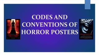
  • 2. CONVENTIONS OF HORROR POSTERS Poster Conventions The film posters that are specifically created for horror films follows a series of conventions. These conventions have been created to fit the genre of the film and to meet the expectations of the target audience. A common convention used in film posters is the use of having one main character featuring on the front cover. If you take a look at posters such as the ‘Scream’ and ‘Final Destination’ you will be able to see only one character featuring on it. By using one image it will attract the audience even more to the magazine because it will give a scary and creepy effect to the audience. It will also make the film more tempting to watch for the audience as they would want to know who the characters is and what the film is going to be about. Some of the main images used on a poster are taken in an extreme close up shot. This is also a very clever technique to use on a poster because by having an extreme close up image it will limit the amount of suspense revealed about the film. Thi creates an enigma because nothing else can be seen on the poster which means that only the emotions of the character can be felt and be relatable to the audience. Most images follow the rule of thirds. They usually place the main image on the centre of the poster so that the audience is only focused on the main image and nothing else. Background Colours/ Lighting Bold and dark colours would normally be used in posters to create a scary effect to the audience. The most common colours that would feature in horror posters would be black, white, grey and red. It generally depends on the sub- genre of the film. The colours could normally represent or reflect a person’s personality. The colours black and grey could represent a person who does not socialise with anyone and is a very unusual person. These characteristics would normally feature in a horror film and you would tend to see the character being very lonely and isolated from others. By looking at horror film posters you would be able to see that the colours are not used to grab the viewers’ attention in fact they are used to grab the intellectual side of the audience by making them think. By looking at the background the audience would be able to establish where the film is set. When you look at the poster of ‘The Last House on the Left’ you would be able to understand that the main film is going to be set in a house. All images would taken in a low – key lighting to make it clear that it is a horror film. The colour black normally symbolises the dark and negative side of life. It is common to see the lighting of a poster dark. This will help create a dark cinematography effect to the audience. It is important to take into consideration the costume that the character is wearing and the way he is presented on screen to create an enigma to the audience. In supernatural films you would be able to see certain settings of the film taken in a low key lighting to create that eerie effect. In slasher films there will be a main weapon in the hands of the antagonist and the image of this will be taken in low key lighting as well to create more suspense to the audience. It is very common to see low key lighting used on a poster alongside with red text for the title to make the sub-genre clear to the audience. Just by looking at the poster the audience will be able to feel that the film is going to be full of gruesome deaths and violence which is going to be caused by the antagonist. Font Style/ Font Colour The font of the horror film poster would normally be written in bold. The font used would be very simple. You would be able to read the text without any difficulties because the font is not written in a fancy complicated way. When looking at horror film posters another main convention you would be able to see is the colour of the font used. Normally you would be able to see the colour red used in posters to reflect and symbolise blood. If you look at one of the posters for the film ‘Sinister’. You would be able to see that the font looks as if a young child has written it. This could reflect the idea to the audience that the child has been possessed as it looks as if the child has written the word using blood. It is nowadays very common to see the font play a major part of the poster because fonts can be written in the colour red but it could reflect so many features of the film. The colour red could symbolise the violent and gruesome part of the film and the different murders that may take place throughout the film. CODES AND CONVENTIONS OF HORROR POSTERS
  • 3. CODES AND CONVENTIONS OF HORROR POSTERS Images/ Layout A main convention of posters is the image. Normally an image would be taken in a close up angle to make it clear to the audience the emotions of the character. When you look at the posters below you could see that each poster has an image of a character. Most posters contain a close up shot of the character. This is a technique used in horror posters to make the audience feel like there is no way to escape. It is used to make the audience feel uncomfortable and scared. The layout of horror posters are usually the same. You would be able to see one main image being used in the poster to grab the audiences attention. Sometimes the characters featuring on the poster could confuse the audience as they are not sure if they are going to be the one causing a disequilibrium in the horror film. The title would be placed usually at the top or bottom of the poster. The title is also commonly shown in a bold font. So after the viewers look at the image the first thing they will see is the title. The layout is very clear on horror posters. It is usually a very simple layout which catches the audiences attention. Setting It is quite predictable to know where about a horror film is set by just knowing the sub – genre of the film. Most horror films are set in an isolated place where you will not be able to get help if you are in danger. If a horror film is set in a house it could potentially mean that the house is haunted or has evil spirits lurking around. It is now very conventional to see film posters use medium close ups and low angle shots to show the setting of the film clearly to the audience. If you look at posters such as ‘Fright Night’ you will be able to see the setting of the house featuring on it as the main image. This is nowadays very conventional to see. By adding a ghost effect to the poster through the use of shadows, will grab the audience’s attention because you can only see the setting feature on the poster as the main image which is only conventional in specific sub genres such as supernatural horror films. Some of the colours used in horror posters have the capacity to attract the audience which builds more suspense to them as they would wonder how the setting is linked with the film. When you look at the poster of ‘Friday the 13th’ you could clearly see that the image is taken in a forest. There has been a lot of black colour used to surround the outline of the poster to make the audience feel that there is no way to escape once they have entered the forest. Posters which feature certain settings of a place like the forests and the woods would create an enigma for the audience because they don’t know what problems are going to be caused by that specific location. Character Representations/Costume Hair and Makeup Characters are usually represented in a specific way in horror movies. It is conventional to have a blonde girl get killed first in horror movies. It is also very common to see girls flirt with boys and make them look very sexualised. It is also very common to see girls half naked in horror movies to represent their personality and behaviour towards men. The main makeup that would be used in horror movies is the blood especially on the victim's face. If you watch a lot of horror films you would mostly be able to see that the characters would usually have their hair down. This is used to create a evil and scary feel to the audience and to make the antagonist look like a demonic figure. Positioning (Rule of thirds) Rule of thirds is used to see where the audiences eyes go first and this is usually to the middle of the page therefore that’s why the main image is always put on the middle of the poster. It is a very clever technique to use by having the main image of the poster on the centre because the audience will look automatically at the centre before looking at anything else on the page.
  • 4. CODES AND CONVENTIONS OF HORROR POSTERS Analysing Specific Examples When you look at the three posters below you would be able to see that there are different conventions and features that are included which makes the posters look common. All the posters have a main face of a character being feature in the horror film poster. You will be able to see that a close up shot has been used for all three of the posters. One of the main conventions used in all three posters is the colour. The colour black has been used to make it clear that it is advertising a horror film. The colour black could reflect that there will be unpleasant and uncomfortable scenes in the film to make the audience feel disturbed and scared. Another convention used in two of the posters below is the colour use of red. The colour red could represent the violent side of the film. It could also symbolise that someone is going to be killed in the film. The next convention that has been used in all three posters is the emotion of all three images. Each of the character has an emotion that can be seen through the poster. On the first poster on the left hand side you could see two people screaming where the eyes should be placed. This could reflect the idea that people may get trapped in this film and that there is no way out or there is no solution to this problem. The next poster could symbolise that something unexpected could happed in the film. There may be jumpy scenes added in the film to scare the audience. By looking at this poster we could also come up with the idea that the girl is an important character in the film and that something is going to happen to her. When you look at the third poster it is actually a bit different to the other two posters. The girl has a mask on her face. This could be because she may have been possessed or trapped by a person. The mask could represent the bad side of the film. As the mask has a smiley face drawn on it could give us an idea that the girl has been forced to wear a smile on her face and that there are unpredictable events that will take place in the film. As the girl looks young from the image below it could also make us think that the antagonist is aiming to get people who are young and innocent. I would want to mainly use the main conventions that are used to make horror posters. I would want to have one main image used on the middle of the poster and then I would like to use the colour red somewhere in the text to symbolise the blood that will be seen in the trailer. I would definitely try to also use low key lighting for the background to make it clear that the poster is for a horror genre. Main Image (Rule of thirds) Film Title Strapline Dark Background / Low – Key Lighting Used