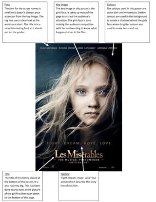
1. Font Key Image Colours
The font for the actors names is The key image in this poster is the The colours used in this poster are
small so it doesn’t distract your girls face. It takes up most of the quite dark and mysterious. Darker
attention from the key image. The page to attract the audience’s colours are used in the background
tag line uses a clear text as the attention. The girls face is cute to create a shadow behind the girls
words are short. The title is in a making the audience sympathise face where brighter colours are
more interesting font so it stands with her and wanting to know what used to make her stand out.
out on the poster. happens to her in the film.
Title Tag line
The title of this film is placed at ‘Fight. Dream. Hope. Love’ four
the bottom of the poster, it is words which describe the story
also not very big. This has been line of this film.
done so you look at the picture
of the girl first then scan down
to the bottom of the page.
2. Key image Title Colours
The key image in this poster is the The title is in a big sized text so it The colours used are quite dark
soldier in the middle of the page. stands out in white against the and merky as this film is sad which
His silhouette stands out against black background. The words gives the audience this impression
the sunset background. This makes ‘saving’ and ‘Private Ryan’ have of the film. The colours give a
the audiences eyes focus to the been separated as the word camouflage effect to the poster
middle of the page. separated is bolder, this is to show which relates to army colours as
the private Ryan as someone’s this film is based around the army.
name.
Background
Font Tag Line
The text is against a black
The font used is simple and clear so ‘The mission is a man’ this tag line
background which is supposed to
it doesn’t distract the audiences gives the audience an idea of what
be the ground in which the soldier
attention but is easy to read. the film is about, as this film is
is walking on. The background
about a group of troops that go
above is a sunset with the mens
looking for a man named Ryan.
courageous faces blended into the
sky.
3. Layout Title Colours
The layout of this poster is in a The title of this film is placed just The colours used in this poster are
triangular composition with the fire below the centre line of the page quite dark and create a lot of
starting the triangle along with the as the audiences attention is shadow, giving the poster lots of
3 main actors coming out from caught by the fire in the middle. depth. The black, blues and greys
each side. This makes you focus on are cold colours so make the actors
the centre of the poster, the look heartless.
triangular shape makes your eyes
look in either direction.
Tag Line
The tag line gives the
audience an idea of what
the film is going to be
about ‘No names. No
badges. No mercy.’ They
are very short and
straight to the point
giving you a good idea of
the style of film which is
fast paced and to the
point.
Background Font Target Audience
The background is quite simple to The font used is sharp, clear and The target audience for this poster
make the title stand out but there attracts the audiences attention. would be mainly male as the main
is a ‘hollywoodland’ sign on the left The actor’s names are small and actors are male and there is an
side of the poster which tells the clear so they can be seen but don’t attractive women actor also.
audience the film is set in attract lots of attention.
Hollywood.