On the poster a female has
been presented as one of
the main characters. This
would appeal to the female
target audience because
they are the same gender so
they are able to relate to the
character. Also her clothing
suggests that she is a working
class women allowing the
audience to put themselves
in her shoes because they
know what It is like to be a
working class women.
Within the poster the women
is standing on stack up
presents so she is at the
same height of the male in
the poster, this is
representative of equality
between the male and
female allowing the target
audience to relate to the
character.
The Couple are tied
together with ribbon this
connotes that the two
characters are
associated in some way,
could be in a
relationship or have a
very strong friendship
allowing the target
audience to relate if
they have experienced
what the couple are
representing. The colour
red is symbolic of love
suggesting that the two
characters have some
form of love for each
other
The colour of the texts
suggests that this poster has
been made for the female
target audience seeing as
pink is seen to be a very
feminine colour also the
secondary images like the
ribbon and presents is also
suggestive of the target
audience because ribbon
and presents are usually
made/used by the female
audience.
The woman's posture within
the poster is straight and
upright and she also has her
hands on her hips this
suggests that she has some
form of power within the film
this would entice the female
target audience to watch
the film to see what kind of
power the women holds
within the poster.
The Actor ‘Reese
Witherspoon’ has
stared in a lot of
romantic
comedy’s this
would entice the
female target
audience to
watch the film if
they are
passionate about
‘Rom Coms’
The protagonist within this
film seems to the the
female character this
would make the target
audience want to view
the film because of the
female character has a
main part to play within
the film.
Within this poster the clothing of
the protagonist is very smart, this
alone suggest that the main
character is a some sort of
business men This would attract
the attention of the target
audience because having a
main character that’s smartly
dressed would allow the male
target audience to relate to him
also the fact that the
protagonist is a male the target
audience would want too see
the film because the are of the
same gender
Also the poster you are able to
see an explosion this is has been
done to attract the target
audience enticing them to
watch the film.
The Poster of the main
character suggests
that the character is
a brave person this
would allow the
target audience not
only to relate to the
character but want
to watch it because
brave character spells
action.
Another thing that
would attract the target
audience would be the
colours that have been
used within the poster
the grey sky’s and the
fire red flames
immediately suggest
that this is an action film
also suggest that this
film would attract more
of an male audience
rather then a female
audience.
The fact that there are
2 females within the
poster suggest that they
have some sort of
relationship with the
protagonist not only
does this attract the
target audience but
makes you ask who are
they? The female within
the poster would
attract the target
audience not only
because she is
attractive she also looks
like some kind of
The Superhero and villain
have me made larger on
the poster then the rest
of the characters this
suggests that they are
the main focus of the
film. Also seeing as they
have added a villain
suggests that the film is
going to be action
packed this will appeal
to the target audience
because more action
means more explosions
fights ETC.
The title also suggests the
target audience the film
has been release for
because it is in block letters
and also has masculine
colours surrounding it.
Another suggestive
signifier is one of the
females within the
poster usually she will
fall for the hero
putting her in
danger meaning
that at some point
she will have to be
saved.
Colour Scheme – the colours used
for each target audience are
completely different this is so that
it catches the eye of that gender
audience for example the ‘Four
Christmases’ poster has used
whites and pinks to appeal to its
target audience whereas the
‘Iron Man 2’ poster has used
grey’s, blue’s and reds to appeal
to its target audience.
The Use of protagonists
within the ‘Iron Man 3’
poster the protagonist has
been presented as a brave
character to appeal to its
target audience also to fit in
with its genre. When you
take a look at ‘Four
‘Christmases’ Not only is the
protagonist for that poster
female she is the dominant
character within that poster
that has been done to
appeal to the female target
audience.
Secondary images – between the
two posters the uses of secondary
images have been changed to fit
the target audience. Within the ‘Four
Christmases’ Poster the secondary
images are presents and ribbon this
has been done to appeal to the
female target audience. On the
other hand ‘Iron Man 2’ have barley
used secondary images and when
they have its of the villain down
bellow this has been done to entice
their target audience.
Titles – The use of titles
completely differ between the
two posters this has been done
to appeal to each individual
target audience. On the ‘Four
Christmases’ poster the title has
used softer and connative
colours and a more subtle text
whereas the ‘Iron Man 2’ poster
has used more masculine and
a rougher text to entice its
target audience.

Poster analysis

  • 2.
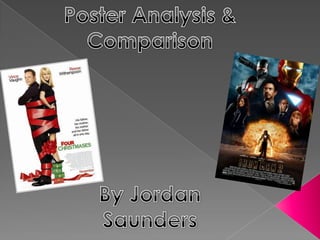
    On the postera female has been presented as one of the main characters. This would appeal to the female target audience because they are the same gender so they are able to relate to the character. Also her clothing suggests that she is a working class women allowing the audience to put themselves in her shoes because they know what It is like to be a working class women. Within the poster the women is standing on stack up presents so she is at the same height of the male in the poster, this is representative of equality between the male and female allowing the target audience to relate to the character. The Couple are tied together with ribbon this connotes that the two characters are associated in some way, could be in a relationship or have a very strong friendship allowing the target audience to relate if they have experienced what the couple are representing. The colour red is symbolic of love suggesting that the two characters have some form of love for each other The colour of the texts suggests that this poster has been made for the female target audience seeing as pink is seen to be a very feminine colour also the secondary images like the ribbon and presents is also suggestive of the target audience because ribbon and presents are usually made/used by the female audience.
  • 3.
    The woman's posturewithin the poster is straight and upright and she also has her hands on her hips this suggests that she has some form of power within the film this would entice the female target audience to watch the film to see what kind of power the women holds within the poster. The Actor ‘Reese Witherspoon’ has stared in a lot of romantic comedy’s this would entice the female target audience to watch the film if they are passionate about ‘Rom Coms’ The protagonist within this film seems to the the female character this would make the target audience want to view the film because of the female character has a main part to play within the film.
  • 4.
    Within this posterthe clothing of the protagonist is very smart, this alone suggest that the main character is a some sort of business men This would attract the attention of the target audience because having a main character that’s smartly dressed would allow the male target audience to relate to him also the fact that the protagonist is a male the target audience would want too see the film because the are of the same gender Also the poster you are able to see an explosion this is has been done to attract the target audience enticing them to watch the film. The Poster of the main character suggests that the character is a brave person this would allow the target audience not only to relate to the character but want to watch it because brave character spells action. Another thing that would attract the target audience would be the colours that have been used within the poster the grey sky’s and the fire red flames immediately suggest that this is an action film also suggest that this film would attract more of an male audience rather then a female audience. The fact that there are 2 females within the poster suggest that they have some sort of relationship with the protagonist not only does this attract the target audience but makes you ask who are they? The female within the poster would attract the target audience not only because she is attractive she also looks like some kind of
  • 5.
    The Superhero andvillain have me made larger on the poster then the rest of the characters this suggests that they are the main focus of the film. Also seeing as they have added a villain suggests that the film is going to be action packed this will appeal to the target audience because more action means more explosions fights ETC. The title also suggests the target audience the film has been release for because it is in block letters and also has masculine colours surrounding it. Another suggestive signifier is one of the females within the poster usually she will fall for the hero putting her in danger meaning that at some point she will have to be saved.
  • 6.
    Colour Scheme –the colours used for each target audience are completely different this is so that it catches the eye of that gender audience for example the ‘Four Christmases’ poster has used whites and pinks to appeal to its target audience whereas the ‘Iron Man 2’ poster has used grey’s, blue’s and reds to appeal to its target audience. The Use of protagonists within the ‘Iron Man 3’ poster the protagonist has been presented as a brave character to appeal to its target audience also to fit in with its genre. When you take a look at ‘Four ‘Christmases’ Not only is the protagonist for that poster female she is the dominant character within that poster that has been done to appeal to the female target audience.
  • 7.
    Secondary images –between the two posters the uses of secondary images have been changed to fit the target audience. Within the ‘Four Christmases’ Poster the secondary images are presents and ribbon this has been done to appeal to the female target audience. On the other hand ‘Iron Man 2’ have barley used secondary images and when they have its of the villain down bellow this has been done to entice their target audience. Titles – The use of titles completely differ between the two posters this has been done to appeal to each individual target audience. On the ‘Four Christmases’ poster the title has used softer and connative colours and a more subtle text whereas the ‘Iron Man 2’ poster has used more masculine and a rougher text to entice its target audience.