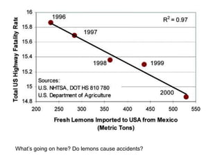
The document discusses scattergraphs and correlation by:
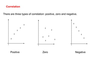
1) Explaining the three types of correlation: positive, zero, and negative.
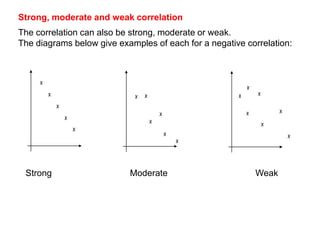
2) Describing strong, moderate, and weak correlation and providing examples of each for a negative correlation.
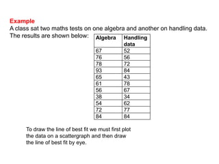
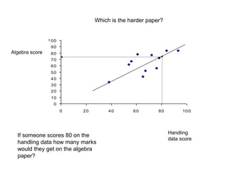
3) Presenting sample math test score data in an example scattergraph plotting algebra scores against handling data scores to illustrate the correlation between performance on the two tests.