This document discusses key geographical skills including topographical map reading, geographical data techniques, and conducting geographical investigations. It covers topics such as reading grid references, measuring distances on maps, interpreting map symbols and scales, describing landforms and relief, settlement patterns, and using compasses to find bearings. It also discusses creating and interpreting various types of graphs to display geographical data, such as line graphs, bar graphs, pie charts, scatterplots, climographs, and histograms. Finally, it discusses the phases of conducting geographical fieldwork and how to develop hypotheses or guiding questions.
In this video Data Graphics has been discussed. How the data can be presented with the help of different line graph, poly graph, bar diagram, histogram and Scatter plot and semi logarithmic plot/graph.
Portion completed:
1.DATA GRAPHICS
2. REPRESENTATION OF DATA
3. line graph,
4. poly graph,
5. bar diagram,
6. histogram
7. Pie diagram
8. Wind rose and star diagram
9. Flow Charts
10. Simple Bar Diagram
11. Line and Bar Graph
12. Multiple Bar Diagram
13. Compound Bar Diagram
14. Pie Diagram
15. Scatter plot
16. Semi-log plot
Definition of Surveying
Objects of Surveying
Uses of Surveying
Primary Divisions of Surveying
Principles of Surveying
List of Classification of Surveying
Definitions : Plan and Map, scales :Plain Scale and Diagonal Scale,
GIS Lecture 3- Map Projetion and Coordinate System.pptabdukkedir2007
the perfect land development plan for Project Site X, Y & Z, we will explore various methods of land assembly and public-private partnerships to secure the remaining 20 hectares of land for the project
Visualisation for BusinessANL 201The Art of Data Visua.docxjessiehampson
Visualisation for Business
ANL 201
The Art of Data Visualisation
Study Unit 3
January 2020
Visual Cues
3
Visual Cues
The eight components of visual cues
1. Position (e.g., scatterplot)
2. Length (e.g., bar chart)
3. Angle (e.g., pie chart)
4. Direction (e.g., line graph)
5. Shape (e.g., scatterplot)
6. Area (e.g., square area graph)
7. Volume
8. Colour
4
Visual Cues
Mun Teng
Sticky Note
normally attributed to the scatter plot, useful for spotting outliers, good for relatively comparison between points, not so good for telling you the exact data points and when many data points are close to one another
Mun Teng
Sticky Note
always start from 0 scale
Mun Teng
Sticky Note
the larger the circle of a chart, the bigger the size
5
Visual Cues
6
Visual Cues
Colour — the Red-Green-Blue (RGB) colour system
‣ The basic idea of the RGB colour system is that any coloured light can be
matched by a weighted sum of any three distinct primary colours
C ≡ rR + gG + bB,
where
C is the colour to be matched
R, G, and B are primary sources to be used to create a match
r, g, and b are the amounts of each primary source
≡ denotes a perceptual match
Mun Teng
Sticky Note
colors are good at segmenting categories
Mun Teng
Sticky Note
only supplementary on math, need to know this only thoroughly for this module
7
Visual Cues
Colour — the CIE colour system
‣ The CIE colour system uses a set of abstract primaries called tristimulus values
that are labelled XYZ. These values are chosen for their mathematical
properties, and not because they match any set of actual lights
‣ The CIE colour system is by far the most widely adopted colour system to
measure coloured lights. We should always use the CIE colour system when
precise colour specification is required
8
Visual Cues
Colour — the HSV colour system
‣ The HSV colour system uses colour hue, colour saturation, and black-white
brightness (i.e., value) to specify the surface colours
‣ In the HSV colour system, hue refers to which part of the rainbow colour map a
colour belongs to, such as red or green. Saturation refers to how rich a colour
hue is, for example, neon colours are very saturated, while pastel colours are
less saturated. Value denotes how bright a colour is, or in other words, how close
a colour is to pure white or pure black
Coordinate Systems
10
Coordinate Systems
The cartesian coordinate system
‣ The cartesian coordinate system specifies each data point on a plane by a pair
of numerical coordinates. The numerical coordinates are the signed distances
from the data point to the two fixed perpendicular reference lines, called the x-
axis and y-axis
‣ Both axes meet at a point, called the origin, which is usually represented by the
ordered pair (0, 0)
‣ The numerical coordinates can also be expressed as a signed distance from the
origin
Mun Teng
Sticky Note
distance can be plus or minus that's why it is signed distance
C ...
What Exactly Is Contouring in Survey & Levelling?
It will be helpful for Architectural and Civil engineering students.
A presentation by Harshit Gupta (B.Arch 1st year).
Read| The latest issue of The Challenger is here! We are thrilled to announce that our school paper has qualified for the NATIONAL SCHOOLS PRESS CONFERENCE (NSPC) 2024. Thank you for your unwavering support and trust. Dive into the stories that made us stand out!
A Strategic Approach: GenAI in EducationPeter Windle
Artificial Intelligence (AI) technologies such as Generative AI, Image Generators and Large Language Models have had a dramatic impact on teaching, learning and assessment over the past 18 months. The most immediate threat AI posed was to Academic Integrity with Higher Education Institutes (HEIs) focusing their efforts on combating the use of GenAI in assessment. Guidelines were developed for staff and students, policies put in place too. Innovative educators have forged paths in the use of Generative AI for teaching, learning and assessments leading to pockets of transformation springing up across HEIs, often with little or no top-down guidance, support or direction.
This Gasta posits a strategic approach to integrating AI into HEIs to prepare staff, students and the curriculum for an evolving world and workplace. We will highlight the advantages of working with these technologies beyond the realm of teaching, learning and assessment by considering prompt engineering skills, industry impact, curriculum changes, and the need for staff upskilling. In contrast, not engaging strategically with Generative AI poses risks, including falling behind peers, missed opportunities and failing to ensure our graduates remain employable. The rapid evolution of AI technologies necessitates a proactive and strategic approach if we are to remain relevant.
June 3, 2024 Anti-Semitism Letter Sent to MIT President Kornbluth and MIT Cor...Levi Shapiro
Letter from the Congress of the United States regarding Anti-Semitism sent June 3rd to MIT President Sally Kornbluth, MIT Corp Chair, Mark Gorenberg
Dear Dr. Kornbluth and Mr. Gorenberg,
The US House of Representatives is deeply concerned by ongoing and pervasive acts of antisemitic
harassment and intimidation at the Massachusetts Institute of Technology (MIT). Failing to act decisively to ensure a safe learning environment for all students would be a grave dereliction of your responsibilities as President of MIT and Chair of the MIT Corporation.
This Congress will not stand idly by and allow an environment hostile to Jewish students to persist. The House believes that your institution is in violation of Title VI of the Civil Rights Act, and the inability or
unwillingness to rectify this violation through action requires accountability.
Postsecondary education is a unique opportunity for students to learn and have their ideas and beliefs challenged. However, universities receiving hundreds of millions of federal funds annually have denied
students that opportunity and have been hijacked to become venues for the promotion of terrorism, antisemitic harassment and intimidation, unlawful encampments, and in some cases, assaults and riots.
The House of Representatives will not countenance the use of federal funds to indoctrinate students into hateful, antisemitic, anti-American supporters of terrorism. Investigations into campus antisemitism by the Committee on Education and the Workforce and the Committee on Ways and Means have been expanded into a Congress-wide probe across all relevant jurisdictions to address this national crisis. The undersigned Committees will conduct oversight into the use of federal funds at MIT and its learning environment under authorities granted to each Committee.
• The Committee on Education and the Workforce has been investigating your institution since December 7, 2023. The Committee has broad jurisdiction over postsecondary education, including its compliance with Title VI of the Civil Rights Act, campus safety concerns over disruptions to the learning environment, and the awarding of federal student aid under the Higher Education Act.
• The Committee on Oversight and Accountability is investigating the sources of funding and other support flowing to groups espousing pro-Hamas propaganda and engaged in antisemitic harassment and intimidation of students. The Committee on Oversight and Accountability is the principal oversight committee of the US House of Representatives and has broad authority to investigate “any matter” at “any time” under House Rule X.
• The Committee on Ways and Means has been investigating several universities since November 15, 2023, when the Committee held a hearing entitled From Ivory Towers to Dark Corners: Investigating the Nexus Between Antisemitism, Tax-Exempt Universities, and Terror Financing. The Committee followed the hearing with letters to those institutions on January 10, 202
Model Attribute Check Company Auto PropertyCeline George
In Odoo, the multi-company feature allows you to manage multiple companies within a single Odoo database instance. Each company can have its own configurations while still sharing common resources such as products, customers, and suppliers.
Palestine last event orientationfvgnh .pptxRaedMohamed3
An EFL lesson about the current events in Palestine. It is intended to be for intermediate students who wish to increase their listening skills through a short lesson in power point.
Biological screening of herbal drugs: Introduction and Need for
Phyto-Pharmacological Screening, New Strategies for evaluating
Natural Products, In vitro evaluation techniques for Antioxidants, Antimicrobial and Anticancer drugs. In vivo evaluation techniques
for Anti-inflammatory, Antiulcer, Anticancer, Wound healing, Antidiabetic, Hepatoprotective, Cardio protective, Diuretics and
Antifertility, Toxicity studies as per OECD guidelines
Unit 8 - Information and Communication Technology (Paper I).pdfThiyagu K
This slides describes the basic concepts of ICT, basics of Email, Emerging Technology and Digital Initiatives in Education. This presentations aligns with the UGC Paper I syllabus.
The French Revolution, which began in 1789, was a period of radical social and political upheaval in France. It marked the decline of absolute monarchies, the rise of secular and democratic republics, and the eventual rise of Napoleon Bonaparte. This revolutionary period is crucial in understanding the transition from feudalism to modernity in Europe.
For more information, visit-www.vavaclasses.com
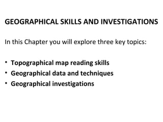
1. GEOGRAPHICAL SKILLS AND INVESTIGATIONS
In this Chapter you will explore three key topics:
• Topographical map reading skills
• Geographical data and techniques
• Geographical investigations
2.
3. Reading grid references
• Always read the eastings (x-
axis, vertical lines) then the
northings (y-axis, horizontal
lines)
• They can be:
- 4 digit grid references
(xxyy): identify an area OR
- 6 digit grid references
(xxx1yyy1): identify a point
x1 andy1 are derived by sub-
dividing the northings and
eastings into 10 segments
Area: 0736
Point: 088376
4. Measuring distances
Straight-line distance
1. Connect two points.
2. Use a strip of paper to mark
out the distance between the
points.
3. Place the strip of paper on
the line scale.
4. Alternatively, use a calculator
to convert the map distance
into actual distance (i.e 1cm:
1km therefore 2.5cm=2.5
km)
5. Curved distances
1. Divide the curved distance
into various straight line
segments.
2. Mark each location on the
strip of paper until the whole
length of the curved route is
marked.
3. Place the strip of paper
against the scale to convert
into the actual distance.
4. Alternatively, use string to
trace the curved distance,
and then convert into actual
distance using the scale.
Measuring distances
6. Interpreting map symbols
Symbols represent the actual
features on the map. They are
found in the key.
They can be used to represent
physical features and human
activities. Some of the
examples are seen on the left.
7. Interpreting scales
Type of scale Description
Representative
fraction
• Written as a fraction (1/2,500) or Ratio
(1:2,500)
• No unit of measurement (can be used
for any units of measurement)
Linear scale • A visual representation using a straight
line that is divided into equal parts.
• Used to represent actual distance on
the map (e.g 2 cm represents 1 km)
Statement scale • A scale expressed in words (e.g 1 cm
represents 1 km)
11. Description of landform Name of landform
• A highland more than 600
metres above sea level.
• Have steep slopes indicated
by closely spaced contour
lines.
Mountain
• Steep and near-vertical rock
face.
• It is indicated by closely
spaced contour lines.
Cliff
• A depression between two
highlands.
• represented by v-shaped
contour lines pointing
towards higher ground.
• may have a river running
through it
(River) Valley
12. Description of landform Name of landform
• A low-lying land found
near a river.
• Generally flat and can
be identified by the
lack of contour lines or
widely spaced
contours.
Floodplain
• A highland with steep
slopes and a flat
summit.
• Steep slopes are
indicated by closely
spaced contour lines
• A flat summit is shown
by the absence of
contour lines at the
Plateau
13. Q7. If you took a train from May’s train station
towards Beacon Town, in which direction would
the train be moving in grid square 0235?
14. Follow these steps when measuring compass bearing:
1.Draw a straight line to join the two objects.
2.Draw the north arrow on the object you are measuring ‘from’.
3.Place the 0° of the protractor on the right side of the north arrow. Read
clockwise to obtain the grid bearing.
4.If the grid bearing is more than 180°, place the 0° of the protractor on the left
side of the north arrow. Add 180° to the bearing measured by the protractor.
Reading directions: Compass bearings
15. Q12. At the peak of May Hill, what are the three
features that Ah Beng could see if he has looked
westward?
16. Q8. what is the bearing of the trigonometrical
station in grid square 0133 from the
trigonometrical station in grid square 0435?
19. Q9. What type of settlement
pattern does Beacon Town have?
20. Q10. What is the height of the
highest point on Mt Beacon?
21. Q11. what is the contour interval
of Country Moo Moo?
22. Calculating gradient
Gradient indicates the steepness of a slope. It
is measured by dividing the height of the land
with a given horizontal distance. Gradient is
expressed as a fraction or ratio. It is calculated
using the formula:
Difference in height between two points
Horizontal distance between two points
Follow these steps:
1)Difference in height between two points:
maximum height minus minimum height (using
the contour values)
2)Horizontal distance: measure the distance
between the two points and convert into
actual distance
3)Divide results from (1) with (2). NOTE: both
(1) and (2) must be in the same units i.e
metres
23. No. Types of
Map
Uses
1 Base maps Focus on basic information or highlight important information by providing an
outline of the area.
2 Atlas Provide details of natural and human features/occurrences of places.
3 Topographical
maps
Show physical and human features through the use of lines, symbols, colours
and abbreviations.
4 Road maps Road maps show the location of roads, buildings, railway tracks and airports,
and used as navigation tool.
5 Sketch maps Sketch maps are simplified illustrations of an area, drawn to show the basic
positions of an area’s main features.
6 Choropleth
maps
Show the geographical distribution and trends using colours or shadings to
group different data values
7 Isoline maps Isoline maps are maps with isolines, or continuous lines joining points of equal
value
8 Dot maps Dot maps show the distribution of data using dots. The dots have a fixed size or
value and are drawn on a base map.
9 Maps with
proportionate
symbols
Symbols drawn are proportional to the values of the data being mapped. For
example, bigger symbols are accorded to larger values.
24. Simple line graphs Advantages
-Shows trend over time
-Allow for easy
comparison of multiple
sets of data
-May be use to estimate
future patterns
Disadvantages
-Unsuitable if only few
values in data set
-Change may appear
greater if different
scales are used
Air temperature:
independent
variable
Water vapour:
dependent
variable
25. Comparative line graphs
Allows comparison of
two or more sets of
data
Compound line graphs
Allows one set of data
to be sub-divided into
two or more sets of
data
26. Bar graphs
Advantages
-Allow data to be compared
-Patterns can be easily observed
Disadvantages
-Trends are hard to predict
-Only use discrete data (cannot use
0.5)
27. Comparative bar graphs
Allows comparison of
two or more sets of
data
Compound bar graphs
Allows one set of data
to be sub-divided into
two or more sets of
data
28. Describe the trends in the graph
1) General Trend : Increasing / Decreasing / Stable /
Fluctuating
2) Highest reading:
Provide data from figure
3)Lowest reading:
Provide data from figure
4) Anomalie : Sudden
drop/dip/increase/Spike
29. Histogram
1. Histograms show distribution or
frequency of data. The x-axis
shows the range of values.
2. The values do not overlap. The y-
axis shows the frequency.
3. Different from bar graphs
because x-axis states size/classes
and not categories.
30. Pie charts
Advantages
- Easy to interpret
- Show percentage total for each category
Disadvantages
-Value of actual data unknown
-Unable to include too many categories
31. Scattergraphs
1. Plot data using ‘X’s.
2. Draw a straight line of best fit. This will broadly represent
the general pattern formed by the two points.
3. Take note of any anomalies.
32. Climographs
1. A climograph shows how
mean monthly
temperature and total
monthly precipitation vary
throughout the year for a
particular place.
2. The temperature is shown
using a line graph while
the precipitation is shown
using a bar graph.
33. Describing climographs
When describing climograph, always
state the:
1.The months where the minimum and
maximum temperatures are
experienced.
2.The average temperature range
(using key terms in (a) and (b))
3.The months where it minimum and
maximum rainfall are experienced.
4.The total amount of rainfall
experienced in the place (using key
terms found in (c))
36. Suggesting a hypothesis or guiding
question
Hypothesis Guiding Question
Expressed as a statement Expressed as a question
Consist of a prediction May consist of a problem
Explanation for something that needs to be
tested or proven
Highlights what needs to be known about a
topic
Can have more than two variables
“How long does a Secondary 4 student spend
in the washroom?”
Does not need to have an independent or
dependent variable
“The older the student, the longer the time
they spend in the washroom.”
Editor's Notes
Suggested activity:
- Illustrate to students how the 10 segments can be drawn.
Help students understand grid references by showing them these videos: http://www.youtube.com/watch?v=CRb2gRiTQxY&feature=related
http://www.youtube.com/watch?v=AJVxgWttUdY
Suggested activity:
- Show students a topographical map and ask them to identify the R.F, linear scale and write a statement scale.
Suggested activity
- Show students how cross-sections are drawn with this video: http://www.youtube.com/watch?v=X6uavZnHTuY
- Ask students to determine which landform has the lowest height. The height of the first landform from the left is the lowest. The other two is the same height of 250m.
This exercise allows students to understand that the contour lines indicate the height of the landform.
- Ask students what the difference in value between the contour lines is. 50 m. Tell students that the difference between the lines is called a contour interval. Maps generally have a constant contour interval although some maps may use different contour intervals. In this case, the contour interval is 50m.
- Emphasise that contour lines that are close together show steep relief while those that are far apart show gentle relief.
Suggested activity:
- Ask students to match the landforms found in this slide and the next to the descriptions found in slides 22-23.
- Ask students to make inferences based on their prior knowledge.
Suggested activity:
- Ask students to match the landforms found in this slide and the next to the descriptions found in slides 22-23.
- Ask students to make inferences based on their prior knowledge.
Suggested activity:
- As most students will have problems identifying the object they should be measuring the bearing from, the same approach shown in slide 9 can be used to help students determine the angle they have to measure. In this case, accuracy is not essential, the exercise is meant to provide students sufficient practice in determining the angle they have to measure.
Suggested activity:
- Ask students to follow these steps and calculate the gradient of between R and S in the figure before referring to the answer in the Textbook.
Ask students to refer to the Textbook for details on the various types of map.
Tell students that geographical Investigation allows them to explore and understand certain issues about our environment. In order to fully understand the issue, they need to gather, analyse and present data in a systematic manner.
Suggested activity:
Ask students to brainstorm some hypotheses and guiding questions related to their everyday lives. Once the students are used to coming up with hypotheses/guiding questions, they can then craft hypotheses/guiding questions more related to geographical issues.
Ask students to write down the aims for the hypotheses/guiding questions they come up with.