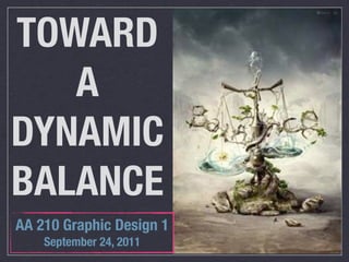
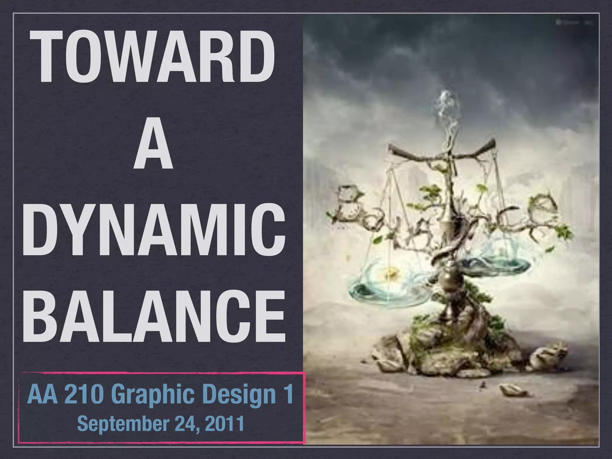
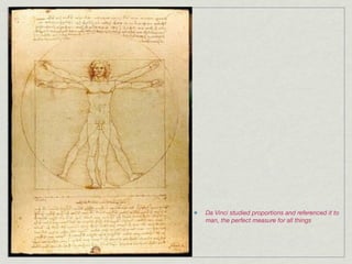
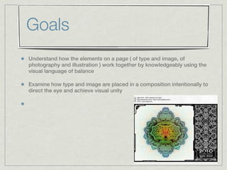
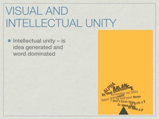
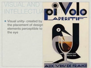
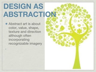
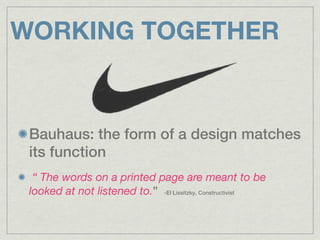
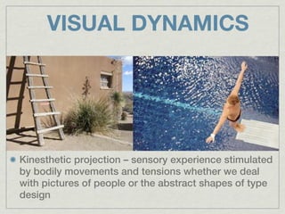
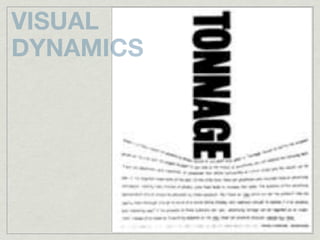
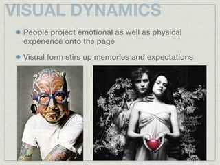
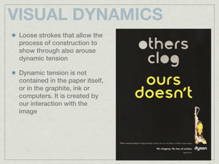
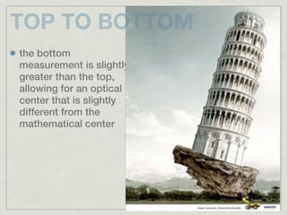
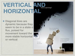
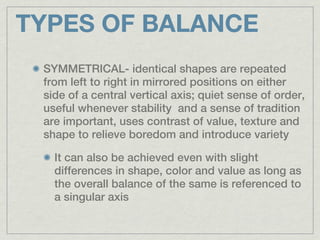
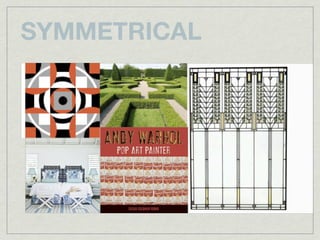
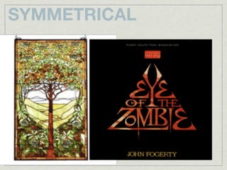
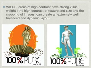
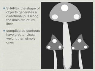
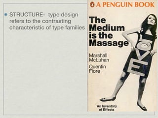
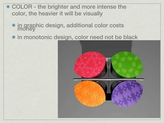
TOWARD
   A
DYNAMIC
BALANCE
AA 210 Graphic Design 1
    September 24, 2011
Da Vinci studied proportions and referenced it to
man, the perfect measure for all things
Terms to remember

 Intellectual Unity
 Visual Unity
 Kinesthetic Projection
 Symmetry
 Asymmetry
 Radial Symmetry
 Visual Weight
 Visual Direction
 Visual Texture
Goals
Understand how the elements on a page ( of type and image, of
photography and illustration ) work together by knowledgeably using the
visual language of balance

Examine how type and image are placed in a composition intentionally to
direct the eye and achieve visual unity
VISUAL AND
INTELLECTUAL UNITY
 Intellectual unity – is
 idea generated and
 word dominated
VISUAL AND
INTELLECTUAL UNITY
Visual unity- created by
the placement of design
elements perceptible to
the eye
DESIGN AS
ABSTRACTION
 Abstract art is about
 color, value, shape,
 texture and direction
 although often
 incorporating
 recognizable imagery
DESIGN AS
ABSTRACTION
DESIGN AS
ABSTRACTION


                                                                                     INTERNATIONAL TYPOGRAPHIC STYLE WITH STRONG
A good graphic designer must be a      POSTER FOR KUNSTGEWERBEMUSEUM, ZURICH, 1960   PURE DESIGN SHAPES REMINISCENT OF MONDRIAN’S
good abstract artist using both                                                         SURFACE DIVISION AND STRONG HORIZONTAL/
                                                                                                  VERTICAL ORIENTATION
pictorial and non objective elements
DESIGN AS
ABSTRACTION
 Graphic design is
 essentially an abstract art
 which combines elements
 into a formal 2D structure

     a work should be
     balanced and visually
     compelling in its own
     right as well as
     supportive of an idea

     Gestalt and semiotics
DESIGN AS
ABSTRACTION
WORKING TOGETHER


 Bauhaus: the form of a design matches
 its function
  “ The words on a printed page are meant to be
 looked at not listened to.” -El Lissitzky, Constructivist
VISUAL DYNAMICS


Kinesthetic projection – sensory experience stimulated
by bodily movements and tensions whether we deal
with pictures of people or the abstract shapes of type
design
VISUAL
DYNAMICS
VISUAL DYNAMICS
 People project emotional as well as physical
 experience onto the page

 Visual form stirs up memories and expectations
VISUAL DYNAMICS
 Loose strokes that allow the
 process of construction to
 show through also arouse
 dynamic tension

 Dynamic tension is not
 contained in the paper itself,
 or in the graphite, ink or
 computers. It is created by
 our interaction with the
 image
TOP TO BOTTOM
Things in the world rest on the
ground than in the sky
TOP TO BOTTOM
the bottom
measurement is slightly
greater than the top,
allowing for an optical
center that is slightly
different from the
mathematical center
VERTICAL AND
HORIZONTAL
Diagonal lines are
dynamic because they
seem to be in a state of
flux, poised for
movement toward the
more stable horizontal
or vertical
VERTICAL AND
HORIZONTAL
Theo van Doesburg
Deviated from the
horizontals and
verticals stating that
the modern human
spirit felt a need to
express a sharp
contrast to the right
angles found in
architecture and
landscape

Tension can create
LEFT TO RIGHT
Pictorial movement
from left to right
seems to require
less effort than
movement in the
opposite direction
LEFT TO RIGHT
LEFT TO RIGHT
 Successful communication requires balance, the
 directing and conducting of visual tensions.
BALANCE
 Lack of balance in design will irritate viewers and impair the
 communication

 In isomorphic terms, we identify our physical structure with the
 physical layout of the page

 When the dynamic tension between elements is balanced, we
 are most likely to communicate our intended message,
 otherwise the eye is confused

 Balance is achieved by two forces of equal strength that pull in
 opposite directions whose strengths offset one another. It is
 not a state of rest but a state of equal tension

 An interplay between tension heightening and tension reducing
 visual devices seem to satisfy us and match our kinesthetic
 and emotional experience
TYPES OF BALANCE
 SYMMETRICAL- identical shapes are repeated
 from left to right in mirrored positions on either
 side of a central vertical axis; quiet sense of order,
 useful whenever stability and a sense of tradition
 are important, uses contrast of value, texture and
 shape to relieve boredom and introduce variety

   It can also be achieved even with slight
   differences in shape, color and value as long as
   the overall balance of the same is referenced to
   a singular axis
SYMMETRICAL
SYMMETRICAL
ASYMMETRICAL - evokes a greater sense of movement and
change, of possible instability and relative weights
CONTRAST
    achieved through contrast to create equal visual weight
    among the elements
    to be effective, contrast must be definitive
    most successful designs rely on a carefully juggled balance
    of similarities and contrasts
WEIGHT
    visual weight is the strength or dominance of the visual
    objects
    visual direction is the way the eye is drawn between
    elements over the flat surface
    balance is determined by the natura weight of an element
    and by the directional forces the composition
LOCATION- the center of a composition will
support more weight than the edges
SPATIAL DEPTH- vistas
that lead the eye into
the page have great
visual strength
SIZE- the contrast between large and small should be sharp
and definite without overpowering the smaller elements so
they can contribute to the composition; unexpected size
results in a visual double take and makes the design
interesting
TEXTURE – a small
highly textured area
will contrast with and
balance a larger area
of simple texture.
Contrast of texture is
useful with text type
ISOLATION- a shape that appears isolated from its
surroundings will draw attention to itself more
quickly and have greater visual weight than one
surrounded by other shapes
SUBJECT MATTER-the natural interest of subject matter will draw the the viewers
eye and increase visual weight

   it can also create directional movement as we move our eyes between elements
   or follow the eye direction of a figure
VALUE- areas of high contrast have strong visual
weight ; the high contrast of texture and size and the
cropping of images, can create an extremely well
balanced and dynamic layout
SHAPE- the shape of
objects generates a
directional pull along
the main structural
lines

complicated contours
have greater visual
weight than simple
ones
STRUCTURE- type design
refers to the contrasting
characteristic of type families
COLOR - the brighter and more intense the
color, the heavier it will be visually

  in graphic design, additional color costs
  money
  in monotonic design, color need not be black
END...à{tÇ~ çÉâ4

Balance

  • 1.
    TOWARD A DYNAMIC BALANCE AA 210 Graphic Design 1 September 24, 2011
  • 2.
    Da Vinci studiedproportions and referenced it to man, the perfect measure for all things
  • 3.
    Terms to remember Intellectual Unity Visual Unity Kinesthetic Projection Symmetry Asymmetry Radial Symmetry Visual Weight Visual Direction Visual Texture
  • 4.
    Goals Understand how theelements on a page ( of type and image, of photography and illustration ) work together by knowledgeably using the visual language of balance Examine how type and image are placed in a composition intentionally to direct the eye and achieve visual unity
  • 5.
    VISUAL AND INTELLECTUAL UNITY Intellectual unity – is idea generated and word dominated
  • 6.
    VISUAL AND INTELLECTUAL UNITY Visualunity- created by the placement of design elements perceptible to the eye
  • 7.
    DESIGN AS ABSTRACTION Abstractart is about color, value, shape, texture and direction although often incorporating recognizable imagery
  • 8.
  • 9.
    DESIGN AS ABSTRACTION INTERNATIONAL TYPOGRAPHIC STYLE WITH STRONG A good graphic designer must be a POSTER FOR KUNSTGEWERBEMUSEUM, ZURICH, 1960 PURE DESIGN SHAPES REMINISCENT OF MONDRIAN’S good abstract artist using both SURFACE DIVISION AND STRONG HORIZONTAL/ VERTICAL ORIENTATION pictorial and non objective elements
  • 10.
    DESIGN AS ABSTRACTION Graphicdesign is essentially an abstract art which combines elements into a formal 2D structure a work should be balanced and visually compelling in its own right as well as supportive of an idea Gestalt and semiotics
  • 11.
  • 13.
    WORKING TOGETHER Bauhaus:the form of a design matches its function “ The words on a printed page are meant to be looked at not listened to.” -El Lissitzky, Constructivist
  • 14.
    VISUAL DYNAMICS Kinesthetic projection– sensory experience stimulated by bodily movements and tensions whether we deal with pictures of people or the abstract shapes of type design
  • 15.
  • 16.
    VISUAL DYNAMICS Peopleproject emotional as well as physical experience onto the page Visual form stirs up memories and expectations
  • 17.
    VISUAL DYNAMICS Loosestrokes that allow the process of construction to show through also arouse dynamic tension Dynamic tension is not contained in the paper itself, or in the graphite, ink or computers. It is created by our interaction with the image
  • 18.
    TOP TO BOTTOM Thingsin the world rest on the ground than in the sky
  • 19.
    TOP TO BOTTOM thebottom measurement is slightly greater than the top, allowing for an optical center that is slightly different from the mathematical center
  • 20.
    VERTICAL AND HORIZONTAL Diagonal linesare dynamic because they seem to be in a state of flux, poised for movement toward the more stable horizontal or vertical
  • 21.
    VERTICAL AND HORIZONTAL Theo vanDoesburg Deviated from the horizontals and verticals stating that the modern human spirit felt a need to express a sharp contrast to the right angles found in architecture and landscape Tension can create
  • 22.
    LEFT TO RIGHT Pictorialmovement from left to right seems to require less effort than movement in the opposite direction
  • 23.
  • 24.
    LEFT TO RIGHT Successful communication requires balance, the directing and conducting of visual tensions.
  • 25.
    BALANCE Lack ofbalance in design will irritate viewers and impair the communication In isomorphic terms, we identify our physical structure with the physical layout of the page When the dynamic tension between elements is balanced, we are most likely to communicate our intended message, otherwise the eye is confused Balance is achieved by two forces of equal strength that pull in opposite directions whose strengths offset one another. It is not a state of rest but a state of equal tension An interplay between tension heightening and tension reducing visual devices seem to satisfy us and match our kinesthetic and emotional experience
  • 26.
    TYPES OF BALANCE SYMMETRICAL- identical shapes are repeated from left to right in mirrored positions on either side of a central vertical axis; quiet sense of order, useful whenever stability and a sense of tradition are important, uses contrast of value, texture and shape to relieve boredom and introduce variety It can also be achieved even with slight differences in shape, color and value as long as the overall balance of the same is referenced to a singular axis
  • 27.
  • 28.
  • 29.
    ASYMMETRICAL - evokesa greater sense of movement and change, of possible instability and relative weights CONTRAST achieved through contrast to create equal visual weight among the elements to be effective, contrast must be definitive most successful designs rely on a carefully juggled balance of similarities and contrasts WEIGHT visual weight is the strength or dominance of the visual objects visual direction is the way the eye is drawn between elements over the flat surface balance is determined by the natura weight of an element and by the directional forces the composition
  • 30.
    LOCATION- the centerof a composition will support more weight than the edges
  • 31.
    SPATIAL DEPTH- vistas thatlead the eye into the page have great visual strength
  • 32.
    SIZE- the contrastbetween large and small should be sharp and definite without overpowering the smaller elements so they can contribute to the composition; unexpected size results in a visual double take and makes the design interesting
  • 34.
    TEXTURE – asmall highly textured area will contrast with and balance a larger area of simple texture. Contrast of texture is useful with text type
  • 35.
    ISOLATION- a shapethat appears isolated from its surroundings will draw attention to itself more quickly and have greater visual weight than one surrounded by other shapes
  • 36.
    SUBJECT MATTER-the naturalinterest of subject matter will draw the the viewers eye and increase visual weight it can also create directional movement as we move our eyes between elements or follow the eye direction of a figure
  • 37.
    VALUE- areas ofhigh contrast have strong visual weight ; the high contrast of texture and size and the cropping of images, can create an extremely well balanced and dynamic layout
  • 38.
    SHAPE- the shapeof objects generates a directional pull along the main structural lines complicated contours have greater visual weight than simple ones
  • 39.
    STRUCTURE- type design refersto the contrasting characteristic of type families
  • 40.
    COLOR - thebrighter and more intense the color, the heavier it will be visually in graphic design, additional color costs money in monotonic design, color need not be black
  • 41.