Downloaded 133 times


The document provides guidance on book cover design, outlining the purpose and process of designing an effective cover, including key elements, compositional modes, and considerations for typography and imagery integration to appropriately represent the book. It also presents examples of book covers and discusses designing covers for book series with consistent visual elements.
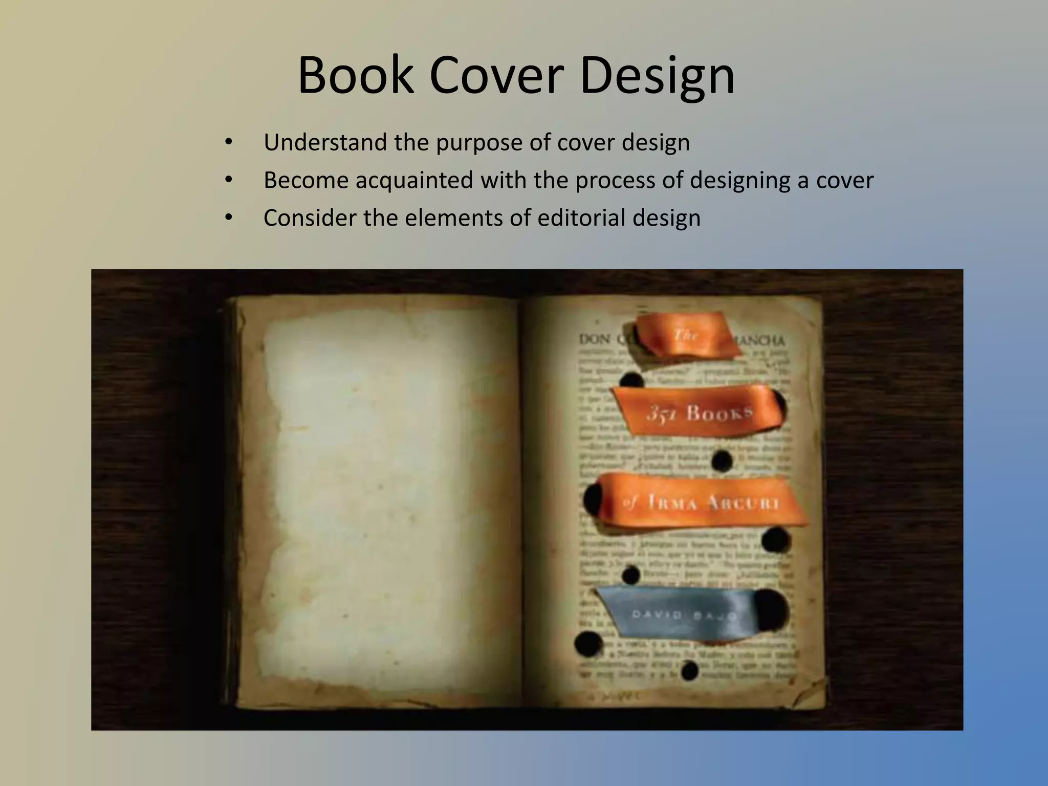
Learn the purpose and components of book cover design, emphasizing attraction and clarity.
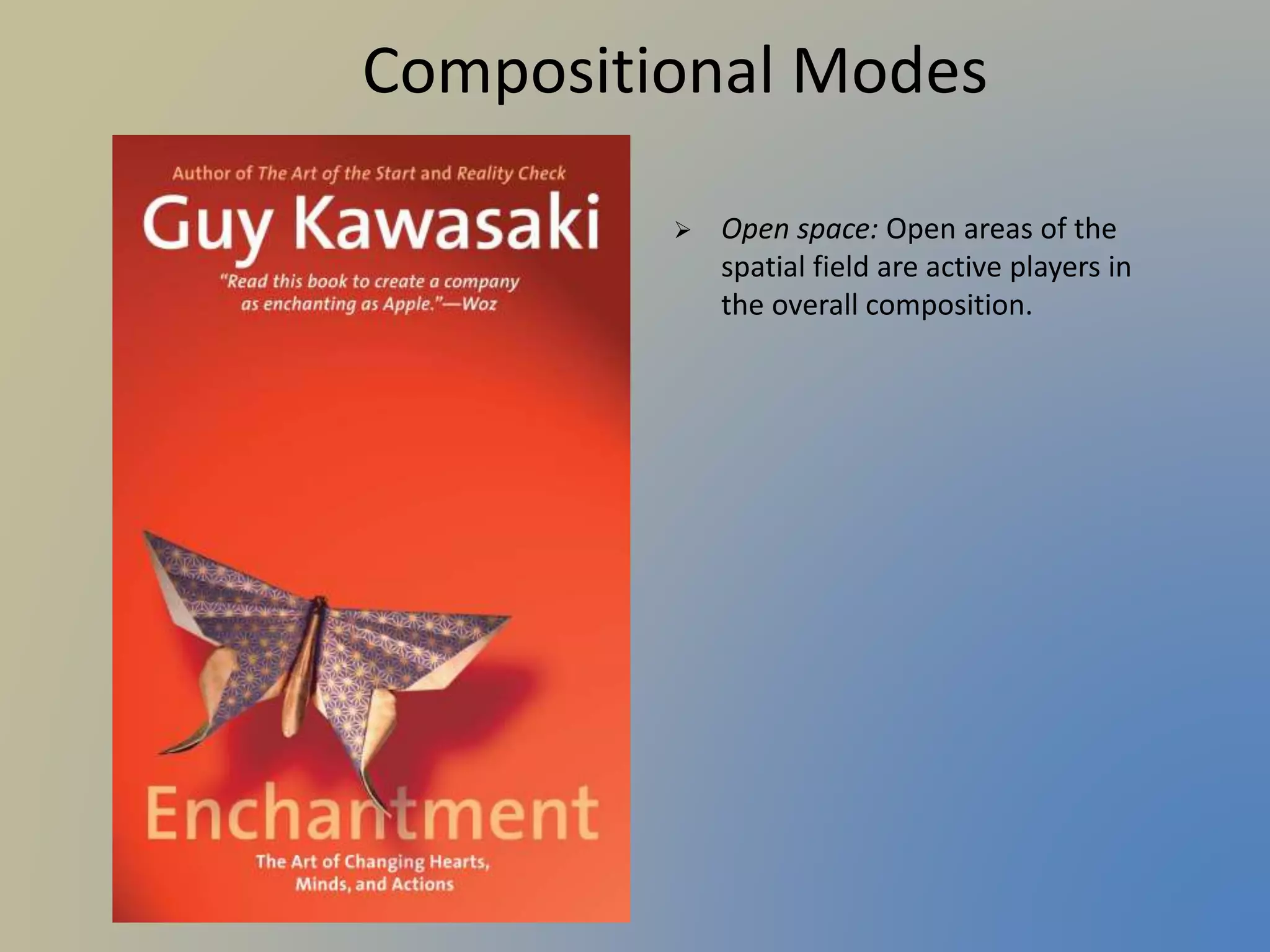
Explore various compositional modes like symmetry, modular grids, and focal points for effective cover designs.
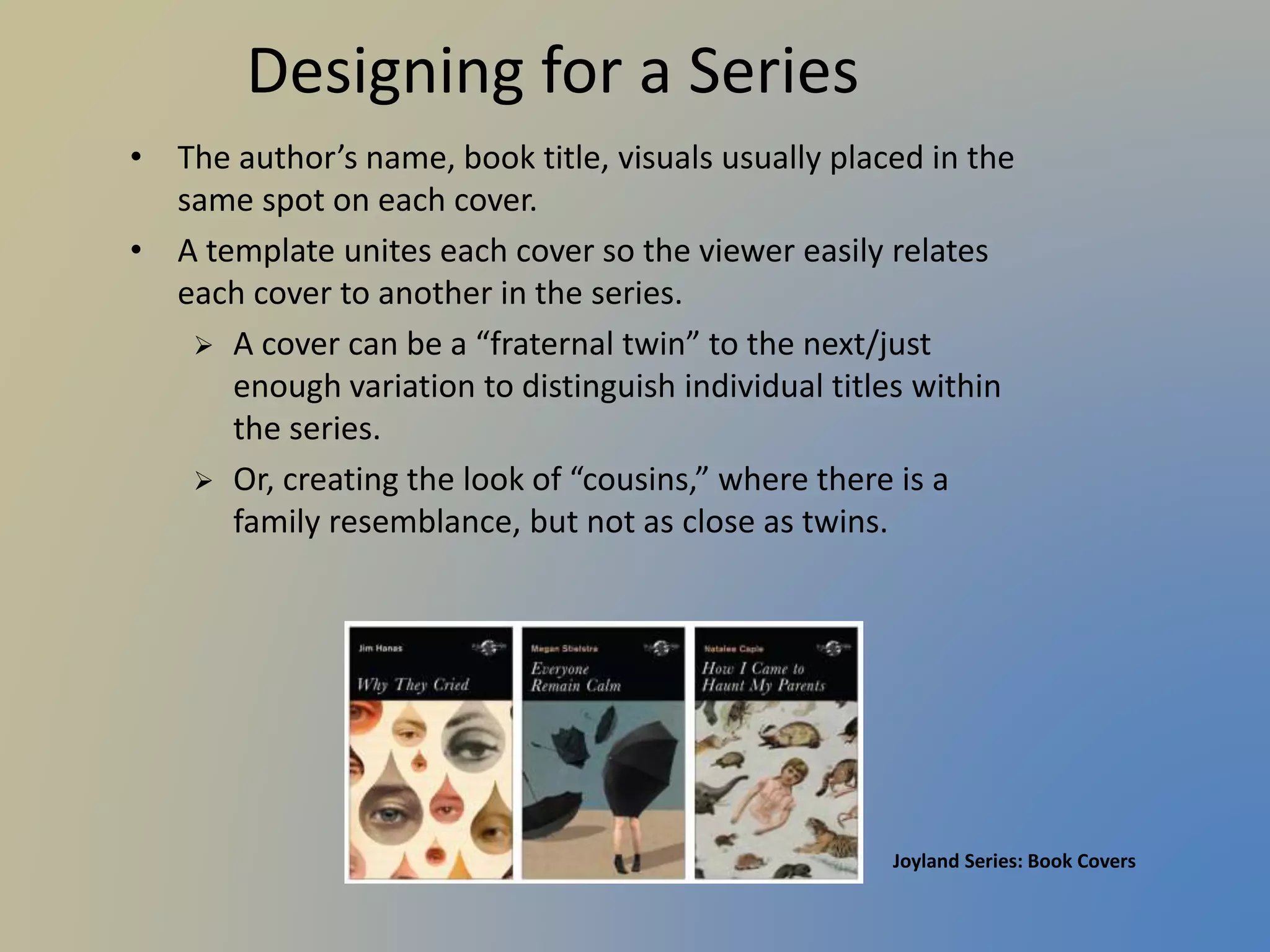
Understand how to design covers that visually connect within a series while differentiating each title.
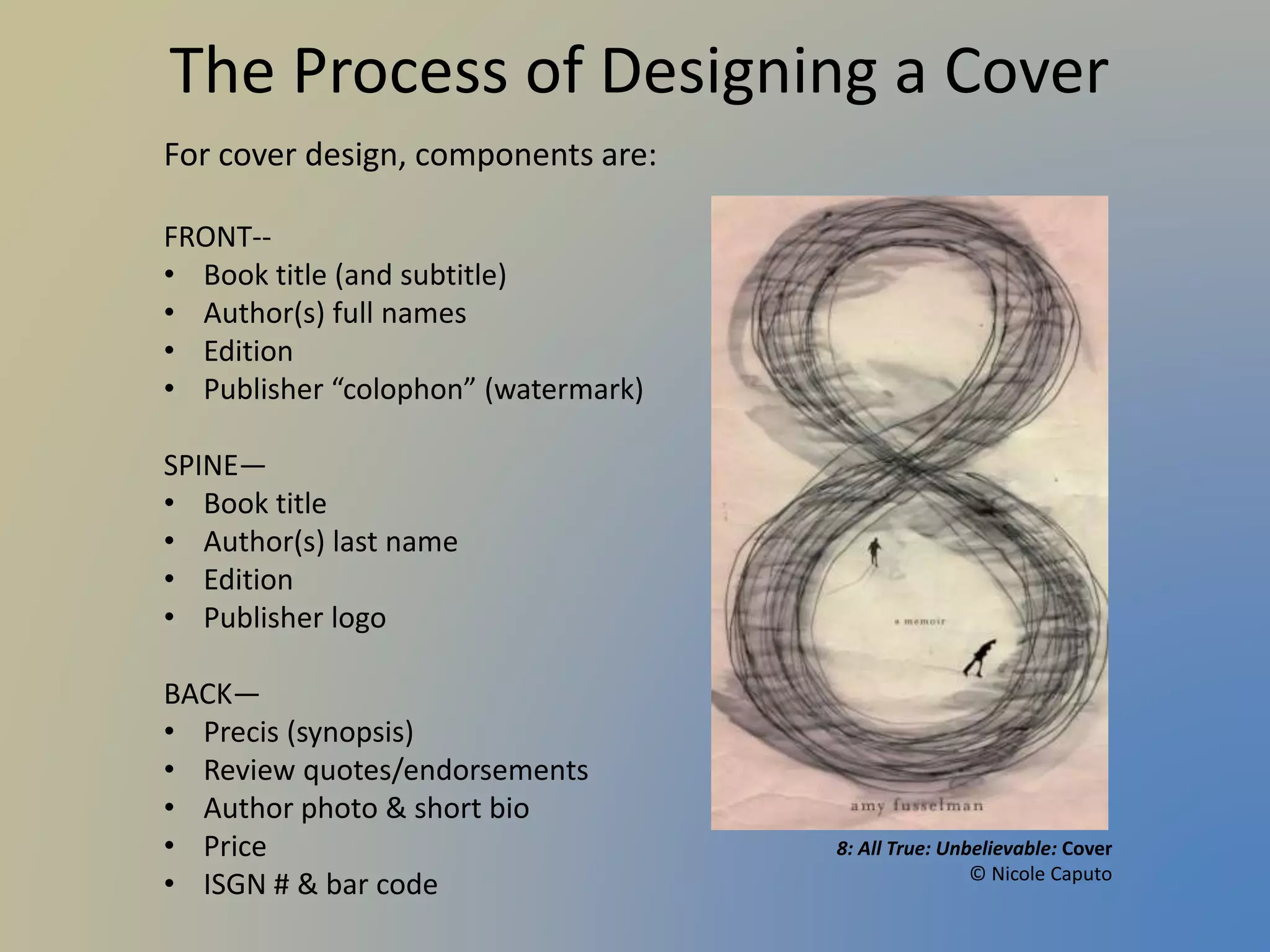
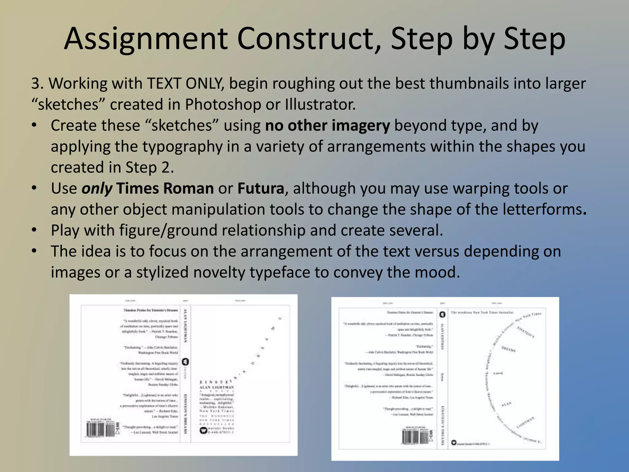
Detailed instructions for designing a trade paperback cover focusing on typography and overall design elements.


![Wondershare Filmora 15.0.11 Crack for Mac Key Full Download [Latest] pptx](https://cdn.slidesharecdn.com/ss_thumbnails/software-251207184836-1d16ba16-thumbnail.jpg?width=640&height=640&fit=bounds)


![iStat Menus 7.20 Crack for MacOS 2026 Full Version [Latest] pptx](https://cdn.slidesharecdn.com/ss_thumbnails/softwareoverview-251207191544-22b737dc-thumbnail.jpg?width=640&height=640&fit=bounds)


