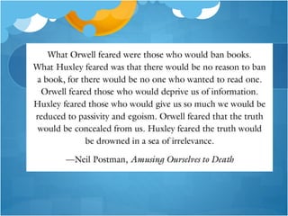
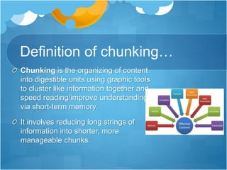
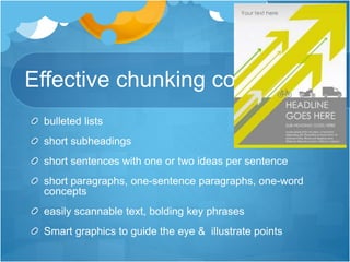
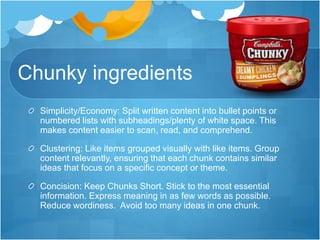
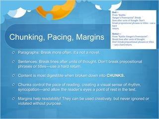
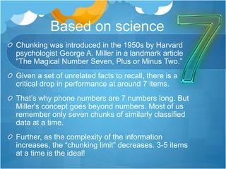
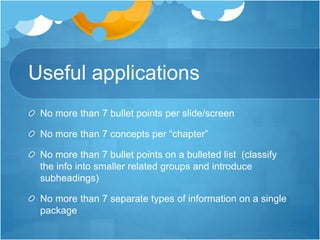
3. Information hurts…
We live in an information age, bombarded by data.
The amount of information we receive in a short
period of time is overwhelming due to its
randomness.
Neuroscientists estimate the brain receives 40 billion
pieces of information every second but only sends 40
of these pieces to the conscious mind for processing.
Working memory, which processes information, can
only hold a limited amount of information at any one
time.
4. The answer?
When content is ordered by relationship (like ideas
together) and organized using size, color, and shape
contrast, instead of in a massive jumble, it is more
easily assimilated.
Better marketers limit content, to avoid an overload
in the working memory and enable connections with
information already in long term memory.
5. Chunk it.
Deliver your message in meaningful units ("chunks").
Split concepts into small pieces or "chunks" of
information to make reading faster and easier.
Categorize! Isolate the key points.
Grouping information so the consumer easily
understands it is effective “chunking.”
6. Chunk it.
Chunking is based on the assertion that
our working memory is easily overloaded
by excessive detail.
It is especially useful for advertising or
content marketing because readers tend
to scan for specific information rather than
read a page sequentially.
7. Definition of chunking…
Chunking is the organizing of content
into digestible units using graphic tools
to cluster like information together and
speed reading/improve understanding
via short-term memory.
It involves reducing long strings of
information into shorter, more
manageable chunks.
8. Effective chunking contains…
bulleted lists
short subheadings
short sentences with one or two ideas per sentence
short paragraphs, one-sentence paragraphs, one-word
concepts
easily scannable text, bolding key phrases
Smart graphics to guide the eye & illustrate points
9. Chunky ingredients
Simplicity/Economy: Split written content into bullet points or
numbered lists with subheadings/plenty of white space. This
makes content easier to scan, read, and comprehend.
Clustering: Like items grouped visually with like items. Group
content relevantly, ensuring that each chunk contains similar
ideas that focus on a specific concept or theme.
Concision: Keep Chunks Short. Stick to the most essential
information. Express meaning in as few words as possible.
Reduce wordiness. Avoid too many ideas in one chunk.
10. Chunking, Pacing, Margins
Paragraphs: Break more often. It’s not a novel.
Sentences: Break lines after units of thought. Don’t break prepositional
phrases or titles—use a hard return.
Content is most digestible when broken down into CHUNKS.
Chunks control the pace of reading, creating a visual sense of rhythm,
syncopation—and allow the reader’s eyes a point of rest in the text.
Margins help readability! They can be used creatively, but never ignored or
violated without purpose.
11. Orchestrating Flow of Info
• How to achieve emphasis using smart typography:
Emphasis by isolation/proximity
Emphasis by placement/eye path/smart use of
white space
Emphasis through scale (size relationships of title to
subtitle to text as well as to images)
Emphasis through contrast
Emphasis through directional cues/use of lines
Emphasis through unity/consistency
Emphasis through color coordination
12. Simplify.
Text Heavy: If a project is text heavy, you should narrow your choices
to typefaces that are eminently readable as well as a typeface from an
extended type family, which offers many options while sustaining unity.
13. Based on science
Chunking was introduced in the 1950s by Harvard
psychologist George A. Miller in a landmark article
"The Magical Number Seven, Plus or Minus Two.”
Given a set of unrelated facts to recall, there is a
critical drop in performance at around 7 items.
That’s why phone numbers are 7 numbers long. But
Miller's concept goes beyond numbers. Most of us
remember only seven chunks of similarly classified
data at a time.
Further, as the complexity of the information
increases, the “chunking limit” decreases. 3-5 items
at a time is the ideal!
14. Useful applications
No more than 7 bullet points per slide/screen
No more than 7 concepts per “chapter”
No more than 7 bullet points on a bulleted list (classify
the info into smaller related groups and introduce
subheadings)
No more than 7 separate types of information on a single
package
15. Reader Fatigue
A long paragraph of text can bring on instant tiredness for
mere psychological reasons.
It looks hard to read.
Use short lines: the average reader cannot handle more
than 35 characters per line before eye fatigue sets in.
Think Twitter…160 character limits
16. Love them bullets
A well laid out text with titles and bullet points is more
attractive because white space abounds.
A person can more easily skim over the information
and pick out key points and assimilate it quicker.
17. Chunky ingredients…
Readability: Use easy-to-read body text. Save the artistic type treatments
for headlines.
Logical Organization of Info : Think in terms of categories and an outline of
information. Titles, headings, and subheadings should be meaningful and
describe what each chunk of content covers.
Inverted Pyramid: Prioritize chunks in order of importance. Important
information forms the base of the pyramid, presented first; the least
important forms the tip, presented last.
Eyepath: Use layouts that facilitate fast navigation and effective gestalt
principles
18. Cards
Segmented chunks of data called cards displayed within
“containers” have been steadily growing in popularity on
the web.
One block (or card) equals one chunk of user interaction.
starting with the image-sharing site Pinterest
evolving alongsideother techniques such as responsive
design and flat design.
19. Grids
Designers are iterating the technique by adhering to
amore strict grid or masonry-style framework that
includes blocksof content either spaced out or
connected perfectly throughout the layout.
Some designers create the grid by weaving together
cards or other container-style patterns
20. Tips for Designing Great Cards
1. Use plenty of space – White space helps provide
separation between elements within each card.
2. One piece of information per card – Think of each card
as a unique call to action.
3. Select a clear, crisp image – Card images are small
and should be cropped and scaled appropriately for the
“containers” in which they reside.
21. Tips for Designing Great Cards
4. Use simple typography – While a fancy headline can work,
simple typography rules in the often-small format.
5. Include an unexpected detail – Consider an animated
effect, video, round frame or use a unique color scheme to
make your cards stand out from what other designers are
doing.
6. Create an open grid – Create a standard grid that outlines
consistent spacing between cards and works across various
sizes and breakpoints.
7. Prioritize usability – Focus on what each card is supposed
to do ahead of the visuals and then design it to fulfill that user
promise.
22. Learn about minimalist design
https://www.dropbox.com/s/n5vbhx8uj5q6619/uxpin_
curated_collection_cards_and_minimalism.pdf?dl=0