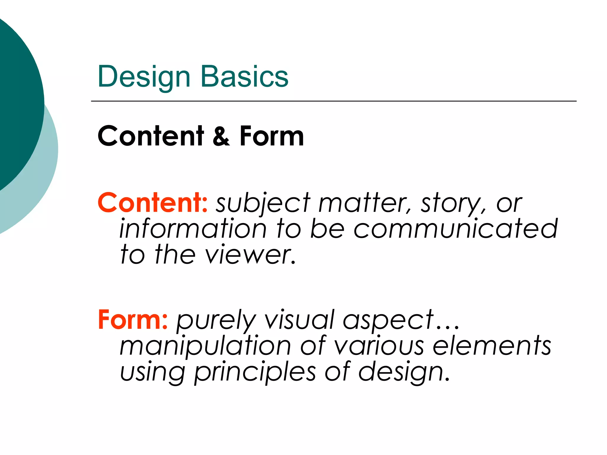
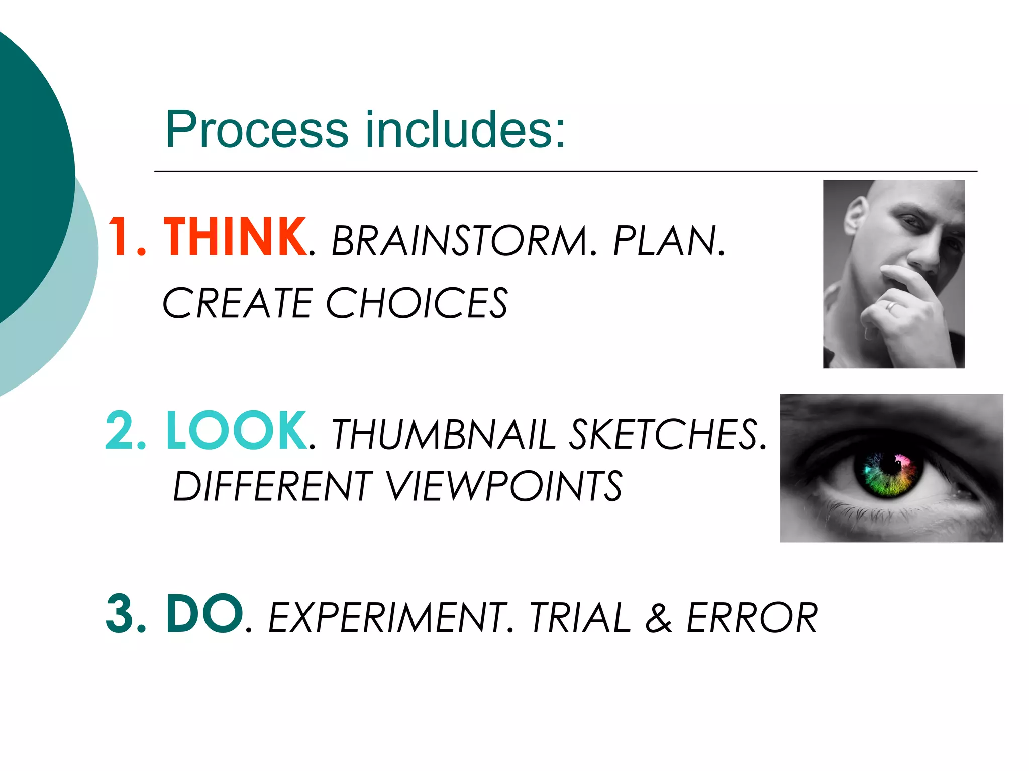
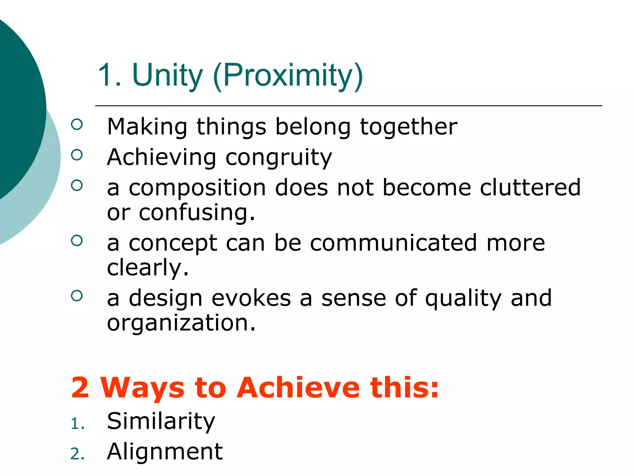
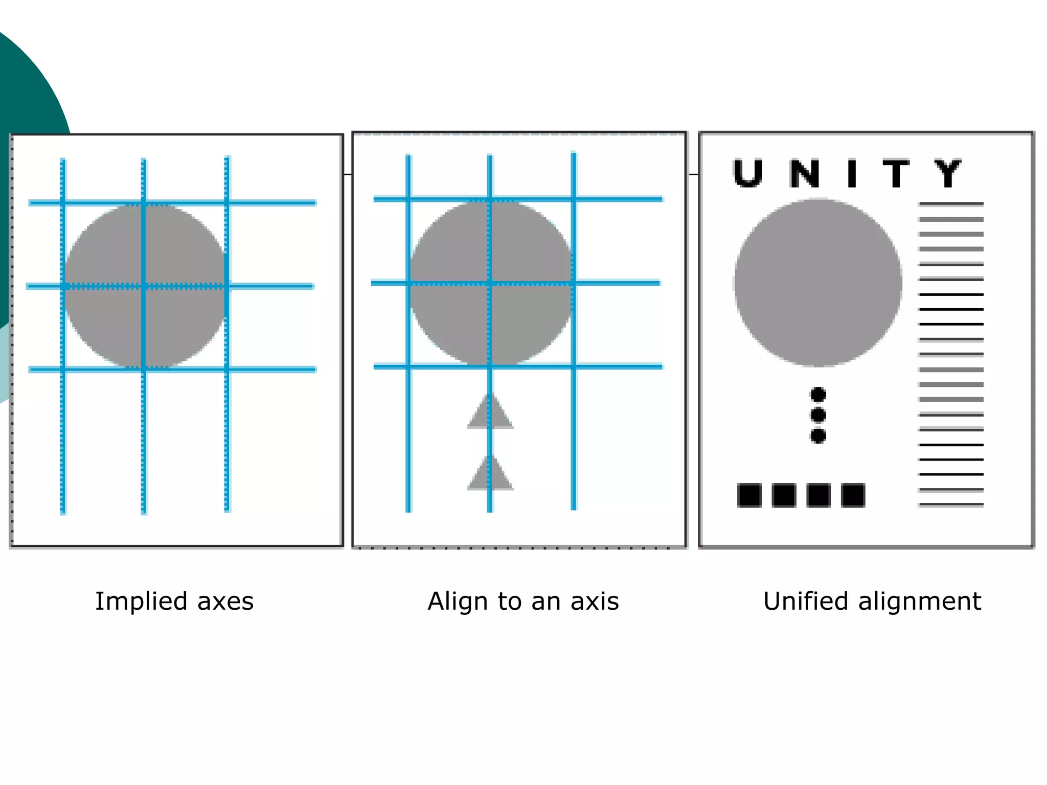
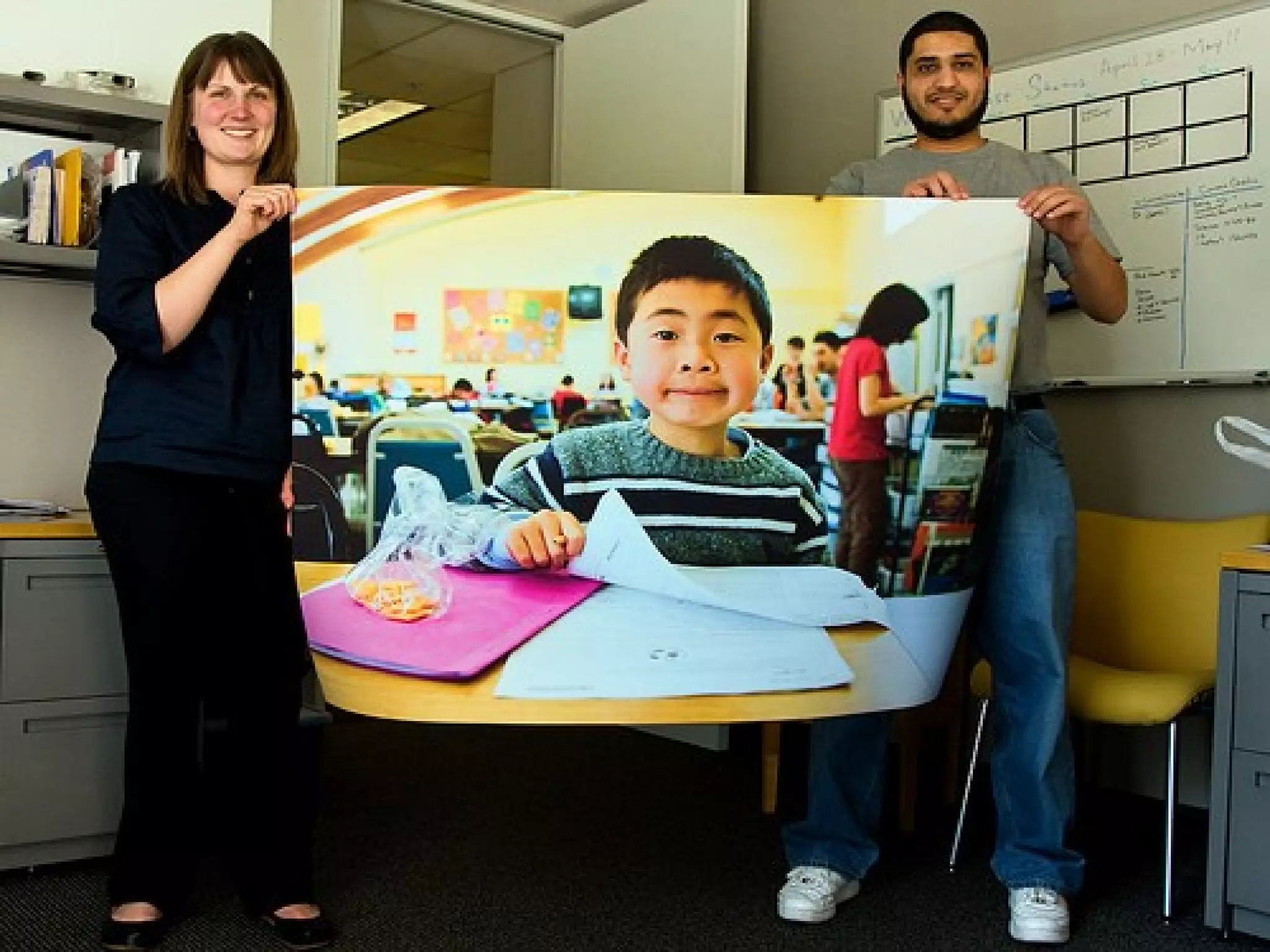
Basic Principles
of Design
Design Basics
Content & Form
Content: subject matter, story, or
information to be communicated
to the viewer.
Form: purely visual aspect…
manipulation of various elements
using principles of design.
Process includes:
1. THINK. BRAINSTORM. PLAN.
CREATE CHOICES
2. LOOK. THUMBNAIL SKETCHES.
DIFFERENT VIEWPOINTS
3. DO. EXPERIMENT. TRIAL & ERROR
1. Unity (Proximity)
 Making things belong together
 Achieving congruity
 a composition does not become cluttered
or confusing.
 a concept can be communicated more
clearly.
 a design evokes a sense of quality and
organization.
2 Ways to Achieve this:
1. Similarity
2. Alignment
Similarity
2 ways to achieve Similarity:
1. Repetition
 Repeating colors, shapes, values,
textures, or lines creates a visual
relationship between elements, called
correspondence.
2. Proximity
 Placing objects on your page closer
together or overlapping making them a
total, related pattern.
Alignment
2 ways to achieve Alignment:
1. Placement:
 Placing objects next to each other
leaving very little “white space” (like
fitting puzzle pieces together)
2. Continuation:
 The eye moves smoothly from one form
or shape to another (image is
organized into a pattern)
 When and element is placed in a
composition, it creates an implied
horizontal and vertical axis at its top,
bottom, center and sides. Aligning
other elements to these axes creates a
visual relationship which unifies them.
Implied axes Align to an axis Unified alignment
2. Focal Point
 Emphasizes elements in the design
 “Catching the eye” of the viewer
3. Balance
 Balance is the distribution of visual
weight. There is an assumed vertical
axis and the eye expects to see equal
distribution of visual weight on either
side.
Types of Balance
1. Symmetrical
2. Asymmetrical
3. Radial Balance
4. Crystallographic Balance
1. Symmetrical Balance
 Is when shapes are repeated on
either side of the vertical axis
 A mirror image
2. Asymmetrical Balance
 Balance is achieved on either side of
the vertical axis using dissimilar
objects.
 This can be done with colour value,
shape and texture, or by position
and eye direction.
3. Radial Balance
 Can be either of the above but it
assumes that objects are distributed
around a centre point
4. Crystallographic Balance
 Is a continuing pattern throughout
the picture but it can be either
symmetrical or asymmetrical
4. Scale and Proportion
 Scale is size (an object is large, an
object is small)
 Proportion is relative size (One
object is larger than another object)
 Importance of an object in a
picture is often related to its size.
 A larger object often commands
greater attention than a small one
 Since we expect certain objects to
be bigger than other objects, we
can play with that idea to make an
object more important than it would
normally be.
Ex. By playing with perspective
(the angle at which we look at
things), we could make the
smaller object LOOK bigger than
the larger object making the
smaller object more important.
5. Emphasis
 Emphasis is attracting attention or
“catching the eye” of the viewer
by making certain element of the
design the focal point or point of
interest.
There are 3 Components of
Emphasis:
1. Contrast
2. Placement
3. Isolation
1. Contrast
 Contrast can be achieved by
having:
 dark vs light areas in your design
 natural images vs abstract images
 large vs small images
 same vs a different shape
 many objects of the same or similar
colour vs one of a completely
different colour
2. Placement
 Making some objects on a page
“point” towards a particular object,
making it the centre of interest.
3. Isolation
 Placing an object away from the
group or having a feeling that
“something is missing” are
examples of creating emphasis
through Isolation
Basic principles of design

Basic principles of design

  • 1.
  • 2.
    Design Basics Content &Form Content: subject matter, story, or information to be communicated to the viewer. Form: purely visual aspect… manipulation of various elements using principles of design.
  • 3.
    Process includes: 1. THINK.BRAINSTORM. PLAN. CREATE CHOICES 2. LOOK. THUMBNAIL SKETCHES. DIFFERENT VIEWPOINTS 3. DO. EXPERIMENT. TRIAL & ERROR
  • 8.
    1. Unity (Proximity) Making things belong together  Achieving congruity  a composition does not become cluttered or confusing.  a concept can be communicated more clearly.  a design evokes a sense of quality and organization. 2 Ways to Achieve this: 1. Similarity 2. Alignment
  • 9.
    Similarity 2 ways toachieve Similarity: 1. Repetition  Repeating colors, shapes, values, textures, or lines creates a visual relationship between elements, called correspondence. 2. Proximity  Placing objects on your page closer together or overlapping making them a total, related pattern.
  • 10.
    Alignment 2 ways toachieve Alignment: 1. Placement:  Placing objects next to each other leaving very little “white space” (like fitting puzzle pieces together)
  • 11.
    2. Continuation:  Theeye moves smoothly from one form or shape to another (image is organized into a pattern)  When and element is placed in a composition, it creates an implied horizontal and vertical axis at its top, bottom, center and sides. Aligning other elements to these axes creates a visual relationship which unifies them.
  • 12.
    Implied axes Alignto an axis Unified alignment
  • 17.
    2. Focal Point Emphasizes elements in the design  “Catching the eye” of the viewer
  • 21.
    3. Balance  Balanceis the distribution of visual weight. There is an assumed vertical axis and the eye expects to see equal distribution of visual weight on either side. Types of Balance 1. Symmetrical 2. Asymmetrical 3. Radial Balance 4. Crystallographic Balance
  • 22.
    1. Symmetrical Balance Is when shapes are repeated on either side of the vertical axis  A mirror image
  • 24.
    2. Asymmetrical Balance Balance is achieved on either side of the vertical axis using dissimilar objects.  This can be done with colour value, shape and texture, or by position and eye direction.
  • 27.
    3. Radial Balance Can be either of the above but it assumes that objects are distributed around a centre point
  • 29.
    4. Crystallographic Balance Is a continuing pattern throughout the picture but it can be either symmetrical or asymmetrical
  • 31.
    4. Scale andProportion  Scale is size (an object is large, an object is small)  Proportion is relative size (One object is larger than another object)  Importance of an object in a picture is often related to its size.  A larger object often commands greater attention than a small one
  • 32.
     Since weexpect certain objects to be bigger than other objects, we can play with that idea to make an object more important than it would normally be. Ex. By playing with perspective (the angle at which we look at things), we could make the smaller object LOOK bigger than the larger object making the smaller object more important.
  • 35.
    5. Emphasis  Emphasisis attracting attention or “catching the eye” of the viewer by making certain element of the design the focal point or point of interest. There are 3 Components of Emphasis: 1. Contrast 2. Placement 3. Isolation
  • 36.
    1. Contrast  Contrastcan be achieved by having:  dark vs light areas in your design  natural images vs abstract images  large vs small images  same vs a different shape  many objects of the same or similar colour vs one of a completely different colour
  • 38.
    2. Placement  Makingsome objects on a page “point” towards a particular object, making it the centre of interest.
  • 40.
    3. Isolation  Placingan object away from the group or having a feeling that “something is missing” are examples of creating emphasis through Isolation