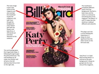
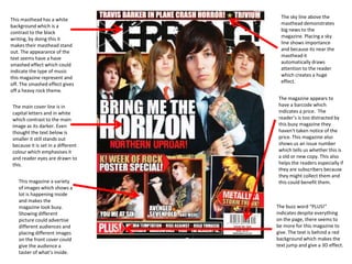
The magazine cover uses bold colors, fonts, and positioning of images and text to draw attention and convey key information. The central image of Katy Perry dominates the page. Her direct gaze at the viewer is intended to involve the audience. Use of buzzwords and differing fonts emphasize important stories and promotions. Proper placement of the masthead, issue date, and other elements follows industry conventions to clearly communicate the publication's identity and contents.
The faster you grow, the faster your small business grows. The more you take care of yourself, the better you serve your clients. Yes, it really is that simple!
21 must haves om meer resultaat te halen uit Google Analytics Online Boswachters
21 dingen die je zeker niet mag vergeten als het gaat om Google Analytics. Om in te stellen of om te bekijken. Onmisbaar voor elke online marketeer die online marketing serieus neemt. Google Analytics of Google Webmaster Tools is extreem handig voor zowel SEO als voor SEA. Met deze 21 tips ben je er dus helemaal klaar voor.
De rol van Lean Analytics in je omnichannel strategie | Webwinkel VakdagenOnline Boswachters
In samenwerking met Webdesigner Magazine heb ik op 20 januari 2016 een presentatie gegeven op de Webwinkel Vakdagen waar ik verteld heb wat het belang van analytics is en hoe je dingen optimaal meetbaar kunt maken. Daarnaast heb ik door middel van Lean Analytics veel praktijkvoorbeelden genoemd hoe je als webwinkel met deze materie om kunt gaan in elke fase van het hebben van een webwinkel.
Google Analytics en Google Tag Manager Masterclass | (Mike van Hoenselaar)Online Boswachters
Een presentatie over verschillende belangrijke aspecten van Google Analytics en Google Tag Manager. Handson voorbeelde. Veel praktische tips over rapporten, events, filters en dashboards. Gegarandeerd leer je iets van deze presentatie.
Onmisbare tips voor jouw Customer Experience door middel van Lean Analytics |...Online Boswachters
In samenwerking met Webdesigner Magazine heb ik op 21 januari 2016 een presentatie gegeven op de Webwinkel Vakdagen waar ik verteld heb wat het belang van analytics is en hoe je jouw klantbeleving beter inzichtelijk kunt krijgen. Bijvoorbeeld om meer conversie te krijgen. Daarnaast heb ik door middel van Lean Analytics veel praktijkvoorbeelden genoemd hoe je als webwinkel met deze materie om kunt gaan in elke fase van het hebben van een webwinkel.
Analytics (Mike van Hoenselaar, Online Boswachters) | Startup School Amsterda...Online Boswachters
Workshop van 4 uur over metrics, Analytics, Lean startup, Lean Analytics, enorm veel praktijkvoorbeelden. Je weet wat metrics zijn en hoe je goede en slechte herkend. Je weet wat Lean Analytics en de 5 fases en 6 verdienmodellen hiervan. Je weet het belang van One Metric That Matters. Je hebt voor een bedrijf de OMTM voor elke van de 5 fases bepaald. Daarnaast weet je de basis van Google Analytics en heb je enkele opdrachten gedaan om de interface van Google Analytics te leren kennen.
2. The main image The masthead is
is put in the completely different
centre of the colour from the
magazine and background. The font is
also overlaps bold, clear and the
the masthead colour is a contrast to
to give the everything else on the
magazine a 3D magazine. The filled in ‘a’
look. Even and ‘d’ makes the title
though the stand out, making it
background different and colourful.
colour blend
well with the
flowers and
Katy Perry, it This plug is put into
still stands out a circle showing the
and draw importance. It
attention to the shows its more
audience. significant than the
other stories on the
left hand side.
The sub-headings gives
the image body shape, it
following through to give
the photo dimension. The ‘Katy Perry’ is in bold
sub-headings are all black writing which is a
under one another and contrast to the pink
all laid on the left background. It shows its
whereas Katy Perry is lent going to be the main
on the right side. story of this magazine.
3. The main image dominates the
The masthead is bold and
page. It a close up of her face and
set in a very large font
the artist’s stare is straight at the
which brings attention to
audience, who are directly
the audience. It follows
addressed. The main cover line is
conventions because it is
above the artist, they did this
basic and the position is on
because it doesn’t get in the way
the top cover takes 1/3 of
of her close up. The colour is
the page making it visible
white and in capital letters which
in shops.
stands out. It is the second
biggest text after the masthead.
A pull quote is set above the
The centre image takes up subheading, because it is in a
the whole page of the large font, it draws attention to
magazine, this represent that the reader .
this issue is strictly about the
women on the front cover.
This magazine
follows conventions
This magazine shows you
because the colour
the date of when the
scheme seems to be
magazine was issue. This
simple. Other than
shows the reader if its an
the masthead, it
old or new issue, keeping
only uses 2 different
them up to date. This also
colours. They use
encourages readers to buy
blue for bullet points
or carry on buying this
and to make things
magazine. The barcode on
stands out which
the bottom left hand side
goes nicely with the
indicates the price to the
artist eyes. Its
reader but it is not very
emphasises her eyes
clear so they are not
and draws your
distracted by the price and
attention to her.
distracted about other
things on the magazine such
as sub-headings and main
image.
4. The colour scheme of this
magazine effects how the
reading sees the magazine. The
The word “EXES” is put in
masthead “VIBE” is in capital
capital letters and in a
letters and bold white. The
different colour which makes
sub-heading is also in white
its even more bold and
which indicates that this is the
stands out than other text.
main story. The white text
contrast with the green and
dark red background which
makes the white stands out
more. This makes it eye- The mode of address in this
catching for the audience. magazine has a lot of
variety. The sub-heading
Chris Brown says “I’m still a virgin here shows it is packed with
in your eyes”. By using a pull different genres. This opens
quote from a story inside the them up to a wider target
magazine draws you into buying audience.
the magazine and by using “your”
it connects with the reader and it
creates a effect on how is the
magazine going to effect the This magazine used a lot of
audience. buss words to help
advertise their magazine.
The main image is a man in the They have used “mega” and
centre of the magazine and “hottest” to establish their
overlaps the masthead. This magazine is the one that
shows his importance in the contains these features and
magazine and that there must other magazines don’t. They
have a story about him in the have put their offers in a
magazine. This is a clear cut of red circle to emphasis and
him, cutting off halfway of his make it looks exclusive.
body. The magazine advertises
Chris Brown because its very
noticeable and clear. The
background shows him in his
ordinary life and not in a
studio/stage.
5. The masthead is bold and
The main image is centre in the
capital letters for audience to
middle and both artists are look
recognise that it is NME. The
directly at you, which already
colour red represent angry
involves the audience. Their
and danger and also
clothing seem to be black and
represent themselves. The
white which is a contrast to the
main heading goes nicely
red writing, “the return of
with the theme and the
kasabian” written over the
masthead. It also aim for a
image. The background seems
particular audience.
to be clear so its makes the
artist pop out.
The use of buzz words
such as “WIN!” draws the The front used for this
reader in. the buzz word particular word “insane”
is put into a circle with describe the type of music this
emphasise the band is. Changing the style
promotion. emphasises the word more and
makes it stand out from the rest
of the cover line.
The colour used in this
magazine all compliment This magazine has a date
each other, it creates a of when the magazine
theme to the magazine was issued, keeping them
by only using block colour up to date and showing
such as red, black and the reader if its an old or
white. The sub-heading is latest issue. The barcode
place on the left hand indicates that it does have
side so it doesn’t get in a price and because it is
the way of the main written in such small
image. Only 2 colour are writing the reader doesn’t
used for the sub- seem to care and is
headings but it still distracted by other things
stands out and reader’s going on, such as main
will still take notice. image.
6. The sky line above the
This masthead has a white
masthead demonstrates
background which is a
big news to the
contrast to the black
magazine. Placing a sky
writing, by doing this it
line shows importance
makes their masthead stand
and because its near the
out. The appearance of the
masthead it
text seems have a have
automatically draws
smashed effect which could
attention to the reader
indicate the type of music
which creates a huge
this magazine represent and
effect.
off. The smashed effect gives
off a heavy rock theme.
The magazine appears to
The main cover line is in have a barcode which
capital letters and in white indicates a price. The
which contrast to the main reader’s is too distracted by
image as its darker. Even this busy magazine they
thought the text below is haven't taken notice of the
smaller it still stands out price. This magazine also
because it is set in a different shows us an issue number
colour which emphasises it which tells us whether this is
and reader eyes are drawn to a old or new copy. This also
this. helps the readers especially if
they are subscribers because
they might collect them and
This magazine a variety this could benefit them.
of images which shows a
lot is happening inside
and makes the
magazine look busy. The buzz word “PLUS!”
Showing different indicates despite everything
picture could advertise on the page, there seems to
different audiences and be more for this magazine to
placing different images give. The text is behind a red
on the front cover could background which makes the
give the audience a text jump and give a 3D effect.
taster of what’s inside.