The document summarizes the design elements of a magazine cover and how they appeal to the target audience. Key points include:
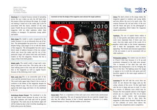
- The masthead takes up only the left side so as not to obscure the image, and its bright red color and classic font style appeal to a older audience.
- The close-up image of the pop singer gives her a "rock look" to tie into the magazine's theme, and her eye contact may intrigue readers.
- Varied cover lines in different sizes highlight popular articles and artists, giving readers options and showing the magazine's music focus.
- Dark colors, lighting, and contrast between image and text make the cover visually appealing and professional looking for its