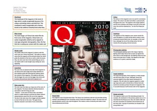
Salford City College
Eccles Centre
AS Media Studies
Foundation Portfolio

 Masthead                                                                                                                                                           Colour
 The masthead of this magazine is the iconic Q                                                                                                                      The colours in this magazine cover are used for connotative
 logo which is easily recognisable because of its                                                                                                                   impact. The colours red, black and white is used primarily
                                                                                                                                                                    throughout the cover. This appeals to the target audience
 unique contrasting colours and bold font. This
                                                                                                                                                                    and the red is striking so the things in red such as the main
 masthead is easily recognisable and a famous
                                                                                                                                                                    cover line and the masthead etc… are the first things you
 brand so the audience instantly know what they                                                                                                                     read.
 are going to buy and what they expect to read.

 Main image                                                                                                                                                         Typefaces
 The main image is of Cheryl Cole which fills the                                                                                                                   The typefaces of this magazine cover remain mostly the
 front cover of the magazine. Cheryl Cole is an                                                                                                                     same throughout. It is quite formal which creates a sense
                                                                                                                                                                    of maturity around Cheryl Cole. For example, in the cover
 easily recognisable celebrity and so appeals to
                                                                                                                                                                    lines, although the size of the writing varies, the font
 most age and gender demographics. Also, the fact
                                                                                                                                                                    remains the same giving a formal outcome.
 that she is making eye contact with the reader and
 because she is in a relatively erotic poseappeals to
 the audience.
 Model credit                                                                                                                                                       Photography Lighting
                                                                                                                                                                    The photography lighting used in this image is high key
 The model credit of this magazine is mixed in with the
                                                                                                                                                                    lighting which helps Cheryl Cole to stand out against the
 main cover line “Cheryl Cole Rocks”. This helps to create a
                                                                                                                                                                    dark colours of the background. The lighting makes her face
 sense that the magazine will be primarily about her which
                                                                                                                                                                    seems more pale than in reality. This appeals to the male
 grabs the attention of her fans as well as other fan bases.
                                                                                                                                                                    audience as it is quite a seductive image.
 Also, the main cover line is the second thing you see so
 the model credit is read straight away making her more
 appealing.


 Coverlines
 The cover lines are placed at the side of the magazine to
 not obscure the main image and to keep attention on
 that celebrity whilst still informing the audience about                                                                                                           Target Audience
 the contents of the magazine. The audience will know                                                                                                               The target demographic of this magazine is mainly people
 that the bigger the cover line the bigger that article will                                                                                                        who like those types of music. Although, Cheryl Cole
 be about that particular band which appeals to all                                                                                                                 contrasts slightly to the other bands mentioned in Q
                                                                                                                                                                    magazine. This will make the magazine appeal to a wider
                                                                                                                                                                    age range and as well as female fans of Cheryl Cole who
 Main cover line                                                                                                                                                    would not normally purchase this genre of magazine. This
 The main cover line takes up a large area of the cover of                                                                                                          is successful because it will increase sales of the magazine.
 the magazine. This draws attention directly towards it
 and makes it the first thing you read.
  ‘3 Words…’ is the name of Cheryl Cole’s new album
 which is a subtle attempt to promote the album without                                                                                                             Design principle
 taking attention away from the rest of the magazine.          House Style                                                                                          This magazine makes use of the Gutenberg principle. For
 The text in the main cover line is bigger and also brighter   The magazine cover has good house style. The colours are continuous with the red and white writing   example, the masthead is in the primary optical area so it is
 to most of the text on the cover. This again draws            making it eye grabbing but also conveying a sense of what the magazine is about. The same font and   naturally the first thing we see. Also, the model credit and
 attention towards it and makes it more memorable.             spacing between words is also used throughout. This creates a sense of maturity and makes it look    the main covverlines are situated in the terminal area of
                                                               more professional and formal.                                                                        the front cover. A group of covverlines are situated in the
                                                                                                                                                                    strong fallow area.

Magazine Front Cover Analysis

  • 1.
    Salford City College EcclesCentre AS Media Studies Foundation Portfolio Masthead Colour The masthead of this magazine is the iconic Q The colours in this magazine cover are used for connotative logo which is easily recognisable because of its impact. The colours red, black and white is used primarily throughout the cover. This appeals to the target audience unique contrasting colours and bold font. This and the red is striking so the things in red such as the main masthead is easily recognisable and a famous cover line and the masthead etc… are the first things you brand so the audience instantly know what they read. are going to buy and what they expect to read. Main image Typefaces The main image is of Cheryl Cole which fills the The typefaces of this magazine cover remain mostly the front cover of the magazine. Cheryl Cole is an same throughout. It is quite formal which creates a sense of maturity around Cheryl Cole. For example, in the cover easily recognisable celebrity and so appeals to lines, although the size of the writing varies, the font most age and gender demographics. Also, the fact remains the same giving a formal outcome. that she is making eye contact with the reader and because she is in a relatively erotic poseappeals to the audience. Model credit Photography Lighting The photography lighting used in this image is high key The model credit of this magazine is mixed in with the lighting which helps Cheryl Cole to stand out against the main cover line “Cheryl Cole Rocks”. This helps to create a dark colours of the background. The lighting makes her face sense that the magazine will be primarily about her which seems more pale than in reality. This appeals to the male grabs the attention of her fans as well as other fan bases. audience as it is quite a seductive image. Also, the main cover line is the second thing you see so the model credit is read straight away making her more appealing. Coverlines The cover lines are placed at the side of the magazine to not obscure the main image and to keep attention on that celebrity whilst still informing the audience about Target Audience the contents of the magazine. The audience will know The target demographic of this magazine is mainly people that the bigger the cover line the bigger that article will who like those types of music. Although, Cheryl Cole be about that particular band which appeals to all contrasts slightly to the other bands mentioned in Q magazine. This will make the magazine appeal to a wider age range and as well as female fans of Cheryl Cole who Main cover line would not normally purchase this genre of magazine. This The main cover line takes up a large area of the cover of is successful because it will increase sales of the magazine. the magazine. This draws attention directly towards it and makes it the first thing you read. ‘3 Words…’ is the name of Cheryl Cole’s new album which is a subtle attempt to promote the album without Design principle taking attention away from the rest of the magazine. House Style This magazine makes use of the Gutenberg principle. For The text in the main cover line is bigger and also brighter The magazine cover has good house style. The colours are continuous with the red and white writing example, the masthead is in the primary optical area so it is to most of the text on the cover. This again draws making it eye grabbing but also conveying a sense of what the magazine is about. The same font and naturally the first thing we see. Also, the model credit and attention towards it and makes it more memorable. spacing between words is also used throughout. This creates a sense of maturity and makes it look the main covverlines are situated in the terminal area of more professional and formal. the front cover. A group of covverlines are situated in the strong fallow area.