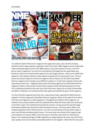
This document analyzes and compares the styles, audiences, and layouts of two music magazines: NME and Metal Hammer. It finds that both magazines use consistent mastheads and focal center images to attract their target demographics. NME aims for a wider audience and variety of music genres in its content. Its style is less intense than Metal Hammer's darker style targeted towards heavy metal fans. Both magazines effectively use the principles of page design, with mastheads drawing initial attention and center images acting as key selling points for the issue's stories.


![Coveranalysis[1]](https://cdn.slidesharecdn.com/ss_thumbnails/coveranalysis1-130516045034-phpapp02-thumbnail.jpg?width=640&height=640&fit=bounds)


![Media studies front cover[1]](https://cdn.slidesharecdn.com/ss_thumbnails/mediastudies-frontcover1-120410062901-phpapp01-thumbnail.jpg?width=640&height=640&fit=bounds)