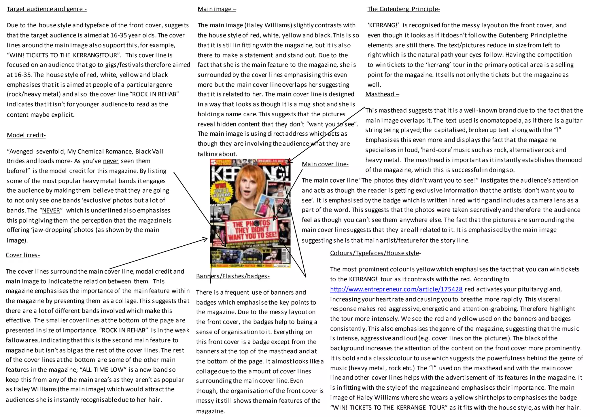
The Gutenberg Principle- 
‘KERRANG!’ is recognised for the messy layout on the front cover, and 
even though it looks as if it doesn’t follow the Gutenberg Principle the 
elements are still there. The text/pictures reduce in size from left to 
right which is the natural path your eyes follow. Having the competition 
to win tickets to the ‘kerrang’ tour in the primary optical area is a selling 
point for the magazine. It sells not only the tickets but the magazine as 
well. 
Masthead – 
This masthead suggests that it is a well -known brand due to the fact that the 
main Image overlaps it. The text used is onomatopoeia, as if there is a guitar 
string being played; the capitalised, broken up text along with the “!” 
Emphasises this even more and displays the fact that the magazine 
specialises in loud, ‘hard-core’ music such as rock, alternative rock and 
heavy metal. The masthead is important as it instantly establishes the mood 
of the magazine, which this is successful in doing so. 
Colours/Typefaces/House style- 
The most prominent colour is yellow which emphasises the fact that you can win tickets 
to the KERRANG! tour as it contrasts with the red. According to 
http://www.entrepreneur.com/article/175428 red activates your pituitary gland, 
increasing your heart rate and causing you to breathe more rapidly. This visceral 
response makes red aggressive, energetic and attention-grabbing. Therefore highlight 
the tour more intensely. We see the red and yellow used on the banners and badges 
consistently. This also emphasises the genre of the magazine, suggesting that the music 
is intense, aggressive and loud (e.g. cover lines on the pictures). The black of the 
background increases the attention of the content on the front cover more prominently. 
It is bold and a classic colour to use which suggests the powerfulness behind the genre of 
music (heavy metal, rock etc.) The “!” used on the masthead and with the main cover 
line and other cover lines helps with the advertisement of its features in the magazine. It 
is in fitting with the style of the magazine and emphasises their importance. The main 
image of Haley Williams where she wears a yellow shirt helps to emphasises the badge 
“WIN! TICKETS TO THE KERRANGE TOUR” as it fits with the house style, as with her hair. 
Banners/Flashes/badges- 
There is a frequent use of banners and 
badges which emphasise the key points to 
the magazine. Due to the messy layout on 
the front cover, the badges help to being a 
sense of organisation to it. Everything on 
this front cover is a badge except from the 
banners at the top of the masthead and at 
the bottom of the page. It almost looks like a 
collage due to the amount of cover lines 
surrounding the main cover line. Even 
though, the organisation of the front cover is 
messy it still shows the main features of the 
magazine. 
Target audience and genre - 
Due to the house style and typeface of the front cover, suggests 
that the target audience is aimed at 16-35 year olds. The cover 
lines around the main image also support this, for example, 
“WIN! TICKETS TO THE KERRANG!TOUR”. This cover line is 
focused on an audience that go to gigs/festivals therefore aimed 
at 16-35. The house style of red, white, yellow and black 
emphasises that it is aimed at people of a particular genre 
(rock/heavy metal) and also the cover line “ROCK IN REHAB” 
indicates that it isn’t for younger audience to read as the 
content maybe explicit. 
Model credit- 
“Avenged sevenfold, My Chemical Romance, Black Vail 
Brides and loads more- As you’ve never seen them 
before!” is the model credit for this magazine. By listing 
some of the most popular heavy metal bands it engages 
the audience by making them believe that they are going 
to not only see one bands ‘exclusive’ photos but a lot of 
bands. The “NEVER” which is underlined also emphasises 
this point giving them the perception that the magazine is 
offering ‘jaw-dropping’ photos (as shown by the main 
image). 
Main image – 
The main image (Haley Williams) slightly contrasts with 
the house style of red, white, yellow and black. This is so 
that it is still in fitting with the magazine, but it is also 
there to make a statement and stand out. Due to the 
fact that she is the main feature to the magazine, she is 
surrounded by the cover lines emphasising this even 
more but the main cover line overlaps her suggesting 
that it is related to her. The main cover line is designed 
in a way that looks as though it is a mug shot and she is 
holding a name care. This suggests that the pictures 
reveal hidden content that they don’t “want you to see”. 
The main image is using direct address which acts as 
though they are involving the audience what they are 
talking about. 
Cover lines- 
The cover lines surround the main cover line, modal credit and 
main image to indicate the relation between them. This 
magazine emphasises the importance of the main feature within 
the magazine by presenting them as a collage. This suggests that 
there are a lot of different bands involved which make this 
effective. The smaller cover lines at the bottom of the page are 
presented in size of importance. “ROCK IN REHAB” is in the weak 
fallow area, indicating that this is the second main feature to 
magazine but isn’t as big as the rest of the cover lines. The rest 
of the cover lines at the bottom are some of the other main 
features in the magazine; “ALL TIME LOW” is a new band so 
keep this from any of the main area’s as they aren’t as popular 
as Haley Williams (the main image) which would attract the 
audiences she is instantly recognisable due to her hair. 
Main cover line- 
The main cover line “The photos they didn’t want you to see!” instigates the audience’s attention 
and acts as though the reader is getting exclusive information that the artists ‘don’t want you to 
see’. It is emphasised by the badge which is written in red writing and includes a camera lens as a 
part of the word. This suggests that the photos were taken secretively and therefore the audience 
feel as though you can’t see them anywhere else. The fact that the pictures are surrounding the 
main cover line suggests that they are all related to it. It is emphasised by the main image 
suggesting she is that main artist/feature for the story line.
It seems as though ‘NME’ magazine targets a range of audiences from 16 -45. This is 
emphasised by the type face and house style. Due to the fac t that the main colours 
are black, white and red, suggests that it is trying to stick to a basic house style and 
not overwhelm the audience. This is so that it doesn’t attract a certain type of 
audience directly. For example, if the house style was pinks and purples this would 
attract a young female audience. There is an element of formality; it is organised 
but there is also an element of informality; the main image used and the typeface. 
What also suggests that t targets an all -round audience is that the acronym NME 
that stands for New Musical Express suggest that it looks at all genres, unlike 
‘HAMMER’ and ‘KERRANG!’ that instigate that it focuses on heavy metal and roc 
bands. His magazine looks at all type of genres . 
Model Credit- 
The Masthead- 
‘NME’ is an acronym for ‘New Musical Express 
‘suggesting the change in target audience 
through the generation. It is in the primary 
optical area so that the audience will see it 
instantly. With it being in this specific area it 
suggests that everything underneath is what’s 
featuring. This is shown by the fact that 
everything is slanted to the left, pointing 
towards it. The masthead is small and concise, 
being catchy and easy to remember, and 
allows there to be a more organised layout on 
the front cover. 
‘GET THE PICTURE?’ is the model credit which is a rhetorical question. This acts as a way of 
instigating curiosity to the reader and so causes them to buy the magazine. It is bigger than 
everything else except from the masthead and main cover line but fits harmoniously with the rest 
of the content; the whole magazine is based upon ‘a picture’. It I also a play on words meaning to 
different things; an actual picture and the metaphorical sense. 
The Gutenberg Principle- 
‘NME’ follows a very basic Gutenberg Principle. The masthead 
is in the primary optical area instigating that this is the brand 
name and is the main feature to the whole magazine. The main 
cover line and model credit is located in the strong fallow area. 
However, there isn’t much content in the other areas which 
could suggest that the focus is on the HAIM. It is very neat and 
organised compared to the magazines such as KERRANG! It 
follows the Gutenberg principle more evidently. Where as in 
comparison to the magazine ‘mixmag’ it follows the principle 
very vaguely. 
Main Image- 
We instantly assume the main image is connected to the main 
cover line and model credit. Not only because it is overlapping 
and the way it is positioned; slanted to the left; suggests that it is 
of them, but the model credit “GET THE PICTURE?” relates to the 
action with in the main image. Due to the fact that the main 
image uses direct mode of address, and that one of the band 
members is upfront holding a camera pointing towards the 
reader, suggests that there are photographs within the magazine 
related to the band. The way in which the girls are positioned 
suggests that they are fun and exciting and therefore attract a 
certain kind of audience. 
Main Cover line- 
The main cover line “HAIM” is of an alternative rock 
band, targeting younger audience of 16-36. This is the 
main selling point of the magazine as they know that it 
will attract a certain audience. It is emphasised by the 
badge and the colour black, which works with the main 
image in instigating the relationship between the main 
cover line and model credit. Furthermore, judging by the 
colours used and typeface they are a modern and a new 
band which over laps the main image. We instantly 
assume that the main cover line is of the main image due 
to the fact that the main selling point for the magazine is 
in the strong fallow area; being almost as important as 
the masthead. 
Target Audience and genre- 
Banners/flashes/badges- 
Cover lines- 
The cover lines are all quotes from the band who feature in the main image, suggesting there is an 
interview which is going to be explicit “Don’t *@!$ with my sisters!”. However, there is various 
artists that surround the main image on the outside of the frame. They don’t follow the Gutenberg 
principle which could suggest that they aren’t as important as the main feature (HIAM). The cover 
lines around the outside are small and black, making them bold but not stand out as much as the 
main cover line. 
There is a lot of badges used to instigate the 
model credit of ‘GET THE PICTURE?’. The whole 
magazine is based upon a picture acting as a 
frame around the main image, and the text. 
This emphasises the importance of the content, 
especially the frame around the main image 
which suggest that the main is the main focus 
of the magazine. There are no banners or 
flashes used on the magazine due to the fact 
the magazine is quite formal and doesn’t need a 
lot of information to grab the reader’s 
attention. The fact that everything but the main 
image is leaning towards the left emphasises 
the selling point (HAIM). 
Colours/typefaces/house style- 
The house style of the magazine is red, white and black, which are very classic colours to 
use on a magazine. This emphasises its formality. Compared to magazines such as 
KERRANG! It is clean and although placed in random areas, it is organised. The masthead 
is written in red which has connotations of energy and power. Even though it is a colour 
that would attract the reader’s eye, it breaks the simplicity of the magazine. This suggests 
that although It Is formal, the content inside is associated with music, being loud and 
aggressive. However, the sans serif style suggests that it isn’t formal but isn’t as informal 
as magazines such as KERRANG and Hammer, therefore adding diversity and elements in 
the content for all ages. The dark colours of the main image work harmoniously with the 
house style, giving it professionalism. The main colour, white, has connotations of 
cleanliness and freshness, suggesting that the magazine is bringing you new content and 
musicians.
Target Audience and genre- 
Taking into account the sans serif style, colloquial language used in the masthead (‘mag’) and main image, it would suggest that 
it is targeting a young audience between 15 and 30. Ignoring the banner at the top of the magazine, the main image, and 
masthead and cover lines suggests that the genre is dance music. ‘IBIZA 2013’ has connotations of clubs and DJ’s also supporting 
the genre and the main artist that is featuring in the magazine. The main image is very dreamy and emphasises the heat of 
summer. But it could also emphasies night clubs as it is very confned and can get very warm. 
Model credit- 
This model credit is a play on words, being catchy and concise it catches passer -by’s attention, also 
emphasises the time of year -“This summer”. It suggests that disclosure is bringing the reader new 
content or music and therefore encourages the reader to buy it. This is the selling point, as well as 
the main cover line “Disclosure”. The colour of “BRINGING THE HEAT” relates to the meaning which 
instigates warmth to the reader. The magazine relates Disclosure to the summer which has 
connotations of heat and sunshine which promotes them as being 
Main Image- 
The main image features Disclosure, music artists favouring the dance 
genre, in the background which has had influence on the house style for 
the magazine. The image is casual but involves direct address with the 
audience, which draws the viewer attention towards the front cover. It 
looks as if the image is hiding behind the cover lines and model credit 
but it is the feature of the magazine so it over laps the mast head. There 
is an awkwardness about the main image of the two boys (Disclosure). 
One is holding his head and the other seems as though he is hiding 
behind the boy in front. This emphasises there unknown identity as their 
faces are outlined. This is the artist’s selling point, to express to the 
audience that this is main feature and selling point to their music. 
Masthead- 
The Masthead on this magazine is big, bold and quite modern, using a 
sans serif font. This woul d attract the audience’s field of view towards 
the masthead; also highlighting the main image which overlaps it. 
This would suggest that Mixmag is a well -known magazine and so the 
font is instantly recognisable to the viewer, having no need to display 
it clearly. The dot on the “I” resembles a radio signal which suggests 
that the magazine is known everywhere, giving it a modernised feel 
to it. 
The Gutenberg Design Principle- 
The Gutenberg principle is a layout that all magazines follow to highlight certain areas that they 
want people to see. The areas include Primary optical area; which is the top left corner; weak fallow 
area; bottom left corner; strong fallow area; top right hand corner; terminal area; bottom left 
corner. Mixmag follows the Gutenberg principle as you instantly look at IBIZA 2013 (main cover line) 
then you see the model credit (DISCLOSURE) then a cover line in the terminal are (PLUS). This 
happens due to reading gravity, where you naturally reading from left to right. 
Colours/Typefaces/House style- 
The colours are warm and humid, which suggest it is a seasonal magazine (summer). The 
house style is red, black and white which work together harmoniously with the 
background (main image). The font is quite alternative and modern; therefore there is a 
sans serif typeface used on this magazine. Disclosure’s album was released in summer 
2013 and Mixmag tries to emphasise this through the use of colour. The hair blends in 
with the back ground and there is juxtaposition between the blue and the red as it 
contrasts with warm and cool colours 
Cover lines- 
‘Mixmag’ uses a lot of cover lines that are distributed around the main image. 
Problems that arise with cover-lines are that they run over the image with a lot 
of colour changes. The main image does have a lot of colour changes but 
‘Mixmag’ is careful not to overlap the text. Where colours are similar the text is 
backed with black making sure it doesn’t drown into the background. Due to 
the fact that your eyes naturally follow from right to left the text size reduces in 
order of importance- following the Gutenberg principle. The cover lines 
surround the main image which emphasises the main feature in the magazine 
whilst also including other features. ‘IBIZA 2013’ is the main cover line for this 
magazine. We know this due to the fact that it is situated in primary optical 
area- therefore being the first headline a passer-by sees. The text is slightly 
larger than the other cover-lines, and comes in four layers and three colours - 
black orange and white. 
Banners/Flashes/badges- 
Banners/flashes and badges are either across the page (banner), a splash 
of colour (flash) or a circle or rectangle (badge). They are used to 
highlight a certain text e.g. EXCLUSIVE. On this magazine there is a banner 
across the top above the masthead which advertises small articles, or 
titles within the magazine. The banner above the masthead over 
exaggerates the magazine which affects the audience in the way that 
causes them to think that they are missing n out on “the world’s biggest 
dance music and clubbing magazine”. This banner features on every issue 
‘mixmag’ publishes which could be a part of the masthead and branding 
of the magazine. This means that they focus on one genre and one genre 
only – clubbing and dance music. 
Main Cover Line- 
The main cover line features the main 
artist in the magazine- ‘Disclosure’. It 
is situated in front of the main image 
almost overpowering it. The text 
suggests the name of the artist behind 
and gives a visual reference to the 
main feature. The fact that it is bold 
larger than any of the other text and 
is white suggests that importance of 
the artists, as it is the main selling 
point to the magazine. The whole 
magazine is featured around them 
(colours and text).

Magazine Cover Analysis

  • 1.
    The Gutenberg Principle- ‘KERRANG!’ is recognised for the messy layout on the front cover, and even though it looks as if it doesn’t follow the Gutenberg Principle the elements are still there. The text/pictures reduce in size from left to right which is the natural path your eyes follow. Having the competition to win tickets to the ‘kerrang’ tour in the primary optical area is a selling point for the magazine. It sells not only the tickets but the magazine as well. Masthead – This masthead suggests that it is a well -known brand due to the fact that the main Image overlaps it. The text used is onomatopoeia, as if there is a guitar string being played; the capitalised, broken up text along with the “!” Emphasises this even more and displays the fact that the magazine specialises in loud, ‘hard-core’ music such as rock, alternative rock and heavy metal. The masthead is important as it instantly establishes the mood of the magazine, which this is successful in doing so. Colours/Typefaces/House style- The most prominent colour is yellow which emphasises the fact that you can win tickets to the KERRANG! tour as it contrasts with the red. According to http://www.entrepreneur.com/article/175428 red activates your pituitary gland, increasing your heart rate and causing you to breathe more rapidly. This visceral response makes red aggressive, energetic and attention-grabbing. Therefore highlight the tour more intensely. We see the red and yellow used on the banners and badges consistently. This also emphasises the genre of the magazine, suggesting that the music is intense, aggressive and loud (e.g. cover lines on the pictures). The black of the background increases the attention of the content on the front cover more prominently. It is bold and a classic colour to use which suggests the powerfulness behind the genre of music (heavy metal, rock etc.) The “!” used on the masthead and with the main cover line and other cover lines helps with the advertisement of its features in the magazine. It is in fitting with the style of the magazine and emphasises their importance. The main image of Haley Williams where she wears a yellow shirt helps to emphasises the badge “WIN! TICKETS TO THE KERRANGE TOUR” as it fits with the house style, as with her hair. Banners/Flashes/badges- There is a frequent use of banners and badges which emphasise the key points to the magazine. Due to the messy layout on the front cover, the badges help to being a sense of organisation to it. Everything on this front cover is a badge except from the banners at the top of the masthead and at the bottom of the page. It almost looks like a collage due to the amount of cover lines surrounding the main cover line. Even though, the organisation of the front cover is messy it still shows the main features of the magazine. Target audience and genre - Due to the house style and typeface of the front cover, suggests that the target audience is aimed at 16-35 year olds. The cover lines around the main image also support this, for example, “WIN! TICKETS TO THE KERRANG!TOUR”. This cover line is focused on an audience that go to gigs/festivals therefore aimed at 16-35. The house style of red, white, yellow and black emphasises that it is aimed at people of a particular genre (rock/heavy metal) and also the cover line “ROCK IN REHAB” indicates that it isn’t for younger audience to read as the content maybe explicit. Model credit- “Avenged sevenfold, My Chemical Romance, Black Vail Brides and loads more- As you’ve never seen them before!” is the model credit for this magazine. By listing some of the most popular heavy metal bands it engages the audience by making them believe that they are going to not only see one bands ‘exclusive’ photos but a lot of bands. The “NEVER” which is underlined also emphasises this point giving them the perception that the magazine is offering ‘jaw-dropping’ photos (as shown by the main image). Main image – The main image (Haley Williams) slightly contrasts with the house style of red, white, yellow and black. This is so that it is still in fitting with the magazine, but it is also there to make a statement and stand out. Due to the fact that she is the main feature to the magazine, she is surrounded by the cover lines emphasising this even more but the main cover line overlaps her suggesting that it is related to her. The main cover line is designed in a way that looks as though it is a mug shot and she is holding a name care. This suggests that the pictures reveal hidden content that they don’t “want you to see”. The main image is using direct address which acts as though they are involving the audience what they are talking about. Cover lines- The cover lines surround the main cover line, modal credit and main image to indicate the relation between them. This magazine emphasises the importance of the main feature within the magazine by presenting them as a collage. This suggests that there are a lot of different bands involved which make this effective. The smaller cover lines at the bottom of the page are presented in size of importance. “ROCK IN REHAB” is in the weak fallow area, indicating that this is the second main feature to magazine but isn’t as big as the rest of the cover lines. The rest of the cover lines at the bottom are some of the other main features in the magazine; “ALL TIME LOW” is a new band so keep this from any of the main area’s as they aren’t as popular as Haley Williams (the main image) which would attract the audiences she is instantly recognisable due to her hair. Main cover line- The main cover line “The photos they didn’t want you to see!” instigates the audience’s attention and acts as though the reader is getting exclusive information that the artists ‘don’t want you to see’. It is emphasised by the badge which is written in red writing and includes a camera lens as a part of the word. This suggests that the photos were taken secretively and therefore the audience feel as though you can’t see them anywhere else. The fact that the pictures are surrounding the main cover line suggests that they are all related to it. It is emphasised by the main image suggesting she is that main artist/feature for the story line.
  • 2.
    It seems asthough ‘NME’ magazine targets a range of audiences from 16 -45. This is emphasised by the type face and house style. Due to the fac t that the main colours are black, white and red, suggests that it is trying to stick to a basic house style and not overwhelm the audience. This is so that it doesn’t attract a certain type of audience directly. For example, if the house style was pinks and purples this would attract a young female audience. There is an element of formality; it is organised but there is also an element of informality; the main image used and the typeface. What also suggests that t targets an all -round audience is that the acronym NME that stands for New Musical Express suggest that it looks at all genres, unlike ‘HAMMER’ and ‘KERRANG!’ that instigate that it focuses on heavy metal and roc bands. His magazine looks at all type of genres . Model Credit- The Masthead- ‘NME’ is an acronym for ‘New Musical Express ‘suggesting the change in target audience through the generation. It is in the primary optical area so that the audience will see it instantly. With it being in this specific area it suggests that everything underneath is what’s featuring. This is shown by the fact that everything is slanted to the left, pointing towards it. The masthead is small and concise, being catchy and easy to remember, and allows there to be a more organised layout on the front cover. ‘GET THE PICTURE?’ is the model credit which is a rhetorical question. This acts as a way of instigating curiosity to the reader and so causes them to buy the magazine. It is bigger than everything else except from the masthead and main cover line but fits harmoniously with the rest of the content; the whole magazine is based upon ‘a picture’. It I also a play on words meaning to different things; an actual picture and the metaphorical sense. The Gutenberg Principle- ‘NME’ follows a very basic Gutenberg Principle. The masthead is in the primary optical area instigating that this is the brand name and is the main feature to the whole magazine. The main cover line and model credit is located in the strong fallow area. However, there isn’t much content in the other areas which could suggest that the focus is on the HAIM. It is very neat and organised compared to the magazines such as KERRANG! It follows the Gutenberg principle more evidently. Where as in comparison to the magazine ‘mixmag’ it follows the principle very vaguely. Main Image- We instantly assume the main image is connected to the main cover line and model credit. Not only because it is overlapping and the way it is positioned; slanted to the left; suggests that it is of them, but the model credit “GET THE PICTURE?” relates to the action with in the main image. Due to the fact that the main image uses direct mode of address, and that one of the band members is upfront holding a camera pointing towards the reader, suggests that there are photographs within the magazine related to the band. The way in which the girls are positioned suggests that they are fun and exciting and therefore attract a certain kind of audience. Main Cover line- The main cover line “HAIM” is of an alternative rock band, targeting younger audience of 16-36. This is the main selling point of the magazine as they know that it will attract a certain audience. It is emphasised by the badge and the colour black, which works with the main image in instigating the relationship between the main cover line and model credit. Furthermore, judging by the colours used and typeface they are a modern and a new band which over laps the main image. We instantly assume that the main cover line is of the main image due to the fact that the main selling point for the magazine is in the strong fallow area; being almost as important as the masthead. Target Audience and genre- Banners/flashes/badges- Cover lines- The cover lines are all quotes from the band who feature in the main image, suggesting there is an interview which is going to be explicit “Don’t *@!$ with my sisters!”. However, there is various artists that surround the main image on the outside of the frame. They don’t follow the Gutenberg principle which could suggest that they aren’t as important as the main feature (HIAM). The cover lines around the outside are small and black, making them bold but not stand out as much as the main cover line. There is a lot of badges used to instigate the model credit of ‘GET THE PICTURE?’. The whole magazine is based upon a picture acting as a frame around the main image, and the text. This emphasises the importance of the content, especially the frame around the main image which suggest that the main is the main focus of the magazine. There are no banners or flashes used on the magazine due to the fact the magazine is quite formal and doesn’t need a lot of information to grab the reader’s attention. The fact that everything but the main image is leaning towards the left emphasises the selling point (HAIM). Colours/typefaces/house style- The house style of the magazine is red, white and black, which are very classic colours to use on a magazine. This emphasises its formality. Compared to magazines such as KERRANG! It is clean and although placed in random areas, it is organised. The masthead is written in red which has connotations of energy and power. Even though it is a colour that would attract the reader’s eye, it breaks the simplicity of the magazine. This suggests that although It Is formal, the content inside is associated with music, being loud and aggressive. However, the sans serif style suggests that it isn’t formal but isn’t as informal as magazines such as KERRANG and Hammer, therefore adding diversity and elements in the content for all ages. The dark colours of the main image work harmoniously with the house style, giving it professionalism. The main colour, white, has connotations of cleanliness and freshness, suggesting that the magazine is bringing you new content and musicians.
  • 3.
    Target Audience andgenre- Taking into account the sans serif style, colloquial language used in the masthead (‘mag’) and main image, it would suggest that it is targeting a young audience between 15 and 30. Ignoring the banner at the top of the magazine, the main image, and masthead and cover lines suggests that the genre is dance music. ‘IBIZA 2013’ has connotations of clubs and DJ’s also supporting the genre and the main artist that is featuring in the magazine. The main image is very dreamy and emphasises the heat of summer. But it could also emphasies night clubs as it is very confned and can get very warm. Model credit- This model credit is a play on words, being catchy and concise it catches passer -by’s attention, also emphasises the time of year -“This summer”. It suggests that disclosure is bringing the reader new content or music and therefore encourages the reader to buy it. This is the selling point, as well as the main cover line “Disclosure”. The colour of “BRINGING THE HEAT” relates to the meaning which instigates warmth to the reader. The magazine relates Disclosure to the summer which has connotations of heat and sunshine which promotes them as being Main Image- The main image features Disclosure, music artists favouring the dance genre, in the background which has had influence on the house style for the magazine. The image is casual but involves direct address with the audience, which draws the viewer attention towards the front cover. It looks as if the image is hiding behind the cover lines and model credit but it is the feature of the magazine so it over laps the mast head. There is an awkwardness about the main image of the two boys (Disclosure). One is holding his head and the other seems as though he is hiding behind the boy in front. This emphasises there unknown identity as their faces are outlined. This is the artist’s selling point, to express to the audience that this is main feature and selling point to their music. Masthead- The Masthead on this magazine is big, bold and quite modern, using a sans serif font. This woul d attract the audience’s field of view towards the masthead; also highlighting the main image which overlaps it. This would suggest that Mixmag is a well -known magazine and so the font is instantly recognisable to the viewer, having no need to display it clearly. The dot on the “I” resembles a radio signal which suggests that the magazine is known everywhere, giving it a modernised feel to it. The Gutenberg Design Principle- The Gutenberg principle is a layout that all magazines follow to highlight certain areas that they want people to see. The areas include Primary optical area; which is the top left corner; weak fallow area; bottom left corner; strong fallow area; top right hand corner; terminal area; bottom left corner. Mixmag follows the Gutenberg principle as you instantly look at IBIZA 2013 (main cover line) then you see the model credit (DISCLOSURE) then a cover line in the terminal are (PLUS). This happens due to reading gravity, where you naturally reading from left to right. Colours/Typefaces/House style- The colours are warm and humid, which suggest it is a seasonal magazine (summer). The house style is red, black and white which work together harmoniously with the background (main image). The font is quite alternative and modern; therefore there is a sans serif typeface used on this magazine. Disclosure’s album was released in summer 2013 and Mixmag tries to emphasise this through the use of colour. The hair blends in with the back ground and there is juxtaposition between the blue and the red as it contrasts with warm and cool colours Cover lines- ‘Mixmag’ uses a lot of cover lines that are distributed around the main image. Problems that arise with cover-lines are that they run over the image with a lot of colour changes. The main image does have a lot of colour changes but ‘Mixmag’ is careful not to overlap the text. Where colours are similar the text is backed with black making sure it doesn’t drown into the background. Due to the fact that your eyes naturally follow from right to left the text size reduces in order of importance- following the Gutenberg principle. The cover lines surround the main image which emphasises the main feature in the magazine whilst also including other features. ‘IBIZA 2013’ is the main cover line for this magazine. We know this due to the fact that it is situated in primary optical area- therefore being the first headline a passer-by sees. The text is slightly larger than the other cover-lines, and comes in four layers and three colours - black orange and white. Banners/Flashes/badges- Banners/flashes and badges are either across the page (banner), a splash of colour (flash) or a circle or rectangle (badge). They are used to highlight a certain text e.g. EXCLUSIVE. On this magazine there is a banner across the top above the masthead which advertises small articles, or titles within the magazine. The banner above the masthead over exaggerates the magazine which affects the audience in the way that causes them to think that they are missing n out on “the world’s biggest dance music and clubbing magazine”. This banner features on every issue ‘mixmag’ publishes which could be a part of the masthead and branding of the magazine. This means that they focus on one genre and one genre only – clubbing and dance music. Main Cover Line- The main cover line features the main artist in the magazine- ‘Disclosure’. It is situated in front of the main image almost overpowering it. The text suggests the name of the artist behind and gives a visual reference to the main feature. The fact that it is bold larger than any of the other text and is white suggests that importance of the artists, as it is the main selling point to the magazine. The whole magazine is featured around them (colours and text).