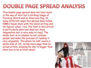
Download to read offline
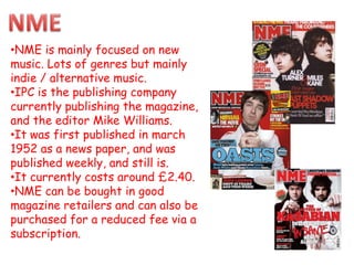

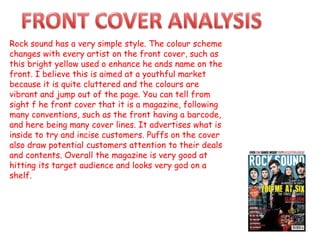

- NME is a weekly music magazine focused on indie and alternative music genres. It was first published in 1952 as a newspaper and is currently published by IPC. - The magazine has a distinctive style with its iconic masthead and uses typical magazine conventions like cover lines and images. This edition seems aimed at female readers with its softer colors and image of a topless man. - Rocksound is a weekly rock music magazine that focuses on rock artists. It was first published in 1999 and is currently published by Freeway Press. It uses vibrant colors on its covers to appeal to a youthful audience.


![As media studies[1]](https://cdn.slidesharecdn.com/ss_thumbnails/asmediastudies1-101104085136-phpapp01-thumbnail.jpg?width=640&height=640&fit=bounds)


![Content analysis media[1]](https://cdn.slidesharecdn.com/ss_thumbnails/contentanalysismedia1-101109073245-phpapp02-thumbnail.jpg?width=640&height=640&fit=bounds)